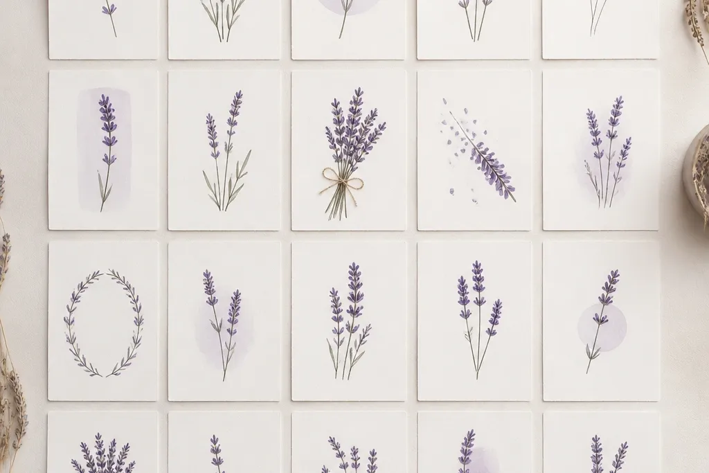
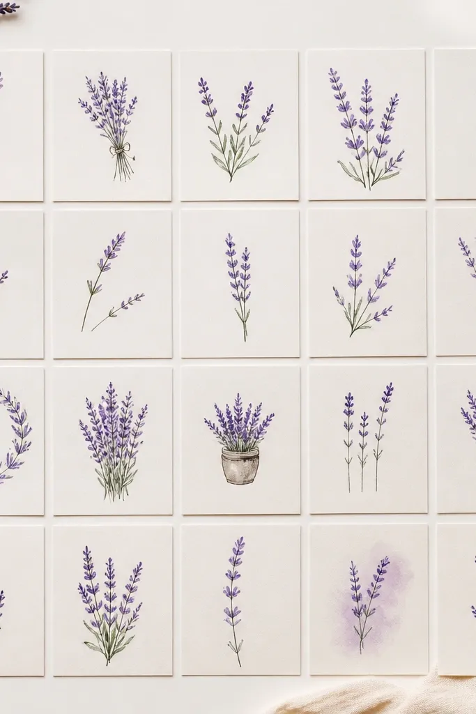
1. Thumbprint Lavender Cluster
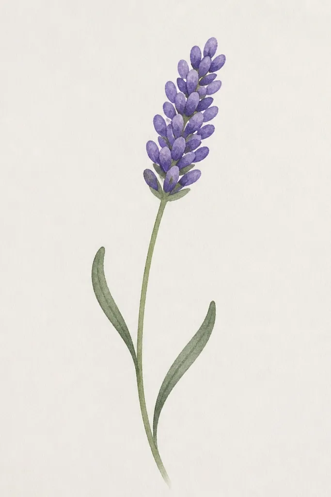
This one is my go-to for kids because it turns a “mess” into a recognizable lavender head. The thumbprint ovals create natural variation, so the cluster looks textured without you drawing dozens of tiny lines. I use a light purple for the base and a deeper violet on the top half of each oval, which makes the head look layered. The stem stays thin and slightly S-curved so the whole sprig looks balanced on a page. It’s perfect for small cards, bookmarks, and any drawing where you want lavender to look cute instead of realistic.
Start by drawing a slightly curved stem that leans a little to one side. Then draw the leaf marks — two short comma shapes facing opposite sides of the stem. For the flower head, stamp the thumbprint shape by pressing the rounded end of a pencil eraser or your fingertip lightly, repeating the oval marks in a tight group. Finally, outline the cluster lightly with purple marker or pencil so it looks intentional, then color the top tips darker and the bottom lighter. Keep all ovals about the same size so the head reads as a cluster.
If you’re using crayons, color the thumbprints in small back-and-forth strokes so the texture matches the stamped shape.
Don’t draw a single filled circle for the head — that makes it look like a pom-pom instead of lavender.
2. Zigzag Stem With Tiny Spike Tips
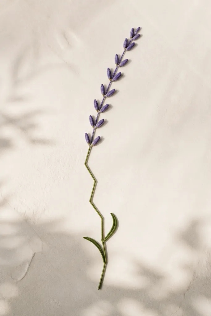
This style is simple but still looks “designed” because the zigzag stem gives energy. The flower head uses tiny V-teeth — that’s the lavender texture in miniature. When you add color, you can keep it super easy: a light purple wash over the head, then a slightly darker purple on each V tip. It flatters smaller pages because the zigzag line naturally fills space without needing extra background. I like it for kids who get bored with slow shading, because the result looks good in 5-10 minutes.
Draw a thin stem with a mild zigzag — not sharp angles, just gentle up-down movement. Add leaves as two short curved lines split into a comma shape on each side, spaced about a thumb-width apart. Sketch a small oval outline where the flower head will be, then fill it with repeated V shapes stacked from bottom to top. Color the base of the V shapes light purple, then touch only the top points with darker violet. Finish by tracing the stem lightly so it looks darker than the head.
Use a ruler under the paper for the first zigzag pass so kids don’t drift into a tangled line.
Skip long, tall spikes — lavender heads should feel compact, not like a cactus.
3. Stacked U-Shapes Lavender Head
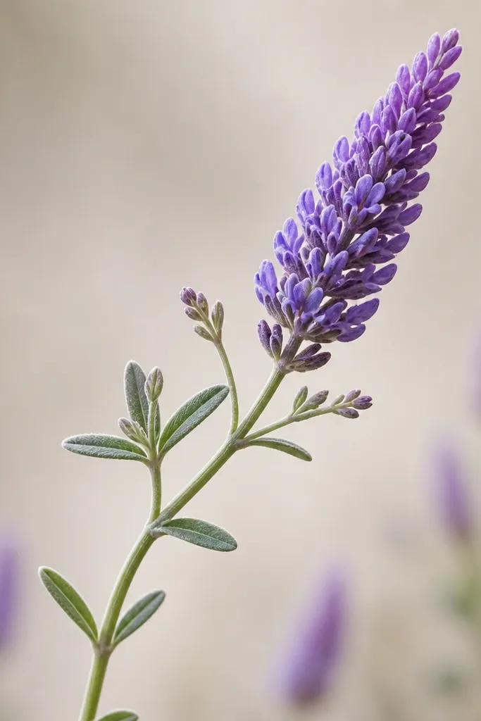
Stacked U-shapes give you that classic airy lavender look while staying easy to draw. Each U acts like a tiny petal spike, and the overlap makes the head look full. I usually keep the stem smooth and then place leaves in matching pairs so the whole sprig looks tidy. Color it like a gradient: light lavender at the bottom of the head, darker at the top where the U-shapes overlap more. This works well for adults doing quick sketchbook pages and for kids who need a clear pattern to copy.
Good to knowIf U-shapes look uneven, draw three practice U’s on the side of the page first.
Start with a curved stem line and draw two leaf pairs along it, one on each side. Make the flower head by drawing a small oval guide, then fill it with U-shapes that are all the same width. Place the U-shapes in rows, starting at the bottom row and stacking upward until the oval is filled. Add a darker line inside the top halves of the U-shapes using a darker purple marker. Color lightly under the U-shapes and more heavily near the top to create depth.
Common mistakeDon’t outline every U heavily — too much ink makes it look like a coloring page outline rather than a sketch.
4. Three-Cluster Lavender Bunch
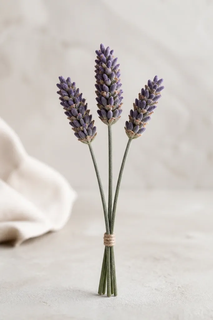
This is the one I use when someone says “I can’t draw flowers.” You don’t draw one complicated lavender — you draw three small, simple clusters and connect them. The spacing creates a pleasing triangle arrangement, and the bundled stems make it feel like a real bunch. I recommend using three shades of purple: very light (base), medium (middle), and deep violet (tips). It flatters kids because it hides mistakes — if one head is a bit crooked, the bunch still reads as lavender.
Draw three stems starting from one bottom point, fanning out slightly. Add one small oval guide at the top of each stem, then fill each oval with short vertical marks that taper slightly — like tiny pencils. Keep the flower heads about the same height so they look like a set. Color each head with a light purple base, then add medium purple shading in the center and deep violet at the top edges. Finish by sketching a loose wrap line around the stems near the bottom.
Use a single purple marker for outlines and switch to crayons for coloring so the bunch doesn’t look harsh.
Don’t make all three heads the same size and perfectly aligned — a little variation looks natural.
5. Single Head, Side View Sketch
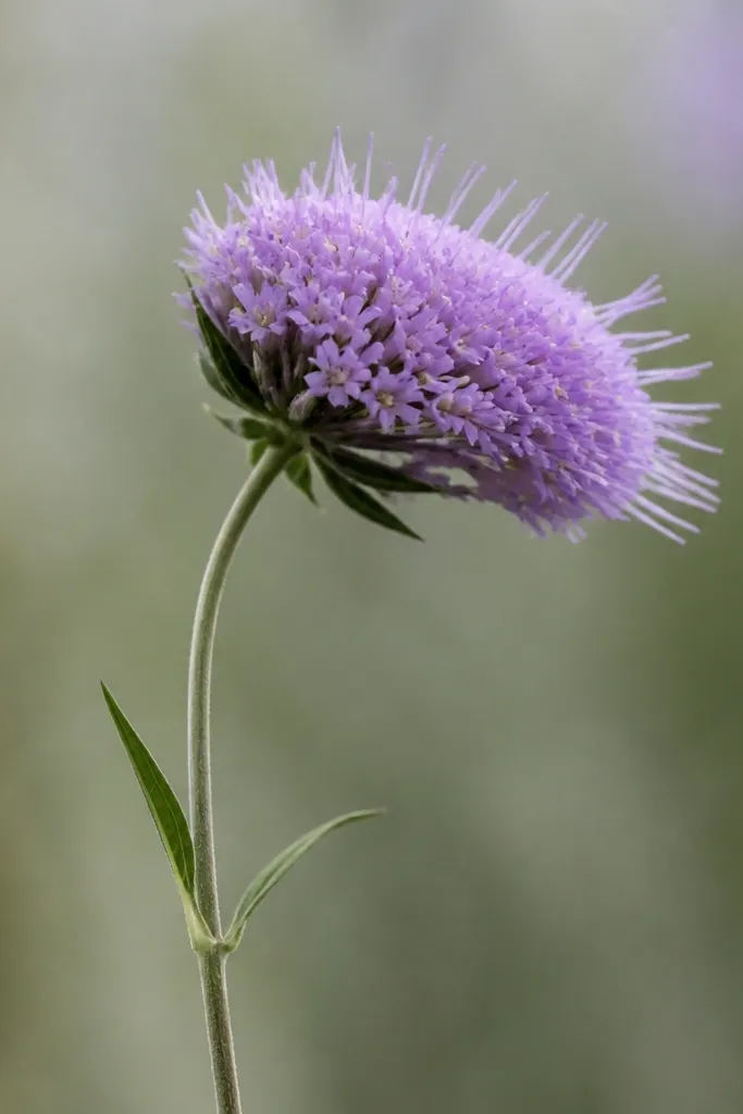
Side view lavender looks more interesting than a straight-on blob, and it’s still easy. The trick is to flatten the head shape slightly and angle the spike marks so they lean in one direction. I like this for monochrome drawings because the spike direction shows form even without heavy color. If you color, keep the base pale and reserve the darkest purple for the outer edge of the head. It’s flattering for tall paper because the stem line can take up space without needing extra details.
Good to knowRotate your paper 10 degrees before drawing; it makes side-view curves feel smoother.
Draw a long stem with a gentle curve and add two leaves as small commas on opposite sides. Sketch a flattened oval for the flower head, narrower on one end. Fill the head with short spike marks — curve them slightly so they all lean the same direction. Add a few darker “shadow” spikes along the outer edge using a darker pencil or marker. Color the inner spikes light lavender and the outer edge deeper purple, leaving a small lighter gap to mimic light.
Common mistakeAvoid drawing spikes in every direction — that makes the head look round and generic.
6. Lavender Sprig With Dotted Texture
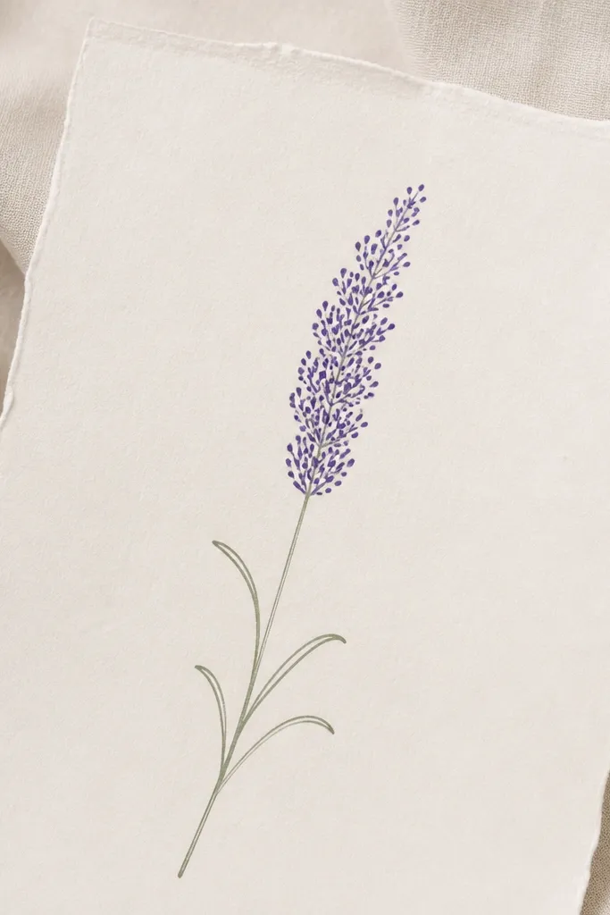
Dots are a cheat code for kids and adults who hate drawing tiny lines. A lavender head made of dot clusters still reads as spikes because the dots create the same dense texture. I’ve done this with marker and with colored pencil; both look good because dots catch light differently. Keep the stem thin and the leaves minimal so the texture stays the focus. This is also great for mixed media because you can add dots with a gel pen on top of watercolor.
Start with a thin stem line and place two leaf marks lower down as curved commas. Draw a soft oval outline for the head. Fill the oval with tiny dots — make them denser in the middle and slightly sparser at the edges. For extra lavender shape, add a few short dash marks between dot clusters. Color lightly with purple pencil, then add darker dots at the top half of the head using a darker purple marker or gel pen.
Use the tip of a colored pencil to place dots instead of scribbling; scribbles blur the lavender shape.
Don’t overfill the whole page with dots — keep them only inside the head so it stays readable.
7. Marker-Only Lavender Head (No Pencil)
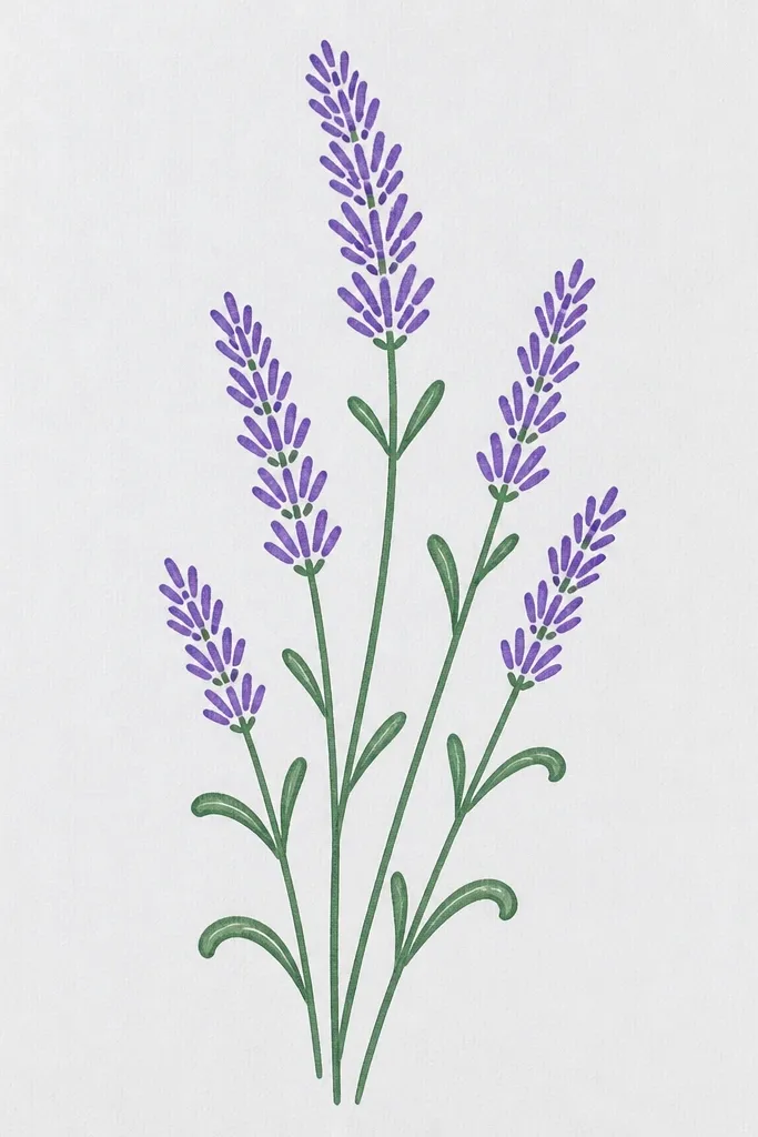
Marker-only drawings look neat because the line weight stays consistent. This idea is excellent for kids who press too hard with pencil and smudge everywhere. You draw the stem and leaves first in one continuous line style, then add the flower head texture with short repeated strokes. When coloring, use a light purple marker for the base and a darker purple marker only on the top third of the head. The result looks intentional even when the texture is a bit uneven.
Good to knowHold the marker farther back in your hand for lighter strokes; it keeps the spikes from getting chunky.
Draw a stem line with a slight curve, then add two leaves as small comma shapes on opposite sides. Draw a small oval guide for the flower head — you can lightly sketch it if you need, but keep it minimal. Fill the oval with repeated short lines that point upward, like tiny matchsticks. Leave a tiny lighter gap on one side of the head to suggest shine. Color the head with light purple first, then go back and color the top tips darker.
Common mistakeDon’t draw thick outlines around the head — it makes the texture disappear.
8. Watercolor Wash Lavender Head With Ink Lines
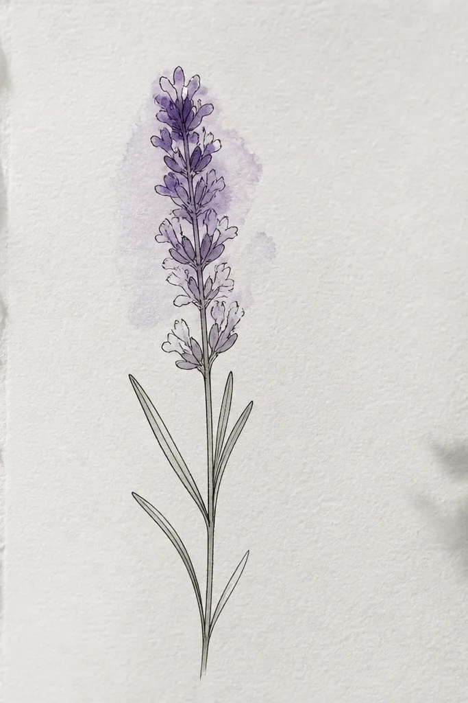
This is the prettiest-looking simple option because watercolor blooms automatically, giving you that soft lavender haze. Ink lines keep the shape readable while the wash does the work of shading. I use a light lavender wash first, then add darker violet at the top edges while it’s still damp. The stem and leaves stay mostly unpainted or lightly washed so the head stands out. It’s flattering for adults doing greeting cards because it looks airy even with minimal drawing skill.
Good to knowIf you see hard edges forming, add a tiny touch of clean water to soften the wash before it dries.
Use a fine liner or black marker to draw the stem and leaves first, keeping them light and thin. Sketch a head oval and leave it uncolored. Wet the head lightly with clean water, then paint a pale lavender wash over it. After it settles, add a small amount of darker violet to the top edge and let it bloom inward. Let it dry fully, then go back with a darker ink line to sharpen a few spike edges.
Common mistakeDon’t paint the stem heavily — a dark stem can make the whole sprig look muddy.
9. Crayon Resist Lavender Tips
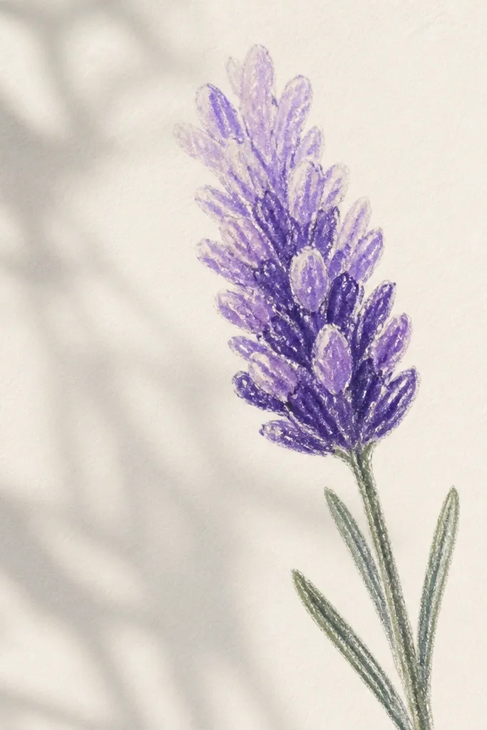
Resist effects look fancy but the method is simple. You draw the head with a light crayon first, then paint over it with watercolor or diluted marker. The crayon resists the paint, leaving pale highlights that mimic the lighter parts of lavender spikes. I’ve used this with kids on thick paper because thin paper warps less. It also looks great in a limited color palette: pale lavender, medium purple, and one dark violet for the top tips.
Good to knowUse thicker crayon lines on the tips — thin resist lines vanish under watercolor.
Draw the stem and leaves in pencil first, then trace with a thin black marker. Color the flower head lightly with a white crayon or very pale lavender crayon, focusing on the top tips and a couple of side highlights. Paint over the entire head with diluted purple watercolor, keeping the paint mostly inside the outline. While the paint is wet, drop a little darker violet at the top edge for depth. Let everything dry, then add a few dark purple marks on the top tips with a marker.
Common mistakeDon’t scrub the crayon all over the page; you want highlights only inside the head.
10. Colored Pencil Shaded Spike Rows
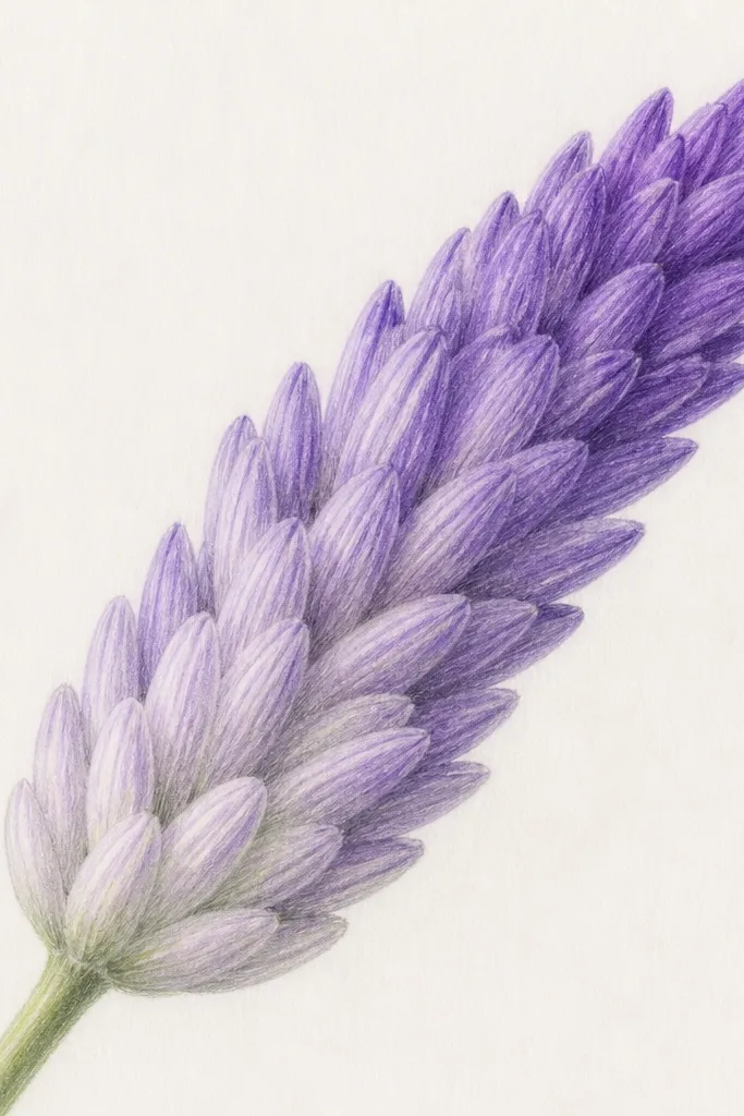
This style looks like real sketchbook work because the pencil strokes follow the lavender texture. You draw the spike marks first, then shade along the direction of the spikes instead of shading randomly. The layered shading makes the head look three-dimensional without blending tools. I like it for people who want control: each spike gets a lighter base and a darker top. It’s also forgiving because colored pencil covers small mistakes better than marker.
Lightly sketch the stem curve and leaf commas. Draw a small oval guide for the head and fill it with short spike lines — keep them fairly close together. Shade the bottom half of the head with a light lavender pencil, pressing lightly. Switch to medium purple for the middle, then add dark violet only near the top edges of the spikes. Blend by burnishing lightly with the light pencil over the transitions, not by smudging everything.
Sharpen your pencil so your spikes look like separate marks, not a fuzzy scribble.
Don’t shade the whole head evenly — that flattens the spikes.
11. Lavender Buds as Mini Circles
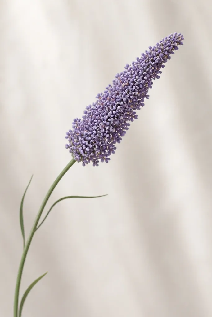
Mini circles sound too simple, but they work because lavender heads are dense and small. When you pack tiny circles into an oval and shade the top, it reads as a spike cluster from a distance. I use this when someone wants a drawing that looks cute and slightly whimsical. The circles also make it easy to color without worrying about perfect lines. It’s great for kids because “draw circles” is a skill they already know.
Good to knowUse a 0.5 gel pen to place circles quickly; it gives crisp dots.
Draw a curved stem and add two leaf commas about halfway down the stem. Sketch a head oval and then fill it with small circles, slightly overlapping like beads. Make the bottom circles lighter and smaller, and keep the top circles a bit darker and more crowded. Color the head with light purple first, then layer medium purple on the middle and dark violet on top. Finish by adding a few tiny darker circle dots on the outer edge for shape.
Common mistakeDon’t space the circles too far apart — lavender heads look dense.
12. Single-Line Lavender Sprig
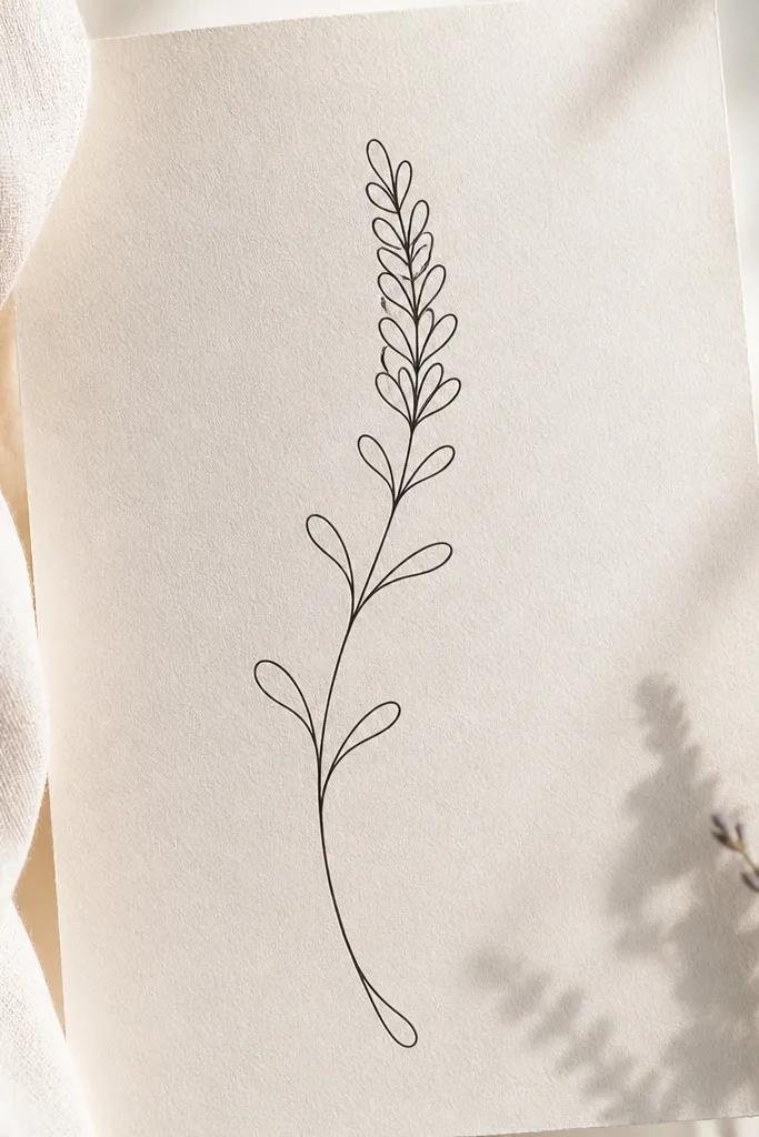
This is the cleanest option for minimalists and for kids who like “one stroke” drawings. The trick is to connect your spikes into a single continuous loop so the head looks like a tight bundle. I use a black fineliner and keep the leaves as tiny teardrop loops so the sprig stays light. If you color, just add a wash of light purple under the head and leave the rest white. It looks modern on plain paper and in simple frames.
Start at the bottom of the stem and draw upward in one smooth line. Create leaves as small teardrop loops that branch off the stem and then come back in. For the head, draw a narrow oval shape and fill it by looping short spike shapes that connect — each spike is a tiny loop. Keep the loops close together so the head looks dense. Add light purple coloring only inside the head, leaving the stem and leaves mostly uncolored.
Practice the head loops once on scrap paper so your line stays steady.
Don’t thicken the line near the head — it makes the spikes merge.
13. Lavender Head With Side Leaves and Curl
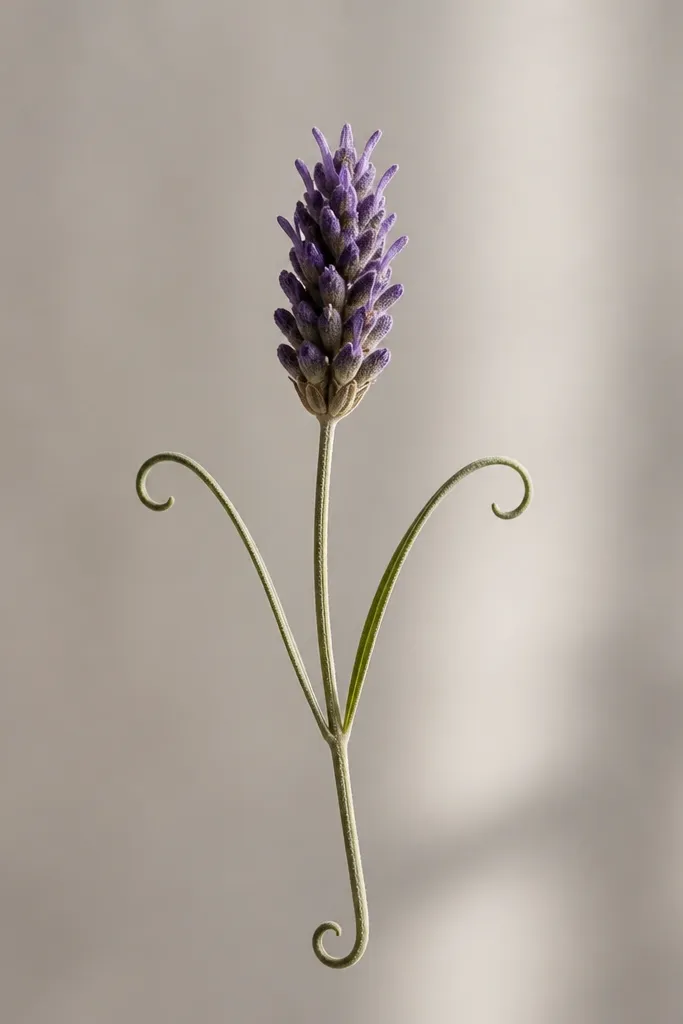
This drawing feels “finished” because the base flourish balances the head. I add two side leaves that curl slightly, which gives movement and makes the sprig look like it’s swaying. The flower head stays simple with short spikes stacked in a tight oval — easy to repeat. Color the head in light purple, then darken only the outer edge and a few top spikes. This works for kids and adults because the flourish hides uneven stems and gives the drawing a focal point.
Good to knowKeep side leaves smaller than the main head so the flower stays the star.
Draw the stem with a gentle curve and plan a curl at the bottom like a small hook. Add two leaves that curl outward from opposite sides of the stem, each leaf made of two short curved lines that meet at a point. Sketch a head oval and fill it with short upward spike marks. Color the head with light lavender, then add dark violet only to the outer edge and top tips. Finish by tracing the bottom curl with a darker line so it stands out against the lighter stem.
Common mistakeDon’t add extra leaves everywhere — two side leaves are enough.
14. Lavender Bouquet Oval Frame
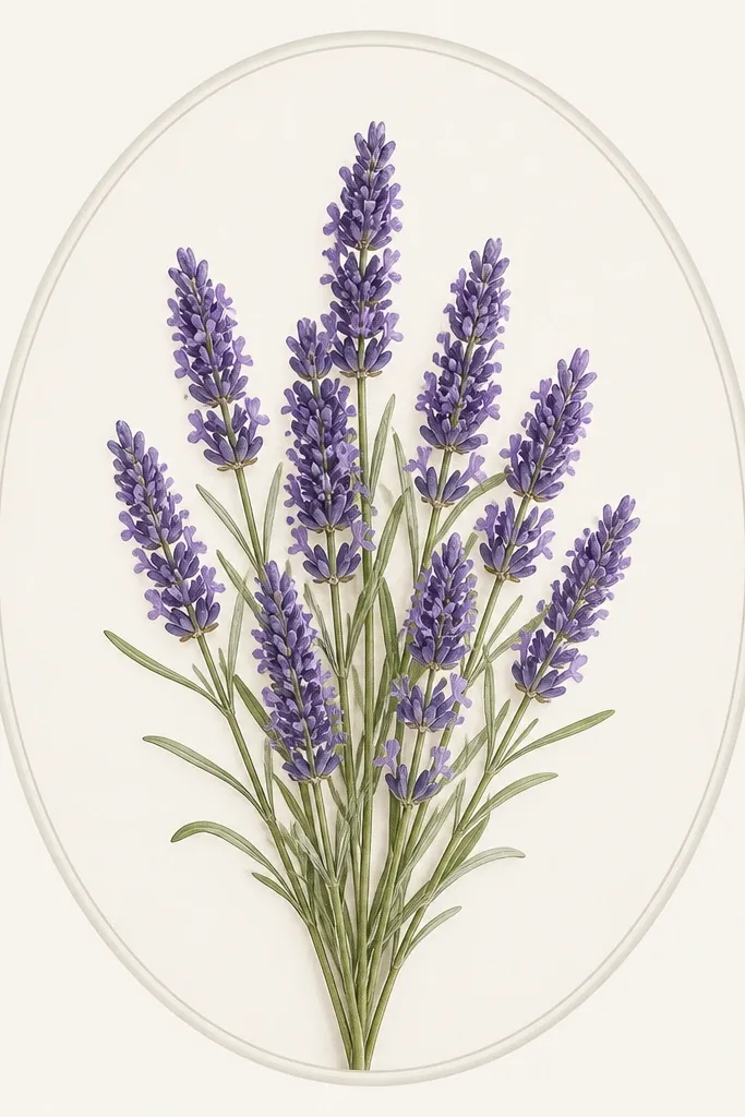
Framing changes everything. Even if the lavender drawing is simple, an oval frame makes it feel like a finished art piece instead of a random doodle. I like to place three or four small heads inside the oval, each with the same spike texture so everything matches. Color the heads with a consistent purple palette and leave the frame lines clean and light. This is great for kids who want to make a “real picture” for a wall or fridge.
Draw a large oval frame in pencil, about 2 inches from the page edges. Inside, place three stems that start near the bottom center and rise to different heights. Add spike clusters at the top of each stem using short repeated strokes. Place two leaf commas between the stems so the inside isn’t empty. Color heads in light purple, shade the middle with medium purple, and add dark violet only at the top tips; leave the frame uncolored or lightly colored in pale gray.
Use a ruler for the frame only; keep the lavender lines freehand.
Don’t color the frame dark purple — it competes with the lavender heads.
15. Lavender Sprig Pattern Tile
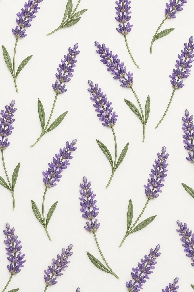
Pattern tiles are a sneaky way to practice without noticing. You draw one sprig, then repeat it in a grid, and the repetition makes your drawing look consistent. I use this when a kid wants “more flowers” but gets stuck on making one perfect. Keep each sprig small and consistent, with the same head shape and the same leaf style. Color it with two purples and one green so it looks cohesive, even when the stems vary a little.
Good to knowUse the same marker thickness for every sprig so the pattern looks intentional.
Draw a square grid on your paper — for example, 3 by 3 tiles using light pencil lines. Pick one tile and draw your lavender sprig: curved stem, two leaf commas, and a compact spike cluster head. Trace or copy that sprig into the other tiles, changing only the angle slightly. Color each head with light lavender base and dark violet tips, and color leaves in a consistent sage green. If you want the tile to look extra clean, add one thin gray outline around each tile section after coloring.
Common mistakeDon’t make one tile much bigger than the others — it breaks the pattern.
16. Lavender Leaf-First Layout
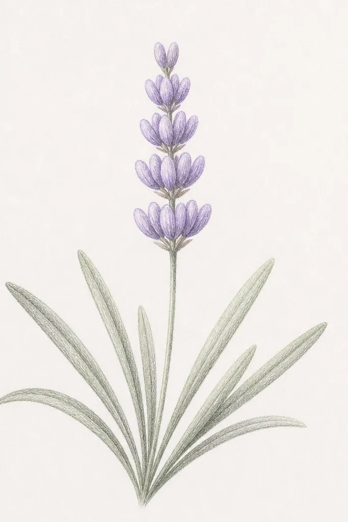
This layout helps when your flowers keep ending up too low or too crowded. You start with leaves as anchors, then place the head where the leaf fan creates space. It looks balanced on portrait paper and feels more natural than “stem then head” every time. I use three leaves in a fan — two on the sides and one slightly higher in the center. The head gets drawn last using stacked U-shapes so the texture matches the leaf layout.
Good to knowKeep leaf tips pointing the same direction as the head spikes for a unified look.
Draw three leaf commas first in a fan shape, with the center leaf slightly taller. Add a thin stem line that connects the leaves at the base. Sketch a small oval head guide above the leaves, centered where the fan opens. Fill the head with stacked U-shapes, using the same spacing as the leaf commas. Color leaves in sage green, then color the head light purple with darker violet at the top and a faint shadow line under the head.
Common mistakeDon’t add the flower head before the leaves — that’s when you end up with awkward spacing.
17. Lavender Sprig With Dainty Seed-Like Dots
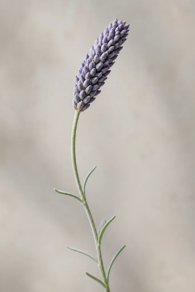
Seed-like dots give lavender a softer, airy texture than sharp spikes. It’s still lavender because the head is dense and the dots are stacked in rows. I like this look for pastel coloring, where you want the head to feel delicate. The stem and leaves stay minimal, so the dot texture is what you notice first. Kids also get quick success because teardrop dots are easier than drawing consistent spikes.
Good to knowIf teardrops look wobbly, start with dots then add a tiny pointed tail to each one.
Draw a thin stem and add two small leaf commas on opposite sides. For the head, draw a narrow oval outline. Fill the oval with tiny teardrop shapes pointing upward, placing them in rows from bottom to top. Keep the density higher in the middle and slightly lighter around the edges. Color using pastel purple for the base and add a deeper violet only on the top half of the teardrops. Outline the stem lightly with a darker purple-green if you want it to pop.
Common mistakeDon’t turn the teardrops into full circles — you lose the “spike-ish” lavender feel.
18. Lavender Head in Pencil Only (Soft Shading)
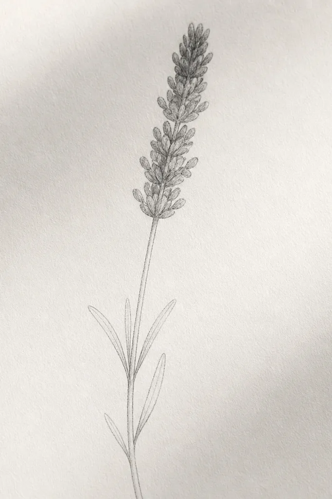
Pencil-only lavender looks calm and pretty, and it’s the easiest way to practice shape without worrying about color. The head looks lavender when you shade in short strokes that follow the direction of the spikes. I use a 2B pencil for the first layer and a 4B for the darkest top area. Leaves stay light so they don’t compete with the head. This works for anyone who wants a “quick sketch” style or wants to save time on coloring.
Lightly sketch the stem curve and two leaf commas. Draw a head oval guide and fill it with short pencil marks that taper slightly upward. Shade the bottom half with a 2B using light pressure, then add a second layer in the middle with slightly heavier pressure. Use a 4B only at the top edge of the head to create a shadow band. Blend gently with your fingertip or a tissue only where you see harsh lines.
Use a kneaded eraser to lift tiny highlights inside the head for extra dimension.
Don’t press hard from the start — heavy graphite ruins the soft lavender look.
19. Lavender Head With Hanging Side Stems
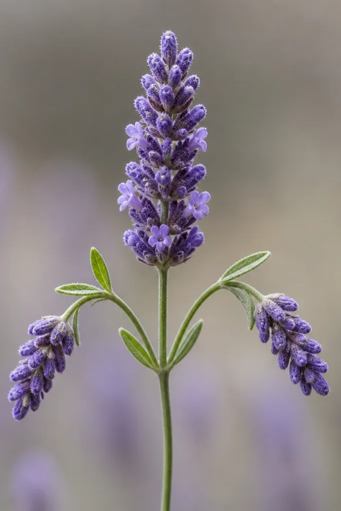
This composition looks more like a real herb bundle because lavender is often tied with side bunches. The main head is the anchor, and the smaller hanging stems create movement. I recommend making the side heads smaller and slightly lower, so the drawing still reads clearly even if the spikes aren’t perfect. Color the main head slightly darker than the side heads for depth. This is a good choice for older kids and teens who like a slightly more complex layout.
Good to knowTie line first, then trim your stems to meet it so everything looks gathered.
Draw a main stem that rises to a central head, then add two smaller stems that branch off near the middle and hang down. Add leaf commas on the main stem and one pair on each side stem. Sketch three head ovals and fill each with short upward spike marks — keep the side heads tighter and smaller. Color the main head with light purple base and dark violet top tips, then color side heads with slightly lighter purple and less dark shading. Finish by drawing a simple tie line around where the stems meet near the middle.
Common mistakeDon’t make side heads the same size as the main head — the “main” flower stops being main.
20. Lavender Flower Head in Pencil-to-Ink Outline
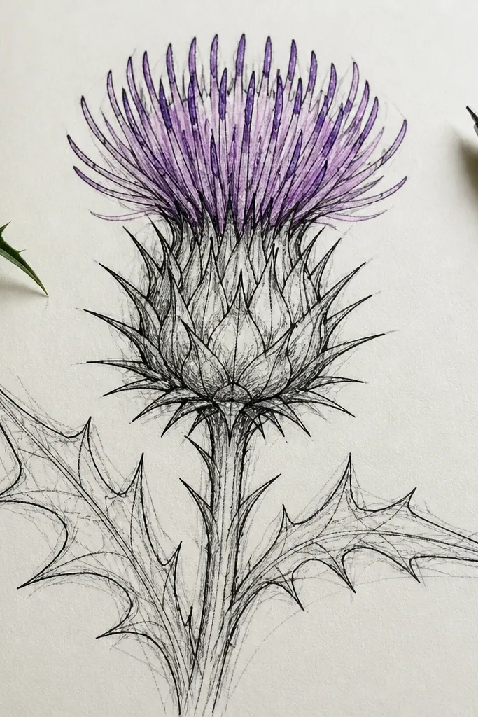
This is the best method when your lines keep wobbling. Pencil gives you a construction map, and ink locks it in once you like the proportions. The lavender head looks more believable when the spikes are planned first, then inked afterward. I use this for cards where you want clean outlines but still need the freedom to adjust the head shape. Coloring is easy afterward: light purple base, medium purple in the center, and dark violet at the top tips.
Start with pencil: draw the stem curve, two leaf commas, and a head oval guide. Fill the pencil oval with light spike marks so you can see spacing. Once you’re happy, use fine liner to ink over the stem, leaves, and the outer edge of the head, then ink only the top parts of the spike marks. Erase pencil lines after the ink dries. Color the head: light purple all over, medium purple in the center, and dark violet on the top tips, keeping the bottom lighter to suggest light.
Ink only the spikes you need for texture — you don’t have to ink every single one to get the lavender look.
Don’t erase pencil lines before the ink dries or you’ll smear graphite into the ink.