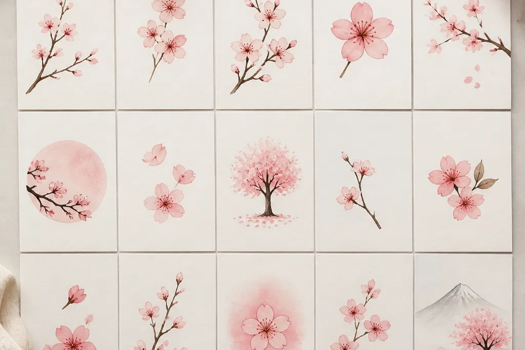
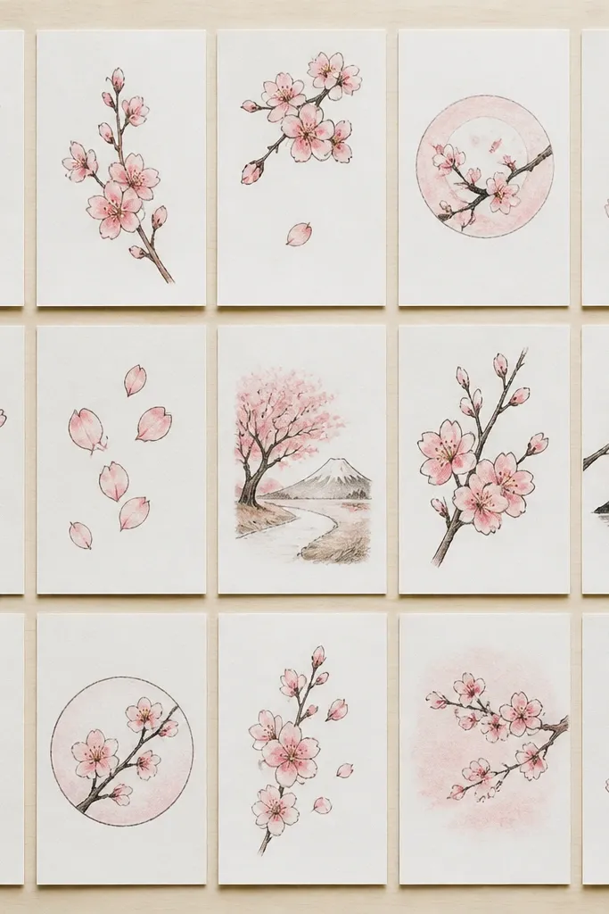
1. Single Branch with 5 Blossom Clusters
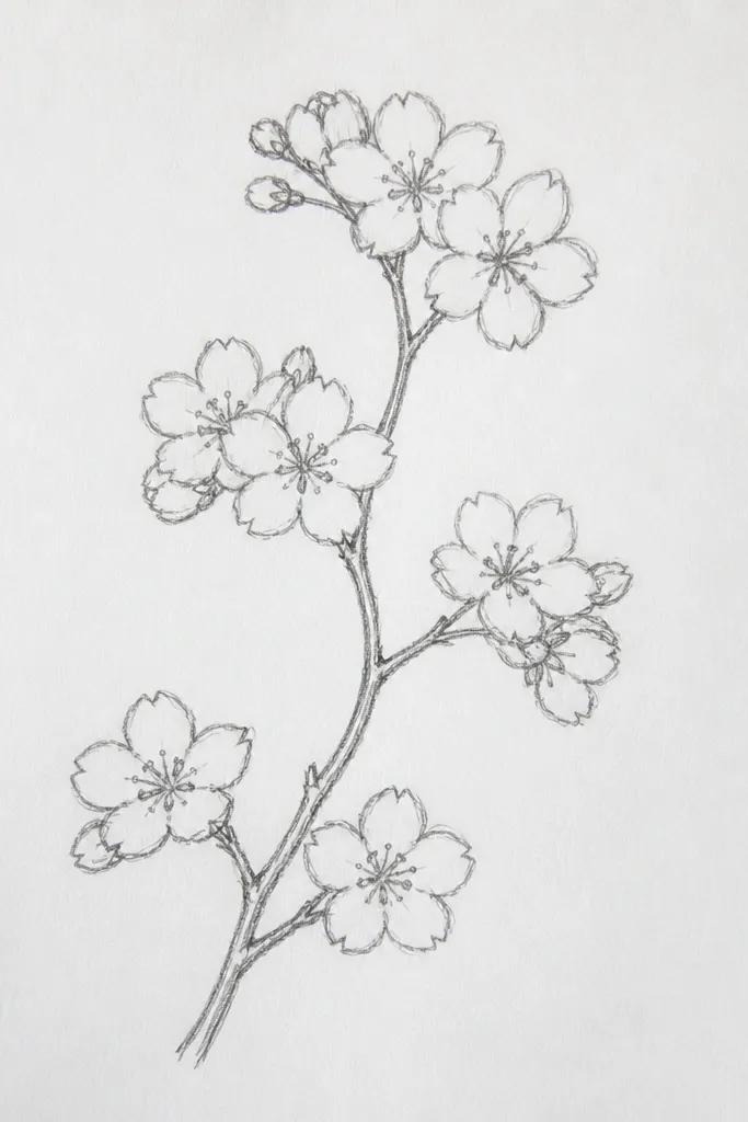
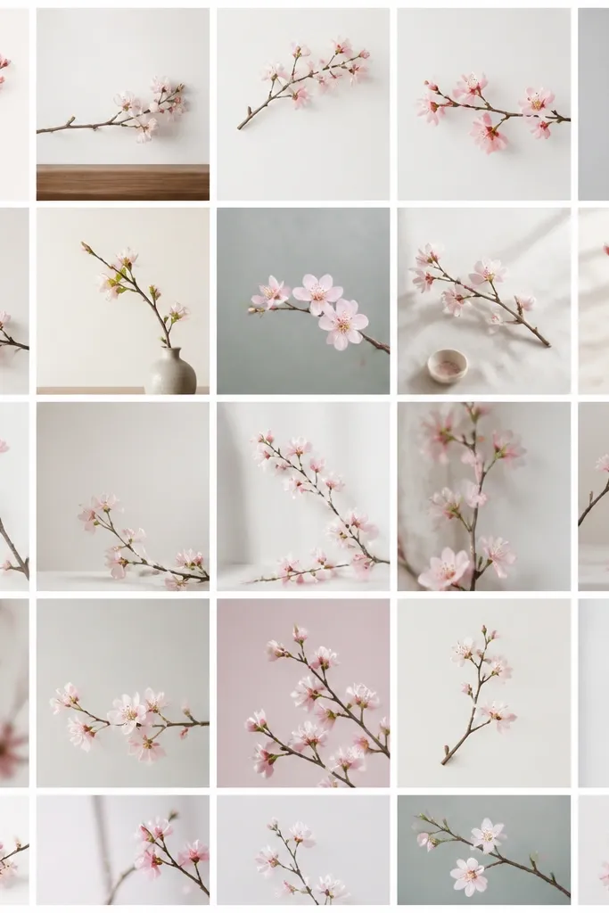
This one is my go-to when I want a neat drawing that still feels delicate. The branch is a single line that curves like a question mark, and each blossom cluster hangs off it. I usually draw the branch with a 0.5 pencil so it looks confident, then add petals with a lighter touch. The blossoms look best in soft pink and warm off-white — think watercolor wash or a light colored pencil tint. It flatters a “small corner of a page” layout because you can leave lots of white space around the branch for that airy spring look.
Start by drawing a branch line that enters from the lower left and exits toward the upper right. Place a cluster at five spots along the branch, spacing them about 1 to 2 finger widths apart on a standard notebook page. For each cluster, draw a tiny center dot, then add 4 to 6 short curved petals around it, like parentheses facing different directions. Shade under two or three petals per cluster using a 2B pencil or light pink colored pencil. Finish by adding a few short twig lines branching off the main branch, keeping them thin so they don’t steal attention.
Good to knowLeave the background completely empty — the white space is what makes it look airy instead of busy.
Common mistakeDon’t draw every petal the same size; that’s what turns blossoms into a repetitive sticker look.
2. Cherry Blossom Frame Border for a Kids' Card
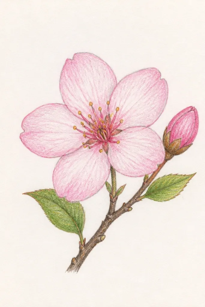
This layout makes a simple card look finished even if the inside message is messy. I’ve used it with kids because the border gives a clear job: draw flowers along the edges, not the whole page. The trick is to keep the blossoms small and consistent, with fewer petals per flower so the border doesn’t get heavy. I like using light pink for the petals and a muted brown for the branch stems so the border looks soft, not loud. The border also flatters anyone who likes neat crafts because it hides uneven handwriting space by keeping the attention on the frame.
Start by lightly sketching a rectangle inside your card, leaving about 1 cm margin on all sides. Draw a thin branch line along the top and bottom edges, then a second line along the left and right edges so it feels like one continuous vine. Add blossom clusters at the corners first, then place smaller clusters between them at regular intervals. Keep each blossom to 4 petals minimum, with one petal overlapping the branch line. Color the petals with light pink, and leave the centers white or lightly shaded.
Good to knowUse a ruler for the inner rectangle, but freehand the branches so they look natural.
Common mistakeDon’t fill the entire border with full, dark petals — heavy flowers will crowd the card and look cheap.
3. Falling Blossoms with One Main Branch
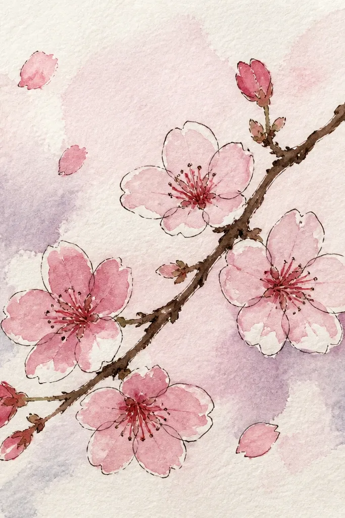
This drawing gives you movement without needing fancy shading. The main branch anchors the scene, and the falling blossoms create that spring “drift” feeling. I like making the falling flowers smaller as they move down — it instantly looks like depth. Use a darker pink for the blossoms closest to the branch and a lighter pink for those farther away. It works well for kids because you can treat each falling blossom as a simplified cluster: fewer petals, less detail, still recognizable.
Start with a curved branch that grows from the lower left toward the upper right, then add 4 to 6 blossom clusters along the top portion. For the falling blossoms, draw 6 to 10 small clusters at different heights across the page, spacing them so they don’t overlap too much. Make the top clusters fuller (5 to 7 petals) and the lower ones simpler (3 to 5 petals). Add motion by drawing a couple of single petal strokes drifting away from a cluster. Lightly shade the underside of each blossom with a soft pink pencil so they look like they’re catching light.
Good to knowPick one direction for the “fall” and keep all blossom centers angled slightly that way for clean motion.
Common mistakeDon’t place every falling blossom at the same size and spacing — that flattens the scene.
4. Cherry Blossoms in a Simple Vase
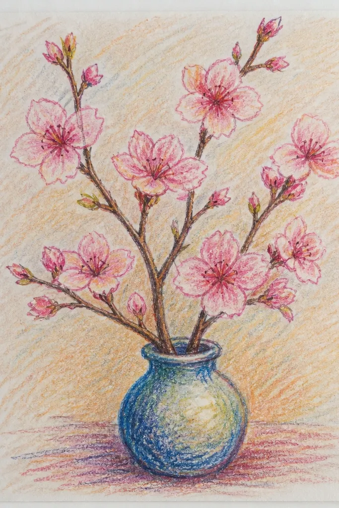
Vases make blossoms feel like a real arrangement, even when the drawing is quick. I like this idea for budget paper because you can keep the vase lines clean and use the blossoms for the detail. The vase looks better in one muted color (soft gray or warm brown) so the pink stays the star. If you’re drawing for someone’s room decor, this also pairs well with a tiny label or date in the blank space around the vase. It flatters a “center composition” style — everything points upward from the vase.
Start by drawing a vase outline: a slightly wider base, straight-ish sides, and a narrow opening. Add two or three branches that spring upward from the vase, each branch curving differently so it looks natural. Place blossom clusters along the branches, with the biggest clusters near the top curve and smaller ones nearer the vase opening. Color petals light pink, then add a tiny darker pink at the petal bases for depth. Shade the vase with a light gray pencil, keeping the darkest part under the rim and along one side.
Good to knowIf petals look messy, draw the outline of each blossom cluster first, then fill in the petal strokes inside it.
Common mistakeDon’t make the vase too dark; heavy vase shading pulls attention away from the blossoms.
5. Branch Across the Page with 3 Big Blossoms
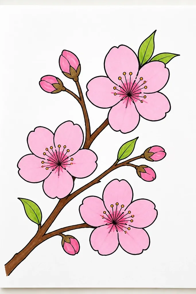
This is the “poster” version — bold enough for a kid’s art wall and clean enough for a grown-up sketchbook. You draw one sweeping branch and then concentrate the detail into three big blossom moments. The big blossoms should have more petals and slightly darker shading so they feel like focal points. I like using pale pink plus a touch of warm red for the darkest petal edges, just a hint. This flatters people who struggle with symmetry because you can place the blossoms at uneven intervals and still make it look balanced.
Draw a diagonal branch that crosses the page from lower left to upper right, keeping the line thicker at the middle and thinner at the ends. Place three large blossoms on the diagonal line, spacing them so there’s a visible gap between each. For each big blossom, draw a center dot, then add 8 to 12 short curved petals around it, with a few petals overlapping the branch. Add tiny twig lines near the big blossoms so the scene feels connected. Leave the rest of the page blank, then color only the blossoms — not the background.
Good to knowUse a darker pencil for the branch only at the thickest section, so the diagonal feels intentional.
Common mistakeDon’t add lots of tiny flowers everywhere; that turns the piece into clutter.
6. Chibi Cherry Blossoms on a Sticky Note
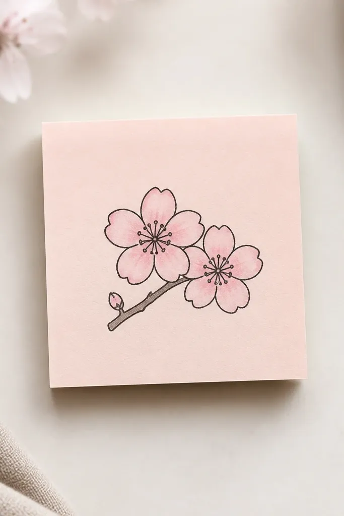
This is for when you want something cute fast, like decorating a homework folder. I call it chibi because the blossoms have fewer petals and rounder shapes, so they’re easier to draw with small hands. The look works because the centers are clear and the petals are simplified into short strokes. Use bright but light pink for the petals and a warm beige for the centers so it stays cheerful. It flatters kids and beginners because the “rules” are short: draw two centers, add petals around them, and stop.
Start with a small curved branch line, about 3 to 4 cm long, leaving one end thicker. Draw two large centers (tiny circles or dots) at each end of the branch curve. Add 5 to 7 petals around each center with short curved lines, keeping them close together so the blossom looks round. Color the petals with light pink, leaving tiny gaps for white highlights. If you want extra charm, add one tiny falling petal near the edge.
Good to knowKeep petals short and stop after you hit 7 per blossom; more petals makes it harder, not prettier.
Common mistakeDon’t over-shade the centers; dark centers can make the cute style look like a bruise.
7. Cherry Blossoms with Dots-Only Background
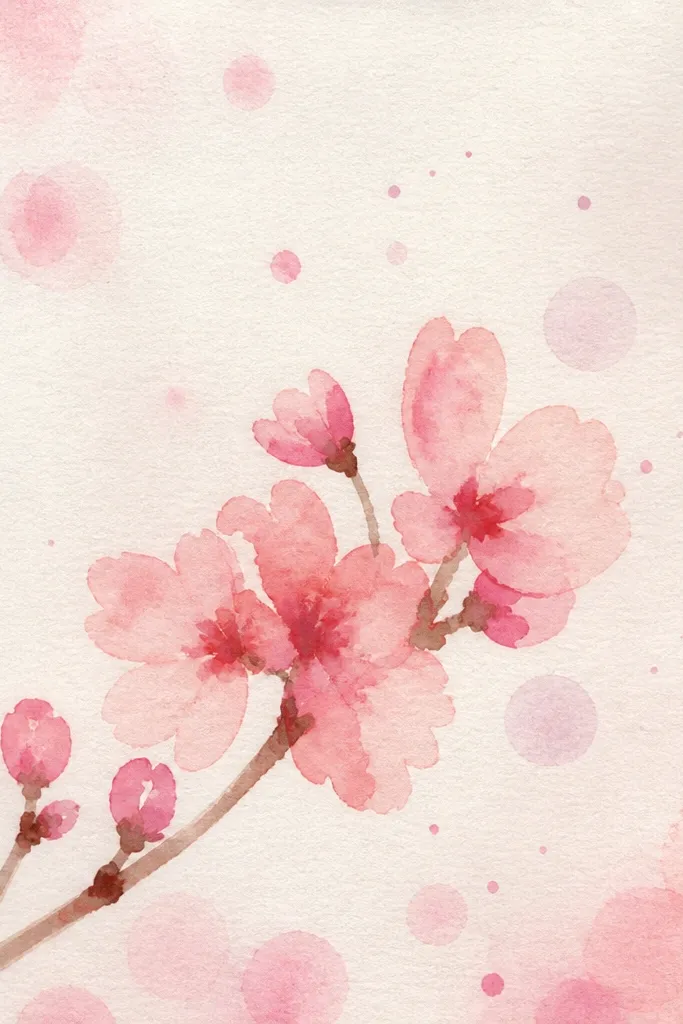
This style makes your blossoms feel like they’re floating without needing watercolor washes. The dot background gives a gentle texture that kids can draw without smudging, and it frames the flowers. I’ve used it on cheap paper where watercolor usually bleeds — pencil dots stay put. Keep the dot color super light (HB pencil) so the petals stay readable. This flatters anyone who wants a “clean but not blank” page, especially for sketchbook aesthetics.
Draw a simple branch across the top half of the page, then add 6 to 8 blossom clusters along it. Color petals lightly pink and leave the centers mostly white. Take an HB pencil and add tiny dots across the background, starting farther away from the blossoms and working outward. If the dots start to look too dark, lighten your pressure and stop before the dots fill the whole page evenly. Finish by adding a few dots in the same direction as the branch curve to guide the eye.
Good to knowUse a dot pattern that’s slightly larger on one side — it gives the illusion of depth.
Common mistakeDon’t press hard on the dots; dark dot fields make everything look dirty.
8. Cherry Blossom Branch in a Window Frame
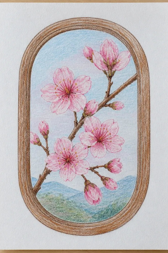
I like this idea because it adds structure and makes the blossoms look like they’re seen through glass. It also helps beginners because the window frame tells you exactly where to place everything. Use a clean pencil outline for the frame, then keep the branch inside lighter and looser. The glass feel comes from leaving the area around blossoms mostly white with only a few faint shading lines. It flatters kids because they can focus on one scene, not a whole background landscape.
Start by drawing a window rectangle with a thin border and a small vertical divider line in the middle if you want it to look like a real window. Sketch one branch inside, angling it upward and slightly to the right or left. Add blossom clusters along the branch, with the densest area near the top. Shade the petals with light pink and add a tiny warm-gray shadow under a few blossoms to suggest they’re behind the “glass.” Keep the outer frame area blank so the scene pops.
Good to knowDraw a single thin shadow line along the bottom edge of the window frame; it makes the frame look 3D.
Common mistakeDon’t add extra background objects like birds or houses; they distract from the blossoms.
9. Cherry Blossoms on Pattern Paper-Style Stripes
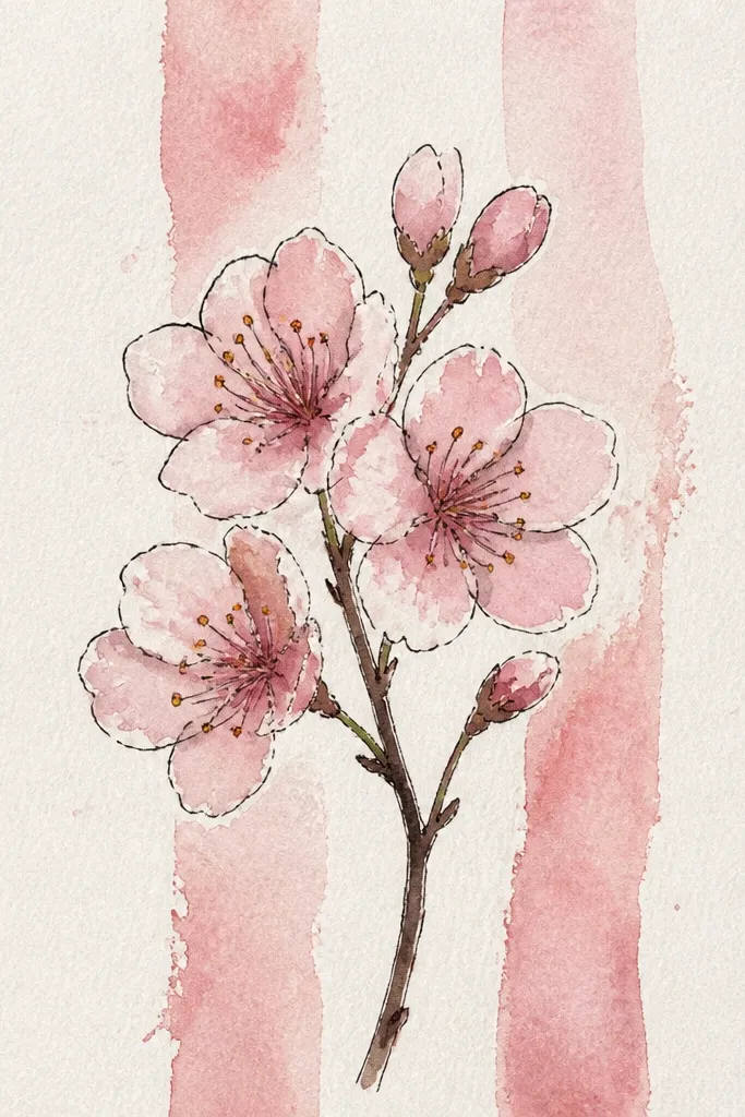
Stripes turn a simple blossom sketch into something that looks like patterned stationery. The stripe pattern gives you contrast, so you don’t need heavy coloring. I like making the stripes very light so the pink still feels delicate rather than loud. This works great for kids because you can draw the stripes quickly with a ruler, then add blossoms on top. It flatters people who like graphic design looks without complicated skills.
Use a ruler to draw 6 to 10 horizontal stripes across your page, spacing them about 1 cm apart, using very light pencil. Draw one branch line that snakes across the stripes, then add blossom clusters at 4 to 6 points. Color petals with light pink, and keep the branch line slightly darker than the dots or stripes. Add 1 to 2 darker pink accents on each blossom so it doesn’t look flat against the stripe background. Finally, erase any thick stripe lines so the stripes stay subtle.
Keep your stripe spacing consistent; uneven stripes make the flowers look less crisp.
Don’t color the stripes in pink too; that makes the whole page look like one big wash.
10. Cherry Blossom Silhouette with One Pink Wash
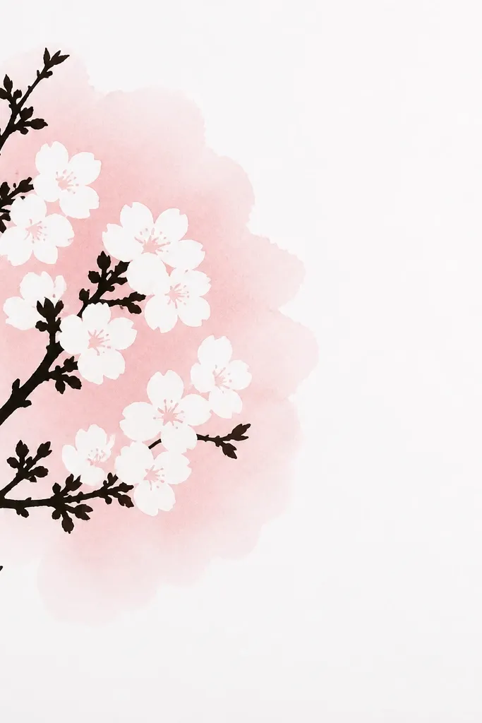
This is the cleanest way to get a “designed” look without drawing every tiny petal. You draw the blossom shapes as a silhouette, then paint one soft pink wash behind them. I do this with a light watercolor pan or a diluted colored pencil blend, but even a watered-down marker works if you’re careful. The blossom shapes stay readable because the silhouette edges are crisp. It flatters older kids and adults who like graphic shapes and want a finished print look.
Start by sketching the branch and blossom clusters in pencil, then darken the branch and blossom outlines with a fine marker or a 2B pencil. Instead of drawing individual petals, draw each blossom cluster as a rounded cloud shape around where petals would be. Add a light pink wash behind the blossoms — keep it behind the cluster area, not over the white highlights. Let it dry, then add a tiny darker pink ring at the base of each cluster if you want more depth. Keep the rest of the page blank so the silhouette stays sharp.
Good to knowIf your wash bleeds, use less water and paint in one direction only.
Common mistakeDon’t overpaint the outline; thick marker blobs ruin the crisp silhouette look.
11. Cherry Blossom Umbrella Top View
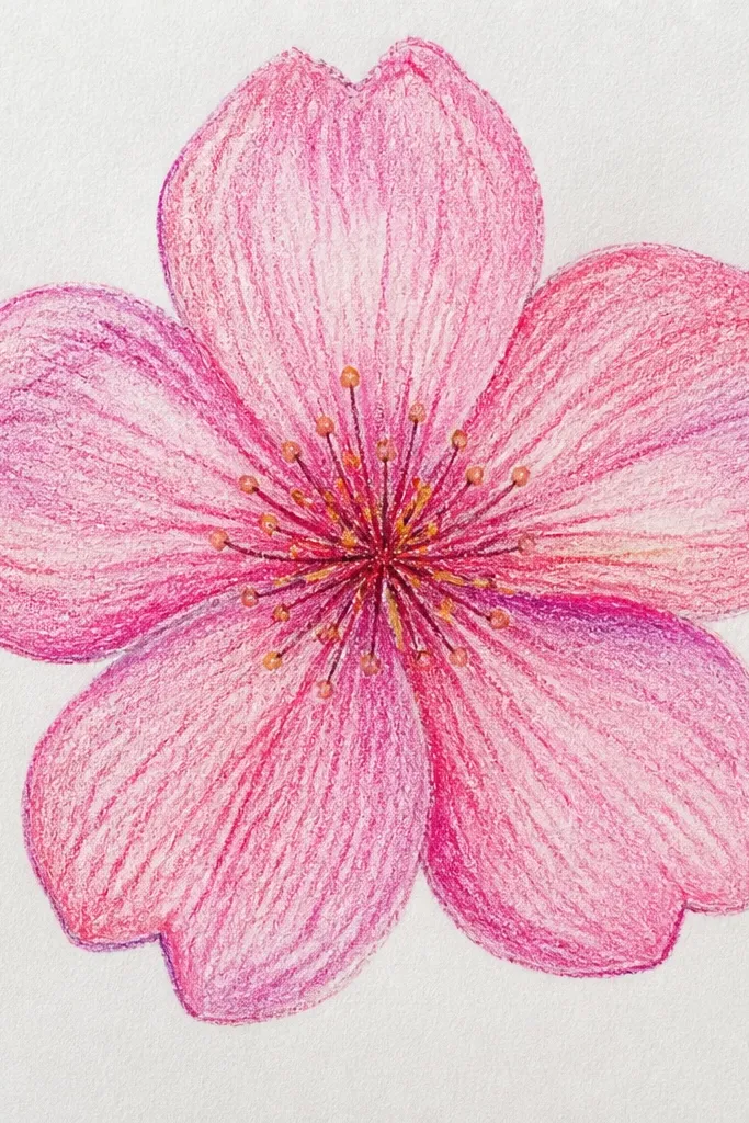
This one turns blossoms into a fun object drawing, and the circle shape makes placement easier. You’re not guessing where to put flowers — you place them along the umbrella rim and between spokes. I like it for kids because it teaches simple geometry: a circle, a center point, and straight lines. Keep the umbrella shading minimal so the blossom color stays the focus. It flatters people who prefer drawing objects over pure nature scenes.
Draw a large circle for the umbrella top, then mark the center point. Draw 8 to 10 spokes from the center to the rim, keeping them evenly spaced. Add blossom clusters along the rim at 6 to 8 spots, using 4 to 6 petals per blossom so the rim doesn’t get too busy. Color petals light pink and shade one side of each petal with a slightly darker pink pencil. Add a few tiny highlights by leaving small white gaps between petal strokes.
Good to knowMake the blossoms smaller near the center so the rim flowers look like they’re wrapping the edge.
Common mistakeDon’t draw all spokes too thick; thick spokes make the umbrella look like a wheel diagram.
12. Cherry Blossoms with Simple Leaf Veins
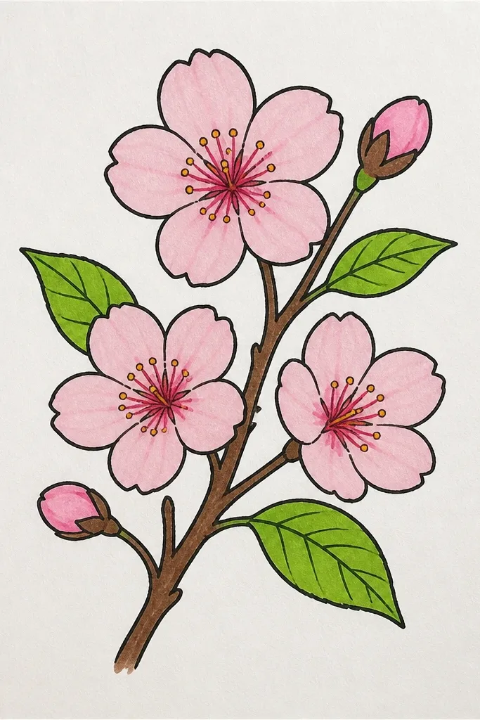
Adding a few leaves makes the branch look more real without turning the drawing into a full botanical study. I keep it simple: almond leaf shapes with one center vein, and just a couple of leaves per branch. The leaves also help if your blossoms feel too floaty — the branch looks grounded. Use muted green or gray-green for leaves, and keep the blossoms light pink. This flatters anyone who likes a balanced composition with both spring flowers and greenery.
Start by drawing the branch curve, then place 3 blossom clusters along it. Add 2 to 4 leaves spaced between clusters, about the same size as the blossoms or slightly smaller. For each leaf, draw an almond shape and add one center vein line with two short vein lines on either side. Color leaves with light gray-green, keeping the edges slightly darker than the center. Finish by adding 4 to 6 petals per blossom and shading the underside of two petals to give depth.
Good to knowUse fewer leaves than you think — two or three extra leaves can make it look like a plant study, not a blossom sketch.
Common mistakeDon’t add lots of leaf veins; too many lines makes it look like a coloring book page.
13. Cherry Blossom Garland Across a Chalkboard Style Background
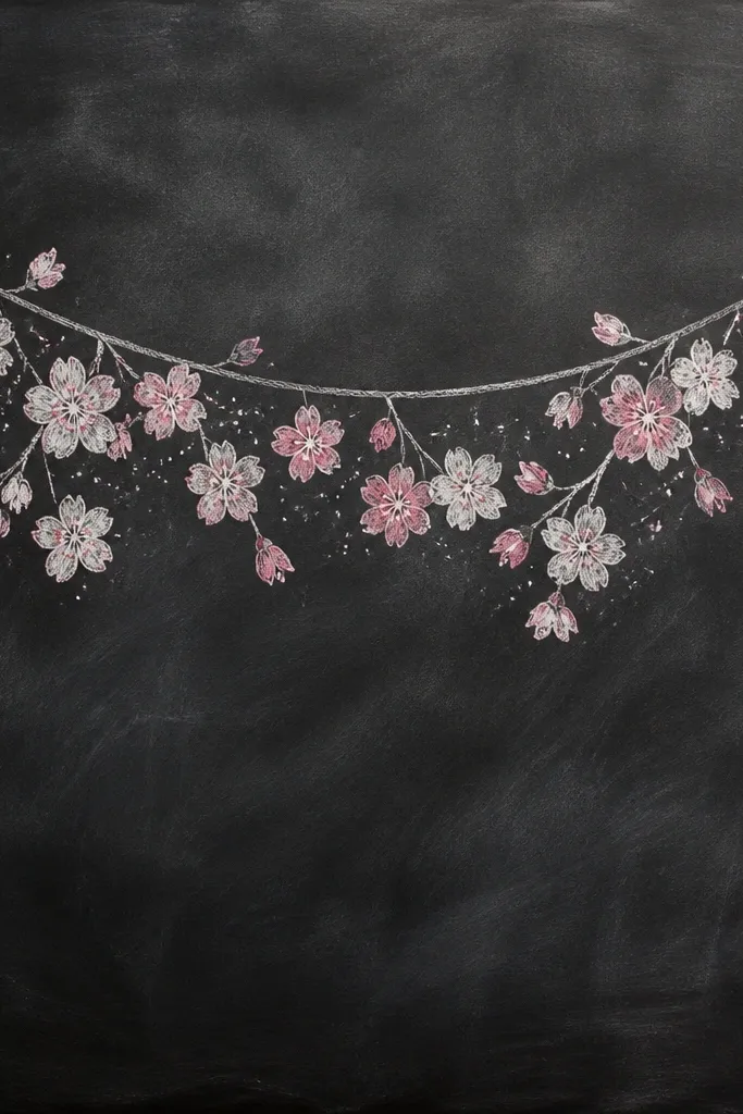
Dark background drawings feel dramatic and kids love them because the flowers pop instantly. I’ve done this with chalk pastels and with a white gel pen over dark paper. The key is keeping the branch line a lighter gray or white so it reads clearly against the board. Blossom petals look best when you draw them with short strokes and leave tiny gaps for chalk texture. This flatters anyone who wants their drawing to look “finished” even without heavy coloring.
Use dark gray paper or color the page with a light layer of charcoal pencil. Sketch the garland curve with a soft white pencil first, then go over with a white gel pen or white colored pencil. Add blossom clusters hanging along the garland at 6 to 9 spots, each blossom made of 4 to 7 petal strokes around a small center. Add pale pink on top of some petals only, leaving others white for contrast. Finish by adding a few speckle dots around clusters to mimic chalk dust — keep them sparse.
Good to knowIf your white gel pen skips, warm it by scribbling on scrap paper for 10 seconds.
Common mistakeDon’t outline every petal with thick white; thin petal strokes look more like chalk.
14. Cherry Blossom Branch with One Ribbon Bow
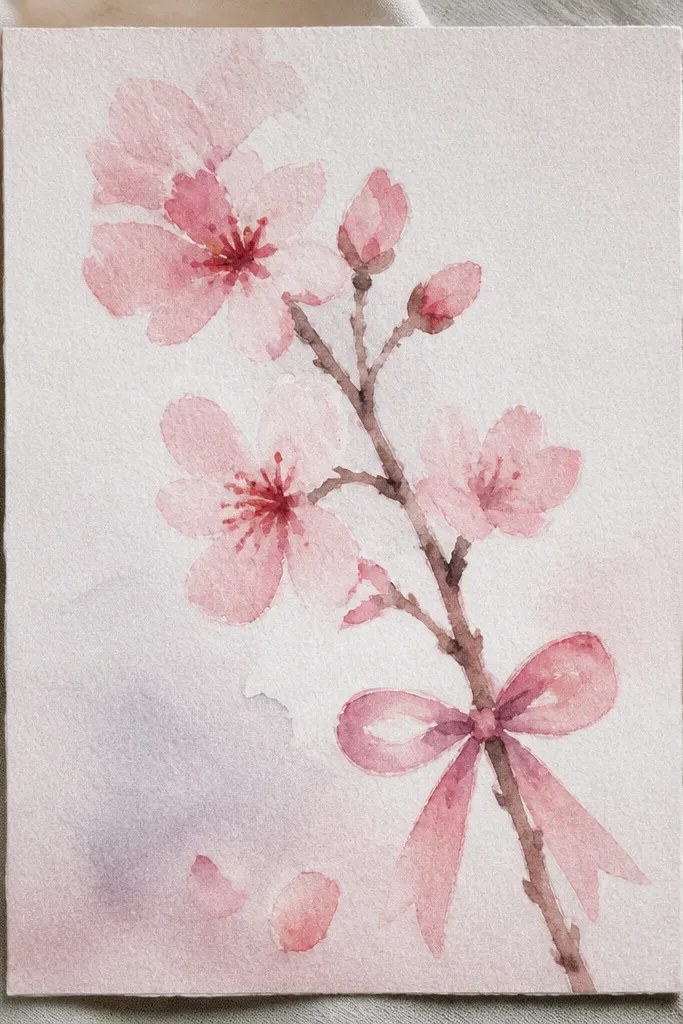
This is the “gift tag” drawing that looks sweet without extra clutter. The ribbon bow gives you a focal point, so the blossoms only need to be good enough to frame it. I like using one ribbon color and one blossom color — too many colors makes it look like a craft store sticker. The bow also flatters shorter attention spans because the viewer’s eye lands on the center first, then travels to the blossoms. It works for kids because the bow is a simple shape: two loops and a knot.
Draw a curving branch line that arcs upward, then add 3 blossom clusters near the top and 2 clusters near the sides of where the bow will sit. Sketch the ribbon bow with two loops, each about half the height of a blossom cluster, and a small knot in the center. Color the ribbon with muted rose pencil or light gray if you want it to look more wintery. Color petals light pink and add a darker pink at the base of each blossom petal group. Shade the branch lightly so the bow stays crisp against the petals.
Good to knowKeep the ribbon edges clean and smooth; messy ribbon lines make the whole piece look rushed.
Common mistakeDon’t color the ribbon the same shade as the blossoms; the bow needs to stand out.
15. Cherry Blossoms in a Circle Medallion
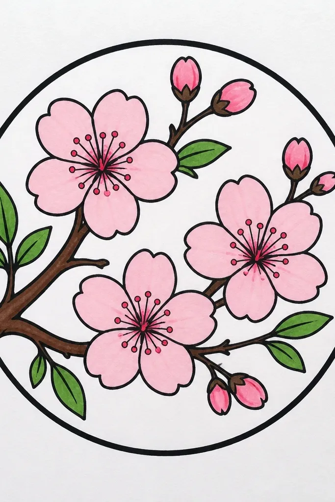
A circle medallion makes your blossoms look like a stamp or decorative seal. It’s also forgiving — even if your flowers aren’t identical, the circle boundary keeps everything feeling organized. I do this when I want something that looks cute on stickers, bookmarks, or a kids' art sheet. Use a thicker outline for the circle border so it frames the petals. This flatters people who like clean shapes and want a drawing that reads well from far away.
Draw a big circle in the middle of the page using a cup or a compass. Make the circle border thicker with a 2B pencil or fine marker. Add blossom clusters along the inner edge of the circle at 8 to 12 points, using 4 to 6 petals per blossom. Place 3 smaller blossoms slightly inside the wreath so it doesn’t look like a flat ring. Color petals light pink, then add one darker pink accent to each blossom cluster on the side facing the border. Keep the center area mostly white for breathing room.
If you’re using marker, wait for it to dry before coloring petals so you don’t smear the border.
Don’t fill the entire circle with dense petals; leave white space inside so the medallion looks crisp.