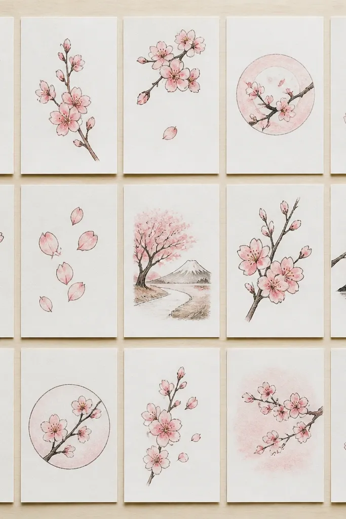
1. Single Branch Sweep with 7 Petals
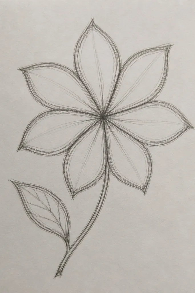
This one works because it’s controlled. You get a clear direction from the branch curve, and each blossom cluster has enough space to stay crisp. I draw the branch with a 0.8 fineliner so it looks like bark, then I switch to 0.3 for the petals. The petals are small and narrow, so the design looks airy on kids' wrists, sleeves, or notebook covers. It flatters slim compositions because it doesn’t crowd the page — it guides the eye upward like a gentle bow.
Step 1: Draw the branch as one continuous curve, starting thicker at the base and easing to a thinner tip. Step 2: Place seven blossoms along the curve, spacing them about 1.5-2 cm apart on letter-size paper. Step 3: For each blossom, draw five narrow teardrop petals pointing outward, then add a tiny center dot. Step 4: Outline over only the branch line with a thicker pen if you want it to pop, and leave the petals lighter.
Good to knowIf your lines wobble, trace the branch again with your thicker pen after the pencil sketch — it fixes the “cheap” look fast.
Common mistakeDon’t fill the gaps with extra petals — letting the empty space breathe keeps it stylish.
2. Corner Frame Blossoms on a Square Tote
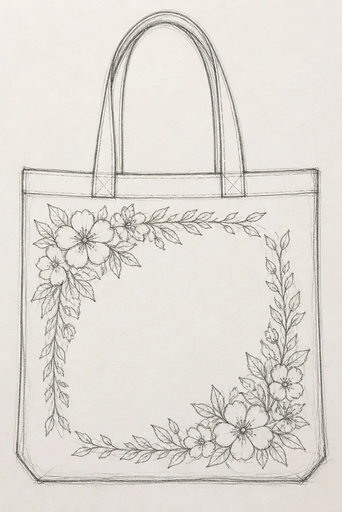
Corner frames look great on tote bags and kids' lunch carriers because they don’t require you to draw a whole scene. I use short branch strokes that hug the corner, then place 3-4 blossoms per corner so it reads as intentional decoration. The petals are drawn with quick, curved strokes so they look lively, not stiff. This style flatters people who want a clean, modern look — it keeps the drawing tight and graphic. It also works well if your fabric is busy, because the lines stay concentrated near the corners where the eye lands.
Step 1: Sketch a light square guideline near the corners (leave 2-3 cm of blank space from the edge). Step 2: Draw branch lines that follow the square guideline like a broken frame, thicker on the outer edges. Step 3: Add 3 blossoms in the top left cluster and 3 in the bottom right, using 5 petals each, with the petals slightly shorter at the outer edge. Step 4: Go over the frame with a 0.8 pen, then add the petals with a 0.4 pen.
Good to knowIf you’re painting on fabric, use fabric markers and let the ink dry fully before adding any extra outlines.
Common mistakeAvoid drawing blossoms in the exact center of the tote — it can look like a sticker instead of a design.
3. Cherry Blossom Branch as a Border Strip
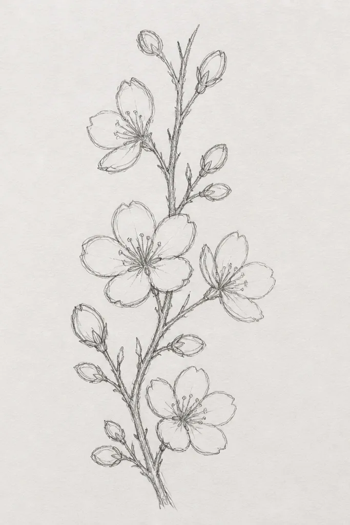
Borders are my go-to for kids because they’re repeatable and forgiving. You don’t need perfect proportions across the whole page; you just need a rhythm. I draw the border as one long branch line with blossoms popping off at intervals, alternating sides to keep it moving. The small scale makes it work on bookmarks, sticker sheets, and even the bottom edge of a worksheet. It flatters bright kids' gear because it adds spring energy without taking over the entire design.
Step 1: Draw a straight guideline where the border strip sits, then lightly mark blossom positions every 2 cm. Step 2: For each position, draw the blossom as five short curved petals around a dot center. Step 3: Add a tiny leaf line (a short oval with a center vein) between every other blossom. Step 4: Keep all petals around the same size so the border looks like one planned pattern.
Make one “perfect” blossom first, then trace it onto the next four spots as a reference.
Don’t change blossom size every time — that’s how borders start looking messy.
4. Two-Layer Blossoms with Tiny Overlap
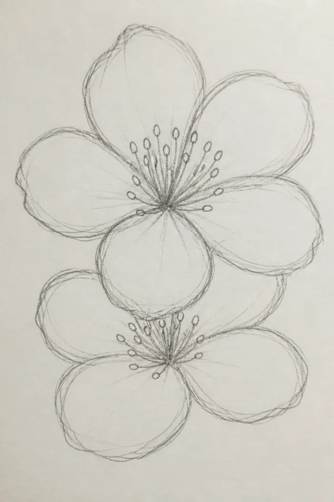
This style looks more expensive because overlap creates depth without shading. I draw one set of blossoms first, then add a second set that sits slightly in front, so you can see which petals are closer. Use thin lines for the hidden/back petals and slightly thicker lines for the front petals. It flatters bigger compositions like a wall print or a large sketchbook page because it fills space in a controlled way. Kids also like it because the flowers look like they’re “touching,” not floating.
Step 1: Sketch 5-7 blossoms as a cluster, spacing them so petals nearly touch but don’t merge. Step 2: Pick two blossoms to be “front” and redraw only their outer petals with a thicker pen (0.6-0.8). Step 3: For the back blossoms, draw petals with a lighter line weight (0.3-0.4) and stop the lines where they’re covered by the front petals. Step 4: Add a tiny center dot for each blossom so they still read clearly even when overlapped.
If you blur with a marker, outline only the front petals and leave back petals as pencil until the end.
Don’t shade in gray or cross-hatch — it ruins the crisp line-art look.
5. Wind-Blown Blossoms with Curved Petal Trails
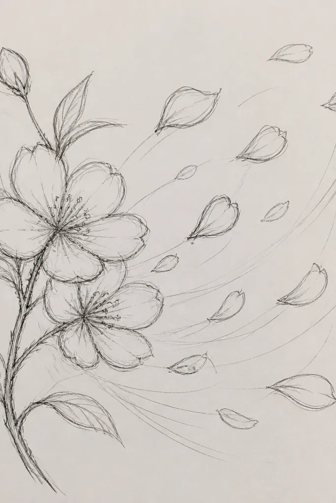
Motion drawings make cherry blossoms feel alive. I like this when you’re decorating a paper banner or a kid’s card because the diagonal energy looks playful. The petals are stretched slightly, and the branch is kept minimal so the wind effect does the talking. Use line weight contrast again: anchor strokes thicker, trailing petals thinner. It flatters crowded pages because the motion lines help your eye read the design as one story, not scattered icons.
Step 1: Draw a diagonal backbone line from bottom left to top right, then add a short thicker anchor branch at the start. Step 2: Place 4-6 blossoms along the diagonal, each with five elongated petals that point in the wind direction. Step 3: Add 2-3 curved motion trails per cluster — short lines that follow the petal direction. Step 4: Keep the trails lighter than the petals so they don’t look like extra blossoms.
Practice one petal shape at the size you’ll use, then copy it for all petals so the wind looks consistent.
Avoid drawing motion trails in the same thickness as the petals — it makes it look cluttered.
6. Bold Branch + Micro Blossoms
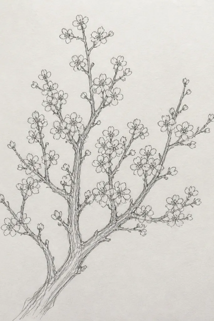
This is the “graphic poster” version. The thick branch gives you structure, and the micro blossoms add texture without needing a lot of detail. I do this with a 0.8 or 1.0 pen for the branch, then a 0.3 for tiny petals, because the scale contrast looks intentional. It flatters kids' drawings too — even if a few micro blossoms are slightly off, the overall silhouette still reads. This also works on bookmarks and phone cases because it stays clean at small sizes.
Step 1: Draw one main branch line with a few side twigs, keeping them bold and dark. Step 2: Add micro blossoms at intervals — aim for about one blossom every 1 cm. Step 3: For each micro blossom, draw five tiny curved petals around a dot center, with petals no taller than 2-3 mm. Step 4: Add a couple of tiny leaf marks (short ovals) to keep the branch from looking empty.
Good to knowIf your pen is too thick for micro petals, switch to a 0.3 fineliner for the blossoms only.
Common mistakeDon’t make the micro blossoms too big — then the contrast disappears.
7. Cherry Blossom Garland Over a Shelf Tag
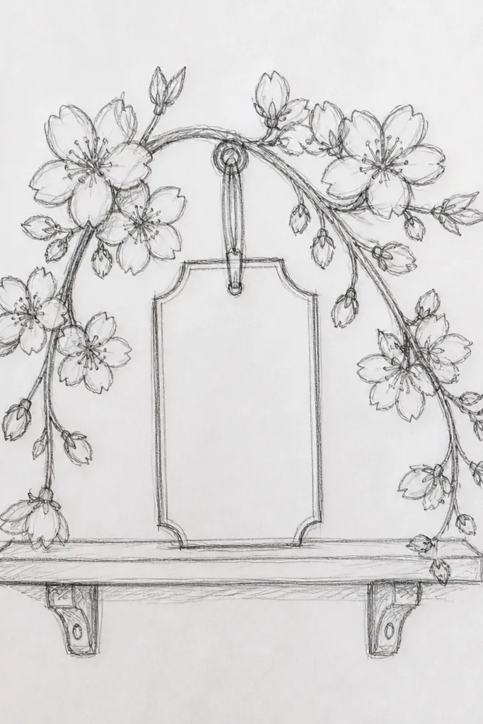
Garlands look great on shelf tags, classroom labels, and even party banners. The key is keeping the shape symmetrical enough that kids can copy it without getting lost. I draw two slightly curved branches that form a gentle V, then attach blossoms along the lower parts. This flatters small spaces because the design fits into a tag outline without overflowing. It also reads as spring because of the mix of open blossoms and buds.
Step 1: Draw a light V shape, then thicken both sides with a 0.8 pen. Step 2: Along the lower half, place 6-8 blossoms, alternating left and right, each with five petals and a dot center. Step 3: Add 2-3 buds using short oval shapes with a small center line. Step 4: Finish with tiny leaf marks between blossoms — keep them simple so the garland stays airy.
Use a ruler for the tag border, then freehand only the garland so the overall piece looks neat.
Avoid putting buds at the same height as blossoms — it flattens the depth.
8. Petal-Only Bloom with No Branch
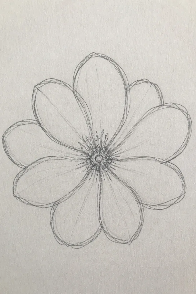
This style is a lifesaver when you don’t want to draw branches on uneven surfaces like cardboard or thick stickers. The eye still reads it as cherry blossoms because the petal shape and center dots do the work. I draw five petals per blossom with thin lines, then overlap them so the cluster looks full. This flatters kids' projects because it’s easier than branches — fewer long lines to mess up. It also works for small logos on pencil cases and water bottle labels.
Step 1: Start by drawing one blossom at the top of your cluster using five teardrop petals and a dot center. Step 2: Add 4-6 more blossoms around it, keeping each blossom about the same size but slightly rotated. Step 3: Overlap petals by stopping some petal lines where they’re covered by another blossom. Step 4: Add 1-2 tiny “half blossoms” at the edges by drawing only three petals to make the cluster feel natural.
Good to knowIf the cluster feels flat, add one blossom with slightly thicker outline to create a clear focal point.
Common mistakeAvoid drawing every petal in exactly the same direction — then it looks like a stamp.
9. Sakura in a Circle Stamp Frame
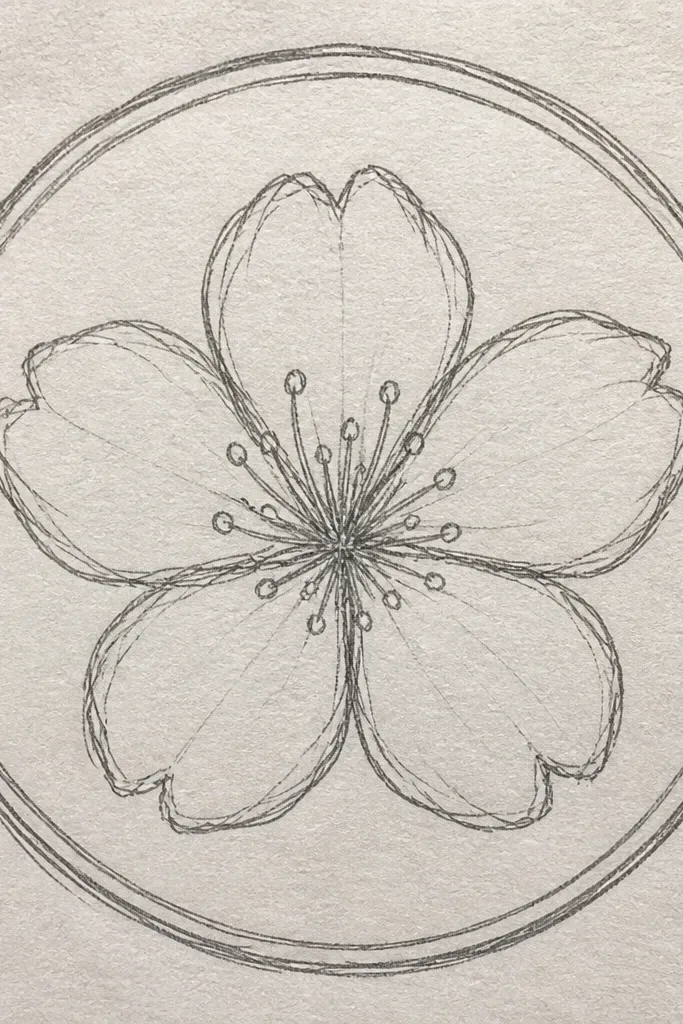
Circle frames make the drawing feel finished, even on a small cutout sticker. The blossoms in a ring look balanced, and the stamp border adds that “printed” look without needing real printing. I use a bold circle outline, then keep the blossom details delicate with thin lines. This flatters labels because it reads clearly at a distance. Kids also like it because it feels like a collectible sticker they can make themselves.
Step 1: Draw a circle about 4-5 cm wide for small labels, or 7-8 cm for larger tags. Step 2: Sketch a faint inner ring guideline, then place 7-10 blossoms along it. Step 3: Connect blossoms with short curved branch arcs instead of long branches — it keeps the frame clean. Step 4: Outline the circle with a 0.8 pen and use a 0.4 pen for petals and centers.
Trace the circle from a cup or tape roll so it looks crisp every time.
Don’t crowd the circle edge — keep at least 5 mm of breathing room.
10. Cherry Blossoms with Buds and Leaves
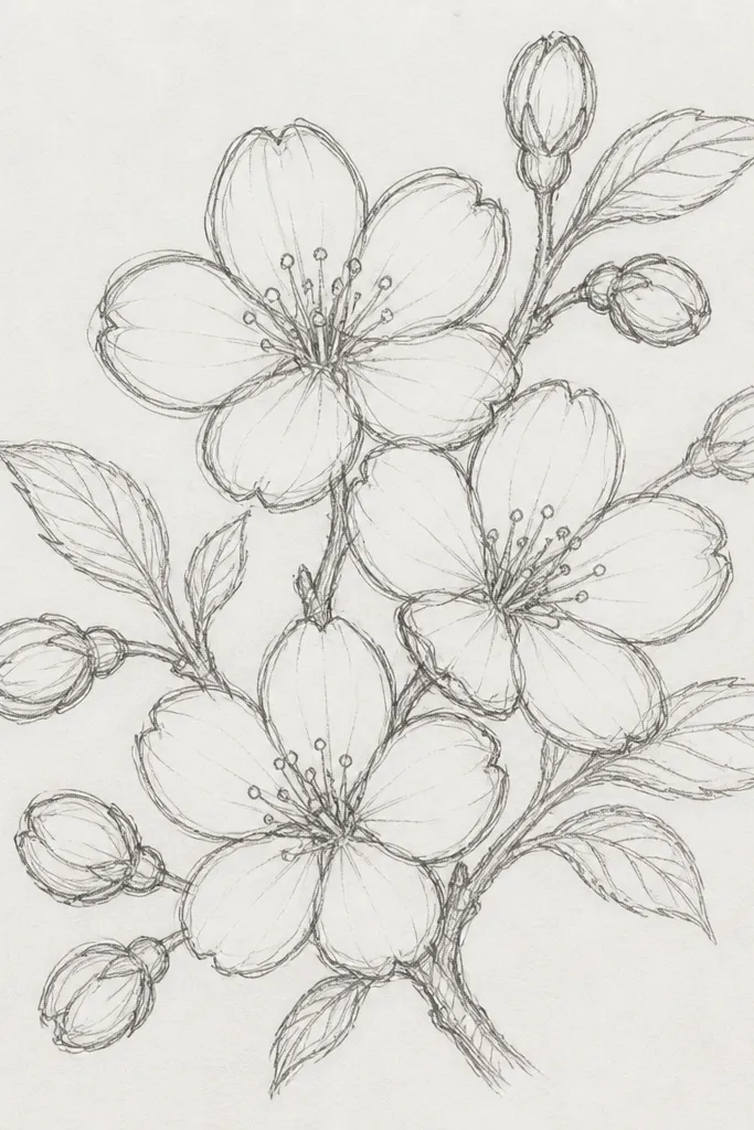
This one looks realistic because it includes the in-between stages. I draw buds as short ovals with a small line inside, then open blossoms as five teardrop petals. Leaves are tiny and sparse so the blossoms stay the star. It flatters kids' art because it gives them multiple shapes to practice without requiring shading. It also works well on sketchbook spines and bookmarks where you want a complete branch story.
Step 1: Draw a branch line with two side twigs, thicker at the base. Step 2: Place 4-6 open blossoms along the branch, then tuck buds between them so they look like they’re about to open. Step 3: Add 3-5 tiny leaves — each leaf is a curved oval with a single center vein line. Step 4: Outline blossoms with a 0.4 pen and buds/leaves with a 0.3 pen so everything stays light.
Good to knowIf you want extra “depth,” draw one leaf slightly behind a blossom by stopping the leaf line early.
Common mistakeAvoid drawing too many leaves — it makes the branch look like a generic flower branch.
11. Minimal Branch with Three Big Blossoms
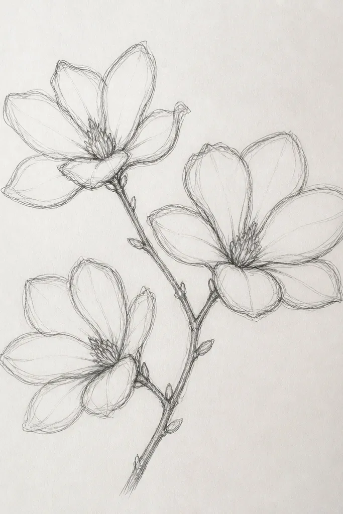
Big blossoms with minimal branches look modern and calm. I use this on kids' wall art and simple notebooks because it doesn’t overwhelm the page. The petals are slightly wider and rounder than the micro styles, which makes them easier for kids to draw. It flatters small print areas because three flowers create a clear focal point. If your kid’s line is shaky, this style hides it better since you’re not trying to draw a ton of tiny details.
Step 1: Draw one branch line that curves gently, then add two small side twigs only if needed. Step 2: Place three blossoms: one near the top, one mid-branch, one near the bottom, leaving about 3-4 cm between them. Step 3: Draw each blossom with five rounded petals (slightly thicker outline than the branch) and a small center circle. Step 4: Leave the background empty on purpose so the design looks clean and stylish.
Use a ruler for the page edge and place blossoms inside a margin — it keeps the design from creeping.
Avoid adding extra flowers “just to fill space” — empty space is part of the look.
12. Petal Scribble Style for Fast Kids
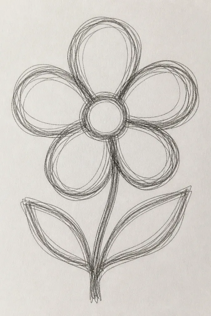
This is the style I use when kids are working with limited patience. It still reads as cherry blossoms because the petal shape is consistent — five “petal strokes” around a dot center. The branch stays simple and smooth, so the scribble petals don’t look chaotic. I’ve seen this work on kindergarten crafts because the strokes are forgiving and the results still look cohesive. It flatters messy handwriting kids too, because the art doesn’t require perfect straight lines.
Step 1: Draw a single branch line with a 0.8 pen or marker — keep it one smooth curve. Step 2: Add blossoms as five curved scribble strokes meeting near the center dot. Step 3: Keep the petals roughly the same size by drawing a light circle guide around each blossom first. Step 4: Add a tiny leaf line once per two blossoms so it feels like a branch, not a sticker.
Have kids practice one blossom on scrap paper, then let them reuse that exact size for the rest.
Don’t scribble the branch too — scribbly branches make it look like random doodles.
13. Cherry Blossom Branch with Dotted Texture
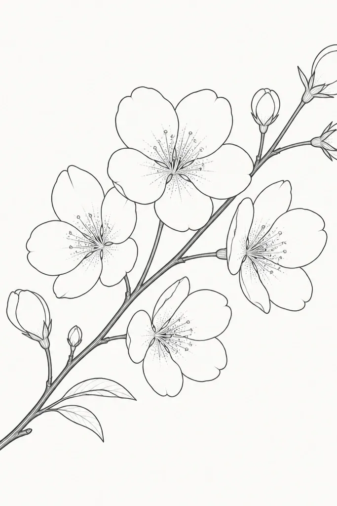
Dotted texture gives the drawing a finished print feel without heavy shading. I add dots only in the petal interior near the center, so the petals still look like line drawings from a distance. The branch remains clean and thick, which keeps it readable. This flatters older kids who want a “detail” step, and it also looks great on greeting cards. Because the dots are small, it holds up on fabric markers and thicker paper.
Step 1: Draw your branch and blossoms with fineliners first, leaving petals as empty outlines. Step 2: For each blossom, add 6-10 tiny dots near the center of the petals, not across the whole petal. Step 3: Use a slightly lighter pen or marker for dots (or press less) so they don’t overpower the outline. Step 4: Keep dot density consistent across blossoms so the cluster looks planned.
Good to knowUse the tip of a mechanical pencil to place dots — it’s easier than trying to dot with a thick marker.
Common mistakeAvoid filling the entire petal with dots — it turns into a fuzzy blob.
14. Sakura Blossoms Falling like Confetti
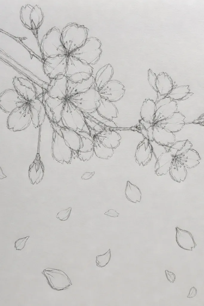
Falling blossoms look great on kids' craft paper, wrapping paper, and the background of a card. You don’t need branches at all — the petal shape does the identity. I draw a mix of full blossoms and partial blossoms so it feels natural, not evenly spaced. This flatters busy layouts because it adds motion behind your main title or message. It also works well if you only have time to draw small icons.
Step 1: Mark a few “anchors” where full blossoms will land (3-5 total). Step 2: Around them, place partial petals — draw only three petals for half blossoms, and single teardrop petals for extra movement. Step 3: Rotate each blossom slightly so they don’t look identical. Step 4: Leave the center area around your main text lighter so the background doesn’t steal attention.
Draw the biggest blossom first, then scale the rest slightly smaller to create a depth cue.
Don’t fill the entire page edge-to-edge — leaving blank space makes it look intentional.
15. Cherry Blossom on a Vertical Bookmark Spine
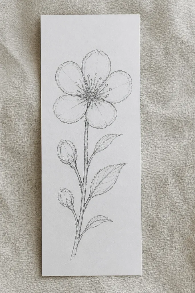
Vertical spines keep line drawings neat because your composition has a direction. I like this for bookmarks, ruler covers, and kids' reading charts. The top blossom is larger so it reads as the start, and the bottom blossoms are smaller to guide the eye downward. It flatters narrow spaces and keeps the drawing crisp even if the marker bleeds slightly. Kids can also color it easily since the layout is simple.
Step 1: Draw a straight vertical guideline in the center of the bookmark (use a ruler). Step 2: From the bottom, draw a branch line that slightly zigzags upward, then add side twigs only near blossoms. Step 3: Place one larger blossom at the top, then two medium blossoms mid, and two small blossoms near the bottom. Step 4: Add tiny leaf lines between blossoms, keeping them short so they don’t dominate.
If markers bleed, outline first with pencil, then trace with pen only after you’re sure of placement.
Avoid placing blossoms too close together — narrow spaces need breathing room.
16. Cherry Blossom Branch with Cross-Hatched Buds
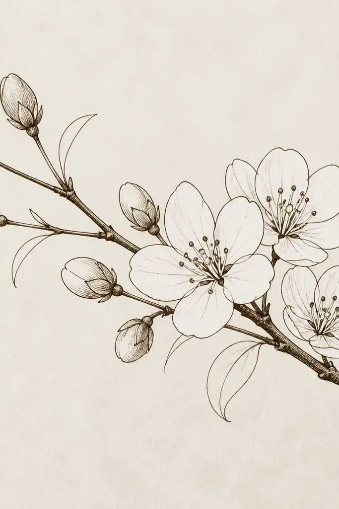
Cross-hatching inside buds adds a hint of volume without turning the whole drawing into a shaded mess. I only hatch the buds so the open blossoms stay crisp and line-art clean. The contrast makes the buds look like they’re deeper on the branch. This style flatters anyone who wants a more “illustration” look for notebooks and covers. It also helps kids because they can focus on hatch marks in small areas instead of shading large petals.
Step 1: Draw a branch and place 4-6 open blossoms along it, each with five petals and a dot center. Step 2: Add 3-4 buds between blossoms as short ovals. Step 3: Hatch only the buds with light cross lines (two directions), keeping the hatch tight so it stays neat. Step 4: Add a few tiny leaves with a single center line and stop — don’t add extra texture elsewhere.
Good to knowUse a lighter touch for hatching so it doesn’t look like a smudge on cheap paper.
Common mistakeDon’t cross-hatch the petals — that’s where it starts looking messy.
17. Cherry Blossom Bouquet Cluster with Uneven Sizes
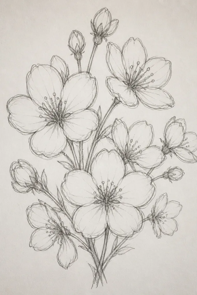
A bouquet cluster looks like you planned a print because the size variation makes it feel natural. I keep the petals consistent in shape, but I change the blossom sizes so it doesn’t look like a pattern. This flatters big blank spaces on craft paper and posters because it fills the area without needing a full background scene. It also looks cute on kids' bedroom wall art when you frame it with a simple border. The main styling principle is controlled chaos — variation within a consistent petal style.
Step 1: Draw a loose circular boundary where the bouquet sits, then sketch 10-14 blossom centers inside it. Step 2: Draw blossoms around each center, varying size by scaling the petal length (for example, small blossoms with 6-7 mm petals, larger with 12-14 mm petals). Step 3: Overlap blossoms so some petals stop early where they’re covered by another bloom. Step 4: Add a few half blossoms at the edge so the cluster looks like it continues beyond the frame.
Good to knowPick one reference size for the smallest blossom, then scale up in 2 steps so sizes look intentional.
Common mistakeAvoid random sizes with no pattern — it can look like you dropped stickers.
18. Cherry Blossom Branch with Bead-Like Centers
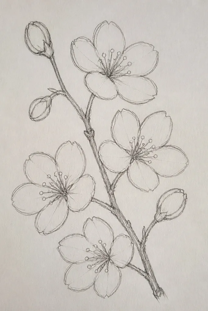
Bead centers make line drawings feel tactile, like tiny pearls. I do this when I want the blossoms to look more “stylish” on stationery and kids' craft labels. The petals stay simple and thin, while the bead centers catch attention. It flatters designs where you want a small focal detail without adding color. Even on busy backgrounds, the bead centers give the flowers a clear identity.
Step 1: Draw your branch with a 0.8 pen and place blossoms along it at 1.5-2 cm intervals. Step 2: For each blossom, draw five teardrop petals with a 0.4 pen and leave the center empty. Step 3: Draw the center as a tiny oval bead with a small highlight line off to one side. Step 4: Keep bead size consistent, and don’t add extra lines around the center so it stays clean.
Use a gel pen for bead highlights if you’re working on smooth paper — it stays crisp.
Avoid making the bead centers too large — then the petals look secondary.
19. Cherry Blossom Branch with Double-Line Petals
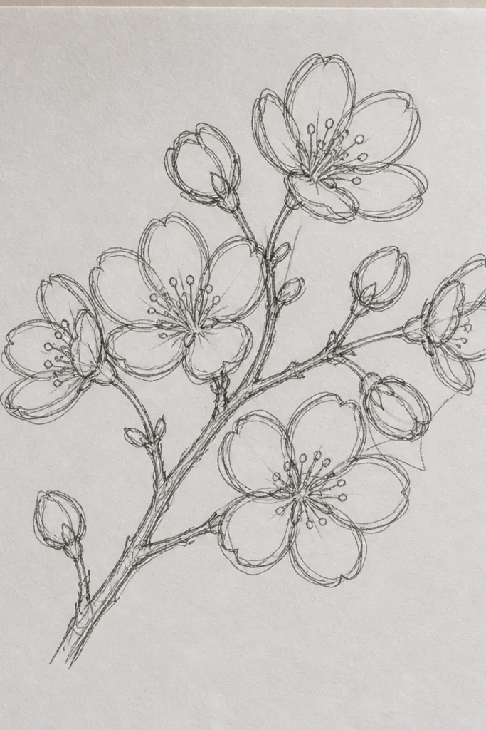
Double-line petals look like you drew on top of yourself, which is why they look stylish. The inner line adds a hint of thickness without doing real shading. I keep the branch single and thicker so the petals don’t look too heavy. This flatters kids because it’s still simple: draw the petal once, then add one inner line. It also looks great on tote bags because the bold outlines hold up after fabric marker dries.
Step 1: Draw the branch with a 0.8 pen and add blossoms along it. Step 2: For each petal, draw a teardrop outline, then draw a second inner line parallel to one side of the petal. Step 3: Keep the inner line shorter near the center so petals don’t look like tubes. Step 4: Add a dot or tiny circle center and keep the rest clean.
Use a darker pen for the outer petal line and a lighter pen for the inner line so the ribbon effect shows.
Avoid drawing both inner and outer lines too thick — it turns into a chunky scribble.
20. Cherry Blossom Branch with Negative-Space Petals
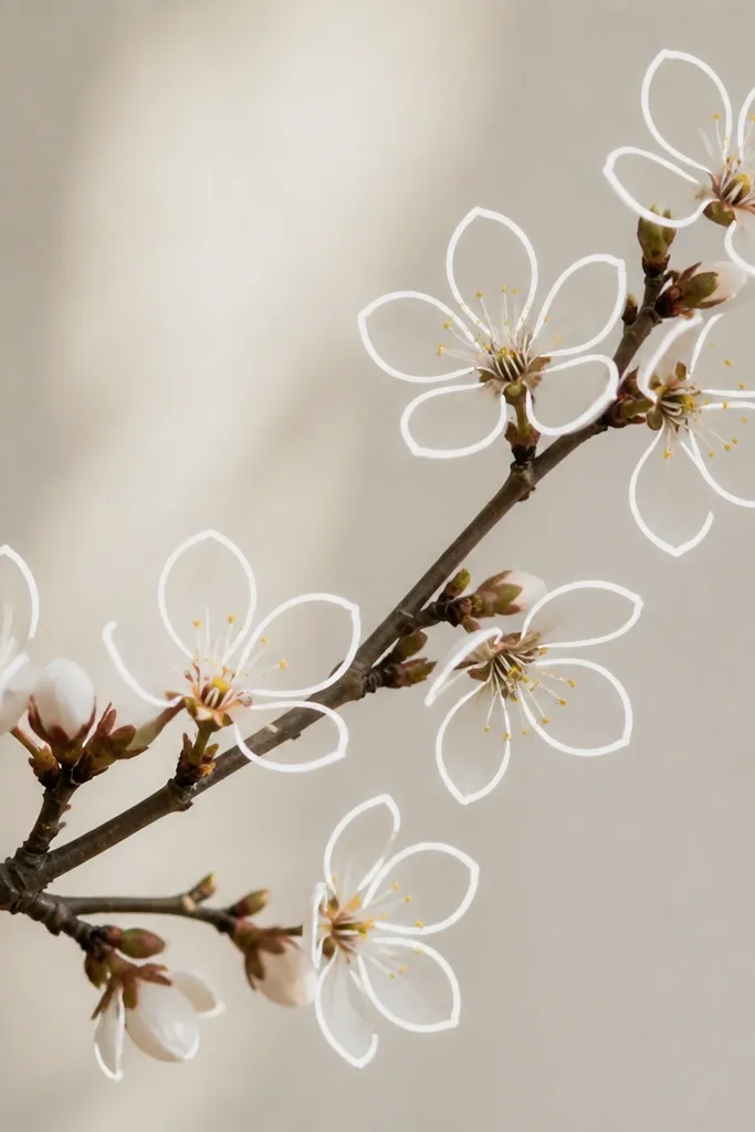
Negative-space petals look sharp because your “fill” is the paper itself. I use this when I’m working on colored paper or when the drawing needs to stay airy. The trick is spacing: petals must not overlap too much, or the negative space disappears. This flatters minimalist projects like simple classroom posters and clean pencil case designs. It also works well for kids because the drawing is just lines — no coloring required.
Step 1: Draw the branch with a thicker outline, then sketch each blossom lightly first. Step 2: Draw five petal outlines that do not touch each other in the center — leave a small gap so each petal interior stays white. Step 3: Add a tiny center dot, then gently connect petals to the center without filling them in. Step 4: Erase pencil guides once ink is dry so the negative spaces stay crisp.
Good to knowIf your petals start touching, widen your petal spacing by drawing the center dot smaller.
Common mistakeDon’t thicken every outline — too much ink makes the negative space vanish.
21. Sakura Branch as a Heart-Shaped Curve
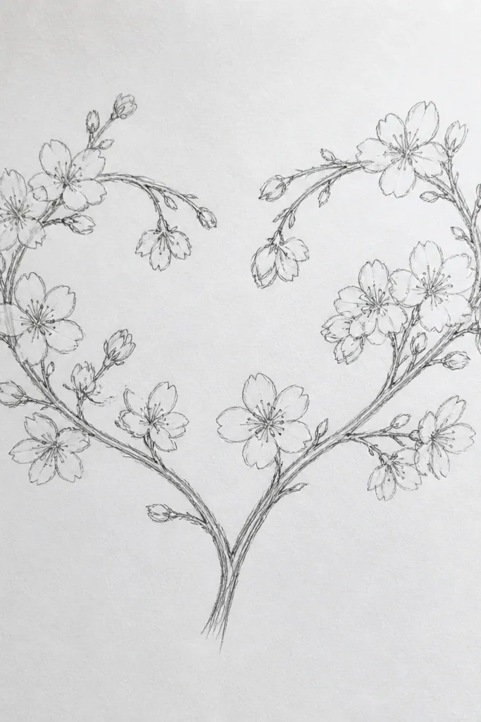
Heart-shaped branches feel sweet without turning into cartoon flowers. I use this for Valentine-season cards that still feel springy. The heart curve gives you a natural frame, so even a simple blossom set looks like a planned design. It flatters kids' crafts because it’s easy to place blossoms along a predictable curve. For adults, it looks stylish on stickers and notebook covers because the line art stays clean and controlled.
Step 1: Draw a light heart outline but skip the bottom point — use it as a guide for the branch curve. Step 2: Thicken the heart curve with a 0.8 pen, then add two side twigs at the upper edges. Step 3: Place 6-8 blossoms along the top curve, with petals pointing outward. Step 4: Add one or two blossoms near the “shoulders” of the heart to balance spacing.
Good to knowDraw one half of the heart, then mirror it by folding the paper — it keeps symmetry without fancy tools.
Common mistakeAvoid drawing a full heart with too many blossoms — it can look like a Valentine sticker instead of line art.
22. Cherry Blossom with Tiny Raindrop Petals
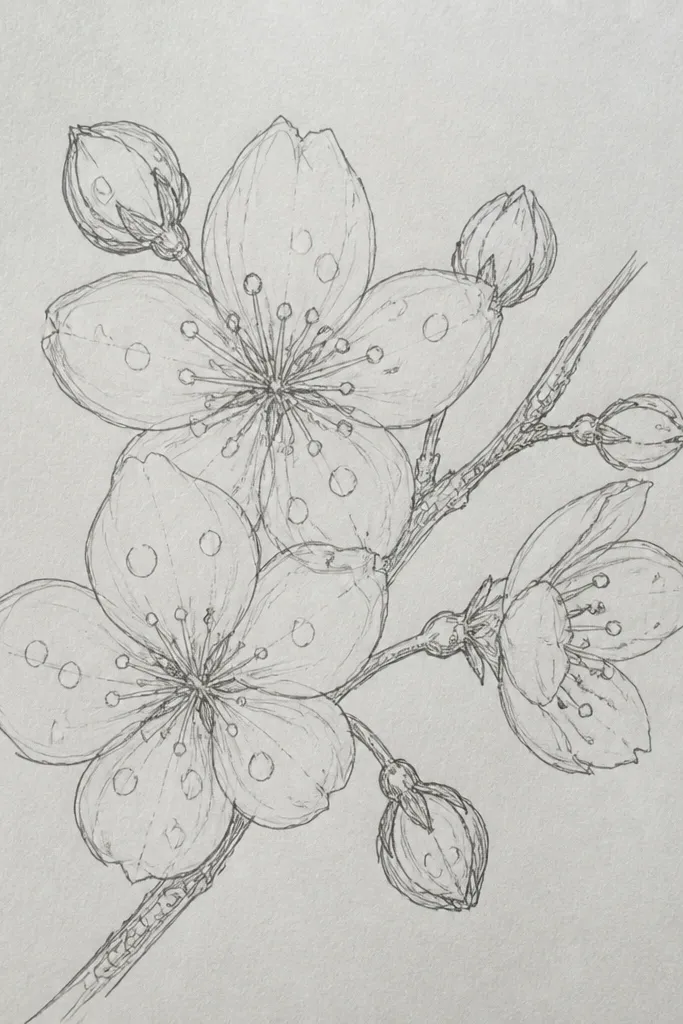
Raindrop petals make the blossoms feel delicate and slightly textured. I like this style for kids' rainy-day craft themes, but it still reads as cherry blossom because the overall structure is the same: five petals and a dot center. The raindrop shape gives you a clear silhouette that stays readable even if the drawing is small. It flatters light, playful designs and looks good on paper that already has a soft blue background. The styling principle is changing just one petal feature while keeping the blossom identity consistent.
Step 1: Draw a simple branch curve with a 0.8 pen, then place 4-6 blossoms along it. Step 2: For each blossom, draw five raindrop petals (rounded top, pointy bottom) around a dot center. Step 3: Add a few tiny raindrop marks near the blossoms using short teardrops, but keep them fewer than the blossoms. Step 4: Keep raindrop marks smaller than petals so they don’t compete.
Good to knowUse a blue gel pen for raindrops if you want a subtle color pop without coloring the whole flower.
Common mistakeAvoid adding too many raindrops — the page starts to look like weather clipart.
23. Cherry Blossom Branch with Dainty Leaf Veins
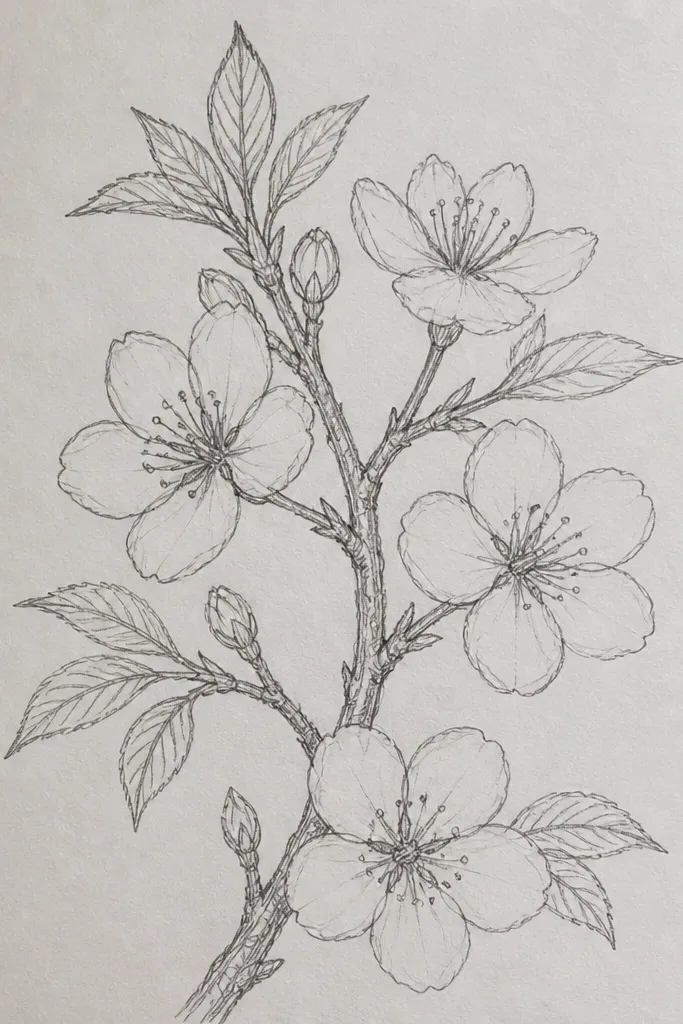
Leaf vein detail makes the whole drawing look more “illustrated” without adding heavy color. I keep the leaves small and only add veins where they’ll be visible — near the branch and between clusters. This flatters older kids and anyone who wants a slightly more delicate aesthetic. The blossoms stay clean, and the leaves add a secondary texture that looks good on notebook margins. It also helps the composition feel balanced because the eye has something to catch besides the flowers.
Step 1: Draw a branch line and place blossoms at 2-3 cm intervals. Step 2: Add 4-6 leaves, each as a small oval with a center vein line. Step 3: Add 2-3 short side veins that branch off from the center vein, keeping them tiny. Step 4: Outline blossoms with a 0.4 pen and leaves with a 0.3 pen so the blossoms stay the main focus.
Draw leaves first, then position blossoms between them so spacing looks natural.
Don’t make leaves bigger than blossoms — then it reads like a generic leaf drawing.
24. Branch with Blossoms in a Vertical Zigzag
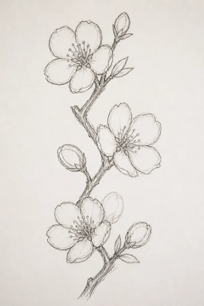
Zigzag branches look stylish because they turn a simple floral motif into graphic design. I use this when the project is strict in shape, like a narrow phone case or a vertical label. The blossoms sit at the bends, so the composition feels intentional and not random. It flatters clean, modern tastes and works great for kids because each bend is a placement cue. You’re basically giving yourself a grid without drawing a full grid.
Step 1: Draw a vertical zigzag line from top to bottom using light pencil, marking 5-7 bend points. Step 2: Thicken the zigzag with a 0.8 pen. Step 3: At each bend point, draw one blossom facing outward — five teardrop petals and a dot center. Step 4: Add one tiny leaf mark on alternate sides so the zigzag doesn’t look empty.
Good to knowIf the zigzag looks uneven, draw it with a ruler to get the angle right, then freehand the curve at the ends.
Common mistakeAvoid placing blossoms exactly on every bend if you’re short on space — skip one to keep rhythm.
25. Sakura Blossom Medallion on a Plate-Shaped Circle
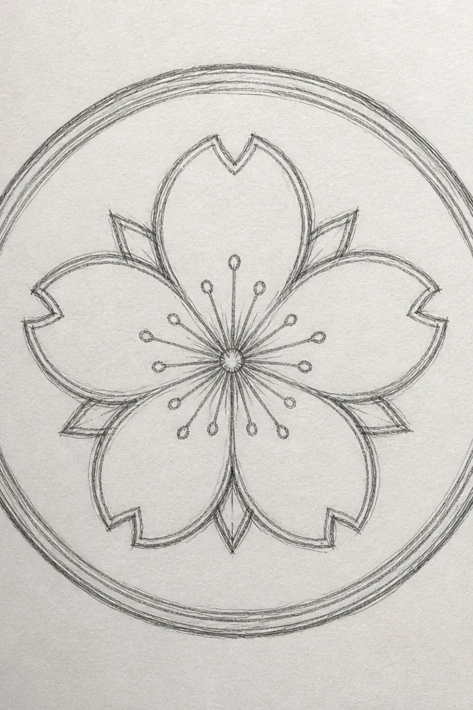
Medallions look finished because the rings tell your brain where to look. I’ve used this on kids' craft plates and paper bowls by drawing on a circle template, then letting them color lightly. The inner ring blossoms are slightly larger, which makes the center feel like a focal “seal.” This flatters projects where you want symmetry and structure. It’s also easy for kids to place because you’re working inside ring boundaries.
Step 1: Draw a large circle and divide it into three faint ring guidelines using a compass or a cup for spacing. Step 2: Place small blossoms on the outer ring (8-12 blossoms), medium blossoms on the middle ring (6-8 blossoms), and one large blossom in the center. Step 3: Use five teardrop petals for each blossom and keep the centers as tiny dots. Step 4: Outline the circle border thick with a 0.8 pen, then keep petals thin with a 0.4 pen.
If symmetry is hard, trace the circle once, then rotate your paper slightly and copy one blossom position around the ring.
Avoid overcrowding the outer ring — if petals touch, it turns into a gray mass.