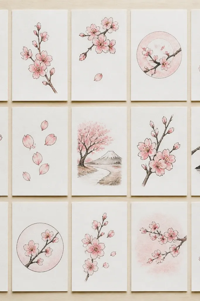
1. Ink + Wash Cherry Blossom Twig Over White Space
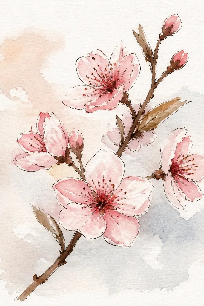
This one is my go-to when I want “spring window art” without turning the page into a sticker pile. The ink branch should be thin at the tips and slightly thicker where it starts, so use a fine liner (0.3 or 0.5) and press a little heavier near the base. The blooms should be pale — I use a light rose wash like diluted pink paint so the paper shows through. It flatters simple layouts because the white space makes the branch feel airy, not crowded. If you’re doing a gift card or a small frame, this style looks clean and grown-up.
Start by sketching the branch lightly, then ink over it with a 0.3 liner. Add side twigs that split into two, each twig ending with a tiny cluster of 3 to 5 teardrop petals. Next, wet the petal area with clean water using a small brush, then drop diluted rose paint into the wet spots so the edges soften. Finally, once dry, add stamens with a darker pink or warm brown dot in the center of each bloom and add 2 to 3 stray petals with a single teardrop each.
Leave at least one big area of paper untouched — that breathing room is what makes the blossoms look expensive.
Don’t outline every petal hard in ink; it makes the flowers look like flat stickers.
2. Pencil Branch with Kneaded-Eraser Bloom Highlights
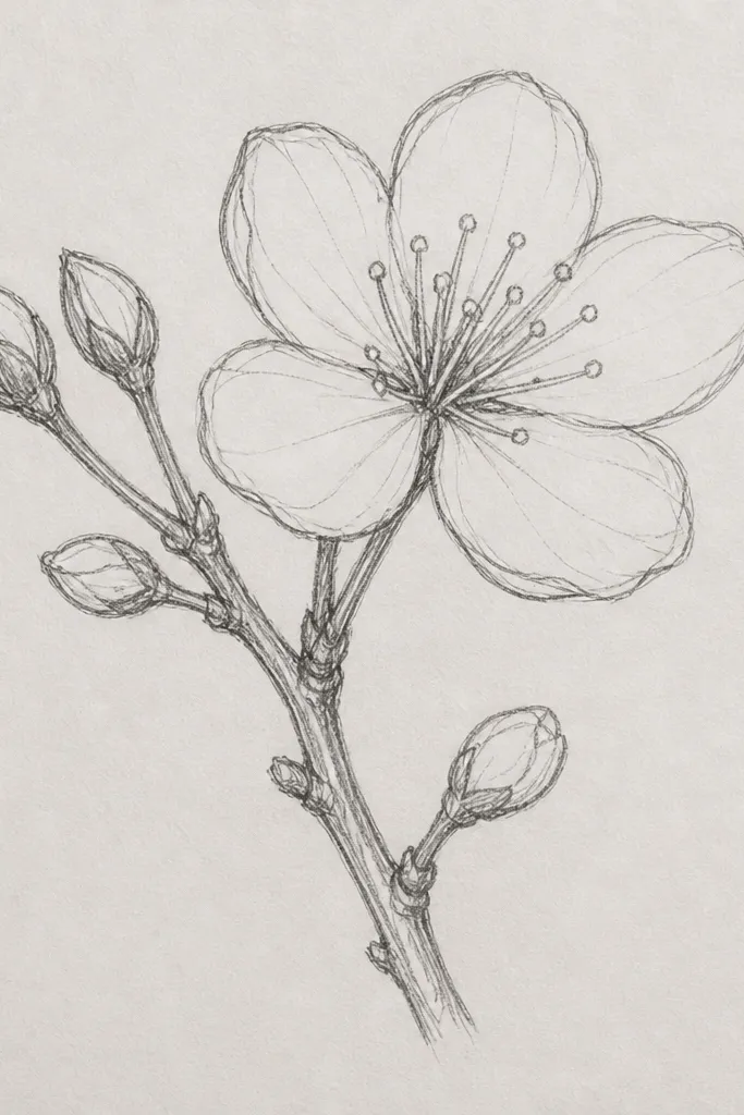
This style is for the days you want a gentle, dusty look. Pencil-only drawings hold up well for kids because you can erase mistakes, but it still looks detailed when you use light-to-dark value changes. I shade the petals with a 2B pencil, then I lift highlights with a kneaded eraser so the petals look translucent. It’s especially flattering for people who like neutral art or want to match a beige room — the colors stay subtle. It also works great if you’re practicing because the form is clear and forgiving.
Start by drawing the branch with a light HB line, then go over the main stem with 2B to give it weight. Add twig lines and blossom clusters in groups of 4 to 6 petals, each petal overlapping the next. Shade the inside of each cluster slightly darker than the outer petals, then smudge lightly with a paper stump so the shading blends. Finally, press a kneaded eraser onto the top halves of a few petals to lift highlights, then add tiny stamen dots with a sharper pencil tip.
Use the eraser on only the top edges of petals so the highlight looks like light, not a random white mark.
Don’t press the whole blossom dark at once — flat shading makes it look like a gray circle.
3. Marker Outline + Colored Pencil Petal Glow
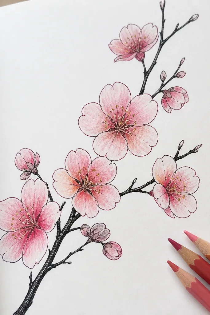
This is the “kid-friendly but still pretty” method I keep coming back to. The marker gives the branch a confident shape, so the whole drawing doesn’t fall apart when hands get wobbly. Then colored pencil adds control: you can layer peach over light pink to make the petals look warm and dimensional. It flatters kids because it hides uneven coloring — the darker centers bring order back to the cluster. For adults, it’s a quick way to get a finished look without watercolor supplies.
Outline the branch with a black fine marker, keeping the stem thicker near the base. Add twigs and blossom clusters of 3 to 7 teardrops, leaving a few petals slightly open so it looks like blooms are turning. Use a light pink colored pencil to fill the whole petal area, then layer peach near the center of each cluster. Finally, use a darker rose pencil for the center and add tiny stamen dots in warm yellow or brown. Keep background areas mostly uncolored for a clean look.
Color in gentle strokes that follow each petal’s curve; it makes the petals look like they have a shape.
Don’t color every bloom the exact same shade — variation in center darkness makes it look real.
4. Watercolor Bloom Clusters with Salt Texture
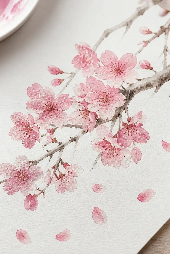
Wet the main stem lightly with a thin brush and paint it in a gray-brown mix (diluted burnt sienna works well). Paint blossom clusters as loose teardrop shapes, overlapping them, and keep the center slightly darker. While the paint is still wet, sprinkle coarse salt on just the blossoms — not the branch. Let it dry completely, then brush off the salt to reveal the speckle texture. Add stamens with a tiny dot of darker pink or brown after the salt is removed.
If you want that “wet spring air” look, salt is your friend. I use this when I’m making art for kids' rooms because the texture hides uneven brush work and still looks intentional. The branch should stay lighter than the blossoms so the flowers are the star. I paint the blossoms with diluted rose and let the paper do the work, then salt creates little speckles that resemble petal texture. This style flatters bright spaces because the pink pops, but it stays soft thanks to watercolor edges.
Common mistakeDon’t salt the branch — it makes twigs look crunchy and messy.
Good to knowUse coarse salt, not table salt, so you get visible speckles instead of dust.
5. Crayon Resist Cherry Blossom Branch on Watercolor Paper
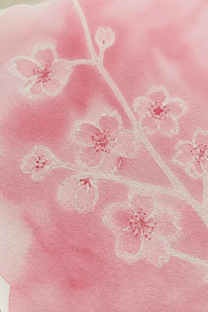
Draw the branch and blossom clusters lightly with a white or very light pink crayon. Keep the crayon strokes visible so the watercolor can’t cover them. Wet the background lightly with clean water and paint a diluted pink wash over the area, leaving the crayon lines lighter. After it dries, go back with a darker rose wash or colored pencil to deepen the centers of each blossom. Add tiny stamen dots last so they sit on top of the wash.
Crayon resist is the easiest way I’ve found to get a dreamy, layered look without fancy tools. The resistance keeps the branch and petal outlines lighter, which makes the blossoms feel like they’re glowing behind a wash. I use this for kids who struggle with drawing accuracy because the crayon lines guide the whole composition. The result looks best on thicker watercolor paper so the wash doesn’t bleed through. It’s also flattering for gift art because it looks intentional even when the blooms are a little uneven.
Common mistakeDon’t flood the page — too much water makes the resist bleed and the lines disappear.
Good to knowUse a thicker crayon (not a super waxy thin one) so the resist lines stay bold after the wash.
6. Cherry Blossom Branch with Gold Gel Pen Highlights
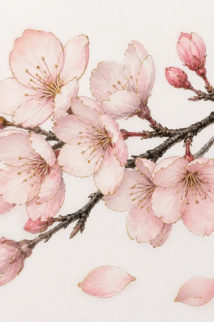
Sketch the branch in pencil, then ink over it with a fine pen. Lightly color blossoms with pale pink watercolor or colored pencil, keeping the outer petals lighter than the center. Once the pink is dry, use a gold gel pen to trace just the top edges of 6 to 10 petals and add a gold dot on a few stamens. Add a tiny darker pink center behind the gold so the sparkle sits in a shadow. Finish by adding 1 or 2 drifting petals with a single outline and a gold edge.
Gold accents make cherry blossoms look like they belong on a card or a journal page. I do this when I want a “pretty in photos” result without making the rest of the drawing busy. The key is restraint: only highlight a few petal edges and stamen points, not every single blossom. The branch stays darker (pencil or ink) so the gold has contrast to catch light. This style flatters neutral outfits and clean interiors because the gold reads warm, not loud.
Common mistakeDon’t cover the whole blossom in gold — it turns into a glittery blob.
Good to knowTest the gold on scrap first; some gel pens look gray until they fully dry.
7. Cherry Blossom Branch in Pastel Side-Lit Shading
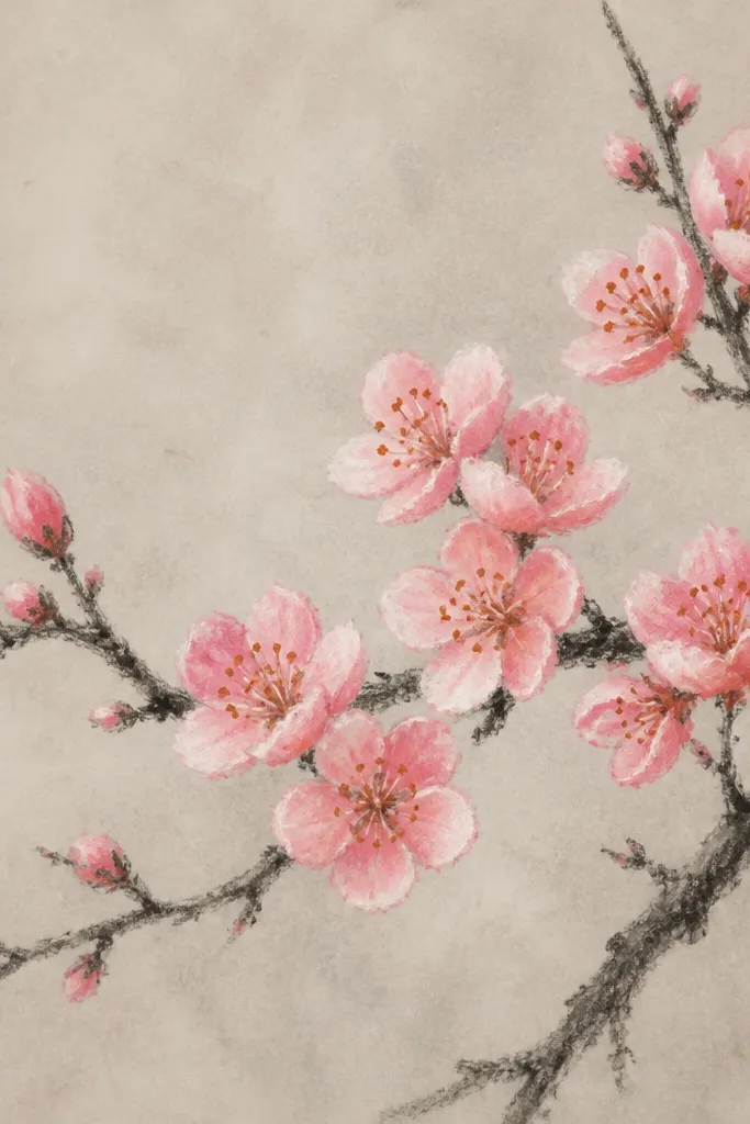
Draw the branch with light charcoal, then define the stem thickness near the base. For each blossom cluster, draw 4 to 7 teardrops overlapping, then shade the petals. Use a light pink pastel on the side facing the light and a deeper rose pastel on the shadow side. Blend gently with a finger or blending stump, then use a darker brown or orange pastel for stamen dots. Tap off extra pastel dust with a tissue so the background stays clean.
Pastels give you that velvety softness that pencils can’t quite match. I use this when I want the blossoms to look like fabric — soft and curved. The secret is direction: pick a light source (I use “left side light”) and shade consistently. That makes the petals look rounded even when the drawing is simple. Pastel also flatters art for kids because it doesn’t need perfect lines, just good cluster shapes. It works great for sketchbook pages where you want the texture to show.
Common mistakeDon’t shade every petal darker — consistent shadow direction makes it look intentional.
Good to knowFixative helps, but even without it, keep your hands off the drawing for the first hour so you don’t smear petals.
8. Monochrome Sepia Cherry Blossom Branch for Vintage Frames
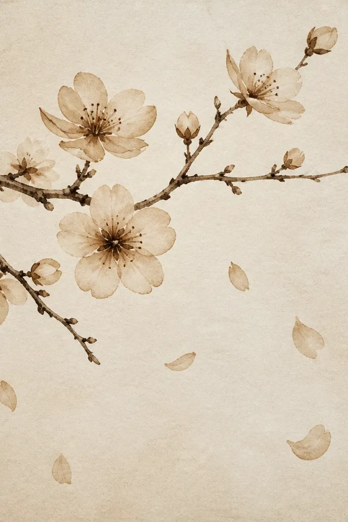
This is the style I pick when I’m making art that has to match a vintage frame or a warm-toned room. Monochrome sepia looks cohesive because the eye reads the branch shape and the bloom clusters, not the color variety. I keep blossoms smaller and more spaced so the negative space feels like old paper. It flatters people who like subtle art because it doesn’t scream for attention — it invites you closer. It also looks great in black-and-white photos.
Draw the branch with a sepia ink pen, keeping the line weight heavier at the base. Add twig splits into two and place blossom clusters of 3 to 6 petals along the twigs. Fill petals with sepia pencil using light pressure, then darken the center of each cluster with a slightly darker pencil or ink dot. Add a few drifting petals as single teardrops with a lighter fill. Keep the background mostly untouched so the sepia paper texture shows through.
Use a slightly thicker pen for the main stem only — it makes the whole branch look vintage, not flat.
Don’t add too many blossoms — monochrome looks best with breathing space.
9. Cherry Blossom Branch with Embossed Petals Using Bubble Wrap
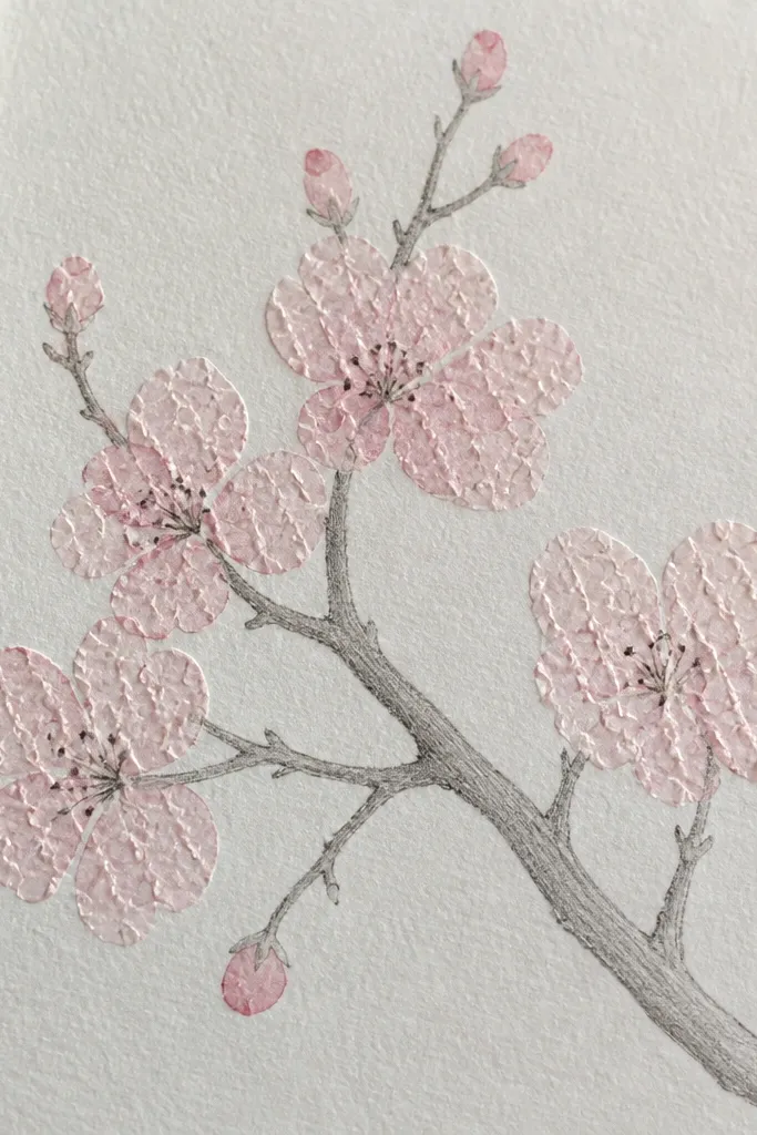
Sketch the branch and blossom clusters in pencil. Paint the blossoms with diluted pink watercolor or craft paint, but stop before it fully dries. Cut a small piece of bubble wrap and gently press it onto the wet blossoms for a few seconds, then lift straight up. Let dry, then add darker centers and tiny stamen dots with a fine pen or colored pencil. Keep the branch untextured — only press on the blossom areas.
Texture makes blossoms feel real, especially if your lines aren’t perfect yet. Bubble wrap embossing gives you tiny irregular edges that mimic petal texture without you drawing every outline. I do this when I want a tactile result for kids — it’s fun and it hides mistakes. Keep the branch smooth and simple so the texture reads as petals, not messy paint. The final look is cute for room decor and also looks great in craft journals.
Common mistakeDon’t emboss the background — texture should stay where petals are.
Good to knowPress lightly and briefly; too much pressure smears the petal shapes.
10. Cherry Blossom Branch with Tissue Paper Petal Overlays
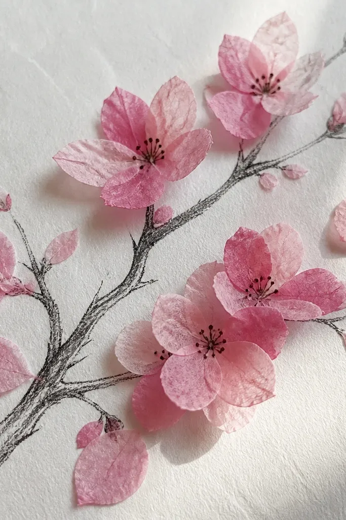
Draw the branch and twig structure on paper using pencil, then outline the main stem with a fine pen. Cut tissue paper into teardrops sized about 1 cm long for small blossoms and 1.5 cm for larger ones. Dab a tiny amount of glue on the center of each blossom cluster and layer two tissue teardrops, then add a third slightly offset. Add darker rose dots at the center and leave some blossoms as drawn-only if you want depth. Finish by adding 2 to 3 drifting tissue petals off the branch.
This is the craft version when you want a real 3D look without sculpting. Tissue paper petals catch light and create natural variation, so even simple clusters look detailed. I use it for kids because cutting teardrops is easier than drawing dozens of petals, and layering hides uneven edges. It flatters anyone who likes airy art — the petals are translucent and float visually. For best results, keep the tissue color limited to two shades of pink.
Common mistakeDon’t use too much glue — it soaks through and turns the tissue dark.
Good to knowUse a toothpick to place small glue dots so you don’t soak the tissue.
11. Cherry Blossom Branch on Black Paper with White Gel Pen
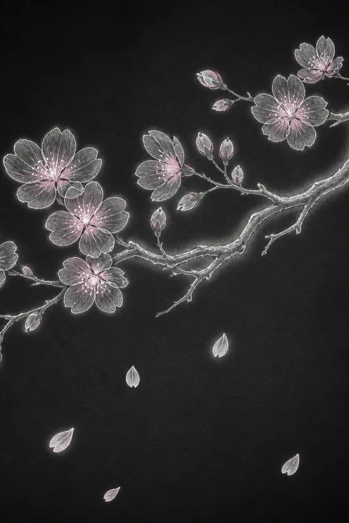
Black paper makes blossoms look like they’re lit from behind. The branch and petal outlines pop instantly, so you don’t need heavy coloring to get impact. I use white gel pen for crisp lines and pastel chalk for quick pink shading in the petals. It’s flattering for kids because the contrast hides shaky pencil lines — you can’t see them once you go over with white. This style also looks amazing for night-themed classroom art.
Sketch the branch lightly in chalk or pencil, then trace the stem and twigs with a white gel pen. Build blossom clusters using small teardrops outlined in white, keeping each cluster to 3 to 6 petals. Add light pink chalk to the inside of each blossom, then deepen the center with a slightly darker rose chalk. Add tiny white or pale yellow stamens as dots. Finish by drawing 2 to 3 drifting petals as single teardrops with only an outline and one chalk wash.
If the gel pen skips, warm it in your hand for 10 seconds and try again.
Don’t smudge the white outlines too much — the glow disappears.
12. Cherry Blossom Branch with Cross-Hatching Petal Veins
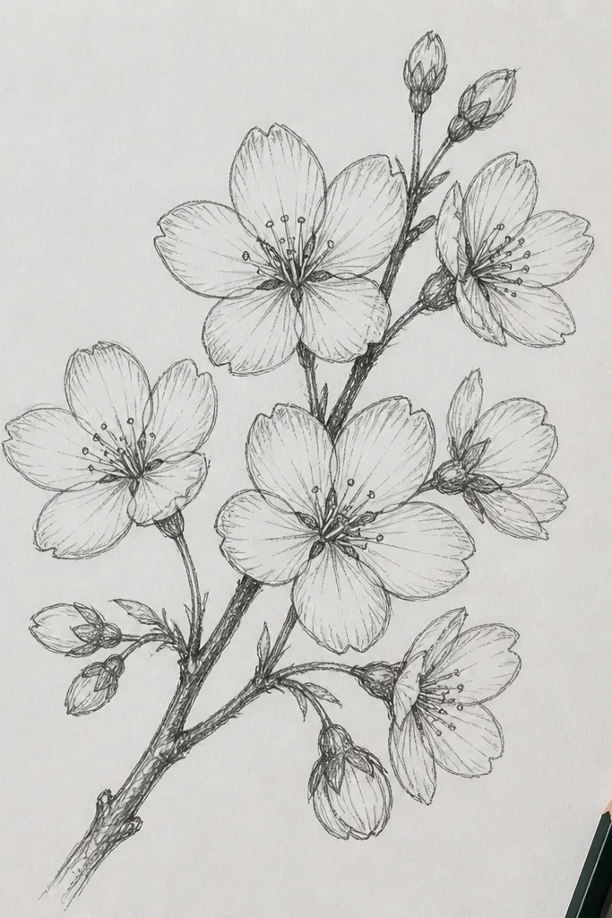
Cross-hatching makes blossoms look detailed without adding color. I use this when I want a black-and-white drawing that still feels “finished” because the texture reads like petal structure. It flatters sketchbook art and also works for gift tags because it looks intentional even when printed small. The key is to keep hatch lines direction consistent — they should follow the petal curve. It’s also a good choice for older kids who can handle shading carefully.
Draw the branch with HB pencil, then darken the main stem with 2B. Add blossom clusters of 4 to 7 petals, each petal lightly outlined. Shade each petal using cross-hatching: one set of lines angled one way, then a second set crossing it, with denser hatching near the petal center. Keep the outer edges lighter by using fewer lines there. Add darker cluster centers with heavy hatch marks and finish with tiny stamen dots in the darkest area.
Use a mechanical pencil for tight lines so the hatch looks clean instead of scratchy.
Don’t hatch the branch the same way as petals — it should stay simpler.
13. Cherry Blossom Branch with Paper-Cut Petal Tips
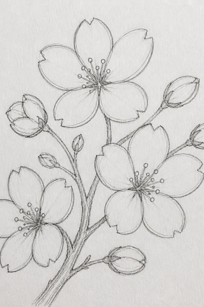
Paper-cut tips give you crisp detail where you need it most: the petal edges. I use this when I’m making art for a frame and I want the blossoms to look sharp up close. The contrast between soft drawn petals and crisp cut tips makes the whole branch feel more dimensional. It’s flattering for people who like clean craft edges and it hides imperfect drawing because the layered tips add realism. It also works well when kids can cut small shapes but struggle with tiny brush strokes.
Start by drawing the branch and blossom clusters with pencil, then shade petals lightly with pink colored pencil. Cut small teardrop pieces from light pink craft paper, about 1 cm long, and keep them consistent. Glue just one small cut tip on the top third of a few petals in each blossom cluster, leaving the rest drawn. Add darker centers with a rose pencil or ink dot. Finish by drawing 2 to 3 drifting petals with a single pencil outline and a light pink fill.
Glue only the center area of each cut tip so the edges stay lifted and catch light.
Don’t cover every petal with cut paper — too much crispness looks cluttered.
14. Cherry Blossom Branch with Crumpled Paper Bloom Background
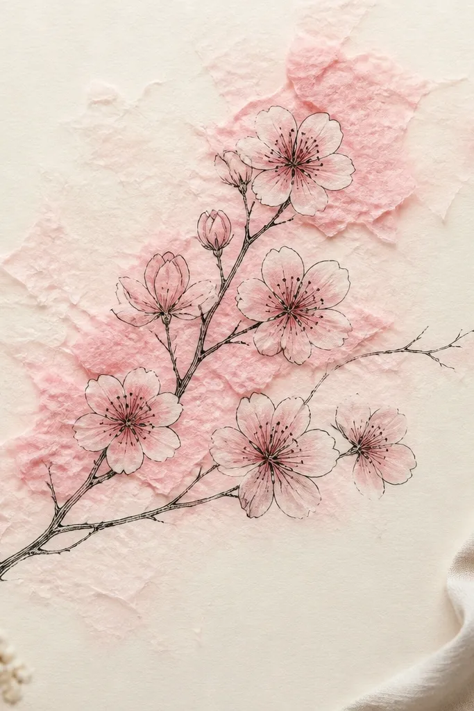
Ink the branch and twigs first, then sketch blossom clusters as simple teardrop outlines. Tear pink tissue paper into irregular pieces and crumple them lightly. Dab a bit of glue on the background areas near the blossom clusters and press the crumpled tissue down to form soft clouds. Once dry, fill the blossoms with drawn teardrops in colored pencil or light watercolor, then add darker center dots and tiny stamens. Keep the clouds behind the branch, not over the branch line, so the structure stays readable.
This is a great “budget decor” style because you get texture without painting every petal. Crumpled tissue creates a cloud effect that makes blossoms look like they’re in soft haze. I use it when I’m working on larger paper and want the branch to feel surrounded by spring air. It flatters kids because the background texture hides uneven coloring. For adults, it still looks intentional because the branch and blossom clusters stay crisp on top.
Common mistakeDon’t glue tissue directly over the branch stem — it makes the twig structure disappear.
Good to knowUse smaller tissue pieces closer to the blossoms and larger pieces further away for a natural fade.
15. Cherry Blossom Branch with Ombre Watercolor Gradient Blossoms
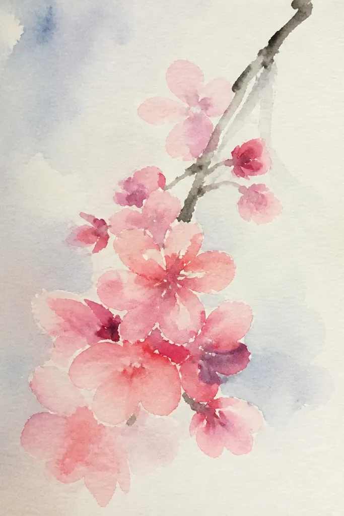
Paint the branch in a diluted brown-gray wash, keeping it thin. For each blossom cluster, paint overlapping teardrops in a very light pink and let them stay pale at the edges. Then, while still wet, add a small amount of deeper rose only in the center of the cluster so it bleeds outward. Let dry, then add stamens as tiny dots using a darker pink or warm brown. Finish with 1 to 2 drifting petals painted with only the light edge color.
Ombre blossoms look extra delicate because the center reads as depth. I do this when I want the drawing to look “painted” without heavy detail work. The branch stays light so the darker centers don’t swallow the page. This style flatters people who like subtle color transitions and it’s forgiving if your petal shapes aren’t identical. It also looks great as classroom art because the technique is repeatable across many blossoms.
Common mistakeDon’t let the whole blossom turn one flat pink — the ombre is the point.
Good to knowWork in small sections so the paint stays wet when you add the deeper center.
16. Cherry Blossom Branch as a Continuous Line Drawing
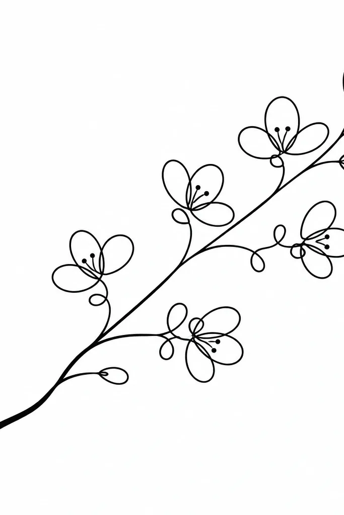
Continuous-line drawings look modern and clean, even when the subject is soft and floral. I use this when I’m making quick art for kids to copy — it’s basically one rhythm: stem, twig, blossom loop. It flatters minimal decor because there’s no heavy shading, just a clear silhouette. The blossoms feel airy because the line acts like the petal outline. It also works well for journaling since it leaves lots of blank space for handwritten notes.
Pick a fine liner and decide where the branch starts — I like starting low left and curving upward. Draw the main stem in one smooth motion, then add twigs as two-way splits. Make each blossom by looping 3 to 6 teardrop shapes along a twig, keeping the loops small. Add tiny stamen dots inside a few blossoms, then go back to thicken the stem slightly near the base. Leave the rest of the page blank for contrast.
Keep loops smaller on the far side of the branch to create a sense of depth.
Don’t add shading or extra lines until the branch shape looks right; the line quality matters most.
17. Cherry Blossom Branch with Watercolor Splatter Petal Rain
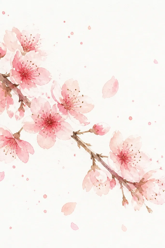
Splatter is the easiest way to add motion without drawing extra branches. I use it when the branch feels too still and I want the page to look alive. The trick is controlled splatter: tiny drops, not big paint blobs. This style flatters busy backgrounds because the motion fills empty space, but it still keeps the focus on the branch. It’s also great for kids because the splatter technique is fun and forgiving.
Paint the branch and blossoms in watercolor first, keeping the blossoms as clustered teardrops with slightly darker centers. Load a brush with diluted rose paint and tap it gently over the area next to and below the branch to create small petal-like dots and teardrop smears. Use a smaller brush for finer splatters so it looks delicate. After it dries, add darker stamens and a few clear drifting petals as single teardrops. Keep splatter mostly on one side of the branch so it looks intentional.
Practice tapping pressure on scrap — one light tap gives tiny drops that look like petals.
Don’t splatter over the branch stem — it makes the twigs look fuzzy.
18. Cherry Blossom Branch with Patterned Background and Simple Blossoms
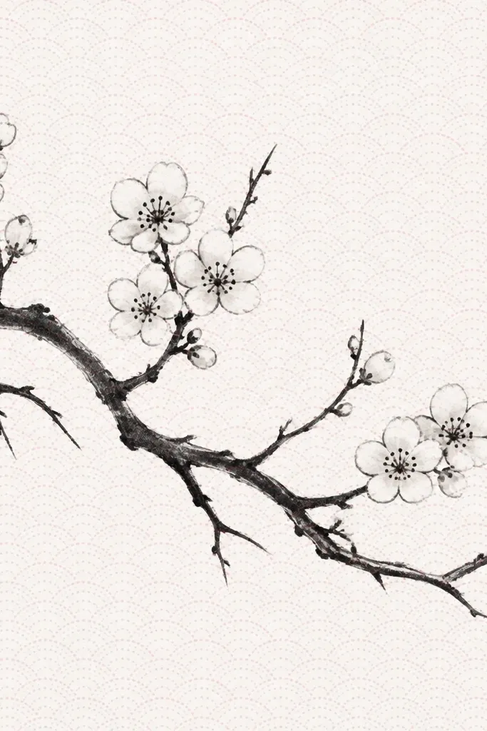
Pattern backgrounds make cherry blossoms feel like they belong on stationery or a planner page. I like keeping the blossoms simpler so the pattern doesn’t compete for attention. This style flatters people who like graphic design looks because the contrast between crisp line art and soft pattern feels modern. It also helps when you need to fill a page but don’t want to paint dozens of petals. The branch shape still matters, but the background does half the work.
Draw the branch with ink or a dark pencil, then place blossom clusters of 3 to 6 petals along the twigs. Keep blossom shading minimal — just light pink fill and a darker center dot. Create the background pattern with a light gray or pale pink pen: small dots or tiny curved marks in a repeating spacing. Leave a margin around the branch so the line art stays readable. Add two drifting petals at the edge of the patterned area to connect the foreground and background.
Use pattern color at 20-30% intensity by diluting ink or using a very light pencil so it doesn’t overpower the blossoms.
Don’t make the pattern dark — it will turn the blossoms into a distraction.
19. Cherry Blossom Branch with Layered Colored Pencil Petals (3-Step Color)
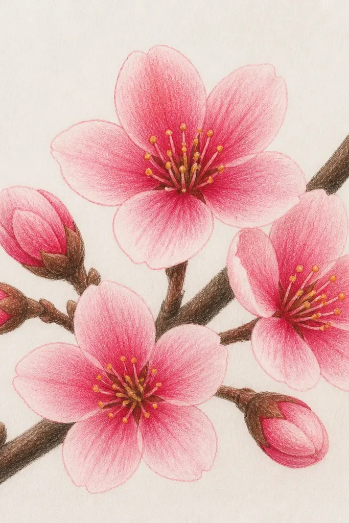
Sketch the branch with light brown pencil, then darken the stem and twigs with a medium brown. Draw blossom clusters as overlapping teardrops and lightly fill them with a light blush pink. Next, add mid pink only in the middle area of each petal cluster, leaving outer edges lighter. Finally, press deep rose in the center of the cluster and along a few petal inner edges. Add tiny yellow dots for stamens and keep the background mostly blank.
This is the most repeatable “looks like a print” method I’ve used on budget supplies. Layering colored pencil in three steps gives you depth without needing watercolor paper or brushes. I keep the outer edges light so the petals don’t look heavy, then I press harder only near the cluster center. This flatters most skin tones if you’re making a card because the palette is warm and gentle. It also works for kids if you pre-plan the cluster centers so they know where to press darker.
Common mistakeDon’t skip the light first layer — without it, the center won’t look like depth.
Good to knowRotate your paper slightly while shading so your pencil strokes follow the petal curve naturally.