1. Soft Blush Branch with 3-Value Petals
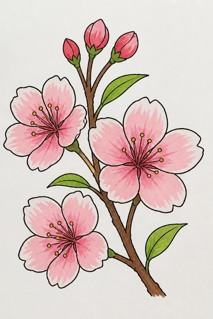
This one is my go-to when I want a clean, pretty result without fighting marker bleed. I use pale pink for the first petal pass, then mid rose where petals overlap, and a tiny amount of magenta right at the shadow edge. The branch stays warm brown or light gray and is thinner than the biggest petal stroke, so the flowers look like they’re floating. It flatters almost any occasion because it reads soft and romantic, not dramatic. Kids also like it because the blossoms are small clusters instead of lots of individual petals.
Start by lightly sketching a branch that curves from the lower left toward the top right, leaving breathing space around it. Then add 3 blossom clusters: each cluster gets 5-6 petal shapes, drawn as teardrops that overlap in a circle. Color first with pale blush across all petals, then layer mid rose only where petals overlap, and finish with a small magenta shadow at the inner edge of each petal. Finally, add 2-3 tiny buds in warm brown and a few short leaf hints as thin lines.
If your markers streak, press the tip lightly for the first layer and go back for the second layer after it dries for 30-60 seconds.
Don’t outline every petal with a dark line — it makes the blossoms look like stickers instead of drawn flowers.
2. Fuchsia Center Blossoms with Sunlit Highlights
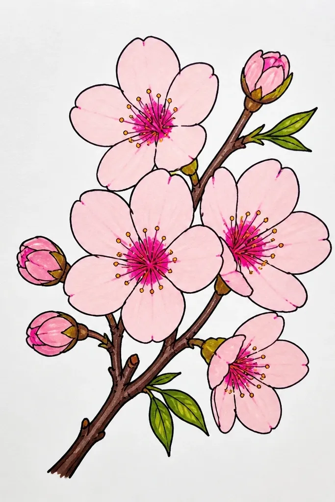
This drawing looks more “glossy” and dramatic because you keep highlight space. I fill petals from the outside in, leaving a narrow white strip on the top edge of each petal, which mimics sunlight. The center gets the strongest fuchsia so your eye lands on the blossom first. It works great for greeting cards because the contrast makes it pop even when the paper is small. For skin tones and styles, it pairs nicely with warm outfits and gold accents since fuchsia reads bold.
Draw a gentle branch curve and place 4 larger blossoms along it, spacing them so none touch. For each blossom, sketch 6 petals and color the outer half with mid rose, keeping a thin white highlight strip near the top. Add fuchsia to the inner half of the petals and blend lightly by dragging the marker tip across the overlap. Finish by tracing stamens in warm brown at the center with a fine tip and add a few small dots along the branch for texture.
Use a white gel pen only after the marker dries if you want sharper highlight lines than the marker can leave.
Don’t fully color the petals edge-to-edge — no highlight means the flowers look flat.
3. Watercolor Look with Dry Brush Marker Splatter
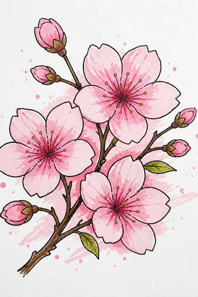
If you want that airy watercolor mood without real paint, this method is the closest marker trick I’ve found. You let marker dry-brush and splatter create texture, so the background feels alive. I keep the branch line light and slightly imperfect, then build blossoms with pale pink first and magenta only in a few shadow areas. This looks best on thicker paper because marker texture sits on top instead of soaking instantly. It’s also forgiving for kids because the splatter hides uneven coloring.
Start with a light pencil branch and lightly trace it with a gray or light brown marker, keeping the strokes thin. Color each blossom with pale pink using short, dry-ish strokes so the edges look soft. Dip the marker tip very lightly into deeper magenta and flick off tiny dots around each blossom cluster, not all over the page. Add a few extra splatters behind the blossoms to create depth, then stop and let it dry.
Test your splatter on scrap paper first so you know how big the dots land.
Don’t over-splatter — too many dots turn it into confetti instead of spring mist.
4. Monochrome Cherry Blossoms with Sepia Branch
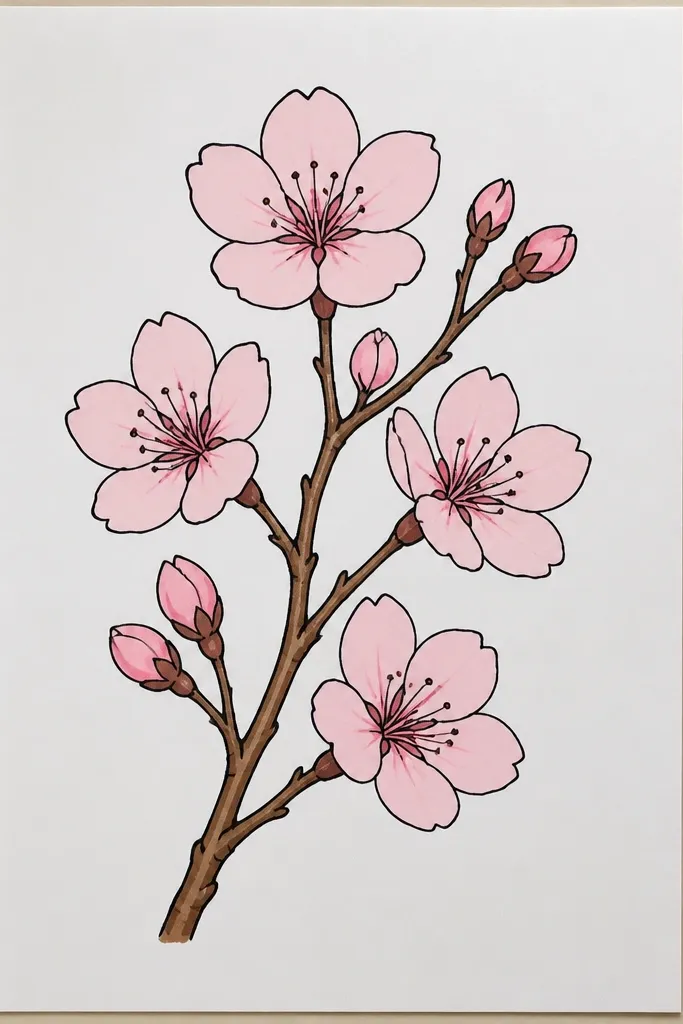
Monochrome blossoms look classy and older-girl pretty, and they’re surprisingly easy with markers. I use one muted rose for most petals, then add cool gray only where petals overlap. Sepia brown for the branch warms the whole drawing so it doesn’t look cold. This style fits school projects, journal pages, and even minimal wall prints because it doesn’t fight for attention. It also flatters lighter color palettes because the gray shadows add shape without loud pink jumps.
Sketch a branch with 5-7 small blossom clusters, spacing them so the page isn’t crowded. Color all petals with muted rose, leaving some areas lighter by not pressing hard. Then add cool gray under each overlap and at the petal base closest to the center. Finish with sepia for the main branch and add 2-3 tiny twig lines branching off.
If your rose marker is too bright, tone it down by lightly layering it over paper tone instead of pressing fully.
Don’t use black for shadows — it makes the petals look bruised.
5. Pastel Sky Background with Negative Space Blossoms
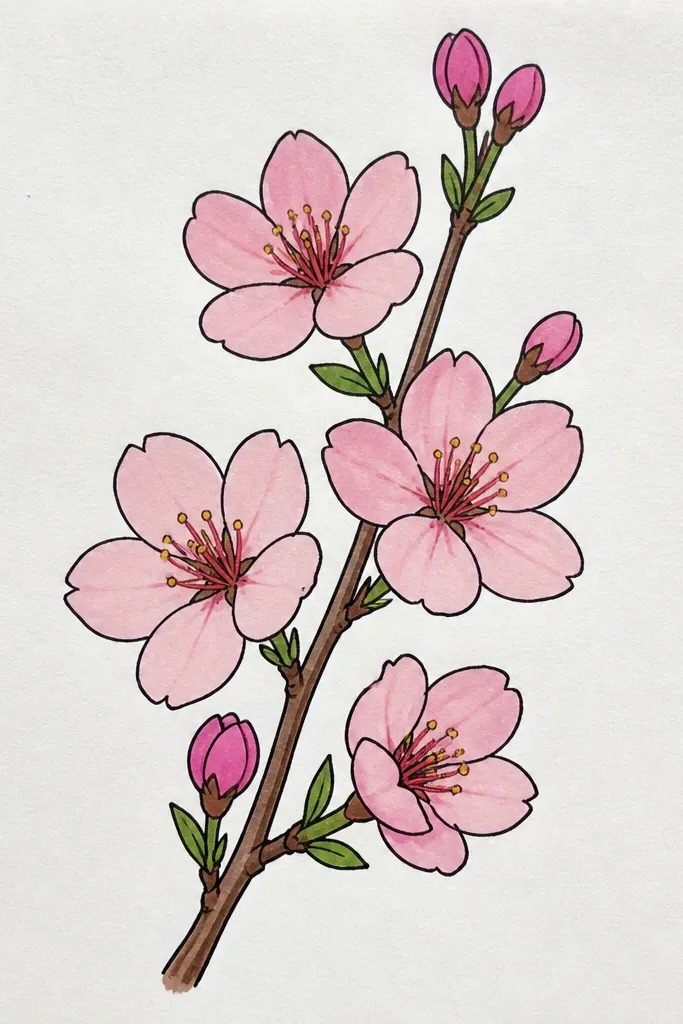
Color the background first with pale blue across the top half and a light lavender toward the edges, using a light hand and horizontal strokes. Let it dry completely. Then draw the branch in a thin gray-brown and add blossoms as teardrop petals, leaving a big chunk of each petal white. Add just a light pink pass on the lower half of each petal and a deeper rose shadow where petals overlap.
This one looks like a little window into spring because the background is doing the work. I color a pale sky first, then treat blossoms like cut-outs by leaving the brightest parts uncolored. Negative space keeps the blossoms airy, and the pastel background makes the pinks feel softer. It’s perfect for kids because they can stay inside the branch lines while you handle the background. It also looks great in larger formats since the sky has room to breathe.
Common mistakeDon’t color the blossoms fully on top of the background — you lose the dreamy cut-out effect.
Good to knowUse fewer background colors than you think — two pastels look cleaner than five.
6. Hot Pink Petal Outline with Clean Inner Gradients
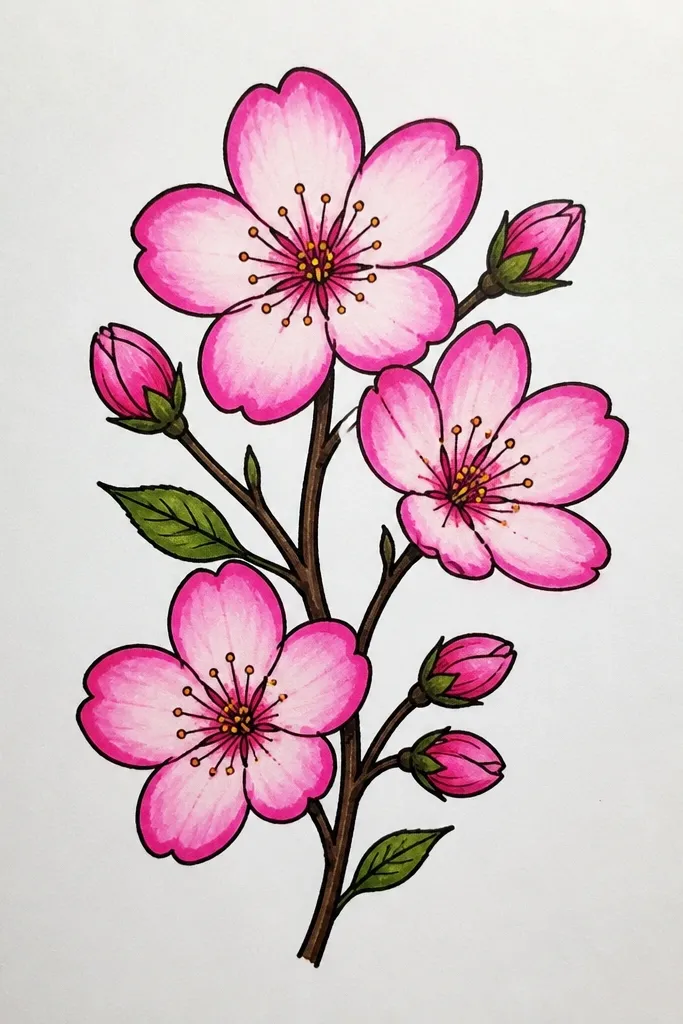
Sketch your branch and place 3 medium blossoms and 2 smaller ones. Draw each petal shape, then outline the petal edge with a hot pink marker using one steady stroke. Fill the petal interior by starting at the base with magenta and lifting pressure as you move upward to leave lighter color. Add a few buds and small twig lines, then finish by drawing tiny stamens in warm brown at each blossom center.
This is the “cute but graphic” version that stands out on a fridge or a kid’s bedroom wall. The trick is to use a stronger color only for the outline and keep the inside gradient smooth. I outline each petal with hot pink, then fill from base (magenta) to top (light pink) without going over the outline. The branch stays darker brown so it doesn’t wash out against the blossoms. It looks great for vibrant rooms and for anyone who likes clean, poster-like art.
Common mistakeDon’t outline the branch with hot pink — it makes the whole drawing look tangled.
Good to knowKeep outlines consistent thickness by using the same tip angle for every petal.
7. Tiny Cherry Blossom Confetti on a Diagonal Twig
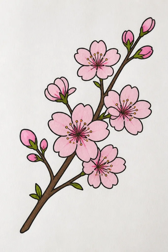
This style looks playful and works well when you’re doing a smaller page or a quick activity. Because the blossoms are tiny, you rely on value contrast rather than complex petal detail. I do a quick light pink fill, then a minuscule deeper rose shadow at the inner edge. The diagonal twig gives motion so the scattered flowers don’t feel random. It flatters younger kids' art styles and also looks great as a border on a journal page.
Draw a diagonal twig with a thin chisel-tip stroke, keeping it slightly wavy. Add tiny blossom centers as small circles, then draw 5 petals around each center using very short teardrop strokes. Color petals with light pink first, then tap deeper rose at the inner edge of each petal where it meets the center. Leave lots of empty space so the confetti effect stays light.
Use a fine tip for the centers so the tiny flowers don’t blur.
Don’t crowd the page — empty space makes the confetti look intentional.
8. Layered Paper-Torn Petal Look with Marbled Marker Edges
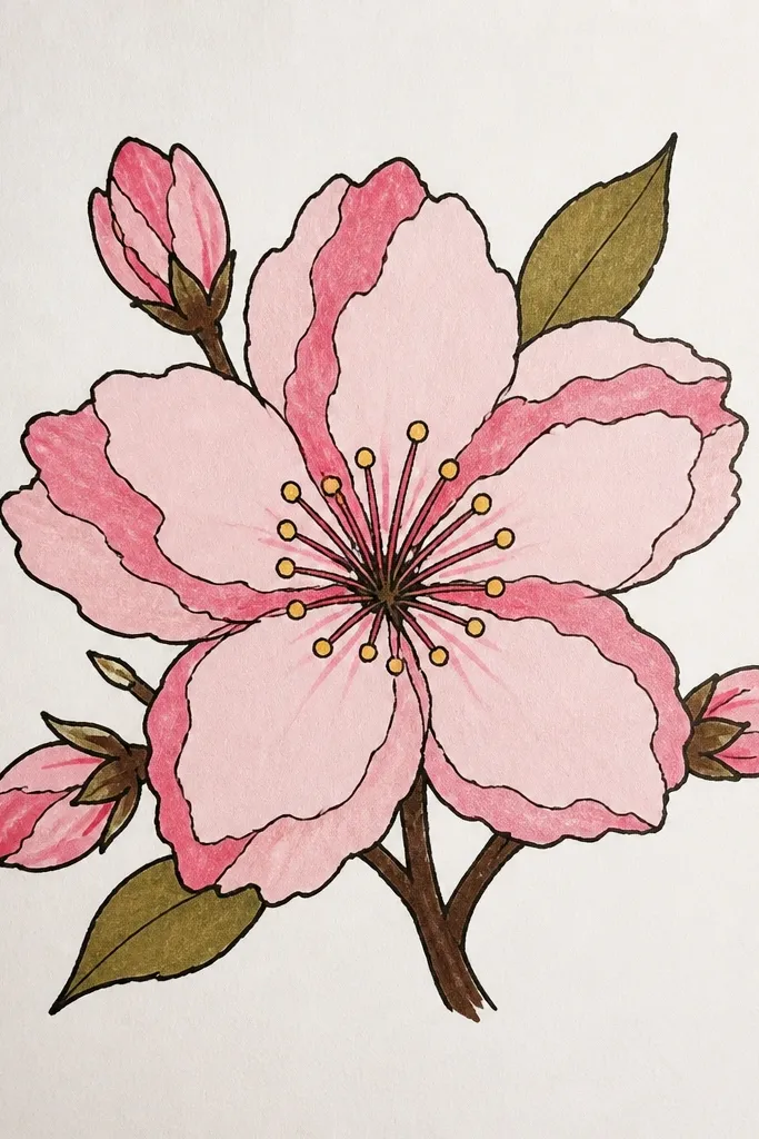
Sketch 4-5 blossoms along a thin branch. For each blossom, draw 6 petals, then color the entire petal with a medium rose. While it’s still slightly wet, swipe a pale pink marker lightly over parts of the petal and leave ragged white edges by not fully filling. Add a second pass of deeper magenta only at the petal base and behind edges to create a shadow layer. Finish with warm brown for the branch and a few short twig lines.
This one gives you that layered, tactile vibe without using actual paper. I mimic torn edges by blending marker tones unevenly and leaving tiny white gaps along petal edges. The deeper pink sits underneath the lighter pink so each blossom feels stacked. It looks best on heavier paper because the texture holds. It’s a great fit for older kids and adults who want something more visual texture than “pretty and simple.”
Common mistakeDon’t fully overblend every petal — the torn look comes from intentional unevenness.
Good to knowBlend with a light touch — if you drag too hard, the edges turn muddy instead of marbled.
9. Sakura Branch Border for Kids' Stationery
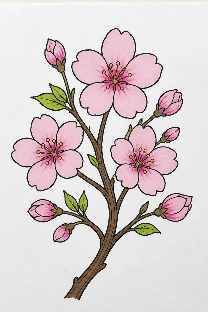
Borders make your drawing look finished even when the center is blank. I do this for kids' letters because it frames the message and keeps the art from feeling like a random doodle. The branch line stays thin and consistent, and blossoms repeat in small sizes so nothing looks out of place. I add a couple of leaf marks to keep the pink from taking over. This style flatters handwriting because it doesn’t compete with the page text.
Draw a light rectangular margin on the page with pencil, leaving about 1 inch from the edge. Add a thin branch line along the top border first, then mirror a smaller branch along the side using the same thickness. Place small blossom clusters at intervals: every 2-3 inches on top, every 2 inches on sides. Color petals pale pink, add tiny magenta shadows at overlaps, and finish with 3-4 simple leaf lines in a warm green-gray.
Use a ruler for the margin, then freehand the branch so the border stays relaxed.
Don’t make the border too thick — it crowds the page and makes it look heavy.
10. Two-Tone Blossom Curtain with Varying Sizes
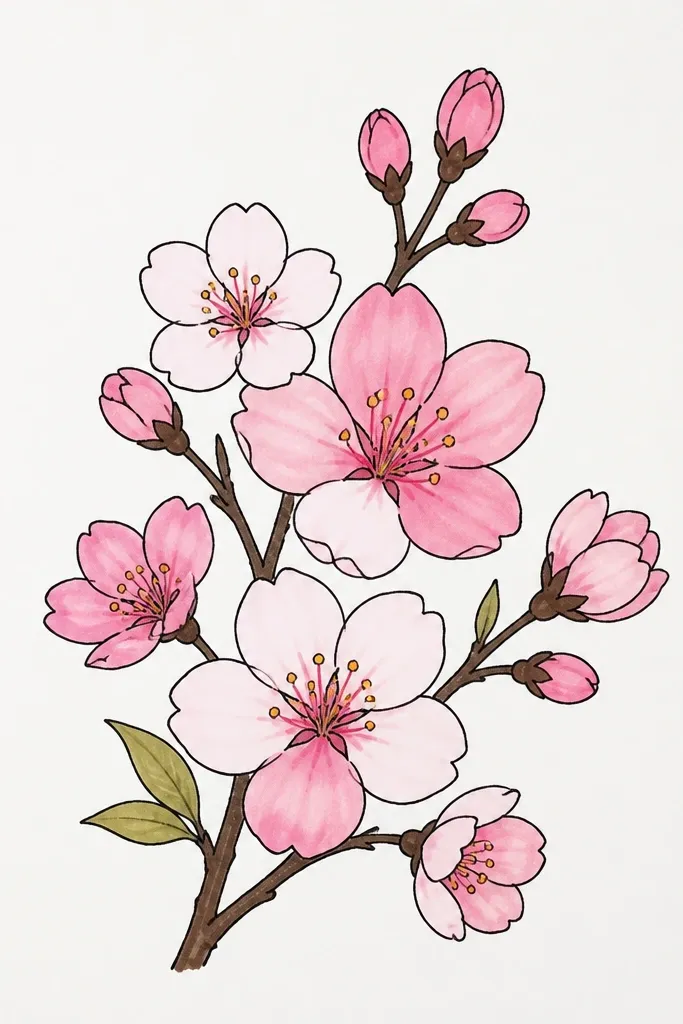
Sketch a soft vertical “curtain” shape with pencil, then place the biggest blossoms at the bottom center and smaller ones as you move upward. Use 7-9 blossoms total so it doesn’t feel empty. Color all petals pale pink, then add deeper rose only at the inner edge of each petal near the center. Keep shadows consistent across the whole curtain, then add a few tiny buds in the gaps to connect the flow.
This one looks like blossoms falling because the sizes change and the density follows. I use pale pink as the base and deepen rose at the petal base to create a curtain effect. The branch is minimal — you’re guiding placement, not drawing a detailed twig. It’s a strong choice for posters, classroom displays, and gift wrapping because the composition reads fast. It also works well for different skin tones in photos, since pink blossoms sit nicely against warm and cool backgrounds.
Common mistakeDon’t keep every blossom the same size — the falling effect disappears.
Good to knowIf you want extra movement, tilt the petals slightly in the direction the curtain leans.
11. Cherry Blossoms with Charcoal-Style Branch Texture
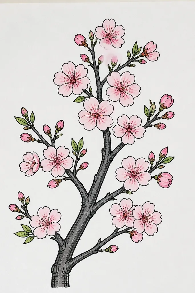
Texture on the branch makes the whole drawing look more grown-up. I do a charcoal-like effect by using a gray marker with light pressure and quick, broken strokes along the twig. Then I keep blossoms clean and smooth, so the contrast between rough branch and soft petals feels intentional. This style looks great in monochrome rooms and pairs well with neutral outfits. It also makes the blossoms stand out because the branch doesn’t compete.
Sketch the branch lightly, then shade the main twig with a gray marker using short broken strokes. Add smaller twigs with the same technique but even lighter pressure so they fade. For blossoms, draw 5-7 petals per flower and fill with pale pink first. Layer mid rose only where petals overlap and add a tiny darker rose at the petal base. Finish with a few stamens in warm brown and leave the rest of the page white.
If your marker looks too smooth, rotate the tip slightly and use shorter strokes to break up the ink.
Don’t make the branch too dark — charcoal texture should support the blossoms, not replace them.
12. Cherry Blossom Branch over Light Grid Paper Look
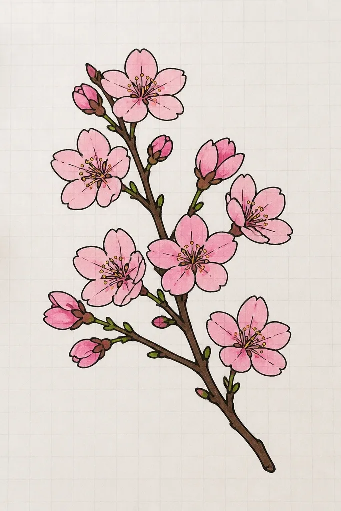
This is the one I use when I want it to look neat and “designed,” not just drawn. The faint grid gives structure, so the eye reads the branch direction and the blossom spacing more clearly. I keep the grid super light and let markers do the color work. The result feels modern, which is great for kids' planners and art journals. It also helps beginners because alignment becomes automatic.
Start by drawing a light grid with a very pale gray pencil or light marker — keep lines thin and spaced evenly, like 1 cm squares. Draw the cherry branch so it runs diagonally across the grid, crossing a few squares but staying thin. Add blossoms at grid intersections, each with 5-6 petals filled pale pink. Layer magenta shadows at overlaps and leave tiny highlight gaps to keep petals from flattening. Add small buds as simple circles with a short stem line.
Use a ruler for the grid, then erase pencil lines lightly before coloring petals for a crisp look.
Don’t make the grid dark — it competes with the flowers.
13. Gold Outline Effect with Warm Brown + Fine Marker
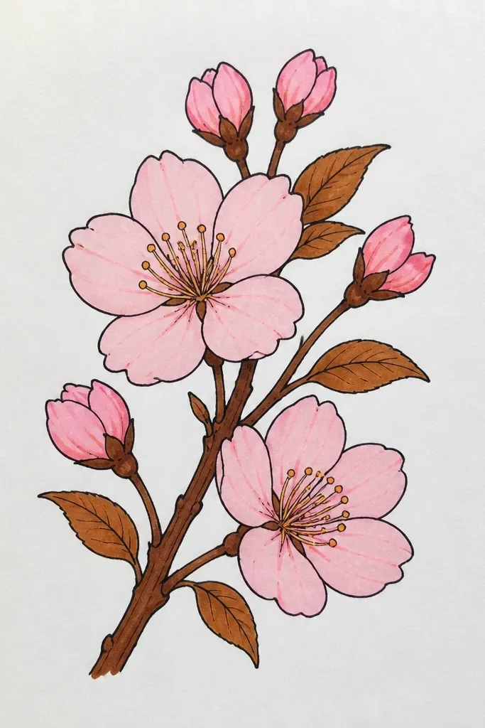
Sketch your branch and place 4-6 blossoms with some buds. Outline each petal edge with a warm brown marker using a fine tip. Fill petals with pale peach-pink, then add deeper rose shading at the inner edge near the center. Keep shading minimal so the outline stays crisp. Finish with warm brown stamens and a few tiny twig lines that match the outline thickness.
Markers can fake a gold outline surprisingly well when you outline with warm brown and keep the inside soft. I use a peachy-pink for the first layer so it warms the whole drawing, then add deeper rose at the petal base. The warm brown outlines make the blossoms look more expensive without adding heavy black lines. This style looks great on white paper and also pops on cream cardstock. It’s especially nice for holiday cards or teacher gifts because it feels polished.
Common mistakeDon’t use dark brown for both outline and shadows — the outline will disappear into the interior.
Good to knowOutline first, then fill. It keeps the edges clean and stops the inside color from bleeding over your lines.
14. Rainy Day Sakura with Blue Gray Background Dots
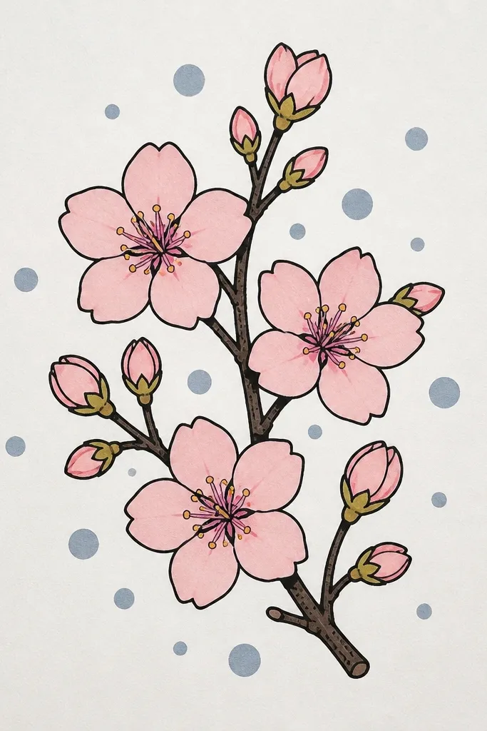
A rainy background makes cherry blossoms feel extra tender. I draw the blossoms normally, then add blue-gray dots and tiny dash marks behind them so the rain doesn’t land on the petals. The cool branch line keeps the mood consistent, while the pink blossoms stay warm. This style works for kids because the rain marks are simple and repeatable. It also looks great for winter-spring cards when you want something softer than a full scene.
Draw the branch in cool gray and add blossoms with 5-6 petals each, using pale pink first. Layer magenta shadows only at overlaps and petal bases, keeping the center slightly lighter. For the background, add blue-gray dots around the branch and a few short dash marks to suggest rain. Keep the rain marks behind the blossoms by stopping them where petals are — no rain lines across the petals. Let it dry, then add a few tiny stamens in warm brown.
Use the tip edge to make short dashes, not full dots, for a more convincing rain look.
Don’t make the rain too dense — sparse marks read better and keep the blossoms clear.
15. Large Bloom Close-Up with Petal Overlap Depth
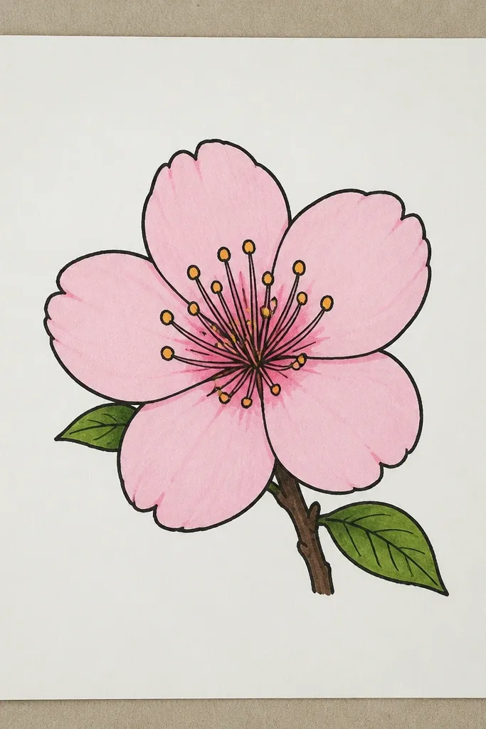
Close-ups look impressive because they show your skill in petal overlap. I make the biggest blossom fill most of the page so you don’t need many flowers to get impact. Each petal has a clear shadow edge where it tucks under the next petal, using deeper rose and a tiny magenta edge. The center glows because I keep it darker but not fully filled, leaving a couple lighter spots for highlight. This style flatters posters and class art displays because it reads from across the room. It’s also great for adults who want a relaxing, detailed marker session.
Sketch one large blossom slightly off-center, then draw 8-10 overlapping petals around a small center circle. Color the outer petals light pink and keep the top edges lighter by using light pressure. Add deeper rose shadows under each overlap, then touch magenta at the inner petal base to create glow. Keep the branch minimal: one small twig and a few tiny buds on the edge of the page. Finally, add stamens with a fine tip in warm brown and add one or two tiny highlight gaps with an uncolored spot.
If your petals look flat, add one more shadow pass at the overlap line, not more color everywhere.
Don’t draw too many petals without shadows — the blossom turns into a pink circle.