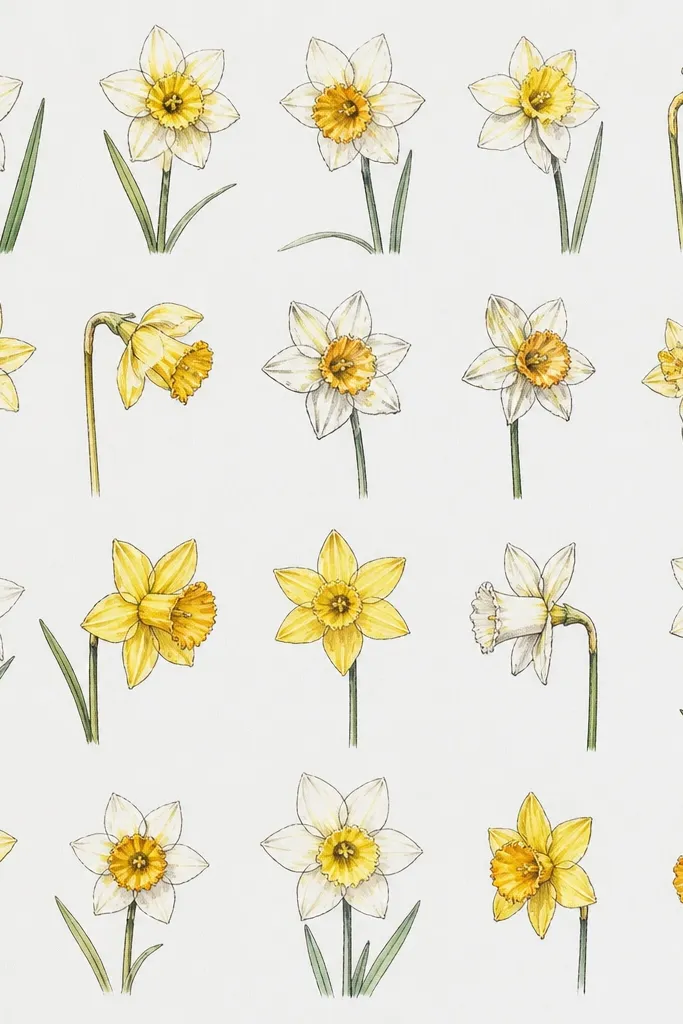
1. Crayon-Style Pencil Daffodil (Soft Petals, No Color Chaos)
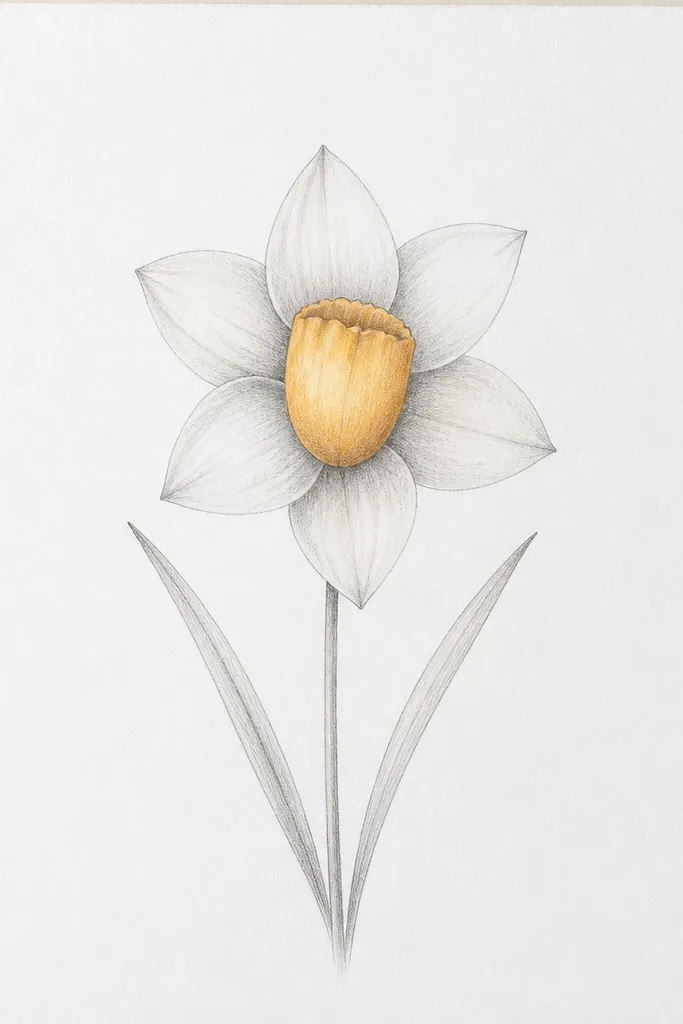
This look is the one I use when kids say they "can't color neatly." You're not relying on perfect yellow coloring at all. The petals stay light gray with a darker edge at the base so the flower still reads as a daffodil. The trumpet gets a slightly heavier outline and a thin shadow under the top fold, which makes it feel layered even without yellow pigment. This flat, soft graphite style looks good on lighter skin tones in drawings because the focus stays on shape, not on color mismatch.
Start by drawing the center trumpet as an oval with a curved "lip" at the top, leaving a small gap for the petal connection. Add six outer petals around it using comma-shaped lines: thin at the tip, thicker near the trumpet. Lightly shade the petal bases with a 2B pencil, then blend with a fingertip or tissue for 2-3 quick passes. Finally, draw two leaves with a single continuous line each, then add one short vein line down the middle of each leaf.
Good to knowUse a kneaded eraser to lift highlights on the petal edges. It makes the petals look shiny without any color.
Common mistakeDon't press hard on the first sketch. Heavy graphite early makes the whole daffodil look dirty after erasing.
2. Fine-Tip Marker Daffodil (Clean Card Outline)
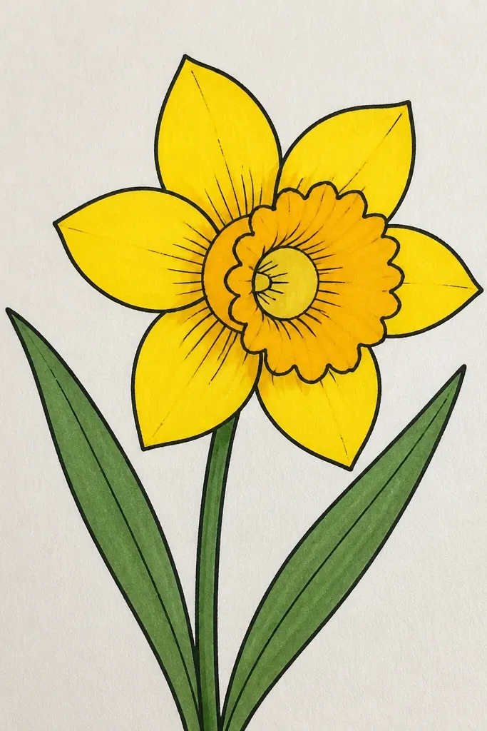
This is the fastest option that still looks "finished." The fine-tip marker gives you crisp lines for the trumpet and the petal edges, so the flower looks like it came from a template. Color stays controlled because you fill in small sections: petals first, then trumpet, then a tiny highlight circle inside. I like this style for kid-made thank-you cards because it reads from across the room. It also works well for kids who get frustrated with smudging since marker lines stay put.
Outline the trumpet first with a thin black line, then draw the six outer petals as rounded shapes that touch the trumpet base. Use a yellow marker to fill each petal in 2 passes: one light pass for coverage, one second pass only near the base. Color the trumpet with a richer golden yellow, then leave a small lighter oval or circle in the center. Add leaves last: draw a leaf line, then fill with green marker and pull a darker green stripe down the middle with a second pass.
Good to knowLet the outline dry for 30-60 seconds before you fill. It prevents the ink from spreading and turning the edges fuzzy.
Common mistakeDon't color over wet outlines. Marker bleed ruins the clean look.
3. Two-Tone Pencil Daffodil (Yellow-Feeling Without Yellow)
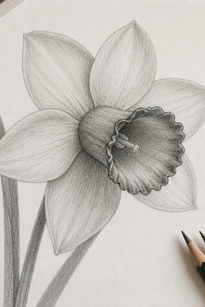
This one is sneaky-effective: it looks like it has color even when you only use pencil. The secret is value separation. Petals get light shading, the trumpet gets darker shading, and the inner rim line gets the darkest tone. Kids like it because it still feels like drawing, not "just coloring." Adults like it because it looks more dimensional than the usual kid daffodil blob.
Draw the center trumpet as a slightly tilted oval so the top lip faces up and right. Add six outer petals with light pencil lines, then shade only the bottom third of each petal with a medium graphite tone. Switch to a darker pencil (2B or 4B) and outline the trumpet opening and add a small shadow under the top fold. Finish by adding a thin highlight line along the inner rim with a lighter pencil, then draw two leaves with light lines and one darker vein line.
Good to knowUse crosshatching only at the petal base. It keeps the rest of the flower airy.
Common mistakeDon't shade every petal evenly. Even shading flattens the daffodil and makes it look like a flower-shaped sticker.
4. Marker + Skip-Fill Petals (Speckled Bloom Look)
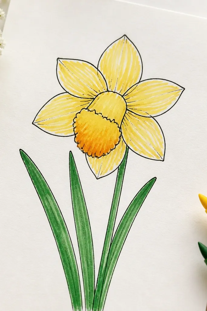
This looks more "alive" than a solid fill because you're leaving tiny uncolored pockets. I learned this after watching kids color daffodils and accidentally skip spots - the flower looked better that way. The trumpet gradient reads as depth, even if the kid's yellow isn't perfectly even. It's a great option for marker because you can control texture with your stroke direction. This style also hides small mistakes in petal shape since the texture distracts the eye from perfect symmetry.
Outline the trumpet and petals in black first, then color the petals with a yellow marker using short strokes. Skip a few spots on purpose - tiny white gaps - especially near the petal tips. Color the trumpet with a deeper golden yellow at the bottom, then blend upward with a lighter yellow pass. Add leaves with two tones: light green base fill and a darker green line down the center, then stop the dark line before the tip so it looks natural.
Good to knowHold the marker at a low angle for the petal texture strokes. It makes the speckle effect stronger.
Common mistakeDon't try to erase marker texture. It smears and turns into a gray patch.
5. Thick Outline Marker Daffodil (Big Kids, Big Confidence)
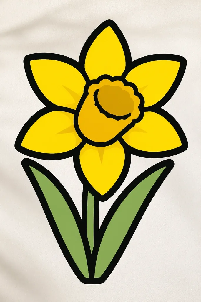
Thick outlines make daffodils look bold and intentional, especially for older kids who want their drawings to look "cool." The form stays clear even if the petal curves aren't perfectly smooth. You get an instant sticker-like look, which is great for posters and classroom bulletin boards. The trumpet looks especially strong because the thick outline frames the opening. If your kid tends to draw light lines that disappear, this is the style that fixes that problem quickly.
Start with a thick black marker for the outer silhouette: trumpet lip, six petal shapes, and leaf outlines. Fill petals with bright yellow, then add a darker yellow shadow at the base of each petal using short strokes. For the trumpet, fill the main area with darker yellow and leave a small lighter area near the inner rim. Finish with leaves: fill with medium green, then add a second green stripe that follows the leaf curve.
Good to knowDo the trumpet outline in one confident loop. The inner rim reads better when it's drawn in a single motion.
Common mistakeDon't add extra lines everywhere. One thick outline plus two shading areas looks clean; too many lines looks messy.
6. Pencil Daffodil With Watercolor Wash (Soft Spring Poster)
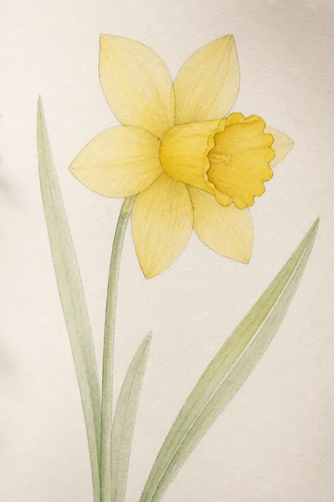
This look is for when you want the daffodil to feel airy. Pencil gives you a guide, and watercolor does the "bloom" effect that kids usually try to imitate with marker. The petals end up translucent, so the paper shows through and makes the drawing look brighter. I like this for simple spring posters because the daffodils look cohesive even when kids color unevenly. It's also forgiving: watercolor hides shaky lines because it softens edges.
Sketch the daffodil lightly in pencil first, then wet only the petal area with a damp brush. Add pale yellow watercolor in thin layers, keeping the darkest concentration at the petal base. Paint the trumpet with a slightly stronger yellow, then add a quick darker wash under the top fold. For leaves, wash light green and leave the mid-vein pencil line visible by painting around it.
Good to knowUse two thin watercolor layers instead of one heavy one. Heavy layers dry streaky and muddy the trumpet.
Common mistakeDon't flood the paper. Too much water makes petals bleed into each other and the flower loses its shape.
7. Graphite + Colored Pencil Rim (Crisp Center Focus)
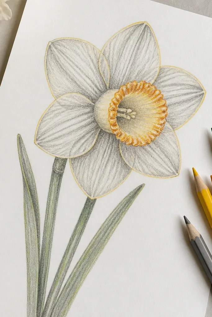
This style pulls attention to the trumpet, which is where daffodils look most alive. You keep the petals soft with graphite, then add just a thin colored rim where the eye naturally lands. It feels "adult" without being complicated, and kids can do it with just one yellow and one green pencil. I've seen this look win in classrooms because it avoids the messy full-color fill that turns into uneven blobs. For different skin tones on the artist's hand-drawn style, it stays readable because the contrast comes from line and rim color, not skin-dependent factors.
Draw the daffodil in graphite first, keeping the petals light and the trumpet slightly darker. Shade the petal bases with graphite only, then take a warm yellow colored pencil and lightly trace the outer edge of each petal. Use a second warm color (a tiny bit of orange or deeper yellow) to line the trumpet opening rim and add a short shadow line under the top fold. Finish by coloring leaves with green pencil and adding one darker vein line down the center.
Good to knowSharpen colored pencils before you do the rim. A blunt tip makes the rim look chalky.
Common mistakeDon't fill the whole trumpet solid. A thin rim and a shadow look cleaner than a heavy block of color.
8. Black Pen Outline With Marker Fill (No Smear, No Guessing)
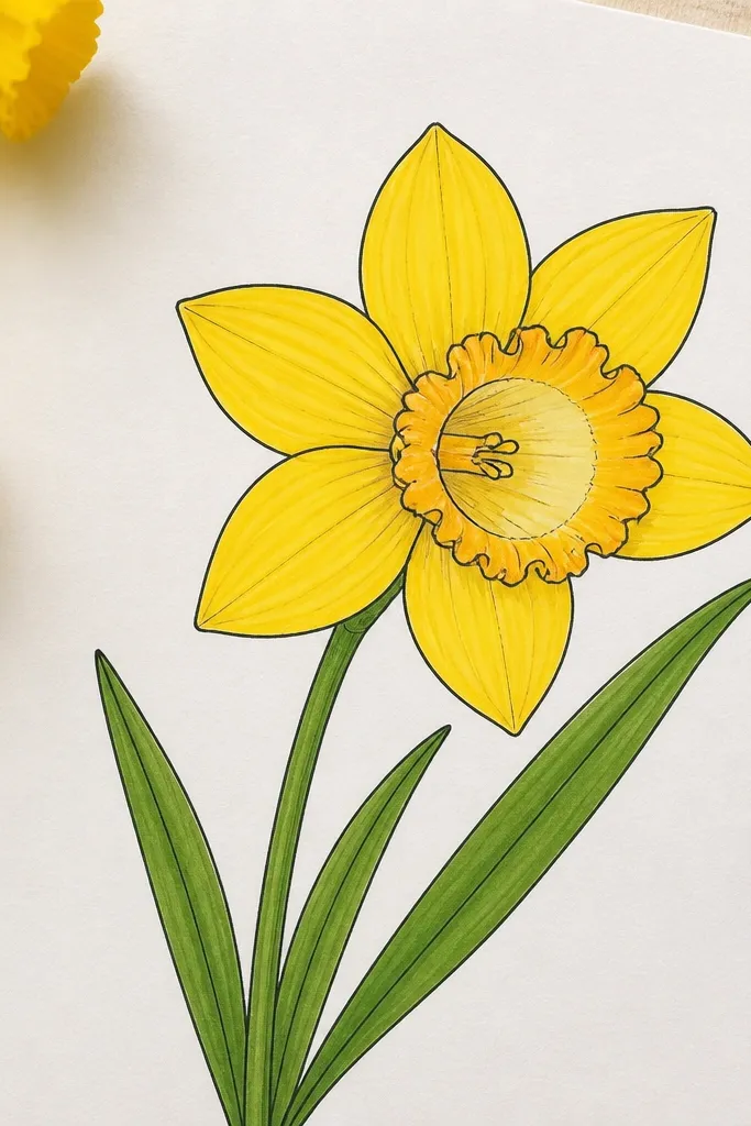
This is the combo I use when I want kids to stop "re-drawing" outlines. The pen creates a stable boundary, so marker color stays inside the lines. It also looks sharp for kids who rush - the outline is already done, so they only focus on fill and shading. The daffodil reads as a clean design element, not a sketch that needs fixing later. If your kid presses too hard with pencil, this method avoids that graphite smudge problem.
Draw the trumpet and petals with a black fine pen first, keeping lines smooth and continuous. Then fill petals with yellow marker using directional strokes from the base toward the tip. Color the trumpet with a darker golden yellow, and leave a small lighter area near the inner opening so it doesn't look flat. Add leaves with green marker, then draw a darker green vein line with the pen or a darker marker.
Good to knowLet the pen dry completely before marker fill. If you rush, ink can blur and bleed under the marker.
Common mistakeDon't use a super wet marker on pen lines. It can pool and create thick halos.
9. Kid-Proof Pencil Daffodil Grid (Spacing That Never Fails)
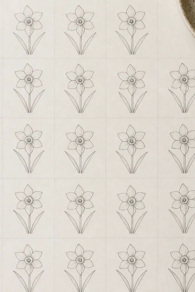
This is for when you're doing a "20 drawings" activity and you need consistency fast. The grid removes the spacing anxiety that makes kids abandon the project halfway. Each daffodil ends up roughly the same size, so the whole page looks like a set, not a pile of random flowers. The pencil look stays simple: light petals, darker trumpet outline, and one leaf pair. It's also great for younger kids because they can follow a repeat pattern without measuring with a ruler every time.
Lightly draw a grid on the page using a ruler: for example, 4 columns by 5 rows if you want 20 tiny daffodils. In each cell, draw the trumpet as a small oval centered in the top half of the square. Add six outer petals around it, keeping the petal tips inside the cell borders. Add two short leaves below the trumpet, then shade only the petal bases lightly with graphite.
Good to knowUse a very light grid line and erase it after the flowers. It keeps the final drawing clean.
Common mistakeDon't make the grid too dark. Dark grid lines show through and make the page look messy.
10. Marker Daffodil With Two Leaf Angles (More Realistic Stem Feel)
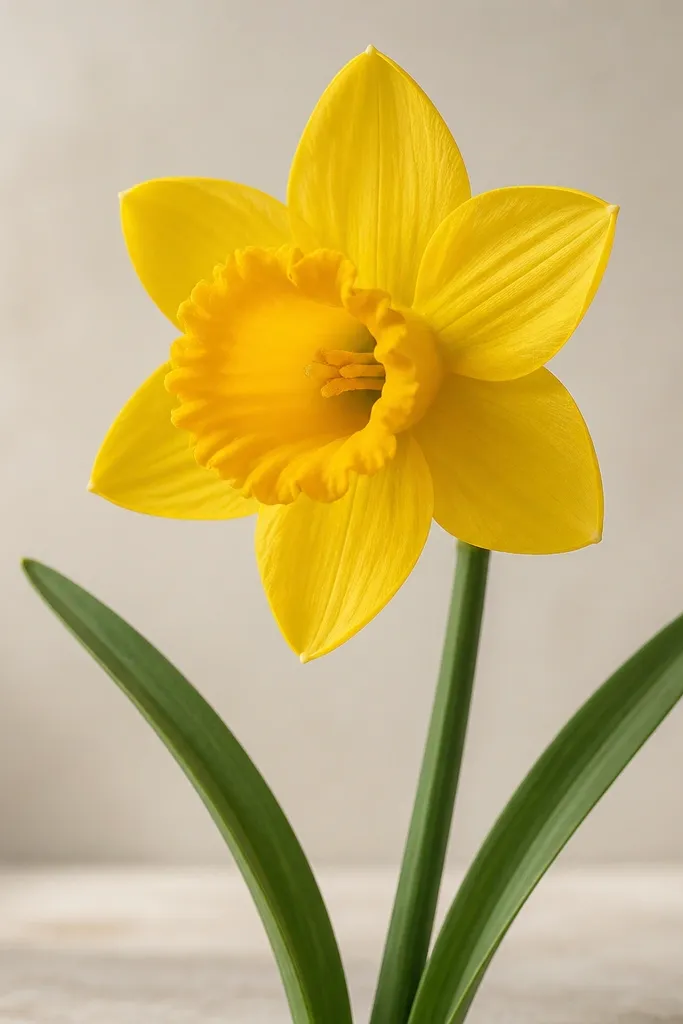
The flower becomes more believable when the leaves don't mirror each other perfectly. I learned this after doing the same daffodil pattern for a group and noticing the ones that looked "real" always had leaf angles that differed. This style uses that trick while keeping the flower drawing simple. The trumpet still anchors the design, and the leaves give it motion. It's a flattering look for kid drawings because even if petal shapes wobble, the leaf angles make the whole plant feel intentional.
Outline the daffodil slightly tilted, then draw the trumpet and six petals in your usual repeat order. Fill petals with yellow marker and deepen the base with a second yellow pass. Color the trumpet with golden yellow and add a small lighter center patch for depth. For leaves, draw one leaf with a leftward curve and one with a rightward curve, then fill both with green and add a darker stripe down the center that follows each leaf's bend.
Good to knowKeep one leaf straighter and one leaf more curved. The contrast makes the stem feel natural.
Common mistakeDon't draw two identical leaves. Symmetry makes it look like a clipart sticker.