1. Watercolor Wash Leaves with Fine Veins
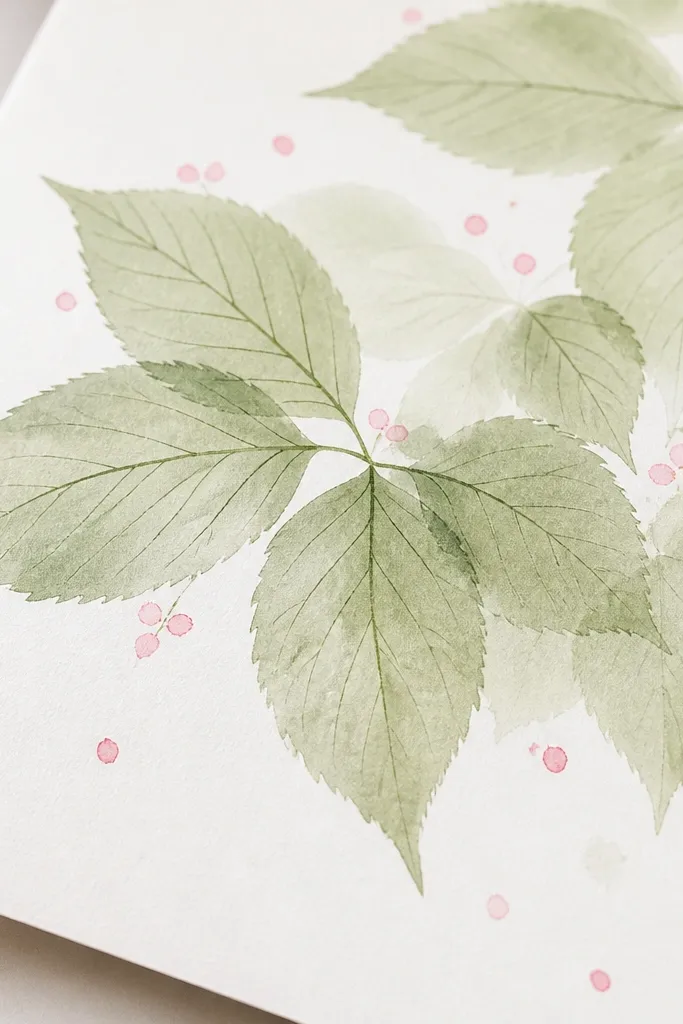
Start with a loose watercolor wash because cherry leaves never look uniformly colored when they’re on a branch. Use a pale green like diluted sap green for the base, then add darker green veins after the wash dries. I like this look for kids because the wash forgives wobbly outlines, and for adults because it reads “garden” without needing perfect symmetry. It flatters light skin tones in photos because the greens stay airy and the pink accents look clean. For a simple wall decoration, it also looks good in a thin frame because the color stays soft.
Step 1: Lightly sketch 10 to 15 leaf shapes with pencil, each one slightly different in size (mix small and medium so it doesn’t look patterned). Step 2: Paint each leaf with a wet brush using pale green, leaving tiny lighter gaps near the center for a natural highlight. Wait until it’s fully dry, then use a fine liner or dark green paint pen to draw one main vein and 3 to 5 side veins per leaf. Step 3: Add cherry blossom cues by dotting small pink circles (or tiny V-shaped petal marks) between the leaves, keeping the clusters to only 2 to 3 spots.
Good to knowIf your pink bleeds into the green, add the blossoms with a cotton swab instead of a brush so you control the edges.
Common mistakeDon’t draw dark veins on wet watercolor — they spread and turn into muddy lines.
2. Crayon Resist Leaves with Pink Marker Blossoms
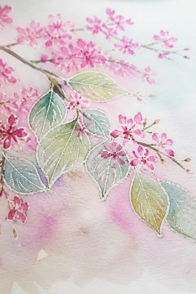
This one looks magical because the crayon resists the paint and leaves crisp leaf edges even if your hand shakes. I use it when I’m making a keepsake card with kids because they can draw freely in crayons first, then the watercolor work is quick. The waxy highlights make the leaves look slightly glossy, like they’re catching light on a spring morning. It flatters the whole page because the white gaps feel intentional, and the pink blossoms pop without needing heavy shading. It’s also great if you want a “winter-to-spring” vibe without drawing a whole tree.
Step 1: Use a light green crayon to draw 12 to 18 leaf outlines with uneven edges, and include a simple center vein line. Step 2: Add a few darker green crayon accents on some leaves by lightly rubbing near the vein so you get variation. Step 3: Paint over everything with a thin watercolor wash (pale yellow-green or very light green), covering most of the page but leaving the crayon lines visible. Step 4: After it dries, use a pink paint marker to add 2 to 4 blossom clusters — each cluster gets 6 to 10 dots, plus 2 or 3 tiny petal dashes.
Good to knowUse a thick watercolor brush and fewer passes over the same spot so the resist stays crisp.
Common mistakeDon’t press the crayon so hard that it creates raised ridges you can see through the watercolor.
3. Tissue Paper Leaf Collage Border
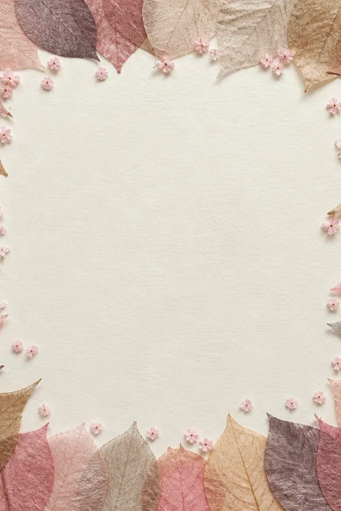
This style looks expensive without being hard. Tissue paper fibers catch light and create natural texture, which makes leaves feel layered even when you keep them simple. I’ve used it for kids' spring bulletin art because it’s forgiving and the border frames everything instantly. The semi-transparency gives a gentle, soft look that doesn’t overwhelm the pink blossoms. It also flatters the page layout because you get a clear focal point in the center — usually a small blossom cluster.
Step 1: Draw a border rectangle on paper and lightly sketch 10 to 16 leaf shapes along the top and sides. Step 2: Cut tissue paper into small leaf-sized pieces: pale green for most leaves and a few darker green pieces for depth. Step 3: Brush a thin layer of glue stick or diluted white glue onto the paper area, press the tissue, then overlap edges by 2 to 3 millimeters. Step 4: Add blossom accents with pink tissue torn into tiny petals or with paint marker dots in the center area.
Good to knowCut tissue slightly smaller than the pencil leaf so the edges don’t turn ragged-looking.
Common mistakeDon’t flood the tissue with glue — it wrinkles and turns dark.
4. Leaf Stencil with Sponge Gradient Veins
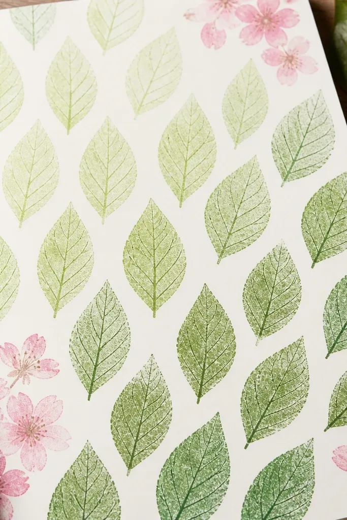
Stenciling is the fastest way to get consistent leaf shapes, and sponge gradients make them feel dimensional. I use this when I need a clean look for a kid’s art wall because the leaves line up without looking like a template. The gradient also hides mistakes — if a child paints unevenly, the sponge texture still looks intentional. It flatters the page by keeping the leaf pattern tidy while the pink blossoms provide contrast. Best for bookmarks, small canvases, and card fronts.
Step 1: Make or buy a simple leaf stencil and place it lightly with painter’s tape so it doesn’t slip. Step 2: Sponge pale green paint within the stencil first, then sponge a little darker green near one side of each leaf for depth. Step 3: After all leaves dry, use a fine marker to add one center vein and short side veins. Step 4: Stamp or dab pink blossoms in 2 corners using a small foam dot or a fingertip with minimal paint.
Good to knowKeep the sponge paint dry on the first layer — wet paint bleeds under the stencil edges.
Common mistakeDon’t stack wet sponges — you’ll get blotchy leaves that look smeared.
5. Overlapping Leaf Silhouettes with Marker Outline
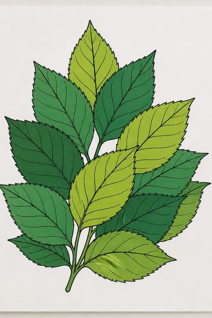
This is my go-to for kids who love coloring hard and fast. Solid silhouettes hide uneven leaf drawing because the outline does the job. The overlap is the secret: cherry blossom branches look crowded, so dense layering makes the drawing read as foliage instantly. It flatters most kids' coloring styles because even thick marker lines still look intentional with this method. The pink blossoms then feel like they’re emerging from the greenery instead of being pasted on top.
Step 1: Draw 8 to 12 leaf shapes as simple ovals with pointed tips, then overlap them so each leaf covers part of the one behind. Step 2: Color the leaves with a dark green marker and press firmly for a solid fill. Step 3: Use a lighter green marker to add a thin edge highlight to some leaves and a fine pen to draw veins only on 5 to 7 of the leaves so it doesn’t get cluttered. Step 4: Add blossom clusters by drawing 3 to 5 tiny petal strokes around a center dot in two or three places.
Good to knowUse only two greens: one dark fill and one lighter edge. More shades make it look muddy.
Common mistakeDon’t outline every single leaf thickly — it turns into a coloring page look.
6. Pencil-First Leaf Veins and Eraser Highlights
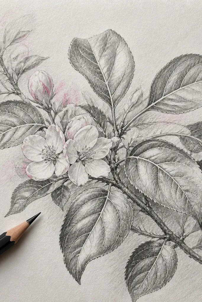
Graphite with eraser highlights looks like real pencil illustration, and it’s shockingly forgiving. You can press hard for shadows and then lift highlights to create the shiny, springy leaf look. I like this when I’m making a calmer, less messy drawing for older kids or adults. The monochrome base makes the pink blossom accents feel special because they’re the only color. It flatters the eye because the veins guide you through the foliage instead of random shapes.
Step 1: Lightly sketch 14 to 20 leaf shapes with a pointed tip and a gentle curved edge. Step 2: Darken the center vein and draw 3 to 6 side veins per leaf, keeping them lighter near the edges. Step 3: Shade under leaf overlaps with pencil — press harder where one leaf sits on top of another. Step 4: Use a kneaded eraser to lift small highlight spots on 6 to 8 leaves, then add pink blossom accents with colored pencil or a light pink pastel smudge.
Good to knowUse a kneaded eraser for highlights — it removes graphite without gouging the paper.
Common mistakeDon’t smudge everything — clean vein lines matter more than heavy shading.
7. Bubble Wrap Leaf Texture Prints
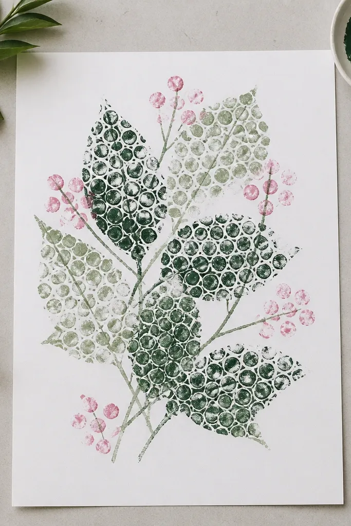
Bubble wrap is one of those supplies that makes texture happen without skill. When you press bubble wrap into green paint and stamp it into leaf shapes, you get a natural speckle that looks like leaf surface. This is a kid-friendly option because it turns the “drawing” into a stamping game, and the leaves come out consistent. The speckled texture also makes the pink blossoms pop because they look smoother by contrast. It’s great for kids who get frustrated by drawing veins.
Step 1: Cut bubble wrap into leaf-size rectangles and lightly trace leaf outlines on paper as guides. Step 2: Paint bubble wrap with green paint (I use a thick tempera or poster paint), then press onto each leaf area to fill it in — overlap edges to build depth. Step 3: Let dry, then add center veins with a dark green marker using 1 main line and 4 short side veins. Step 4: Dip a cotton swab in pink paint and dab 10 to 15 small dots around 2 blossom clusters.
Good to knowPress straight down for texture; dragging makes the print look smeared.
Common mistakeDon’t use watery paint — the bubble marks disappear.
8. Stamp-and-Draw Branch Flow
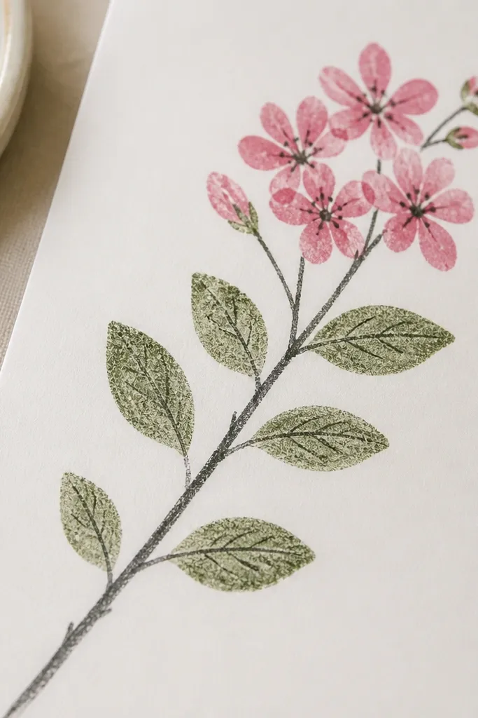
If you want the page to feel like it has movement, draw the branch first and place leaves along its path. Stamping leaves keeps them consistent, and drawing a branch gives you a natural rhythm so the leaves don’t look scattered. I use this for kids because the branch line is a clear target — they can see exactly where each leaf goes. It flatters the page by creating a diagonal composition that looks good in photos. The blossoms then land where the eye already travels.
Step 1: Draw a diagonal branch line with pencil, then trace it with a brown or dark green marker. Step 2: Stamp leaf shapes along both sides of the branch using a leaf-shaped craft stamp in light green. Step 3: Add vein lines to each stamped leaf using a fine liner, keeping veins simple (one center line and 3 side lines). Step 4: At the top third of the branch, add cherry blossoms as 3 to 4 clusters - each cluster has a ring of 6 petal dots around a center dot.
Space leaves so there’s a visible gap between clusters; crowded clusters look best only in one spot.
Don’t stamp leaves on top of each other everywhere — leave breathing room.
9. Masking Fluid Leaf Edges with Watercolor
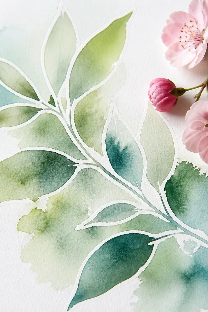
Masking fluid gives you crisp leaf edges that look like you planned them, even if your hand isn’t steady. I use it when I want that “illustration” look: clean whites around the leaf tips and overlaps. It’s best for older kids and adults because masking fluid takes a little patience. The contrast between the crisp whites and soft watercolor makes the foliage read clearly. Pink blossoms look brighter because the background around them stays clean.
Step 1: Sketch a few overlapping leaf shapes and a branch line lightly. Step 2: Paint masking fluid along the leaf edges and around the overlap boundaries where you want white highlights. Step 3: Watercolor the leaves in light green, then tint shadows with a slightly darker green near overlaps. Step 4: Remove masking after the paint dries, then add pink blossoms with a small brush or paint marker for tight clusters.
Good to knowLet watercolor fully dry before erasing masking fluid so you don’t smear pigment into the highlights.
Common mistakeDon’t paint over masking fluid with thick layers — it can peel up with the masking.
10. Green Paper Leaf Border with Drawn Veins
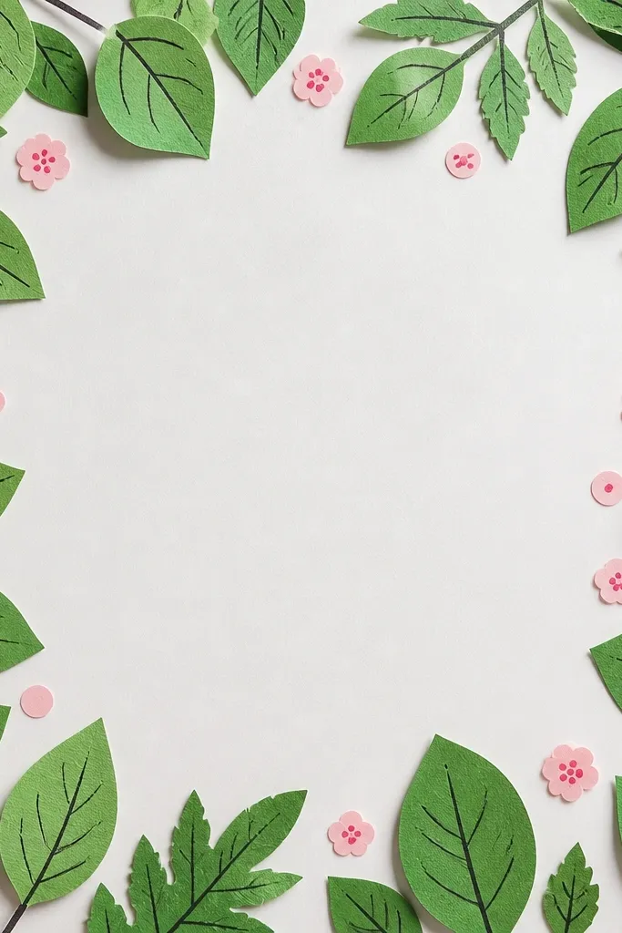
This is the fastest “3D” look without learning complex collage. Cut paper leaves give you crisp edges and a strong shadow line, and drawing veins afterward makes them look botanical instead of craft-store. I like it for birthday invitations and kids' spring posters because it holds up well on a wall. It flatters small spaces because the border frames the page and makes it feel finished. The color also stays consistent, so your pink blossoms match the tone.
Step 1: Cut 18 to 24 small leaf shapes from two shades of green paper: pale and medium. Step 2: Arrange them in a border layout around your page, overlapping edges slightly, then trace where each leaf sits. Step 3: Glue pale leaves first, then layer medium leaves on top in small sections for depth. Step 4: Use a dark green marker to draw center veins and 3 to 5 side veins on the top layer leaves only. Step 5: Add pink blossom dots inside the border using a paint marker.
Good to knowUse a fine-tip marker for veins so the lines stay crisp on paper texture.
Common mistakeDon’t glue every leaf flush — overlapping is what makes it look like a branch.
11. Sumi-Style Ink Leaves with Pink Wash Blooms
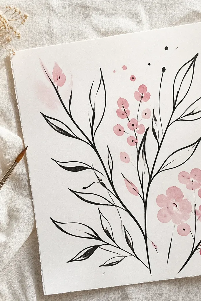
Ink leaves look dramatic even when they’re simple. You get movement from brush pressure, and that makes the foliage feel alive without filling every leaf. I do this for adults or older kids because it needs a steady hand with ink, but the payoff is huge: the leaves look like real botanical ink sketches. The pink wash blooms stay soft, so the page doesn’t turn into a coloring-book mess. It flatters people who like minimal art because it uses restraint.
Step 1: Dip a brush or use a fine brush pen to draw leaf outlines in ink — start thick at the base, lift at the tip for a tapered end. Step 2: Add only 2 to 4 vein strokes per leaf, keeping them light and sparse. Step 3: Let ink dry fully, then watercolor pink behind 2 to 3 blossom clusters, using a very diluted pink so it stays airy. Step 4: Add 5 to 10 tiny petal dots in darker pink at the centers of the clusters.
Good to knowUse paper that handles ink well (heavier than printer paper) so lines stay sharp.
Common mistakeDon’t overdraw veins — too many lines make ink leaves look busy.
12. Marker Dots Leaf Fill with Lighter Center
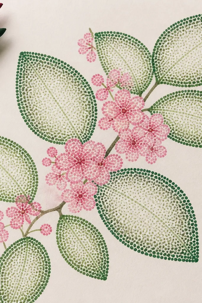
Dot-fill is one of the easiest ways to make leaves look textured without shading. The lighter center trick makes each leaf feel curved, like it has a ridge. I’ve used this for kids who love repetitive patterns because it becomes a rhythm: dot, dot, dot. The style also looks clean in photos because the texture is uniform. Pink blossoms feel brighter since the leaf fill is slightly muted.
Step 1: Sketch 12 to 16 leaf outlines and draw a center vein line. Step 2: Color the leaves with a green marker using dots instead of solid fill, keeping dots denser along edges and thinning toward the center. Step 3: Add side veins as 3 to 5 short lines using a darker green marker. Step 4: Place pink blossom clusters in 2 spots by dotting 8 to 12 dots in a tight group and adding 2 tiny petal dashes around them.
Good to knowUse a darker marker only for veins and edges; keep the dot fill one shade lighter.
Common mistakeDon’t fill every leaf edge with maximum density — variation makes it look natural.
13. Tape-Resist Leaf Shadows with Watercolor
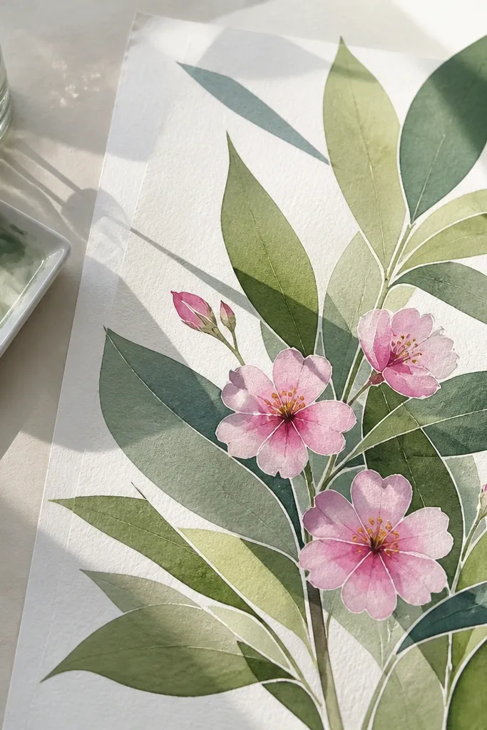
Tape-resist is the quick cousin of masking fluid. You can create clean “shadow boundaries” between overlapping leaves, which is what makes the foliage look layered. I use this when I want a crisp, graphic look but don’t want the mess of masking fluid. It’s great for kids because tape is forgiving and the result looks planned even if the leaf outlines are rough. Pink blossoms land cleanly because the tape keeps background edges sharp.
Step 1: Sketch your leaf cluster with pencil and decide where overlaps happen. Step 2: Place thin masking tape strips along the overlap boundaries, leaving tape edges slightly offset so you get a thin white line. Step 3: Watercolor the leaves in light green, then add darker green shadows in the lower portions of leaves. Step 4: Remove tape once dry, then paint or marker 2 blossom clusters in bright pink.
Good to knowPull tape at a low angle so you don’t tear the paper fibers.
Common mistakeDon’t let watercolor dry on top of tape for a long time — it can seep under and blur.
14. Salt-Sparkle Leaf Edges
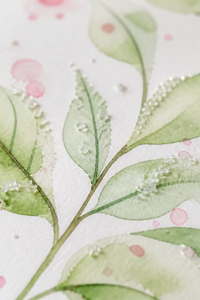
Salt creates random sparkle that looks like dew on fresh spring leaves. It’s a texture trick that doesn’t require drawing skill, and it makes the whole page feel special. I like this when making a winter-to-spring transition piece for kids because it turns “simple leaves” into something that feels magical. The sparkle also makes pink blossoms look more saturated by contrast. Adults can keep it subtle by using only a few salted areas near leaf edges.
Step 1: Lightly sketch 10 to 14 leaf outlines and wet just the leaf area with clean water. Step 2: Paint light green watercolor, then sprinkle a pinch of salt on the wet edges only (not the whole leaf). Step 3: After it dries and you brush off salt, add vein lines with a dark green marker. Step 4: Add pink blossoms as small dot clusters in 2 places, keeping them lighter than the leaf edges so they don’t fight the sparkle.
Use fine salt crystals for tiny sparkle; big crystals look grainy.
Don’t touch the salted wet paint with your fingers — it smears the crystals.
15. Clipped Paper Leaves with Torn Pink Bloom Centers
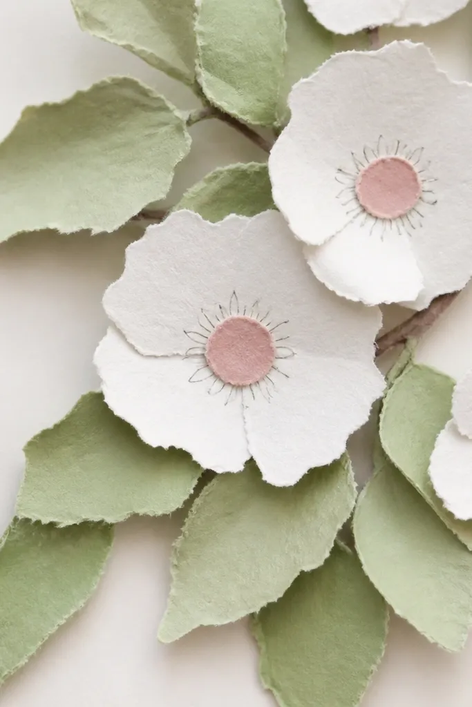
Torn paper centers give you a texture that pencil and marker can’t. The leaves look crisp because they’re cut, and the blossoms look soft because they’re torn. I do this for kids because it mixes “precision” and “messy fun” in one sheet, and nobody gets stuck on drawing perfect petals. It flatters a wide range of ages because the leaf veins can be as detailed or as simple as the kid wants. The torn pink centers also make the blossoms look layered even without drawing lots of petals.
Step 1: Cut 16 to 22 green leaf shapes, mixing pale and medium green. Step 2: Glue leaves in overlapping clusters and leave slight gaps between some leaves so the background shows through. Step 3: Tear small pink paper circles for blossom centers and glue them into 3 clusters. Step 4: Use a pink crayon or marker to draw 6 to 10 tiny petals around each torn center, then add a few short green leaf vein lines on top leaves.
Good to knowTear pink paper a little bigger than the center and then glue the center portion — it gives a soft halo.
Common mistakeDon’t glue the torn centers too flat with no outline — they disappear into the background.
16. Leaf Border with Patterned Vine Lines
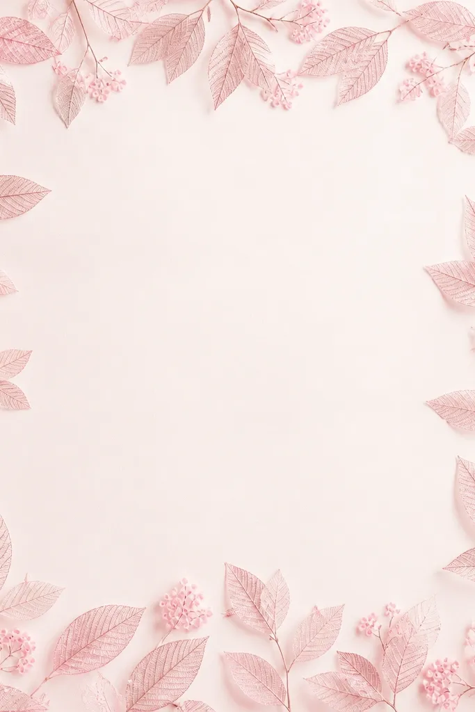
Patterned vine lines make the leaves feel like a print, not a one-off drawing. I love this for kids because they can pick a “line pattern” and repeat it consistently across the border. It flatters the page by giving structure: the border frames the center so the blossoms feel intentional. Pink blossoms as dot rings also look cute and readable at a distance. This style works well for posters, place cards, and craft-store gift tags.
Step 1: Draw a border rectangle and sketch 20 to 26 leaf outlines along the edges, keeping them all pointing inward. Step 2: Choose one vein style and repeat it: draw a center line, then add alternating short strokes on each side like a feather. Step 3: Color leaves lightly in green crayon or marker, then darken only the vein lines with a darker green pen. Step 4: Add pink blossom rings inside the border — each ring is 10 dots with a small center dot.
Good to knowPick one vein style and stick to it; mixing styles across the border looks chaotic.
Common mistakeDon’t overcrowd the border with too many leaves — leave gaps for blossoms.
17. Cherry Blossom Leaf Corner Frame with Negative Space
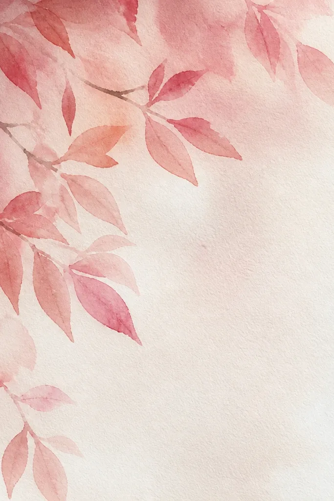
Negative space makes this look modern and clean. By keeping the leaves in one corner, the drawing reads as deliberate composition instead of “filling the page.” I use it when I’m making a card because the blank space gives room for a message or a child’s name. It flatters smaller kids' drawings because you don’t need to cover the whole sheet to make it look finished. The pink blossoms also feel more special since they’re not competing with dense foliage.
Step 1: Choose a corner and sketch 8 to 10 overlapping leaf shapes clustered tightly, with some leaves pointing toward the center of the page. Step 2: Draw veins on only half the leaves — the rest stay simpler so the corner doesn’t get busy. Step 3: Color the leaves with two greens, leaving a few lighter highlights uncolored. Step 4: Add 2 blossom clusters near the edge of the leaf cluster, using pink dots plus 2 to 3 short petal strokes.
Good to knowUse a larger blank area than you think you need; the corner effect looks best with obvious breathing space.
Common mistakeDon’t spread leaves across the whole page — the negative space is the point.
18. Paper Cutout Leaves with Chalk Pastel Veins
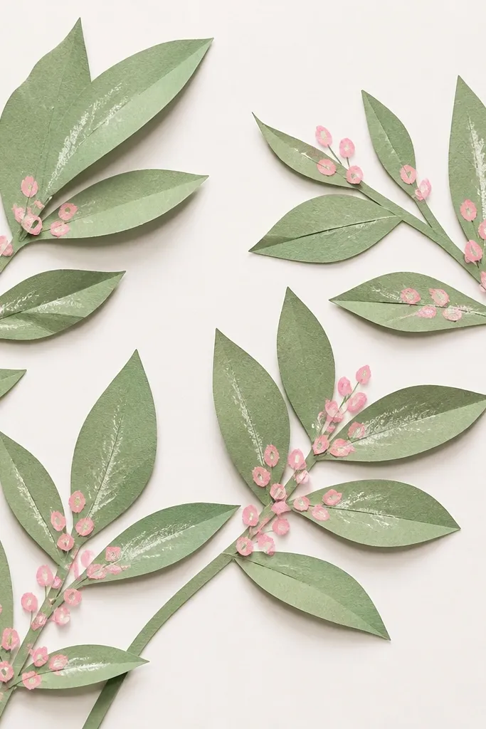
Chalk pastel veins add a soft, powdery look that feels like spring air. The cutout leaves give crisp silhouettes, and the pastel adds depth without heavy coloring. I like this for older kids because they get to control how much pastel shows, and the result looks like a mixed-media illustration. It flatters the eye by keeping veins visible but not harsh. Pink blossoms on top look bright and clean because pastel stays soft.
Step 1: Cut 14 to 18 leaf shapes from green paper and layer them on a light sheet, gluing only the center area so edges lift slightly. Step 2: Use a dark green pastel to rub along where veins go, starting lightly and building only on the top layer leaves. Step 3: Draw a few crisp veins with a fine green marker to anchor the look. Step 4: Add pink blossom dots and tiny petal marks on top of the leaves so the flowers look attached to the foliage.
Good to knowFix pastel gently with a light mist of fixative if you’re going to handle it a lot.
Common mistakeDon’t rub pastel over your finger — oils smear and dirty the background.
19. Monochrome Green Leaves with One Hot Pink Blossom
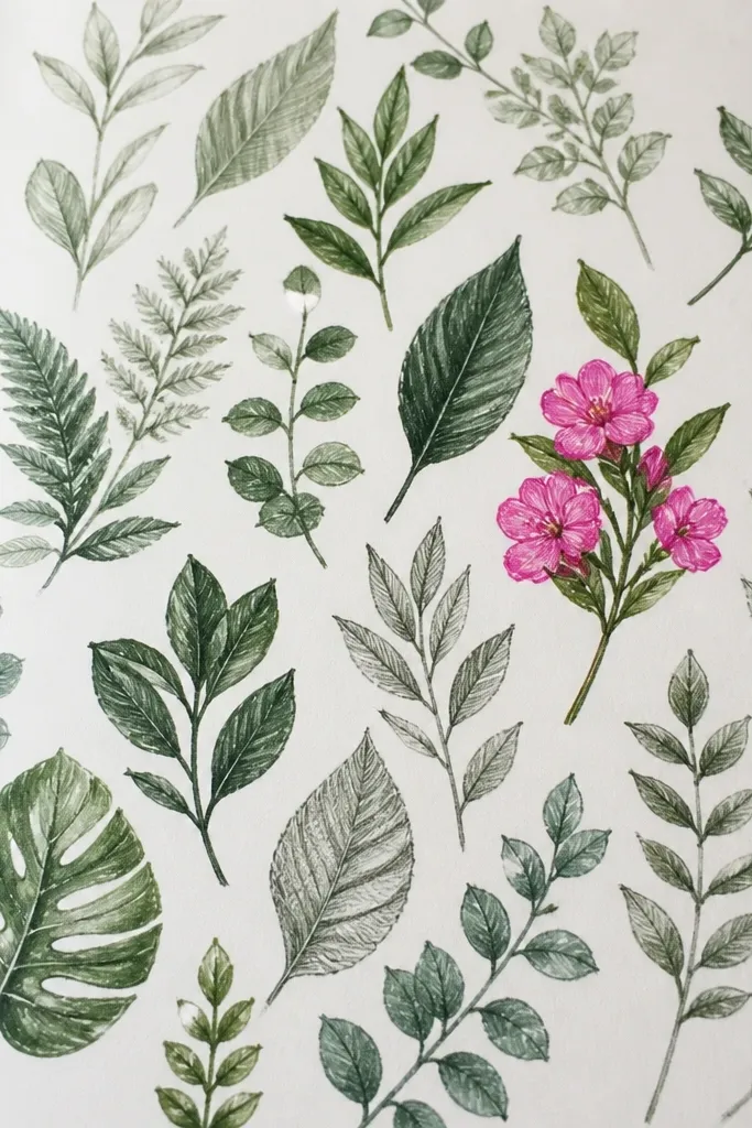
This is the style I use when I want the art to look grown-up even though it’s made with simple supplies. By keeping everything green and making only one blossom cluster hot pink, the eye has a clear focal point. I’ve watched kids get excited because they’re not asked to color the whole page equally — they just make one “star” blossom cluster. It flatters the composition by reducing clutter and making the leaves feel like a pattern. It also works for photos because the pink reads instantly.
Step 1: Draw 18 to 24 leaf shapes across the page, using pencil for outlines and two greens for shading (light and dark). Step 2: Add veins with a fine marker, but vary the intensity — some leaves get detailed veins, others only a center line. Step 3: Keep background mostly blank and add light shadow under overlaps with pencil. Step 4: Add one blossom cluster in hot pink with 5 to 8 petal strokes and a center dot, placed near the upper third of the page.
Good to knowChoose one pink shade and commit; mixing pinks makes the focal point less sharp.
Common mistakeDon’t sprinkle pink everywhere — one cluster is what makes it feel intentional.