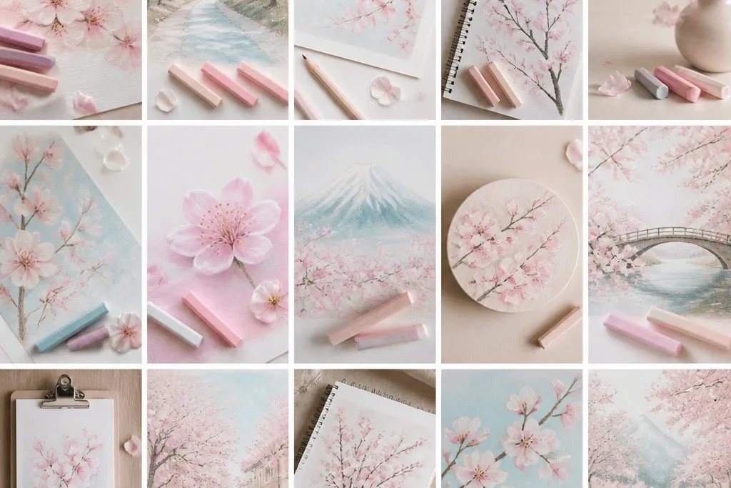
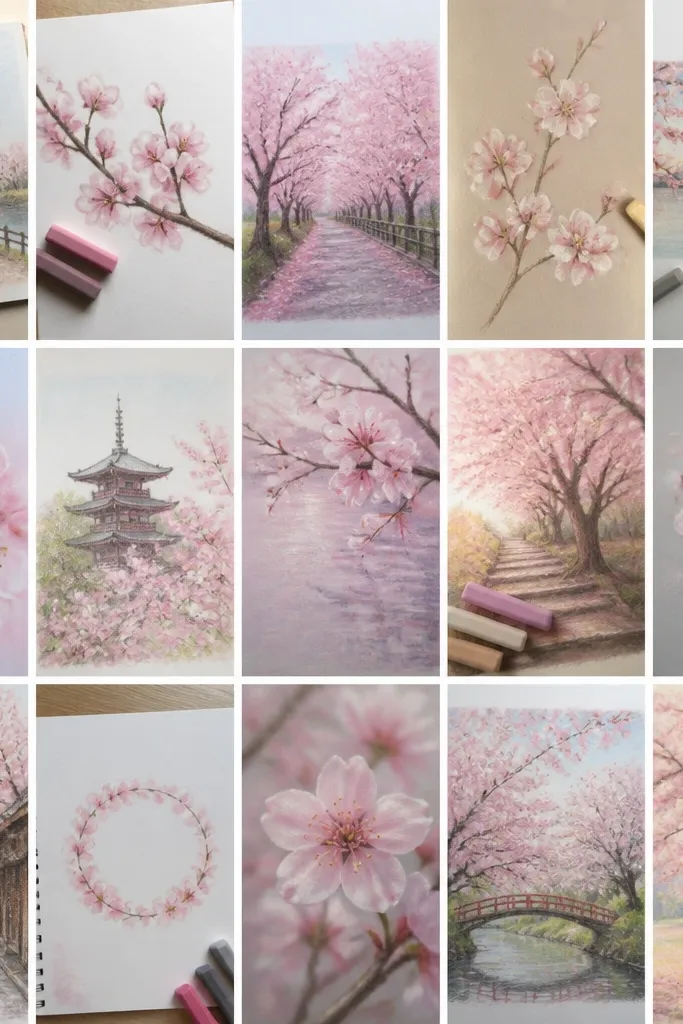
1. Peach Puddle Blossoms on Cream Paper
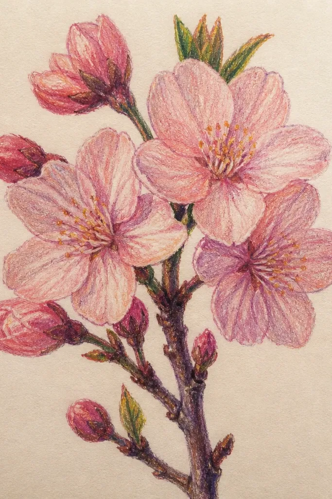
This one works because peach behaves like warm light. I use a cream paper or off-white sketchbook page so the pastel has something friendly to sit on — it prevents the petals from looking gray. Start with light peach across the petal shape, then add a medium blush band near the lower edge. The centers get a tiny warm ochre dot so the blossoms feel alive without turning into heavy “sun” shapes. This drawing flatters warm-toned kids' hands and looks great for birthday pages because it reads cozy, not dusty.
First, sketch a simple branch with a light gray-green pastel pencil — keep the line thin and slightly wavy. Then draw 10-15 petal shapes as small teardrops, but leave the middle area lighter. Next, layer light peach all over the petals, then add blush only along the bottom half of each petal. Finally, tap warm ochre into the center using the pastel tip and blend with a fingertip for one second only — stop before it smears.
If your pastel looks streaky, rub the pencil tip on a scrap paper once, then start again on the drawing.
Avoid pressing hard on the first color pass or the petals go chalky and look dirty.
2. Lilac Mist Blossoms with Powder-Blue Sky
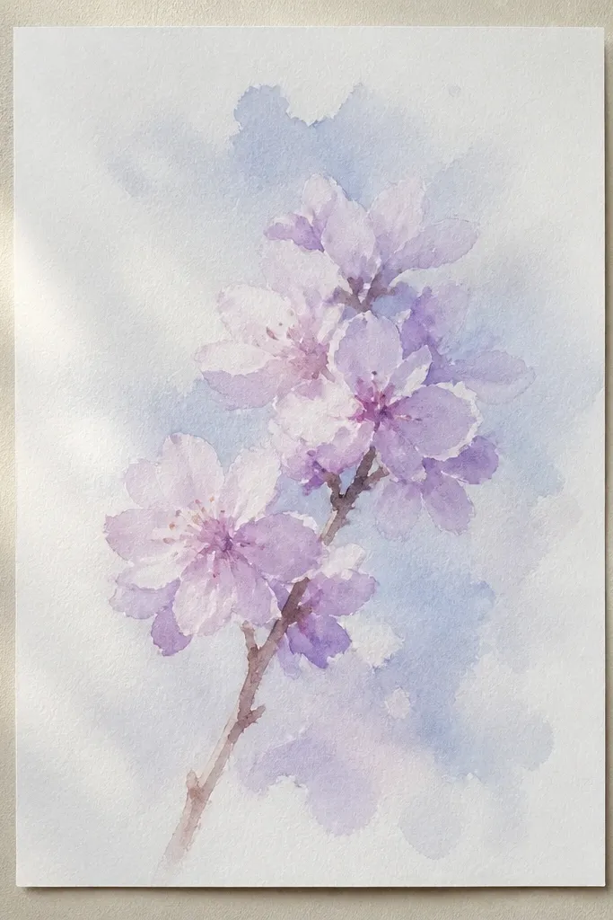
Lilac + powder blue gives that “morning air” look you see in soft sketchbook posts. I like this idea for kids because the background wash makes the blossoms pop even if their petals aren’t perfectly shaped. Use a very light sky so it doesn’t fight the pastel; the blossoms should look like they are floating in the air. The branch stays cool gray so it feels distant and delicate. This color pairing looks flattering on cooler skin tones too — it reads calm and clean on the page.
Start by tinting the background with a very light powder-blue pastel, rubbed in horizontal strokes. Keep the sky faint at the top and slightly stronger at the bottom so it feels like depth. Next, sketch the branch in cool gray with thin lines and a few tiny side twigs. Then layer lilac on each blossom cluster using short, circular touches rather than full strokes. Finish by using a cream pastel pencil to add tiny highlight gaps between petals.
Good to knowPress the pastel down lightly on the sky, then stop — you want a veil, not a solid block.
Common mistakeDon’t outline the petals in dark purple; it makes the blossoms look like stickers.
3. Two-Tone Petal Gradient Blossoms
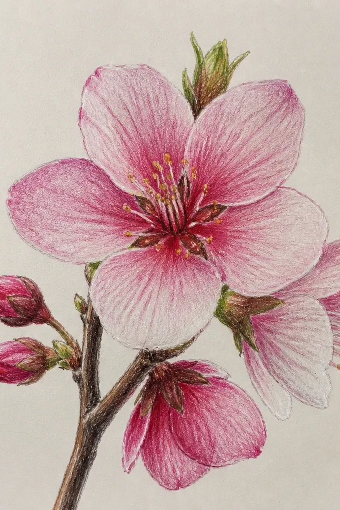
This drawing looks soft because each petal has a built-in light source. I do the gradient by placing one color on the top third and another color on the bottom two-thirds, then blending only at the boundary. The result is a petal that looks rounded instead of flat. I use light pink for the top and rose or deeper pink for the bottom, depending on what’s in your set. This style is great for showing kids that shading isn’t scary — it’s just “two colors in the same shape.”
First, draw the branch with a medium-light gray-green pencil and keep the trunk line unbroken. Then make blossom clusters as simple five-petal shapes, enough to guide the shading. Add light pink to the top third of each petal — barely touch the paper so it stays translucent. Next, add deeper rose to the bottom two-thirds and blend the meeting area with a paper stump. Finally, tap a tiny cream dot in each center and leave a couple white slits for shine.
If the blend turns muddy, stop blending and leave it — the boundary will still look natural.
Avoid blending the entire petal until it’s one flat color.
4. White-Glow Blossoms with Bare Center Spots
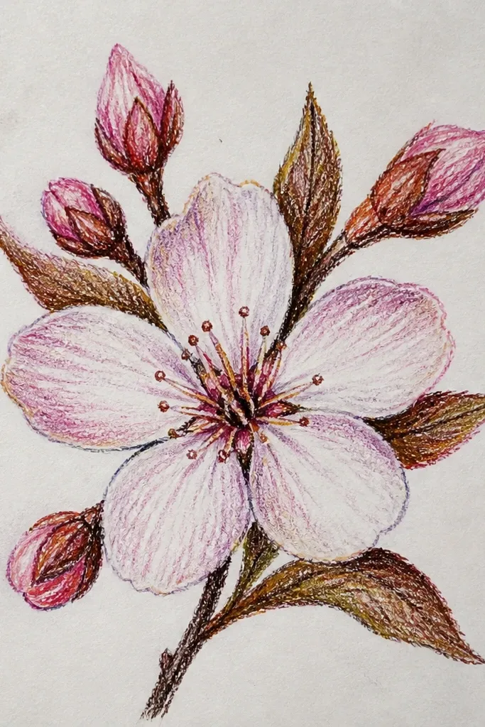
This is my go-to when pastel dust makes everything look dull. The key is leaving bare paper not only between petals, but also as little “glow” centers. I use a pale pink base and then layer a whisper of deeper pink at the petal edges, keeping the center almost untouched. The branch can be slightly darker because the blossoms already have bright highlights. This looks especially good for kids because the white spots are a clear target — they know exactly where to stop coloring.
Start with a branch drawn in gray-green, slightly thicker near the base. Then sketch blossom cluster circles lightly so you don’t overwork the petals. Add pale pink across the petals, but keep a small center circle and a few slits completely blank. Next, add deeper pink only around the outside edge of each petal. Finish by adding a tiny dot of cream at the very center and lightly rubbing the edges of the petals with a stump.
Use a clean paper towel corner to lift pastel from one spot if you accidentally colored the center too much.
Don’t cover the whole blossom with pink — the glow disappears.
5. Corner Frame Cherry Blossom Branch
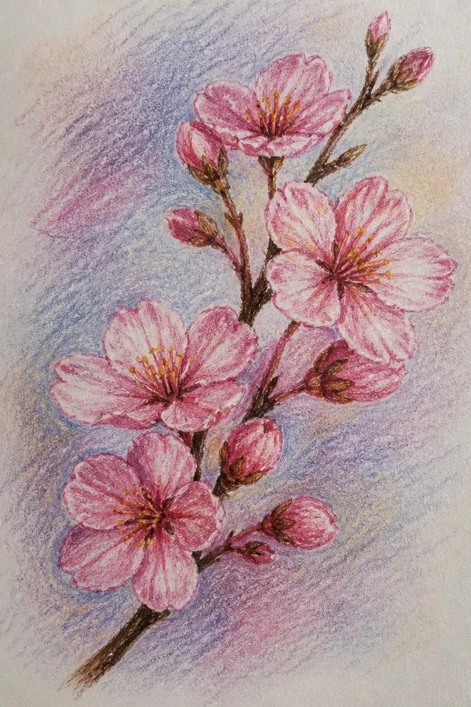
Framing is how you make a simple drawing look intentional. I place the branch in one corner so the blossoms feel like they’re growing into the page, not floating randomly. Use soft pink petals with a faint lavender shadow under the petals so they look layered without heavy outlines. The blank space gives kids confidence because they don’t have to fill the entire page. This also works for cards because you can write on the untouched area.
First, lightly mark where the branch enters the page — bottom-left corner is my favorite — then draw the line upward with a slight curve. Place 3-4 blossom clusters along the branch, leaving big gaps between clusters. Color petals in light pink, then add lavender under each petal edge so the shadow sits consistently. Finally, add two or three tiny bud shapes on the branch using a pale green-gray pastel. Keep the background untouched except for a faint dusting near the blossoms.
Good to knowIf the branch looks too stiff, drag your pastel pencil once along the branch line and then stop. One pass is enough.
Common mistakeAvoid scattering blossoms across the whole page; corner framing needs breathing room.
6. Cherry Blossom Rain Drops on Pastel Wash
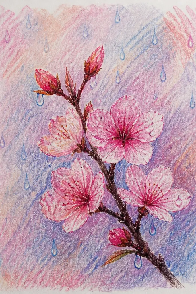
Rain drops add movement, and pastel handles movement well when you leave white space. I do a light pink wash first, then draw blossoms on top while the wash is still faint. The rain drops are simple white lines that break up the background, so even kids with messy coloring can make it look magical. Use a thin branch so it doesn’t compete with the rain effect. This style feels “spring day” and looks great for classroom projects and quick cards.
Start with a light pastel wash using pale pink and a touch of cream, blended in gentle circles. Sketch a thin branch in gray-green and add blossom clusters with five-petal shapes. Color petals with light pink, then add a little rose at the bottom edges. For rain, use a white pastel pencil or gel pen to draw short vertical streaks, then add a few small dots between them. Finish by tapping a tiny highlight at the top of some drops near the petals.
Good to knowIf you use oil pastel for the wash, wait until it sets before drawing rain with a white pencil.
Common mistakeAvoid heavy outlines around the blossoms; the rain already gives contrast.
7. Soft Branch Only with Petal Confetti
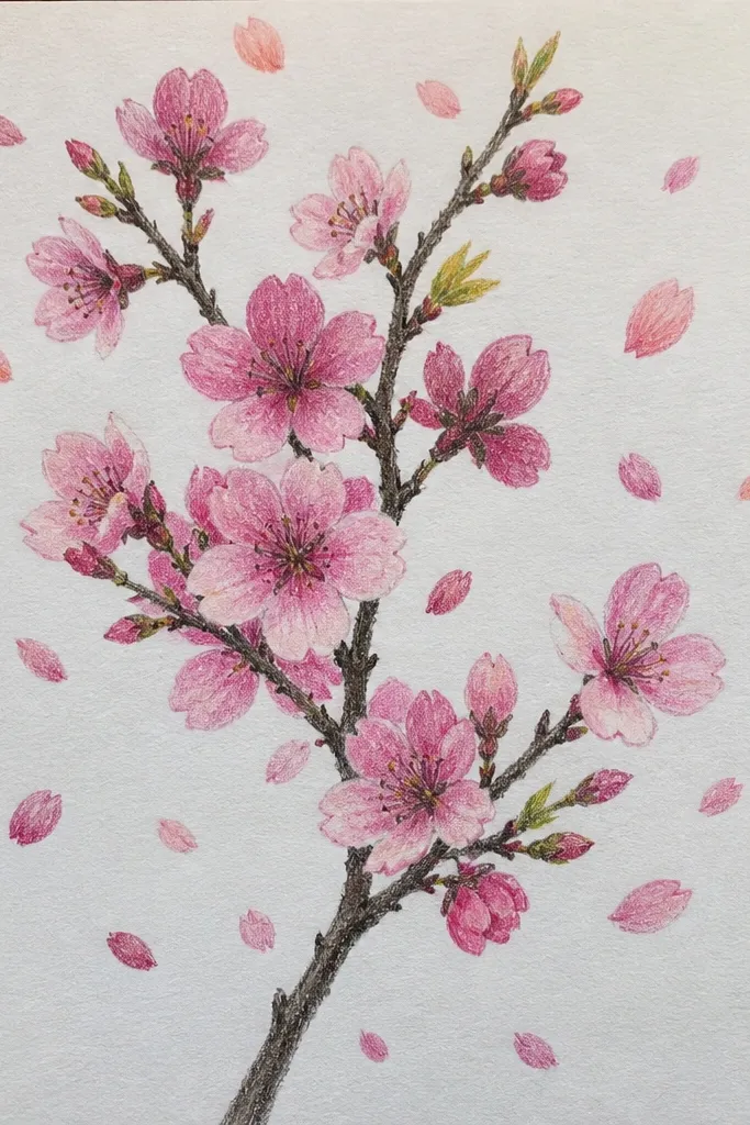
This is the cleanest way to make pastel blossoms look grown-up. You keep the branch simple, then you sprinkle petals like confetti — not clustered too tightly. I use three pink tones only, and I keep petals small so the page stays airy. This works for beginners because you’re not trying to shade every petal perfectly. It also looks good for kids because the confetti placement is a fun “scatter” task.
First, draw the branch with a light gray-green pastel, keeping it to one main curve. Add 2-3 small blossom clusters near the top or center. Then scatter 25-40 tiny petal shapes across the rest of the page, spacing them so they don’t overlap. Color half the petals light pink and the other half blush, leaving white paper showing in the middle. Add a few deeper rose petals only near the branch so the eye has a focal area.
Use the pastel tip like a stamp for small petals — one press, one shape.
Avoid making every petal the same size; tiny variety looks more natural.
8. Cupcake-Pink Blossoms with Warm Centers
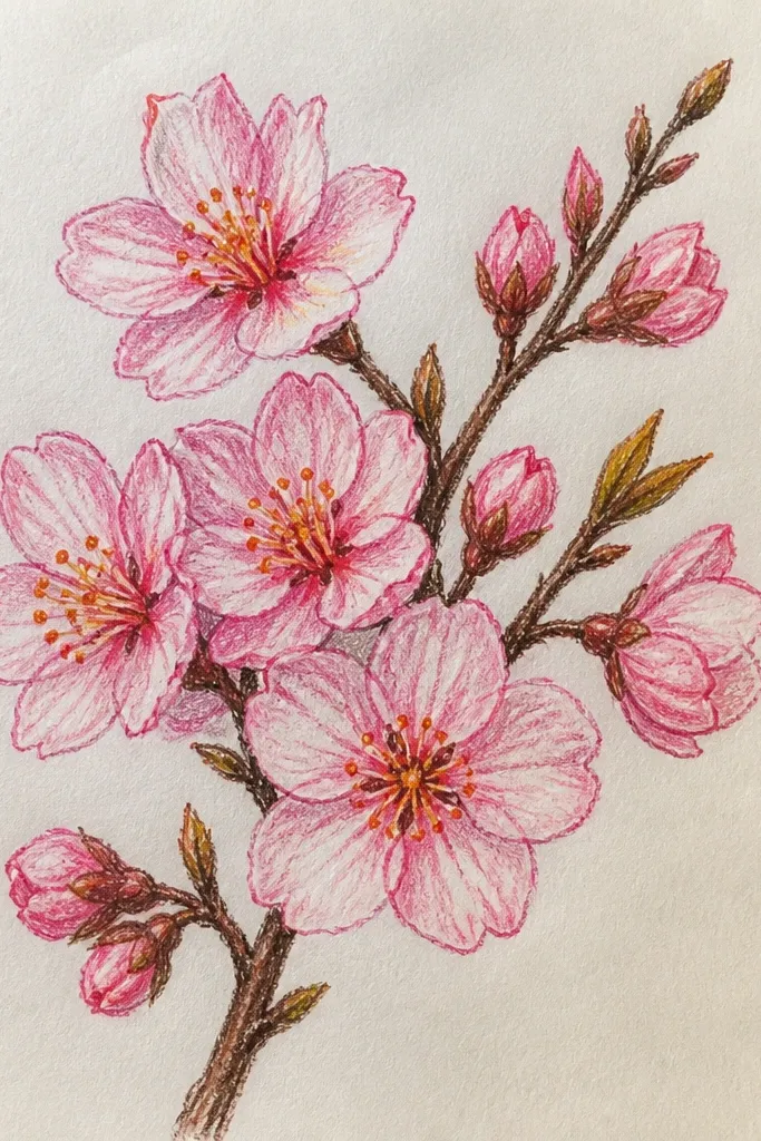
Warm centers make blossoms feel like they’re smiling. I use cupcake pink across the petals and then add a slightly darker pink only where petals overlap. The center gets warm amber or pale orange, which reads like pollen without getting messy. This drawing is flattering for kids because it’s forgiving — the center color hides uneven petal shading. For cards and party art, it looks sweet without being neon.
Start with a light beige wash in the background using cream and a whisper of ochre. Draw the branch in gray-green and keep the twig lines thin. Create blossom rosettes with overlapping petal arcs instead of separate teardrops. Color petals in cupcake pink, then blend gently with a stump at the overlap lines. Finish by tapping warm amber in the center and adding two tiny highlight dots with a white pastel pencil.
Good to knowIf your center gets too dark, rub a clean stump through it and lift some pigment off.
9. Cool Gray Branch with Rose Petal Shadows
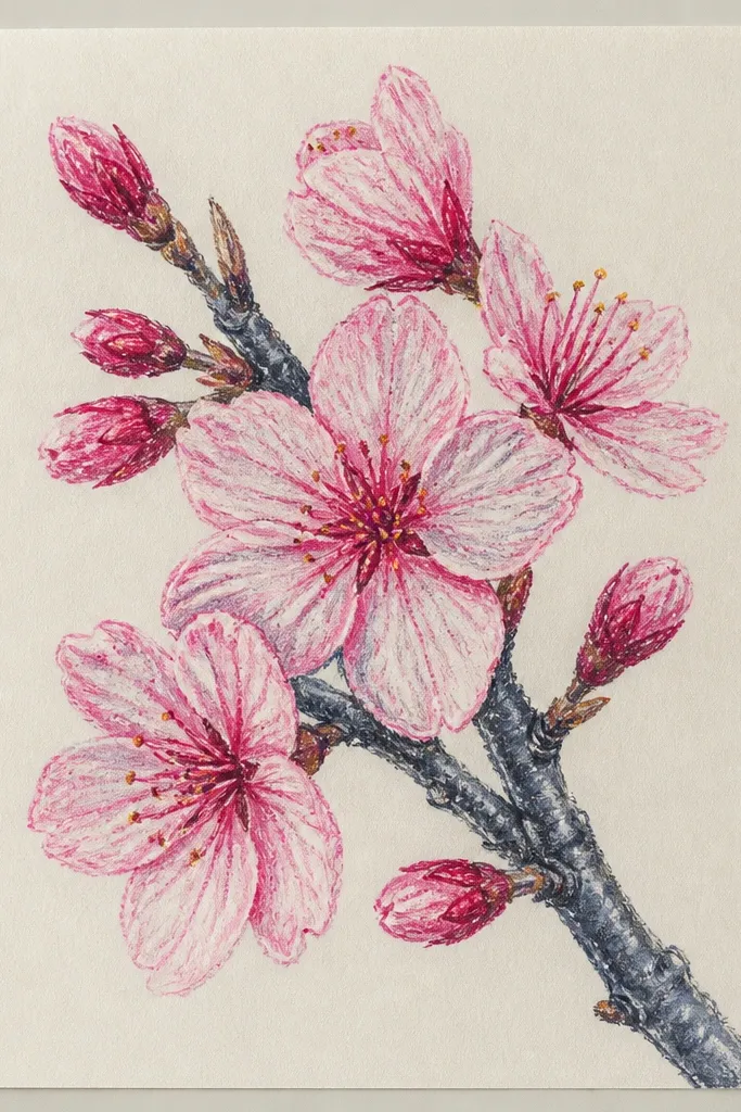
This one looks soft because you’re using shadows, not outlines. A cool gray branch keeps the scene calm, and rose shadows add depth without turning the blossoms heavy. I keep the petal base very light, almost translucent, so the rose shadow reads like a gentle fold. This style is great when you only have a few colors — it uses light pink, one rose, and cool gray. It also looks good for older kids learning shading because the shadow placement is consistent.
First, draw the branch in cool gray and add small side twigs. Place blossom clusters with light pink as five small petals. Add rose only along the bottom edge of each petal, leaving the top edge pale. Blend the rose shadow slightly with a stump, but keep the petal edge defined. Finally, add a tiny cream dot center and a few white gaps between petals for sparkle.
Make your shadows all point the same direction; it makes the page look intentional.
Avoid using dark outlines around petals — it breaks the softness.
10. Blended Background Halo Behind Blossoms
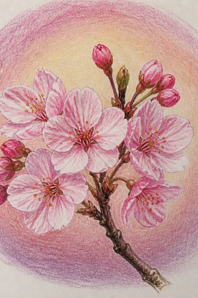
A halo makes pastel blossoms look like they’re lit from behind. I use a very light background haze so the petals still stand out. When you blend the halo outward and keep it lighter than the petals, the whole drawing feels dreamy without getting blurry. This is a great project for kids because the halo is forgiving — it’s meant to be soft. It also makes the blossoms look more dimensional even if your petals aren’t perfectly symmetrical.
Start by drawing the branch and a few blossom clusters in light pink. Then choose one blossom cluster as the “main” and lightly color around it with pale lavender, staying outside the petals. Next, blend pale pink outward in a wider circle around the lavender, leaving the petals brighter and cleaner. Use a stump or tissue to smear outward only — stop at the petal edges. Finish by adding deeper rose at the petal overlap areas and a cream center dot.
Good to knowWork from outer edges inward for the halo so you don’t accidentally darken the petals.
11. Pastel Pencil + Water Brush Petals
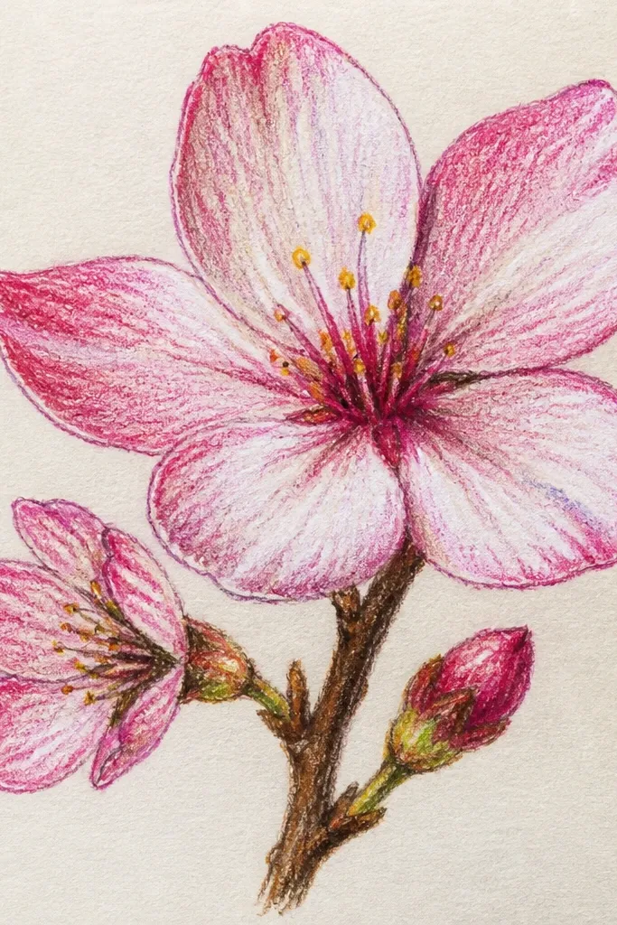
This hybrid method gives you soft petals with clean shapes. I shade the petals lightly with pastel pencil, then touch a water brush lightly to spread the pigment just a bit. The pigment blooms where you want it, but it doesn’t turn into a full watercolor wash if you keep the water minimal. The branch stays dry pencil so it looks crisp and separate from the airy petals. This looks great for kids who like “magic” effects, and it also makes the drawing feel more polished.
First, sketch the branch and blossom outlines in a gray-green pastel pencil. Color the petals with light pink pencil in the petal shape only. Then use a water brush with almost no water — touch the petal once and lift. Let it sit and dry for a minute before adding rose to the lower edges with dry pencil. Finish with a cream center dot and a few white gaps so it still looks airy.
Test your water brush on scrap paper first; too much water makes the whole page bleed.
12. Crayon Resist Blossoms on Pink Wash
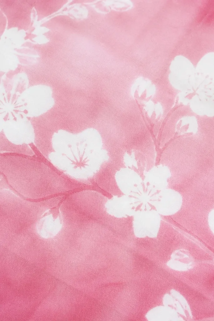
Resist effects look tricky but they’re simple. You use a white crayon to mark petal highlights and blossom centers, then paint or wash over the page with light pink pastel. The wax resists pigment so you get clean, bright whites even if the wash goes messy. Kids love this because the “surprise” moment is instant. This style also helps with softness because the wash is smooth and the resist keeps the blossoms from turning chalky.
First, draw the branch in light gray-green pastel pencil. Then use a white crayon to sketch blossom centers and a few highlight lines within each petal. Apply a very light pink pastel wash over the entire blossom area — keep it translucent. Use a tissue to gently blend edges, but don’t rub over the resist too hard. Once dry, add deeper rose at petal edges with pastel pencil and darken the branch slightly with gray-green.
If your resist lines disappear, your wash is too thick — use lighter layers.
13. Tree Branch with Buds and Partial Blossoms
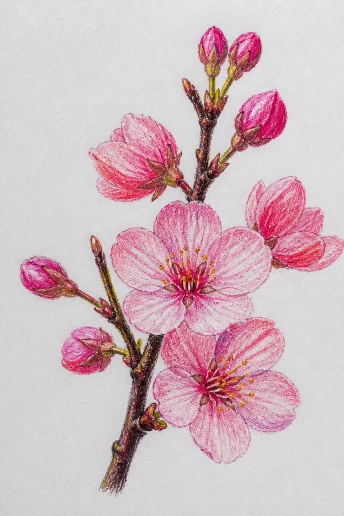
Mixing buds with open blossoms makes the drawing look like a real tree, not a pattern. I keep buds smaller and slightly less pink so they recede a bit, while open blossoms get the softest highlights. This gives depth even on a flat page. The color plan is simple: pale green or gray-green for buds, light pink for open petals, and rose only at petal overlaps. This also works well for kids because “buds” are easier shapes than full blossoms.
Start by drawing a branch with a few side twigs, using gray-green pencil. Add buds as small teardrops along the twigs, colored pale green and lightly shaded with blush. Then place open blossoms where you want the focus, with five rounded petals. Color open petals light pink, add rose at the lower edges, and blend lightly. Finish with cream center dots on open blossoms and leave the buds mostly unblended.
Good to knowMake the open blossoms bigger than the buds by at least 1.5x so the eye has a clear focal point.
14. Petal Overlap Study with Tiny Rose Edges
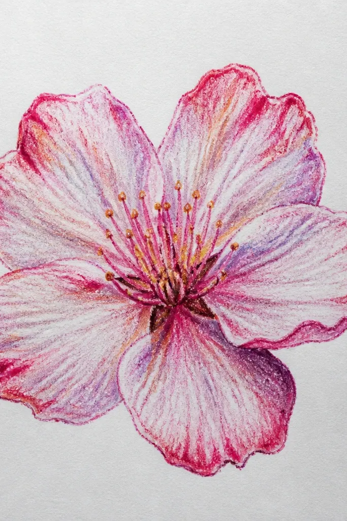
This close-up helps you learn softness through structure. When petals overlap, you can keep the base pale and use tiny rose edges to show the fold. I like this for older kids and teens because it teaches the idea of layering without drawing intimidating realism. The effect is soft but also crisp — like petals you can almost touch. It’s also a great way to use limited colors because you’re repeating the same edge technique.
First, sketch one blossom cluster larger than usual so you can see the overlap. Color all petals light pink across the main area, leaving highlights as blank slits. Add rose only on the outer edge where one petal sits on top of another, using the pastel tip for thin lines. Blend the rose edge outward by a few millimeters with a stump. Finish with a tiny cream center dot and a couple of darker specks for pollen.
Good to knowUse a darker color only at edges; it keeps the center from looking heavy.
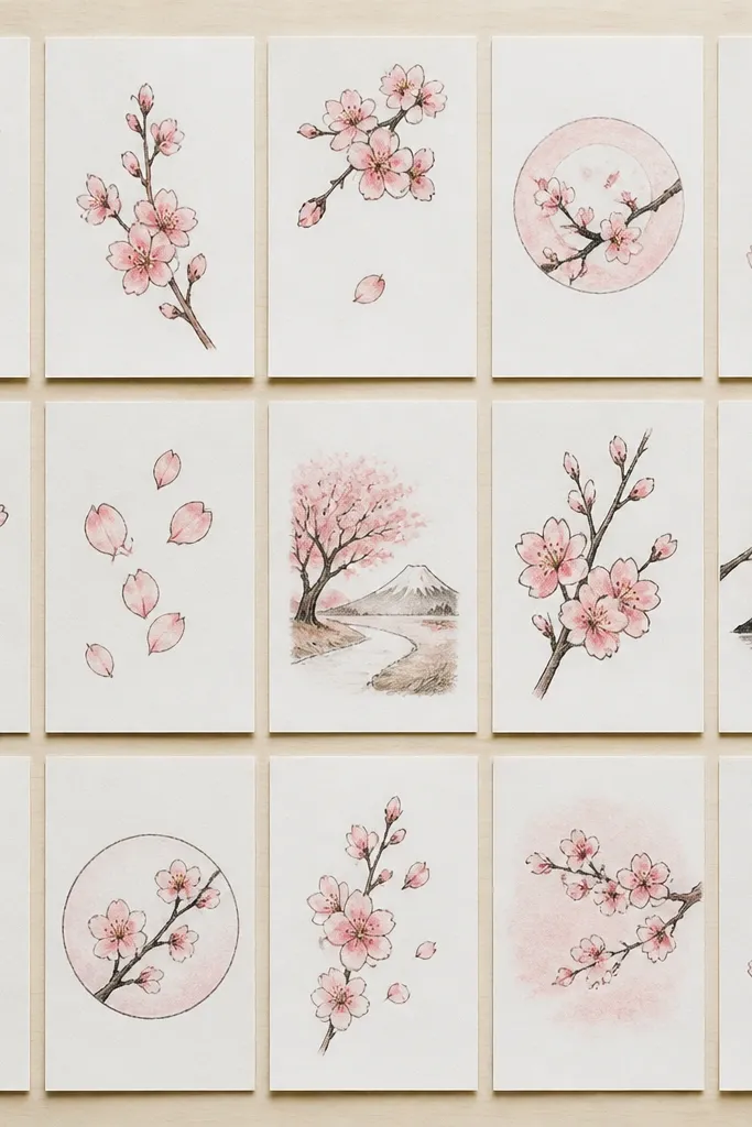
15. Cherry Blossom Wreath on White Space
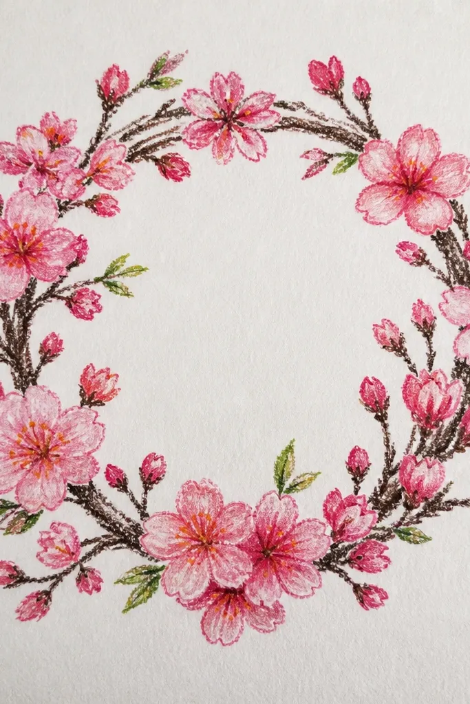
A wreath looks fancy even when you keep it simple. The white space inside the circle keeps it light, and the blossoms placed around the rim look like they’re framing a photo or message. I use light pink petals and add lavender under petals facing inward so the wreath feels dimensional. The branch lines are thin and consistent, so it doesn’t turn into a scribble. This is flattering for kids' art displays because it reads like a finished decoration, not a random page.
First, lightly draw a circle guide with a pencil or faint marker — you can erase later. Then draw a thin branch curve around the circle, adding tiny twigs at intervals. Place blossom clusters around the rim, keeping the blossoms spaced so they don’t touch. Color petals light pink, add lavender shadows on the inner side of each petal, and leave small white gaps. Finish by dotting cream centers and lightly blending only within the petal shapes.
If your circle looks shaky, trace a round object for the guide, then draw the branch freehand over it.