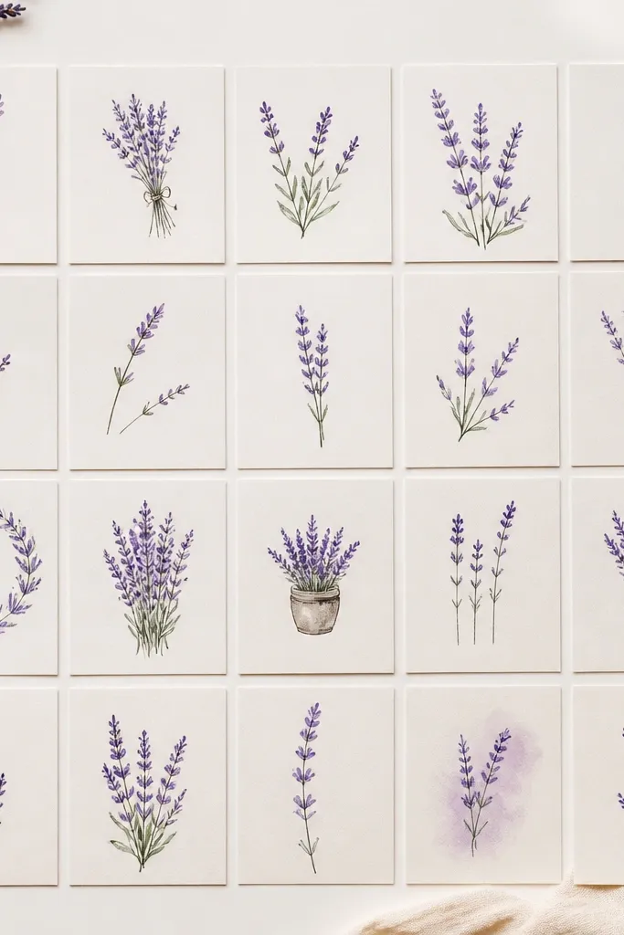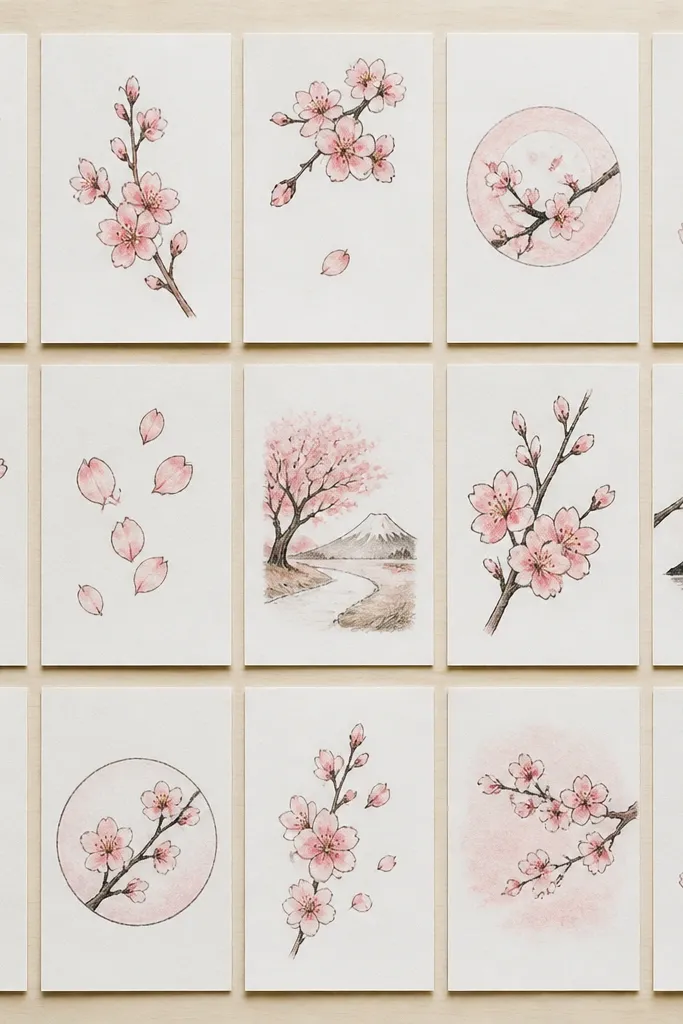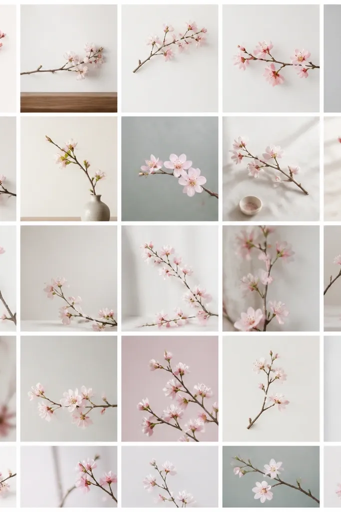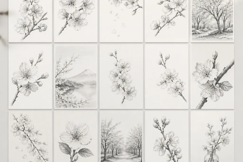
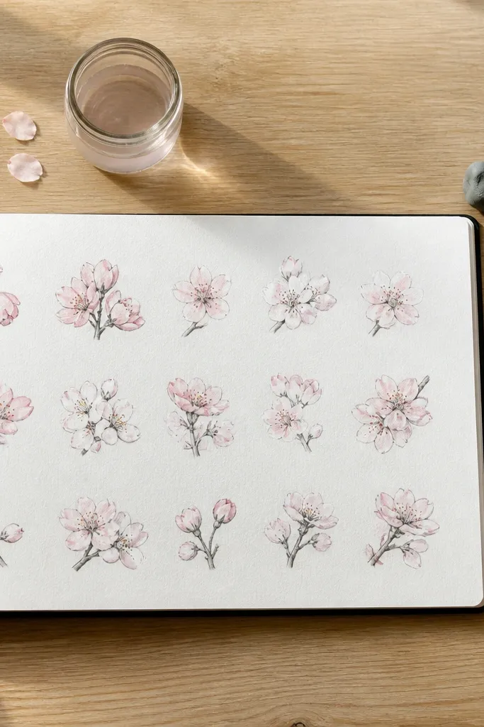
1. Single Curved Sakura Branch on White Space
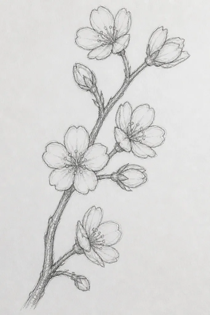
This one is my go-to when I want a finished-looking page fast. Keep the branch line light and delicate at first, then thicken it slightly where it bends, so it feels like real wood. Use a few medium 2B petals per cluster, not dozens, so the drawing stays airy. It flatters small hands because the shapes are repeatable: curved “comma” petals around a tiny darker center. The white space makes the blossoms pop, and it works for any kid’s skill level because you can stop after the first branch without the page looking incomplete.
Good to knowPress the pencil less for the petals on the far side of the branch so the cluster looks layered.
Step 1: Lightly sketch the branch with HB — start at the bottom left and sweep upward to the right, adding one main bend. Step 2: At 5 to 7 spots along the branch, draw a cluster of 5 petals using small curved strokes pointing outward. Step 3: Add one darker center dot per cluster with 4B, then lightly shade under the cluster using a few short strokes so it sits on the branch. Finally, erase any messy construction lines and leave the background mostly untouched.
Common mistakeDon’t fill the entire page with blossoms — the empty white space is what makes it look clean instead of crowded.
2. Cherry Blossom Cloud Burst Above a Tiny Branch
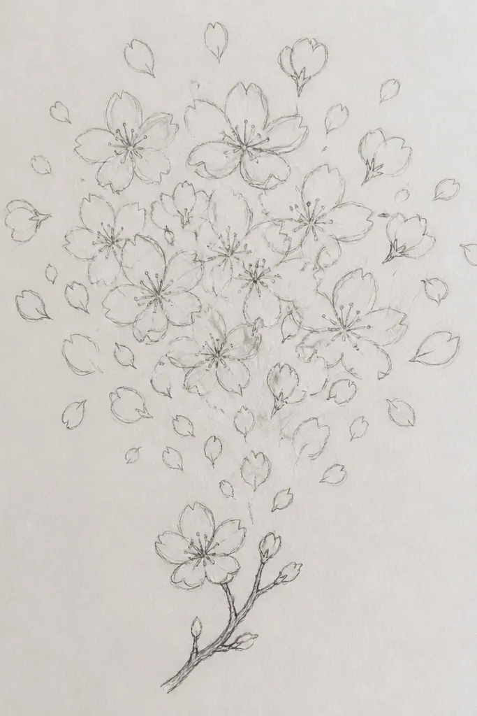
This design looks dramatic without needing a background scene. The key is treating the top area like a single “flower cloud” — you group blossoms so they blend visually. Use medium shading under the cloud’s bottom edge to create weight, then keep the top edge lighter for that airy spring feel. Kids like it because it feels like a big reveal: add petals until the cloud looks full, then stop. It also looks great for portraits because the blossom mass frames the center.
Step 1: Sketch a tiny branch with HB near the bottom center, curving slightly upward. Step 2: Make a loose cloud outline with faint graphite, then fill it with small petal marks — each cluster can be 5 petals around one center dot. Step 3: Darken the bottom edge of the cloud with 4B using short, directional strokes, so it looks like the blossoms overlap. Finally, lift extra graphite with a kneaded eraser on the top edge if it looks too gray.
If the cloud starts to look muddy, erase lightly and redraw fewer petals with crisp edges.
Skip heavy full-page shading — it kills the soft, floating look.
3. Sakura Fan Frame Border
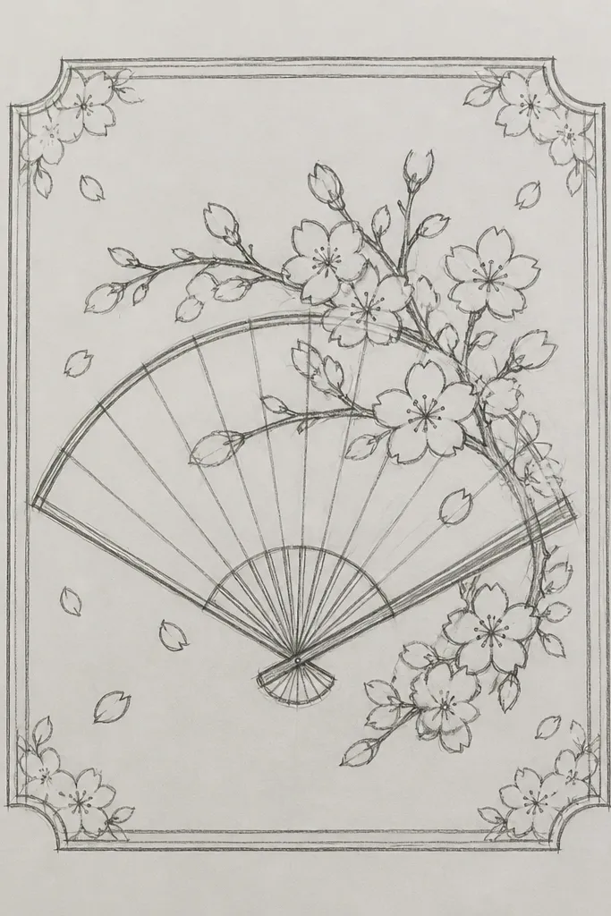
A fan border makes the drawing feel intentional and decorative, even with simple marks. I like it because it gives kids structure: they know exactly where blossoms go. Draw the fan ribs lightly, then place clusters along them so the petals follow a natural curve. This design looks flattering on any paper size because the fan shape creates a clear focal point. It’s also a fun confidence builder for beginners because the border hides unevenness — the frame makes everything look planned.
Step 1: Draw a fan silhouette with HB: a wide curve at the top and a narrower curve at the bottom, leaving a margin around it. Step 2: Add 6 to 8 light ribs from the top curve to the bottom point. Step 3: Along each rib, place 2 to 3 blossom clusters, each cluster made from 5 petals and one dark center. Finally, add 2 or 3 tiny leaf shapes between clusters and darken only the centers and a few shadow sides.
Keep the petals slightly smaller near the edges so the center reads as the focal point.
Don’t draw the fan ribs too dark — bold ribs fight with the blossoms.
4. Cherry Blossom Branch Through a Window
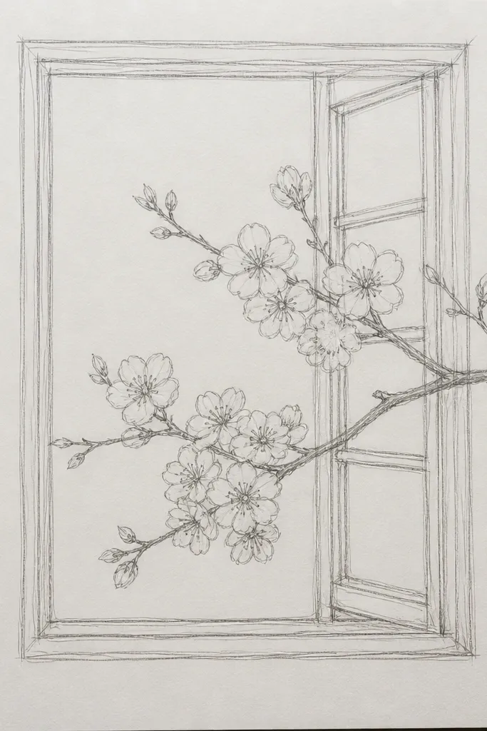
This is the pencil drawing that looks “finished” with minimal effort. The window gives you depth cues: anything behind the glass stays lighter, and anything closer is darker. I draw the glass area with softer graphite and keep the frame crisp with darker lines so the branch feels like it’s outside the house. It’s flattering for kids because rectangles are easy to correct — if the window line wobbles, you can darken it cleanly after erasing. For aesthetic impact, it also creates a cozy spring mood without needing background scenery.
Good to knowTo fake glass depth, keep the far blossoms one value lighter than the near ones.
Step 1: Draw a window rectangle with HB and add a vertical and horizontal divider line to make two panes. Step 2: Sketch a branch that crosses diagonally through the window; keep the branch line lighter where it sits “behind” blossoms. Step 3: Add blossom clusters along the branch, but fade some petals by pressing lighter and leaving a few cluster centers un-darkened. Finally, darken the window frame with 2B and add a few thin shadow lines just under the frame edges.
Common mistakeDon’t shade the whole window interior — the clean glass space is what makes the branch read.
5. Cherry Blossom Lantern with Hanging Blossoms
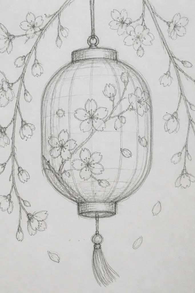
Lanterns look cute and give kids a clear object to focus on. The blossoms hanging from the top lets you practice symmetry and spacing without complicated backgrounds. Use a slightly darker outline for the lantern, then keep the lantern shading minimal — just a couple of vertical stripes — so the blossoms stay the star. This drawing looks great for gifts because it has a clear “theme” and reads well from a distance. It also flatters smaller pages because the lantern shape naturally fills the center.
Step 1: Draw a lantern body with HB — a rounded trapezoid — and add two short handles at the top. Step 2: Add 4 to 6 vertical lines on the lantern body for texture, leaving most of the interior light. Step 3: From the top, draw 5 to 7 blossom clusters hanging down. Each cluster is 5 petals with a dark center, and petals near the bottom should be slightly larger. Finally, shade one side of the lantern body with 2B and deepen the blossom centers with 4B.
Make the closest blossom cluster one size bigger so the whole page has depth.
Don’t over-shade the lantern — pencil lanterns look smudgy fast if you fill the midtones everywhere.
6. Minimal Sakura Silhouette on Darker Ground
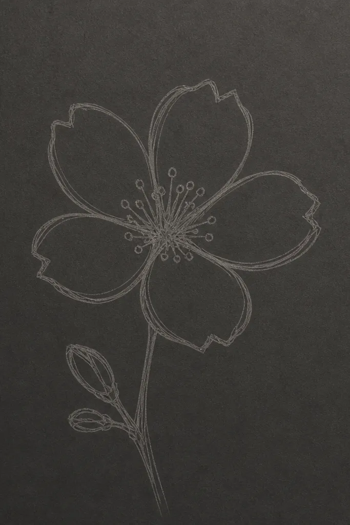
This is the one I use when I want a dramatic look from a single pencil. Instead of drawing every petal dark, you create contrast by putting a soft gray background under the branch and leaving blossom shapes lighter. It reads like a silhouette even with pencil. Kids like it because the background can be “filled in” quickly, and the blossoms look magical as they pop out. It also looks great on scrapbook pages because the contrast is strong and clean.
Good to knowUse the kneaded eraser like a paintbrush — press, lift, and move in small bursts so you get soft edges.
Step 1: Lightly shade a gray area at the bottom with HB, then build it to a steady mid-gray using 2B. Step 2: Draw the branch outline on top of the gray with a lighter HB line so it doesn’t fight the background. Step 3: For blossoms, draw very faint petal shapes or just small petal dots, then use a kneaded eraser to lift graphite so the blossom shapes stay lighter. Finally, darken the branch line slightly with 4B only where it crosses the gray.
Common mistakeDon’t keep layering graphite until it’s charcoal-black — the lifted blossoms won’t show.
7. Cherry Blossom Waterfall Branches (Two Directions)
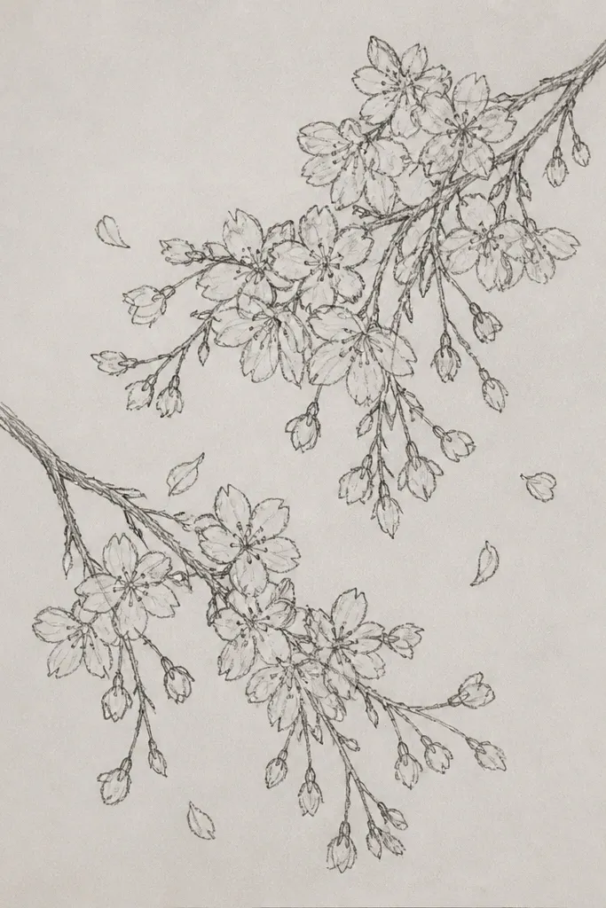
Two-direction branches make the page feel balanced and lively without adding a background. I like the Y-shape because kids can place blossoms like beads along each branch. Keep the upper split point clear, then let the branches taper thinner as they descend. This design flatters wider paper because the branches spread out naturally. It also looks good for families who want matching drawings — you can mirror the left and right clusters and still keep it easy.
Step 1: Draw a Y-shaped branch with HB, starting from the top center and splitting into two curves. Step 2: Along each branch, add 6 to 8 blossom clusters. Place clusters slightly closer near the split point, then space them farther apart as the branches narrow. Step 3: Add a few thin leaves near the split and deepen the cluster centers with 4B. Finally, shade under every other cluster with light 2B strokes to show overlap.
If one side looks heavier, erase 2 clusters and redraw them smaller — balance comes from spacing more than darkness.
Don’t make both branches the same thickness all the way down; tapering makes it look real.
8. Sakura Blossoms Over a Simple Hillside
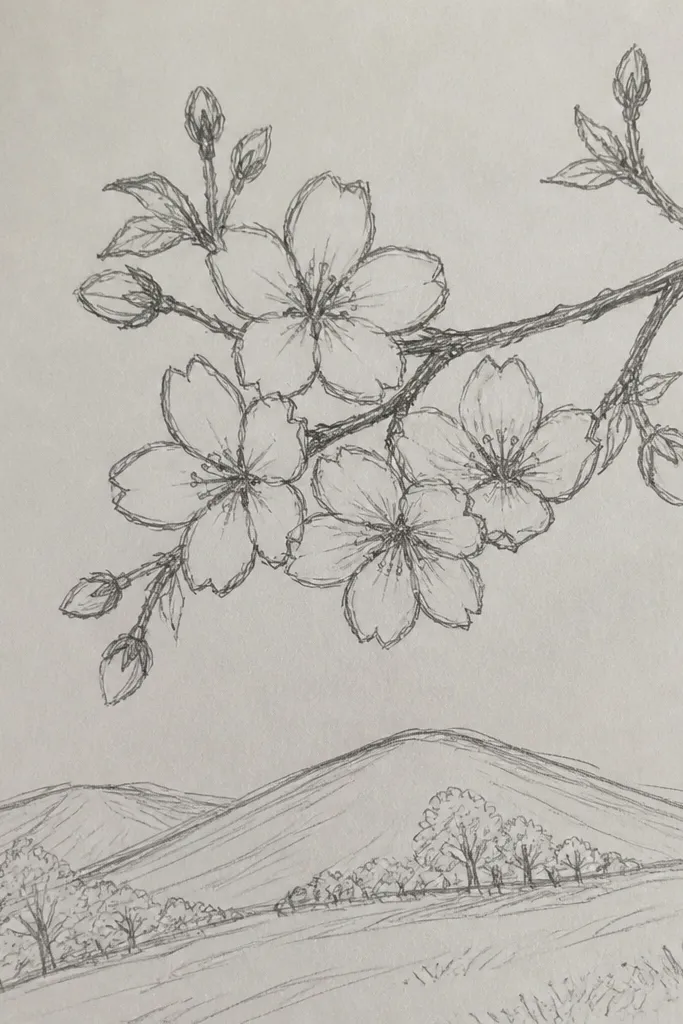
A hillside gives you depth without turning it into a full landscape drawing. I keep the hill simple — two layers max — because too much detail competes with the blossoms. The branch comes in from the side and anchors the blossoms above, so the page has movement. This is a great option for kids who want “something more” than a single branch but still need it easy. It also works for portrait-style paper because the hill sits low and the blossoms stay high.
Good to knowKeep the hill edges softer than the branch edges — softness reads as distance.
Step 1: Sketch a hill shape with HB — a curved ridge line and a second line for the shadow edge. Step 2: Shade the hill’s base lightly with HB and deepen the underside with 2B using short strokes. Step 3: Bring a branch from the right edge across the middle and place 7 to 10 blossom clusters along it. Finally, add a few petals that overlap the hill line so they look like they float above the ground.
Common mistakeDon’t add lots of grass marks under the blossoms; it makes the page noisy.
9. Cherry Blossom Tree Corner Frame (Cropped Composition)
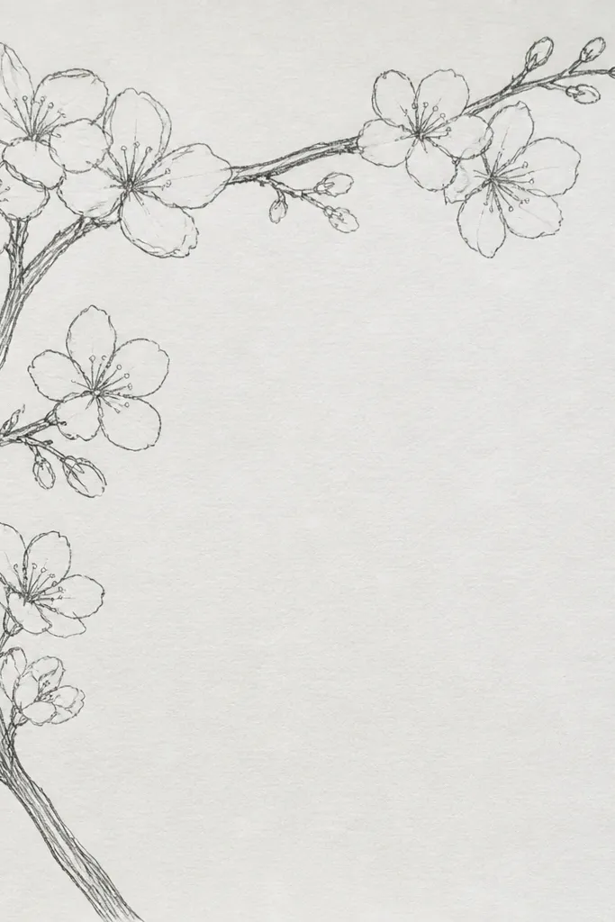
Cropping is a cheat code for looking artsy. When you only show one corner of the tree, you avoid the pressure of drawing the whole canopy. The thick branches in the corner give structure, and the blossom clusters fill the negative space so it still looks complete. Kids do well with this because they can stop when the page feels full. It also flatters smaller sketchbooks because the composition is packed and doesn’t leave awkward empty areas.
Step 1: Choose a top-left or top-right corner to “cut off” the tree and draw thick branch lines that start near the corner and sweep inward. Step 2: Add smaller twigs branching off the main lines, using HB so you can erase. Step 3: Fill the open area with blossom clusters, keeping the biggest clusters closest to the center of the page. Finally, shade a few clusters with 2B and darken only the centers with 4B.
Leave one branch line fully visible from start to finish — it gives the viewer a clear path.
Don’t center the tree canopy perfectly; the corner crop is what makes it feel natural.
10. Cherry Blossom Branch + Falling Petals
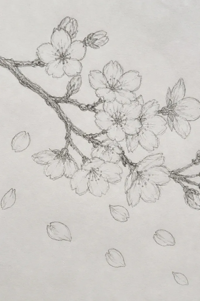
Falling petals add motion without needing extra scenery. I like drawing a few full clusters at the top, then sprinkling single petals down the page so your eye moves like it’s drifting. Use lighter pressure for petals farther away and deeper pencil for petals closer to the viewer. This looks good for classroom art because kids can vary petal sizes and still keep it cohesive. It also flatters the page by filling the empty lower space with simple shapes.
Step 1: Draw the main branch with HB near the upper left, curving gently toward the center. Step 2: Add 3 to 5 blossom clusters along the branch, using 5 petal strokes and one dark center each. Step 3: Draw 10 to 18 falling petals as single curved shapes — some sideways, some upright — and add a tiny dark dot at the base of each petal. Finally, lightly shade under 3 of the falling petals with 2B to make them look like they’re casting a little shadow.
Vary petal direction — don’t make them all fall straight down.
Don’t draw falling petals as full flower clusters; singles look more realistic and easier.
11. Cherry Blossom Bouquet in a Simple Vase
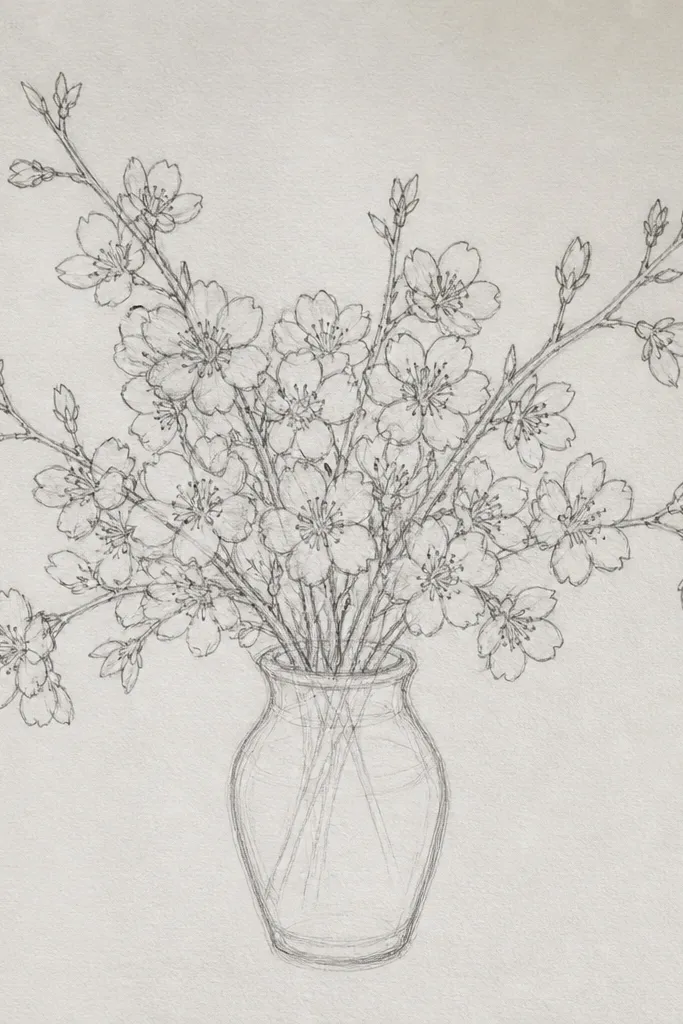
A vase turns blossoms into a “gift drawing” instantly. You get a clear foreground object (the vase) and a lighter airy background (the blossoms). Keep the vase shape simple with one or two shading lines so it doesn’t steal attention from the flowers. This style flatters most skin tones when you color later because warm pinks look great against a pale gray pencil vase. It’s also friendly for kids who like to draw objects — they can get the vase right and then focus on petals.
Good to knowMake the top clusters slightly smaller than the ones near the vase rim for depth.
Step 1: Draw the vase outline with HB — a rounded top, narrower middle, and a slightly wider base. Step 2: Add one vertical highlight area by leaving it blank, then shade one side with 2B. Step 3: Draw three stems rising from the vase and place blossom clusters along each stem. Finally, add 2 to 4 petals that overlap the vase rim so the bouquet feels planted and not floating.
Common mistakeDon’t outline every vase line too dark; it makes the vase look like a cartoon instead of a simple form.
12. Cherry Blossom Tree Trunk with Blossoms on the Branches
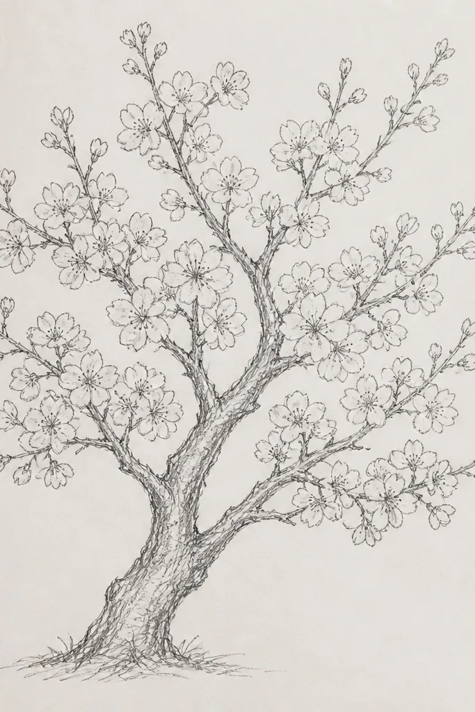
This is the “one-tree” drawing that still stays doable. The trunk gives you a strong vertical line, and the blossom placement creates a natural hierarchy: heavy clusters on outer branches, lighter clusters near the trunk. I use a tapered trunk — thicker at the base, thinner as it rises — because it looks right even with simple shading. Kids like it because it feels like a real tree they can finish in one sitting. It also looks great for spring-themed cards because the trunk anchors the composition.
Step 1: Sketch a trunk with HB, tapering upward and adding two main branch splits. Step 2: Draw smaller twigs off the main branches, keeping them lighter than the trunk. Step 3: Place blossom clusters mostly on the outer branches — aim for 18 to 25 clusters total for a full look. Step 4: Shade the underside of a few clusters with 2B, and deepen only the centers with 4B. Finally, erase stray marks so the trunk line stays crisp.
Add a few short bark lines on the trunk with HB, then stop — too many lines make it messy.
Don’t cover the whole tree in blossoms; sparse inner areas make the blossoms look fuller.
13. Cherry Blossom Heart Frame (Kid-Friendly Symmetry)
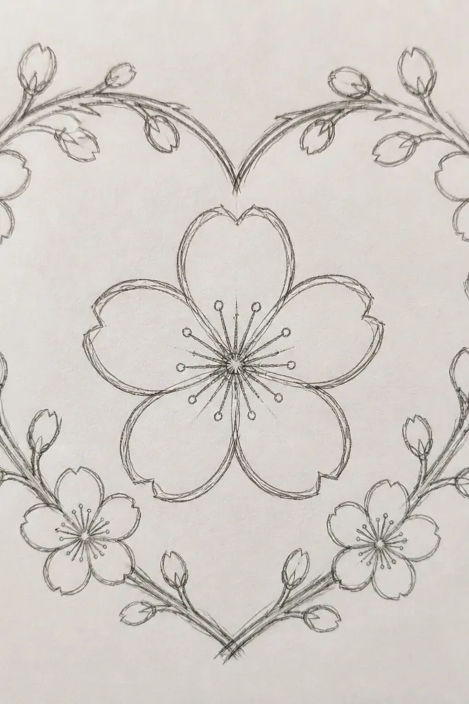
Hearts are the fastest way I’ve found to get kids to care about symmetry. The blossom clusters can be uneven and still look good because the heart outline holds the composition. I draw one side lightly, then mirror the cluster placement on the other side so it feels balanced without demanding perfect drawing. This design looks cute for Mother’s Day cards and birthday notes, and it’s flattering for beginners because the outline gives structure. It also works well if you plan to add color later — pink petals and a pale graphite heart look clean.
Good to knowFlip your paper mentally and check spacing — if one side has 2 clusters more, erase one and redraw smaller.
Step 1: Draw a heart outline with HB, then darken the top curve lightly with 2B once you’re happy with the shape. Step 2: Add two crossing branch lines inside the heart, one slightly thicker than the other. Step 3: Place clusters along those branches, keeping the largest clusters near the center of the heart. Step 4: Use 4B only for centers and a few shadow sides under clusters. Finally, erase any extra construction lines outside the heart shape.
Common mistakeAvoid drawing clusters right up to the heart edge; leave a thin margin so it doesn’t look cramped.
14. Cherry Blossom Pattern Repeat on a Strip
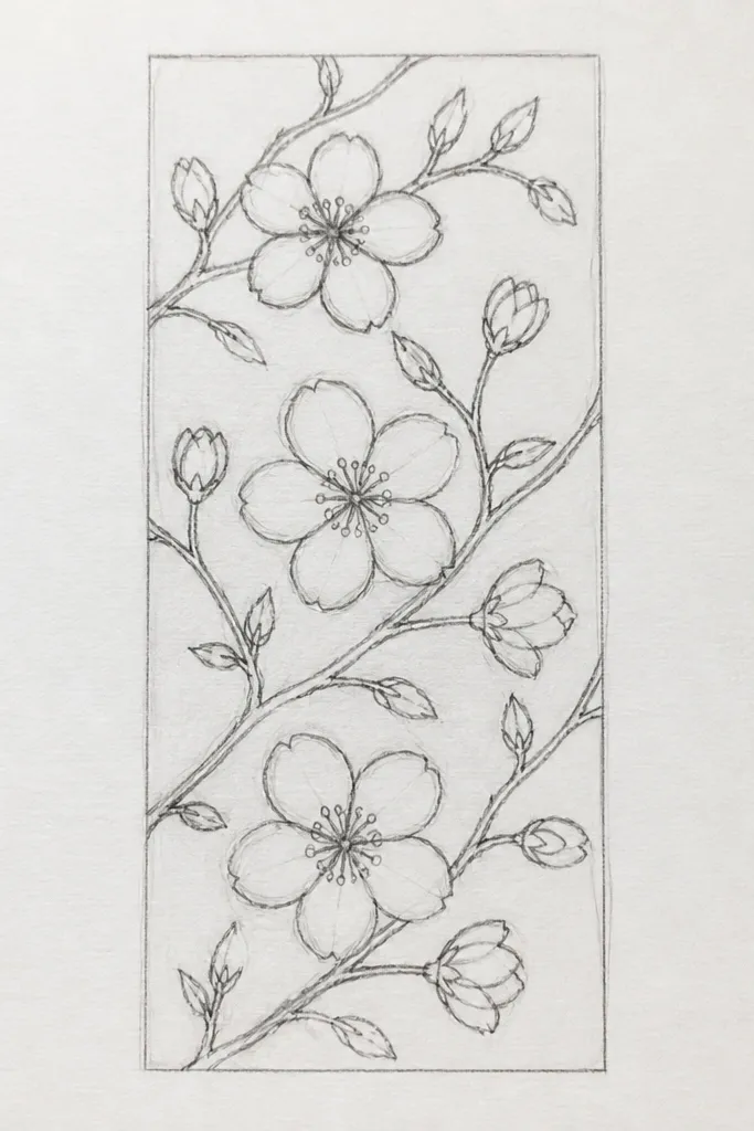
Pattern repeats are how kids get that “wow, I made a whole page” feeling without needing a complex scene. The strip format also keeps attention on spacing, and spacing is what makes pencil patterns look intentional. Keep each motif small and consistent: 5 petals per cluster, one dark center, one light branch stroke. This looks great for bookmarks and craft paper because it’s easy to extend. It also flatters shaky hands because repetition hides small unevenness.
Good to knowUse the same petal size for every cluster — it makes the pattern look designed, not random.
Step 1: Draw a straight guideline for the strip and lightly mark 10 to 12 equal sections along it. Step 2: In each section, draw a tiny branch with HB and add two blossom clusters — one closer to the top of the strip and one closer to the bottom, alternating. Step 3: Keep the petal size consistent and deepen only the centers with 4B. Finally, add a couple of tiny leaf shapes to break up the pattern and erase any guideline marks that show through.
Common mistakeDon’t vary petal size a lot — it turns into a sketch instead of a repeat.
15. Sakura Branch on Textured Paper Look (Light Crosshatch Blossoms)
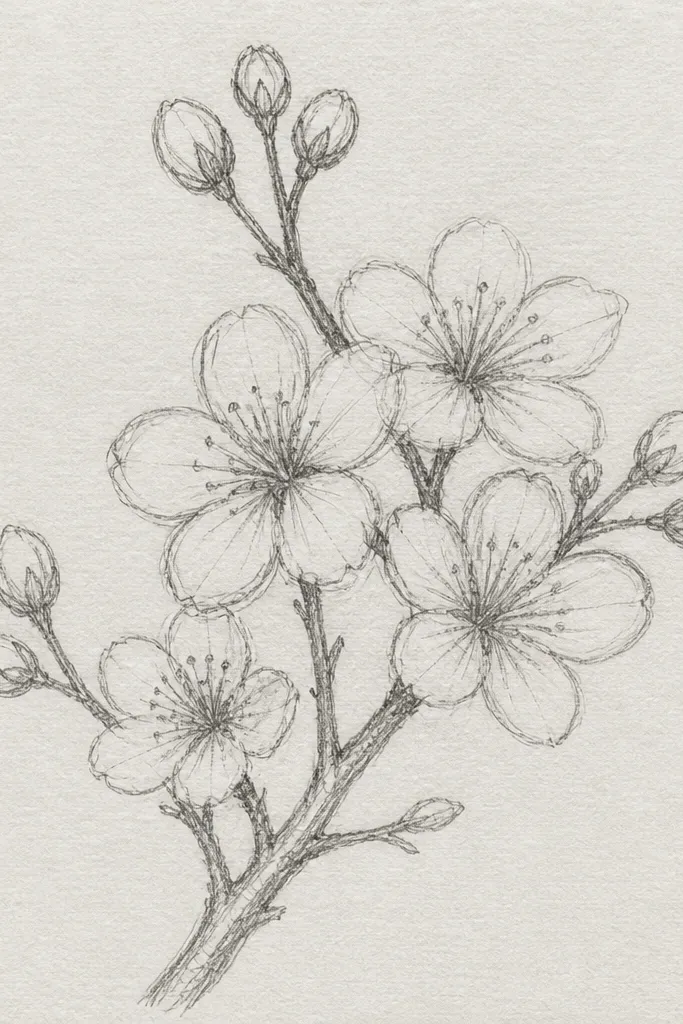
If you want that soft “spring air” texture without adding color, this is the method. The light crosshatch behind the blossoms creates a subtle background tone so the petals look brighter. I keep the crosshatch very light and only in the blossom area, not the whole page, so it doesn’t turn gray everywhere. This style is flattering for kids who like shading because it gives them an easy technique that still keeps the blossoms readable. It also looks great on plain sketch paper because the texture does the visual work.
Good to knowCrosshatch in one direction, then cross it once more — two passes is enough.
Step 1: Sketch the branch with HB and place 8 to 12 blossom clusters along it. Step 2: For the blossom area, add very light crosshatching with HB — short lines crossing each other — staying behind the clusters. Step 3: Darken petal centers with 4B and add a few 2B shadow strokes under select clusters. Finally, use a kneaded eraser to lift graphite where petals overlap the crosshatch so they look crisp.
Common mistakeDon’t press hard on the crosshatch — heavy texture makes the petals look dull.