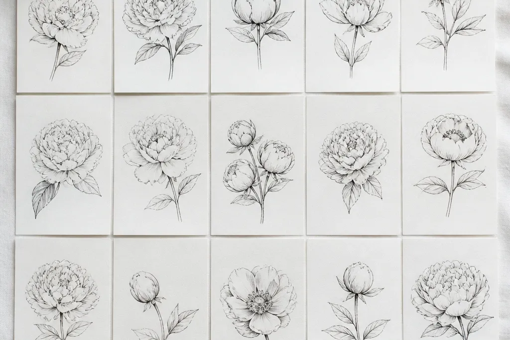
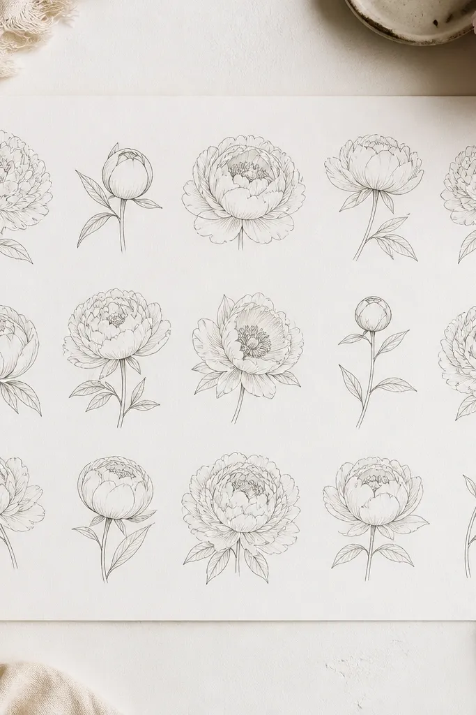
1. Marker-Friendly Peony Cup Center
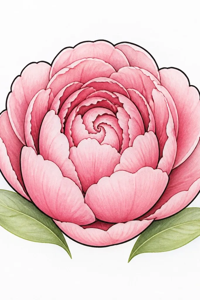
This one is my go-to when I’m coloring with kids because the petal “cups” hide shaky lines. Draw the outer petals larger than you think, then keep the center small so it doesn’t swallow the whole flower. The look flatters anyone’s coloring style — marker, gel pen, even colored pencil — because the cup edges create natural shadows you can color in lightly. I’ve used it on light skin tone cards because the pale pink petals let the paper stay bright, and on darker cardstock because the thick outline keeps the bloom from fading into the background. For a clean aesthetic, keep the outer petal outline bold and let the inner spiral stay slightly thinner.
Step 1: Sketch 6 outer teardrop petals around a center circle, each petal touching the next but leaving a tiny gap where paper shows. Step 2: Inside the center, draw 6 smaller teardrops that curve inward like a spiral — don’t fill the whole circle. Step 3: Add 2 shallow leaf shapes under the bloom, angled outward, and color the leaves with a light green base and a darker green edge. Step 4: Trace only the outer petal edges with a thick black marker, then color the petals with 2 tones of pink (light first, darker at the bottom edge).
Good to knowUse a lighter pink for the top half of each petal and a deeper pink only along the bottom edge. That alone makes it look layered.
Common mistakeDon’t outline every inner line with thick marker — it turns the center into a dark target.
2. Pencil-Soft Peony With Eraser Highlights
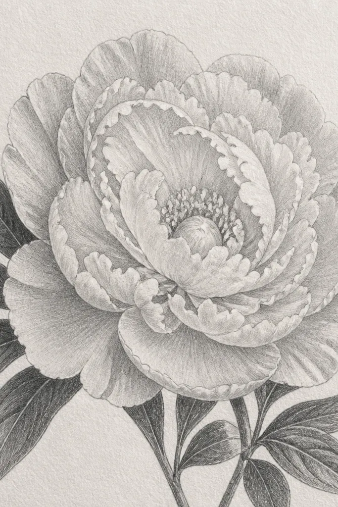
If you want a peony that looks hand-painted without paint, this is the method. The pencil soft edges make the flower feel delicate, and the lifted highlights give it that “petal shine” you usually only get with expensive art paper. This one suits adults and older kids because the shading is forgiving when you use gentle pressure. It also looks great on warm-toned paper — the highlights feel creamy, and the gray shading doesn’t look muddy. I’ve drawn this for a set of birthday cards where the recipient likes subtle art, and it always looks more thoughtful than a flat-color version.
Step 1: Lightly sketch the outer petals as overlapping teardrops, keeping the lines thin and slightly curved. Step 2: Shade under each petal edge with a 2B pencil, then blend with a finger or blending stump so the gradient stays smooth. Step 3: Use a kneaded eraser to lift small oval highlights on the top half of 5-7 petals. Step 4: For the center, sketch a tight spiral and add 12 tiny dot stamens in the middle, then keep the surrounding petals lighter so the center pops. Step 5: Shade leaves with a darker outline line and a lighter fill, leaving a few paper gaps for leaf texture.
Keep your pencil pressure low for the first pass. You can always darken later, but you can’t un-smudge hard graphite.
Don’t press hard on the first sketch — it makes the highlights look gray instead of bright.
3. Tiny Bud Peony In a Corner

This is the peony idea I use when the page feels too empty or you’re making a small craft label. The bud version flatters kids because it’s forgiving — you don’t need a full bloom to read as peony. It also looks great on stickers and gift tags because it doesn’t take up much space, yet it still has that layered flower look. If you’re coloring with markers, small buds prevent the center from turning into a blob. I’ve used it on brown paper bags for party favors and the tiny bloom still reads clearly.
Step 1: In the corner, draw a small curved “C” shape for the bud outline, then add 5 petals around it like overlapping shells. Step 2: Make the center a mini spiral: draw 3 inner teardrops that curl inward. Step 3: Add one leaf below with a simple long teardrop shape, then draw one line down the middle to suggest a vein. Step 4: Color the outer petals with a light base and a slightly darker edge; keep the center lighter so it feels airy. Step 5: Outline only the outer petal edges with a thin black pen.
Good to knowKeep the bud about the size of a quarter. If it’s smaller, it stops looking like a peony and turns into a doodle.
Common mistakeDon’t draw a full big bloom in the corner — it overwhelms the tag and looks cramped.
4. Side-Facing Peony With One Petal Gap
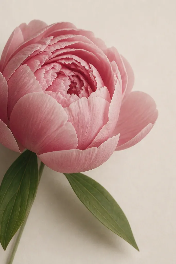
Side-facing peonies look more “alive” than perfectly front-on blooms, and they’re still simple. The trick is the one petal gap: you leave a small opening so the layering reads instead of flattening. This style suits beginners because you can plan the flower like a half circle, and kids usually find it easier than drawing symmetry. It also looks great for cards where you want the flower to point toward the greeting text without covering it. I use this when I’m making a banner with multiple drawings — the variation keeps the set from looking repetitive.
Step 1: Draw an outer half-circle of 7 petals, but stop the right side early so the flower faces left. Step 2: Place the spiral center slightly toward the left — draw 5 inner teardrops curving inward. Step 3: Add one leaf to the bottom-left with a long teardrop and a short stem line, then add a smaller leaf behind it. Step 4: Leave one outer petal gap on the right side by not connecting two petal tips. Step 5: Color petals with two pink shades, keeping the gap area uncolored so the flower looks layered.
Good to knowIf the center looks off, move it 1/4 inch toward the open side. That small shift fixes the whole “read.”
Common mistakeDon’t force symmetry. A perfectly centered spiral on a side-facing bloom looks stiff.
5. Peony Mandala Border Bloom
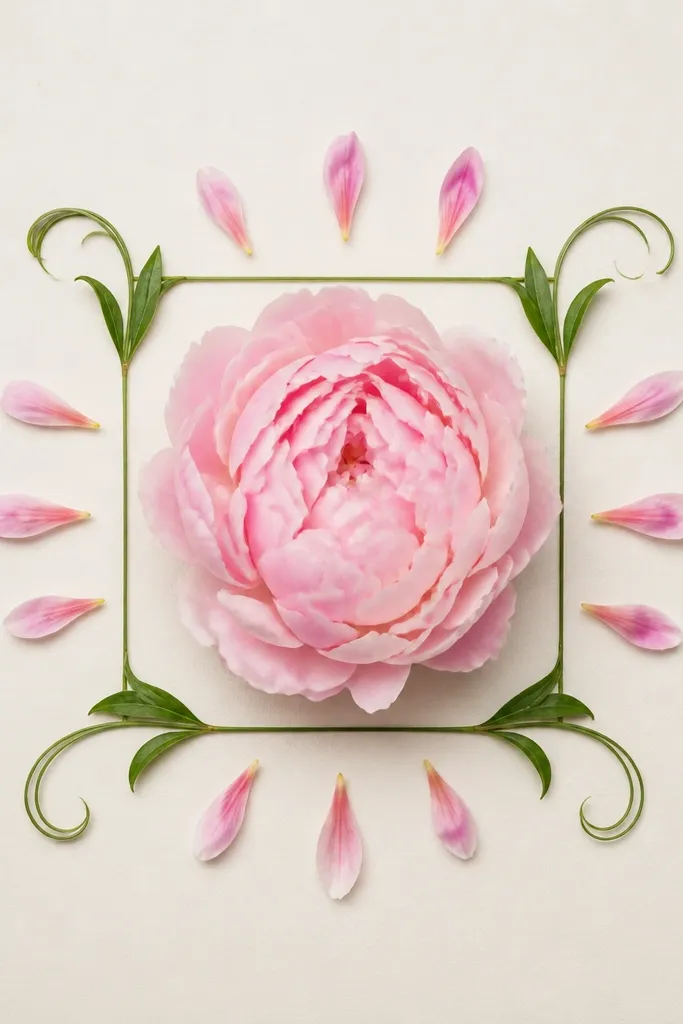
This version works when you want the peony to feel decorative instead of just a single flower. The mandala-style petals around the main bloom make the drawing look finished even with minimal coloring. It’s kid-friendly because you can repeat the small teardrop shapes in a ring. For adults, it looks extra pretty with colored pencil because the ring creates a soft color rhythm. I’ve used this on the corners of kids' art pages and on the front of gift boxes where the peony acts like a focal “stamp.”
Step 1: Draw a small square or rectangle border first, leaving 1/4 inch margin on all sides. Step 2: Place a front peony in the center using 8 outer teardrop petals and a spiral center of 6 small teardrops. Step 3: Add a ring of 10 tiny teardrop petals around the peony — keep them all the same size. Step 4: Add two leaf tendrils that curve along the inner edge of the frame, then color the tendrils light green with a darker outline. Step 5: Color the main bloom in pink and the tiny ring petals in a lighter shade so they don’t overpower the center.
Good to knowUse the same teardrop size for the ring. If the tiny petals vary wildly, the border looks messy.
Common mistakeDon’t color the ring petals the same depth as the main bloom. That flattens the hierarchy.
6. One-Line Peony Outline (No Shading)
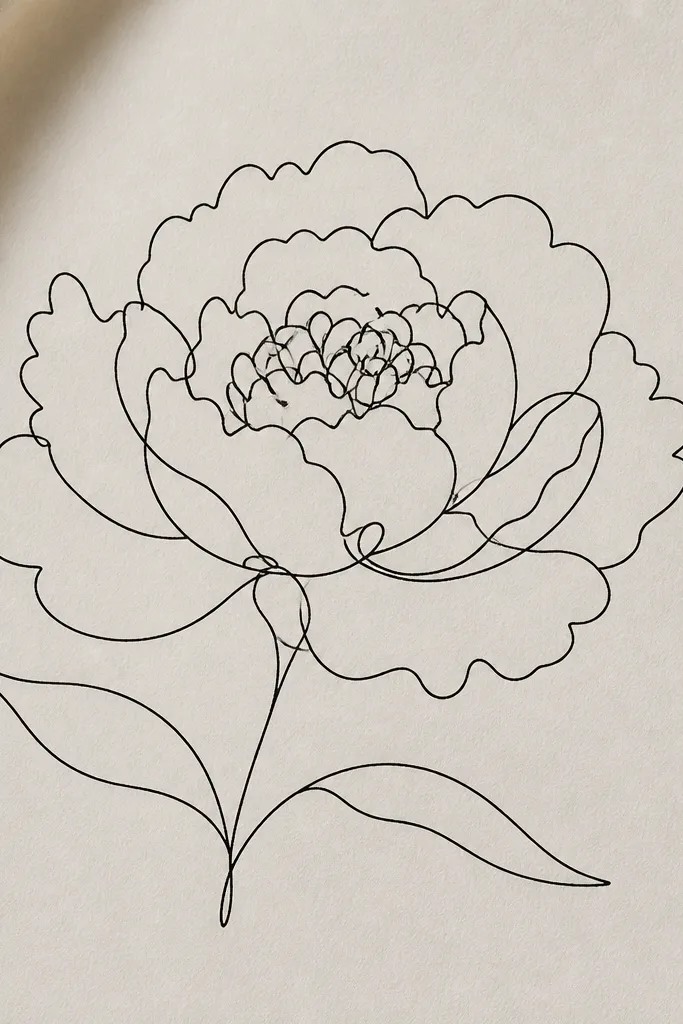
This is the fastest peony drawing I’ve ever taught, and it’s perfect for kids who lose patience with shading. The continuous-line look still reads as layered because the line crosses itself at the right places. It also looks good on craft paper where you don’t want to color much — just let the black lines do the work. I’ve used it for quick wrapping paper accents: one-line peonies repeat nicely without needing perfect symmetry. If you want a clean, modern aesthetic, this is it.
Step 1: Start at the top of the bloom and draw an outer petal loop — keep the line smooth. Step 2: Continue looping petals around the circle, crossing over the previous petal lines so overlaps show. Step 3: When you reach the center, draw a small spiral with 5-6 loops, but leave a tiny open circle in the very middle. Step 4: Add two leaves by drawing long curved lines with one bump at the tip, then close each leaf with a short line. Step 5: Color only the background if you want — leave the flower uncolored for the crisp one-line look.
Good to knowIf the continuous line breaks, restart and keep going. The slight imperfection still looks intentional.
Common mistakeDon’t add lots of extra interior lines. The one-line style needs clean negative space.
7. Peony With Textured Petal Speckles
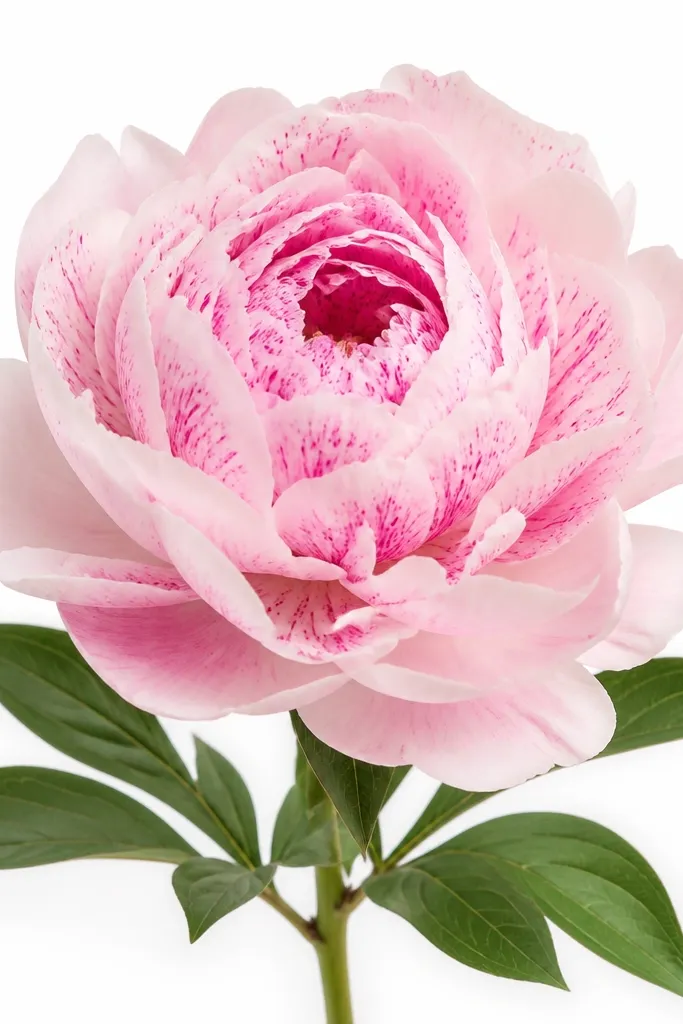
Petal speckles are the shortcut to making a simple peony look detailed without doing full shading. I use this when I’m working with markers that don’t blend well - speckles cover the “flat” look instantly. This style flatters kids because speckling is a controlled action: tap, tap, tap. For adults, it looks gorgeous with gel pens because the specks add a soft texture that resembles petal veins. I’ve made classroom Mother’s Day cards using this method, and the drawings look more finished than the kids expect.
Step 1: Draw the peony with 8 outer teardrop petals and a center spiral of 6 inner teardrops. Step 2: Color the whole petal area in a light pink base, leaving the top edges slightly lighter by not coloring all the way to the tip. Step 3: Use a darker pink marker or gel pen to add small speckles in the center half of each petal, concentrating near where petals overlap. Step 4: Add a few darker dots in the center spiral for depth. Step 5: Color leaves with a light green base and add 5-7 tiny vein lines using a darker green pen.
Keep speckles clustered near petal overlaps. Spread them evenly and the flower looks noisy instead of layered.
Don’t outline every speckle with thick lines. That makes it look like glitter glue.
8. Peony Face Frame for Kids Cards
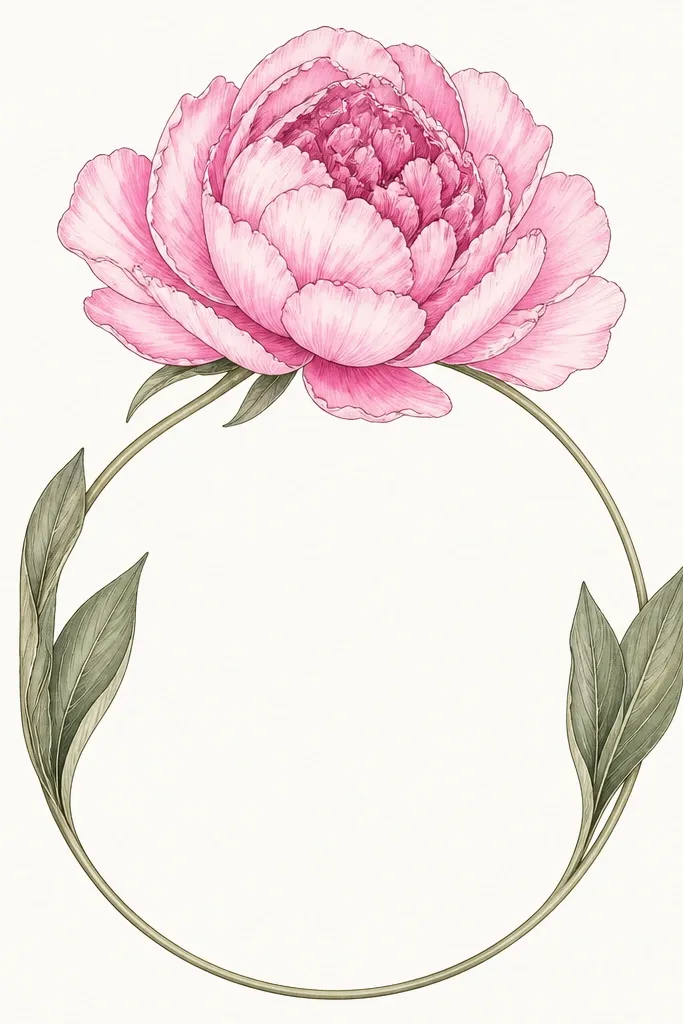
This is the peony layout I use on kids' cards because it creates a natural writing space without extra rules. The arch shape pulls the eye upward, and the center spiral keeps the flower looking “real” even when the leaves are simple. It flatters smaller handwriting because the blank space stays clean and open. I’ve seen kids add their own message in the center without smearing it because the flower doesn’t sit on top of the text. For a sweet aesthetic, keep the outer petals a medium pink and the inner petals a lighter pink.
Step 1: Draw two curved stems that meet at the bottom and rise into an arch — keep the arch width about the same as the writing area you want. Step 2: Place the peony bloom at the top center of the arch, using 7-9 outer petals and a small spiral center. Step 3: Add 2 side leaves that hug the arch, one on each side, angled slightly outward. Step 4: Color outer petals in medium pink and inner petals in light pink, leaving the paper white at the top of each petal for highlight. Step 5: Outline the outer petal tips and the leaf edges with a black pen, then leave the writing area untouched.
Trace a faint pencil rectangle for the writing box first. Erase it after you finish the flower.
Don’t put the bloom too low. If it covers the writing area, the whole card looks cramped.
9. Peony Flower Bud on a Stem With Three Leaves
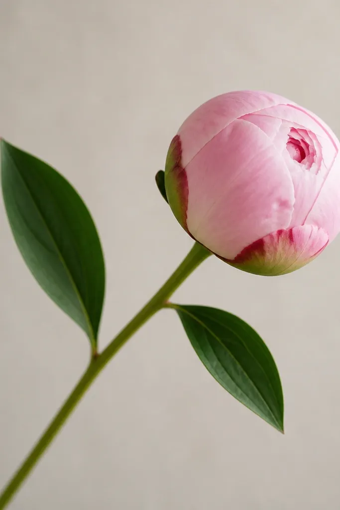
This drawing looks put-together even with minimal petals because the stem and leaf structure does half the work. It’s perfect for older kids who like to add details and for adults who want a simple botanical line. The diagonal stem adds motion, and the three leaves create a balanced silhouette. I used this on a set of bookmarks, and it held up because the composition stays clear even when the artwork gets small. For color, you get a natural palette: soft pink bud, green leaves, and a thin stem line.
Step 1: Draw a diagonal stem line from bottom-left to upper-right, keeping it thin and steady. Step 2: At the top, draw a bud peony with 5 outer petals and a tiny center spiral of 3-4 inner teardrops. Step 3: Add three leaves along the stem: one large leaf near the middle, one smaller leaf above it, and one small leaf below. Step 4: Color the stem light brown or dark green, then color leaves with a light green base and darker green veins. Step 5: Color the bud with light pink, then add a deeper pink along the petal folds.
Good to knowMake the middle leaf the biggest. If the top leaf is biggest, the stem looks top-heavy.
Common mistakeDon’t crowd all three leaves at one spot. Space them 1 to 1.5 inches apart for a cleaner look.
10. Peony Bloom With Bold Outer Petal Edges
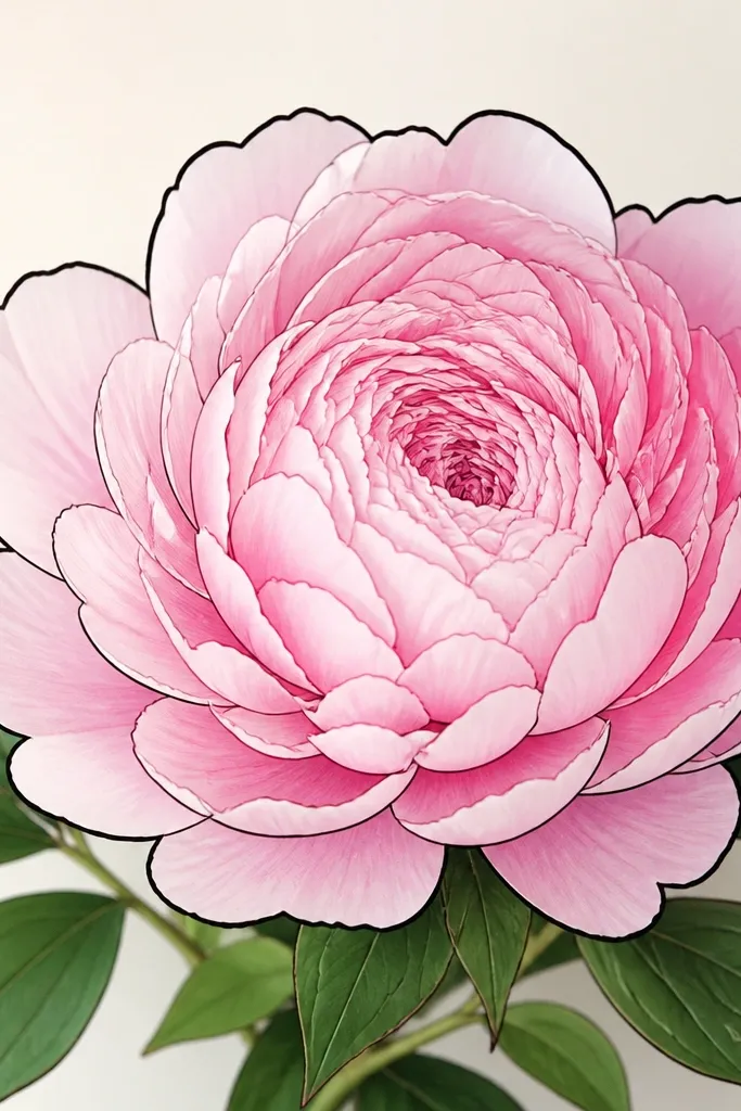
This is the “clean and graphic” peony I use when I’m making a set of matching prints. The thick outline on the outside petals creates a strong shape, and the thin inner lines keep the flower from looking like a sticker blob. It flatters any coloring you do inside because the boundary is clear, so even messy kids stay within the lines. I’ve used it on white paper with watercolor wash over the petals — the bold edge keeps the wash from bleeding too far. If you like a modern look, this is the one.
Step 1: Sketch the peony in pencil with 9 outer petals and a center spiral of 6 inner petals. Step 2: Go over only the outside edges with a thick black pen or marker, leaving the inner spiral lines thinner. Step 3: Add two leaves under the bloom with a simple outline and one vein line. Step 4: Color outer petals with a medium pink wash or marker, then keep the inner petals lighter. Step 5: Add a tiny darker pink shadow at the bottom of each outer petal to make the layers pop.
Good to knowUse a felt-tip pen for the bold outline. Brush pens give uneven edges on kid paper.
Common mistakeDon’t thicken the center spiral lines. Thick inner lines make the center look heavy.
11. Peony With Overlapping Petal Rings
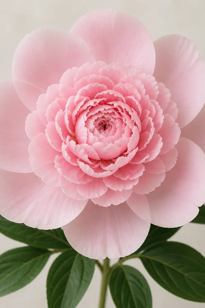
Ringed petals are the easiest way to control layering without shading. You’re basically building the flower in steps: outer ring, middle ring, inner spiral. This is ideal for beginners because each ring has a clear job, and you can stop once it looks right. It also looks great for coloring because you can use three pink tones and keep them separated by ring. I’ve taught this to 8-year-olds and their peonies still look like flowers, not just loops.
Step 1: Draw a light circle guide, then place 8 large outer teardrop petals around it. Step 2: Add a second ring of 7 smaller scalloped petals, tucked between the outer petals — overlap each other slightly. Step 3: For the inner ring, draw 6 tiny curled petals that spiral inward. Step 4: Add two leaves below with long teardrop shapes and a single vein. Step 5: Color ring 1 medium pink, ring 2 light pink, ring 3 pale pink, leaving the center highlight area slightly uncolored.
Good to knowIf the rings look flat, make the overlap deeper by extending each petal tip past the petal underneath.
Common mistakeDon’t make all petals the same size. That kills the ring effect and flattens the bloom.
12. Peony With Stamen Dots Center
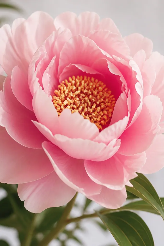
A peony center with stamen dots gives you instant realism without complicated lines. You still keep the drawing simple by using dots instead of detailed stamens, and kids can do it quickly with a pen tip. This looks especially good on colored paper because the center dots create contrast. I like it for gift tags because the center detail reads even when the drawing is small. For color choices, use one darker pink for the petal bases and keep the center pale so the dots stand out.
Step 1: Draw outer petals as 8 overlapping teardrops, each with a scalloped tip — just a little wave at the end. Step 2: Add a center spiral with 5 inner petals, leaving a small open space. Step 3: Fill that open space with 20-25 tiny dots using a fine black pen. Step 4: Draw two leaves under the bloom and add one vein line in the middle. Step 5: Color outer petals with light-to-medium pink and add a slightly darker pink at the base of each outer petal.
Make the dots smaller near the edges of the center and slightly larger in the middle. That creates a natural depth.
Don’t connect the dots into a solid scribble. It turns into a dark blob.
13. Peony With Watercolor Wash Look (Marker First)
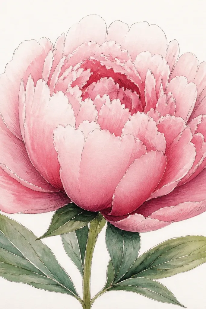
This is the “I used real paint” look using just markers and water. The secret is you outline first, then color lightly so the wash can blend. It flatters anyone because the gradients hide uneven coloring and give the petals that airy peony softness. I’ve done this on cheap printer paper with decent results, but it looks best on thicker copy paper so it doesn’t buckle. For a budget craft, this one makes kids' drawings look like a finished art piece when they’re actually using simple materials.
Step 1: Lightly pencil the peony with 9 outer petals and a spiral center. Step 2: Trace outer edges with a thin black pen, then color the petals lightly with a pale pink marker. Step 3: Dip a clean brush in water and lightly tap over the marker color to spread it, keeping the darkest area at the petal base. Step 4: Add a deeper pink marker only at the bottom edges, then blend with water again. Step 5: Color leaves with light green marker and blend, then add darker green veins near the center line.
Use a small brush and keep moving. If you scrub in one spot, you’ll lift the paper fibers and the wash gets patchy.
Don’t flood the page. Too much water makes the outlines bleed and the flower looks fuzzy.
14. Peony Outline on Grid Paper (Clean Symmetry)
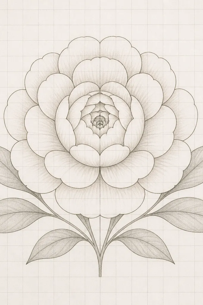
Grid paper makes peonies look “designed” even when you’re not confident with freehand. I use this when I’m teaching kids who want perfect symmetry or when I’m drawing multiple peonies for a set. The grid gives you control of spacing so petals don’t overlap randomly. It also works for adults who want a crisp look for planners, cards, or stickers. If you’re planning to color neatly, grid paper keeps your petal shapes consistent across the whole page.
Step 1: Draw a light circle for your bloom centered on a grid intersection, then divide it mentally into 8 sections. Step 2: Place 8 outer petals, one per section, as teardrops with scalloped tips. Step 3: For the center, draw a spiral of 6 inner petals, keeping the spiral anchored at the circle center. Step 4: Add two leaves under the bloom, each spanning about 2 grid squares in width and angled outward. Step 5: Color with 2 pink shades, staying inside the petal shapes, then lightly shade under overlaps with a darker tone.
Good to knowCount your petals out loud while drawing. “Eight outer, six inner” keeps you from accidentally adding extra petals that break the symmetry.
Common mistakeDon’t outline so heavily that you lose the pencil guide lines. Light pencil lines help you correct spacing.
15. Peony Corner Doodle With Two Overlapping Blooms
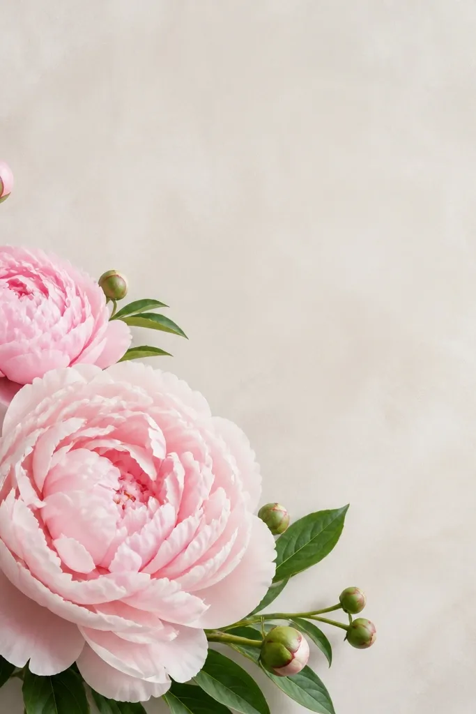
Corner clusters look cute and intentional because they fill space without needing a full bouquet. Two overlapping blooms give you depth, and you can cheat realism by making the back bloom lighter and partially covered. This flatters kids who like drawing multiple things — they get variety without complex backgrounds. It also works for adults making sticker sheets or scrapbooking elements, because the cluster reads clearly even when small. I’ve used this composition on the corners of printed worksheets, and the kids' drawings always look like they belong on the page.
Step 1: Draw a larger front peony with 8-9 outer petals and a spiral center, positioned so it touches the corner. Step 2: Add a second smaller peony behind it with 6-7 outer petals, placing it slightly higher and to the left. Step 3: Draw 3 small buds as tiny teardrop bumps between the blooms to fill gaps. Step 4: Add leaves under the front bloom and one leaf behind it, keeping leaf sizes smaller than the petals. Step 5: Color the front bloom darker pink and the back bloom lighter pink, then outline only the front bloom edges thicker than the back.
Good to knowLet the front bloom overlap the back bloom by at least 1/3 of its width. That overlap sells the depth.
Common mistakeDon’t make both blooms the same size and same color. The cluster loses the layered look.