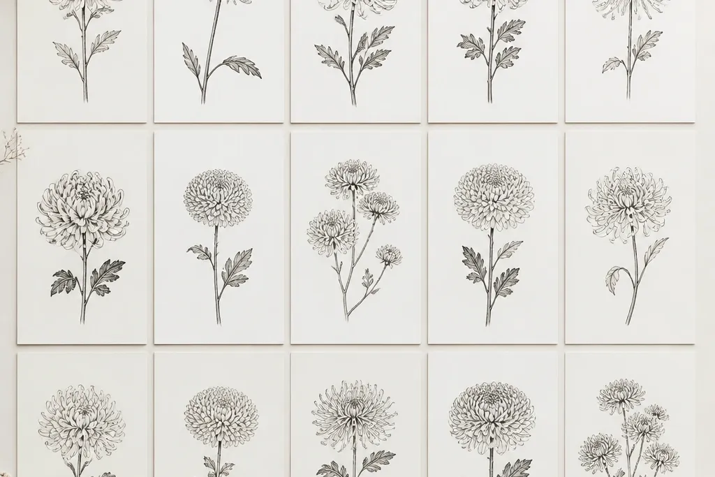
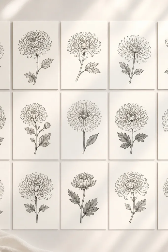
1. Classic Ring Chrysanthemum with Comma Petals
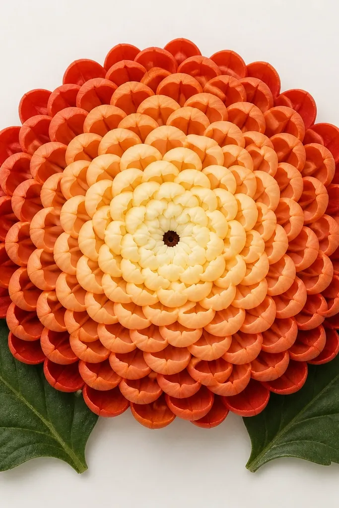
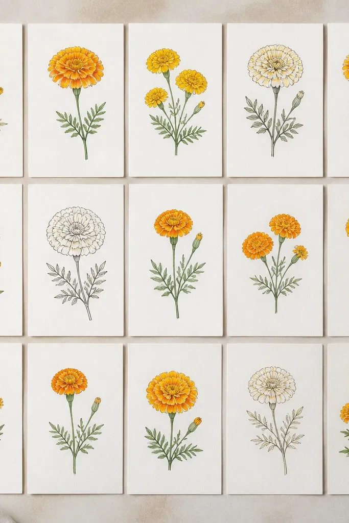
I like this one because it looks neat even when the petals aren’t perfect. Start with a tiny filled circle in the middle, then draw petals as curved comma strokes — the thick end touches the center, the tail points outward. Use 3 rings for a smaller flower and 5 rings for a bigger page, since kids can count rings more easily than individual petals. The look flatters any paper size because the petals scale well; even on cheap printer paper it still reads like a chrysanthemum. For color, I usually keep the center warm (golden brown) and the petals a single flower color like soft pink or pale orange so it doesn’t get busy.
Step 1: Draw a small circle for the center, then add 8 comma petals around it, all pointing outward. Step 2: Add the next ring with 12 comma petals, leaving small gaps between each one so the center doesn’t disappear. Step 3: Build one more ring (or two) using longer comma shapes for the outer layer. Step 4: Add a simple stem line from the bottom of the flower and two leaves with one curved vein each. Finally, darken the petal tips with a slightly heavier hand or a second pass in the same color.
Good to knowAfter you finish a ring, pause and check spacing — equal gaps make it look “designed.”
Common mistakeSkipping the gaps between petals makes the bloom look like a lumpy circle.
2. Spiral Center Chrysanthemum with Petal Feathers
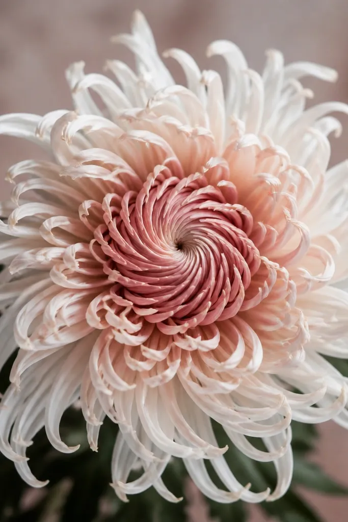
This version looks delicate, and it’s great when you want the flower to feel airy instead of stuffed. The spiral center gives you an instant focal point, even if the petals are short. I draw each petal as a thin curved line with a slight taper, like a feather, then I place them in rings that don’t all match — that irregularity makes it feel natural. It flatters lighter color palettes because the thin lines show contrast; try lavender, peach, or pale yellow. If you’re drawing for a kid, this one teaches control without requiring perfect symmetry.
Step 1: Draw a small spiral in the center, about 1 cm wide, with 6-8 turns. Step 2: Starting at the spiral’s edge, draw the first ring of feather petals — each petal is a curved tapered line, about as long as the spiral radius. Step 3: Add 2 more rings, making outer petals slightly longer and spacing them so you can still see the paper between them. Step 4: Color the center spiral darker, then color petals in a lighter wash outward. Finally, add a single thin stem and one leaf, leaving the leaf vein uncolored so it pops.
Good to knowWhen coloring, keep the petal bases slightly darker than the tips — it gives a hand-painted look.
Common mistakeFilling every petal solid color makes the spiral center hard to read.
3. Toothpick Starburst Chrysanthemum
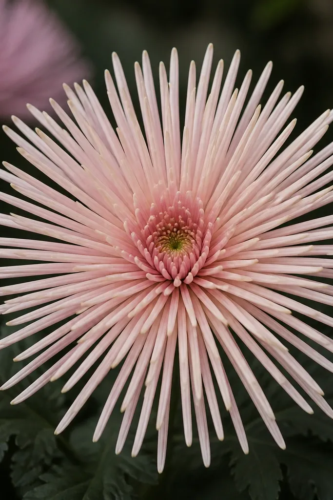
I call it the toothpick style because the petals are thin and upright, like tiny sticks. It’s a good choice when you want a bolder, graphic look for a homemade poster or a classroom craft sheet. The trick is to keep each petal narrow and to place them close to each other without turning them into a blob. This style looks best on thicker paper or cardstock because the lines need to stay crisp. For colors, I like using one saturated shade for petals (red, teal, or deep purple) and a contrasting center (yellow or orange).
Step 1: Draw a circle center, then add 16 petal lines around it — keep them narrow, about the width of a pencil line. Step 2: Curve each petal slightly at the outer third so the chrysanthemum doesn’t look like a clock face. Step 3: Add a second ring of 20 petals that are longer, letting the tips form a rough outer circle. Step 4: Outline the outer tips lightly with a darker marker or pencil to sharpen the edge. Finally, draw a simple stem and add two narrow leaves with jagged edges.
If you’re using markers, press lightly at the base so the petal line looks tapered instead of thick.
Making the petals too wide turns the starburst into a flat disk.
4. Rolled Ribbon Chrysanthemum
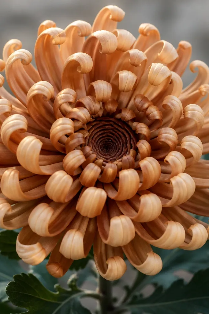
This one looks fancy without being hard. The petals are drawn as short curved ribbons that curl inward at the tip, so you get that “layered” look. I use it when I want the flower to feel dimensional on greeting cards. It flatters medium-to-dark colors because the curled tips catch attention; think burgundy, mustard-gold, or deep orange. The rolled center also helps kids because the center is visually forgiving — even if the outer petals wobble, the curl effect still reads as chrysanthemum.
Step 1: Draw a small spiral center, then thicken it with short curved bands so it looks rolled. Step 2: For the first petal ring, draw 12 ribbon petals as rounded U-shapes that curl at the end toward the center. Step 3: Add a second outer ring with 16 larger ribbon petals, making the outer curls slightly smaller so they don’t overlap too much. Step 4: Color the base of each ribbon darker and leave the curl tip a little lighter. Finally, add a thin stem and two layered leaves drawn as simple ovals with a center vein.
Good to knowUse colored pencil for the ribbon shading — it blends the curl edges without harsh gaps.
Common mistakeOutlining every petal with a thick black line makes it look like a sticker.
5. Dot Cluster Center Chrysanthemum
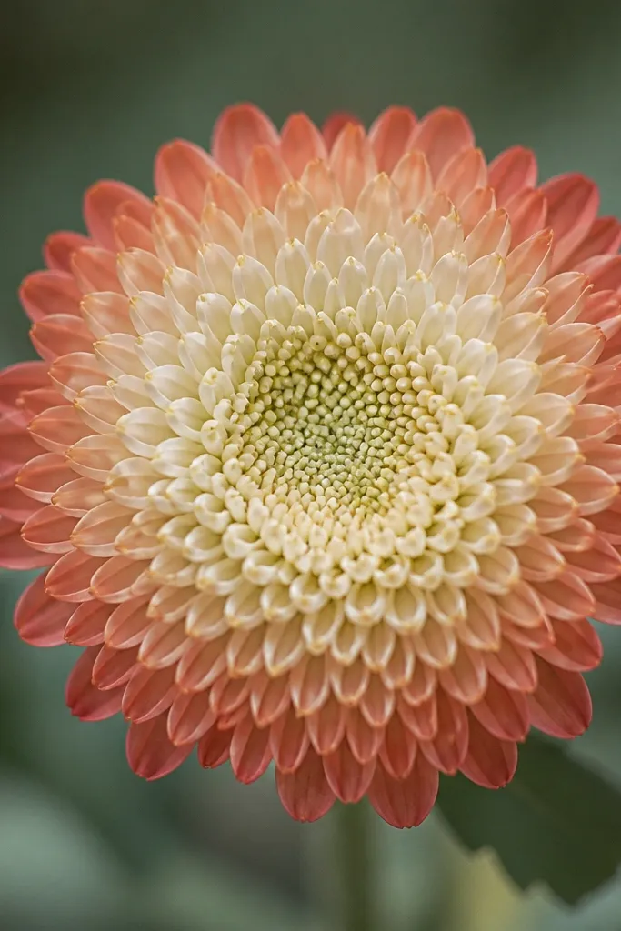
This is my go-to when a kid gets impatient. The dot cluster center fills quickly, so the flower looks “started” even before petals are perfect. The petals go around it in rings made of short curved strokes, and the dots help the center blend smoothly into the first ring. It looks good with any color because the center texture adds contrast. For skin tones and faces on cards, this style is also friendly since it doesn’t compete with the background — it stays focused on the flower.
Step 1: Draw a circle guide for the flower about 5 cm wide. Step 2: Fill the center with 30-40 tiny dots using a pencil dot or a marker tip — keep them within a 1.5 cm area. Step 3: Add the first ring of petals as 10-12 short curved strokes touching the dot cluster edge. Step 4: Add 2 more rings with longer strokes, then color the outer ring slightly darker. Finally, add two leaves at the bottom using curved teardrops and a single line vein down the middle.
Good to knowUse the same dot size all the way through — consistency makes the center look intentional.
Common mistakeMaking dots too large overwhelms the petals and turns the center into a blob.
6. Petal Ladder Chrysanthemum
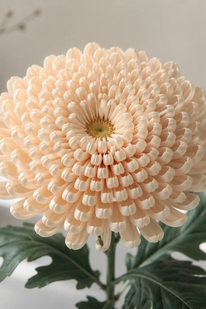
This one is surprisingly easy and looks clean on plain printer paper. The petals are like tiny steps — each petal is a small rounded rectangle that stacks next to the last one. It gives a tidy, almost embroidered look, which I like for budget crafts because it doesn’t need fancy shading. This style works especially well for kids because each petal has a simple shape. Use a single color for petals and keep the center slightly darker so the stacked rows show.
Step 1: Draw a small center circle and then add 6 short lines radiating outward as guides. Step 2: Start the first petal row by drawing small rounded rectangles along those guides, with each rectangle touching the next. Step 3: Add a second row outside it, making rectangles slightly larger and curving the row into a circle. Step 4: Continue for 3-4 rows until you reach your desired flower size. Finally, add a stem and two leaves, using simple ovals with a darker outline on the edge.
If your petal rectangles look crooked, rotate the paper slightly and redraw the row straight.
Leaving big gaps between rows makes the flower look like separate chips.
7. Sunburst Spiral Chrysanthemum
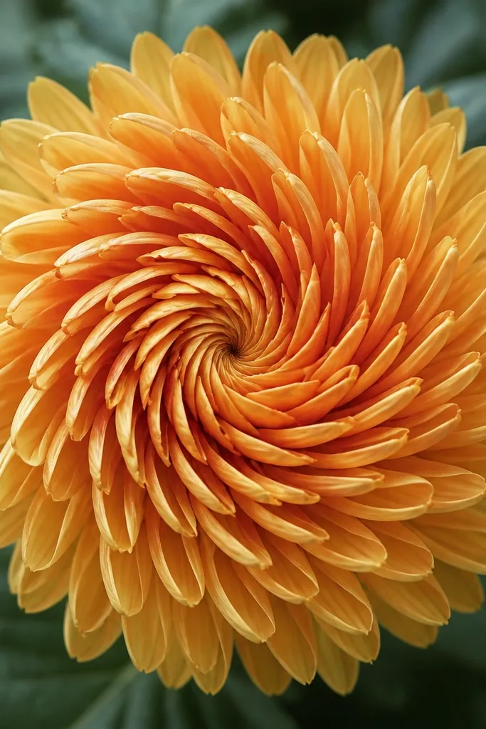
This is the one I use when I want movement in a page. Instead of rings that are perfectly circular, petals follow a spiral route, so the flower feels like it’s turning. It still looks like a chrysanthemum because the petal shapes are consistent — the spiral just changes the layout. This flatters drawings that need to sit beside a face or text because it has direction, not just symmetry. I like it in warmer tones like orange-red with a darker center.
Step 1: Draw a small spiral center and mark one “starting spoke” line from the center outward. Step 2: Draw petals along the spiral path — each petal is a curved teardrop that points outward, placed where the spiral line would go. Step 3: Keep following the spiral for 3-4 rotations, expanding the petal size gradually. Step 4: Add one outer ring of slightly longer petals to finish the edge. Finally, color the center darker and sweep outward with lighter strokes so the spiral direction shows.
Count your spiral turns — 3 turns looks great for smaller pages, 4 for bigger ones.
Switching petal shapes mid-flower makes it look like two different drawings.
8. Half-Petal Edge Chrysanthemum
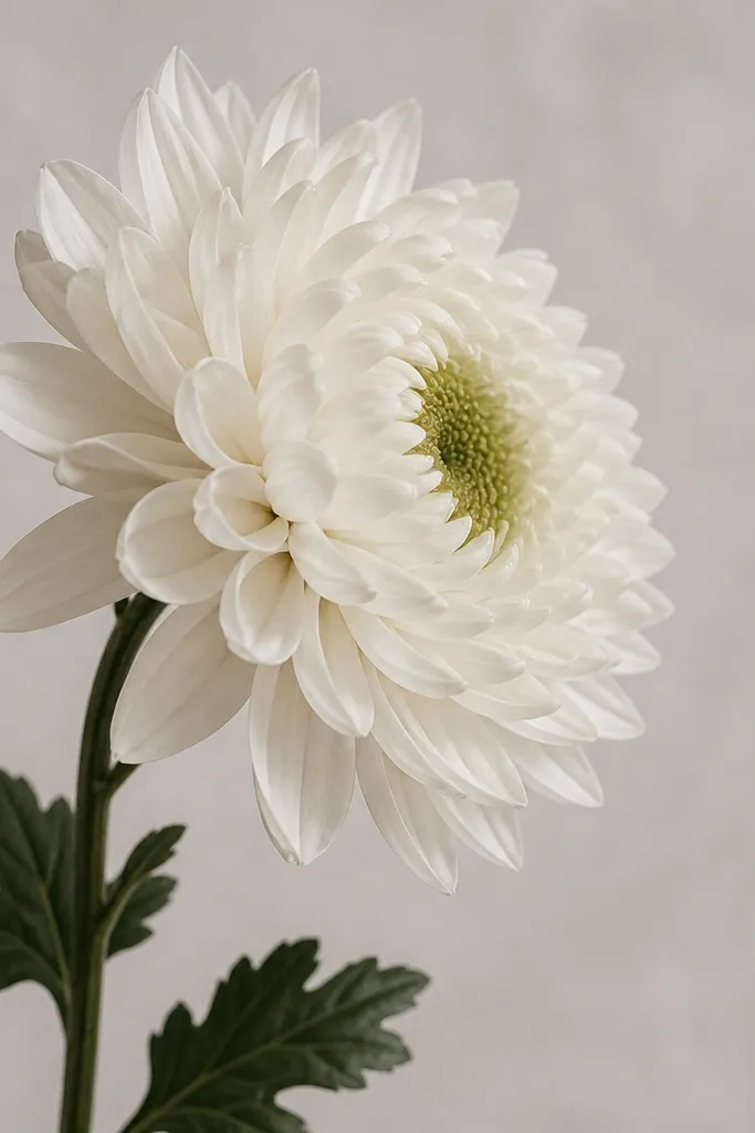
This one makes your drawing look more realistic because it isn’t perfectly front-on. I use it for cards where the flower sits behind a name or a ribbon — the partial petals make it feel layered. The center stays visible, but the outer petals get shorter on the “hidden” side. It flatters busy backgrounds because it doesn’t take up the whole page with symmetry. You can color the hidden side lighter or even leave it mostly uncolored, and the contrast helps the viewer read the shape.
Step 1: Draw an oval center guide, slightly wider on the left. Step 2: Add full comma petals on the left side in 3 rings, each petal pointing outward. Step 3: On the right side, add only 1 ring of shorter petals and tuck them closer to the center. Step 4: Darken the left outer petal tips and keep the right side lighter. Finally, add a stem that angles slightly upward and one leaf behind the stem line so it looks layered.
Good to knowOffset the center 1 cm toward the visible side — it instantly makes the flower look turned.
Common mistakeKeeping both sides identical defeats the side-view effect.
9. Two-Color Petal Tip Chrysanthemum
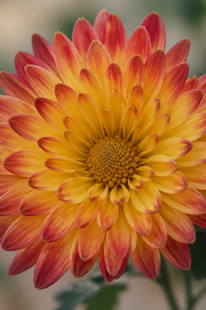
This is the easiest way to make a simple chrysanthemum look expensive. The petals are drawn as comma or feather shapes, but you color only the tips with a second color. I’ve used this for kids and adults because it’s forgiving: even if the petal shapes aren’t identical, the two-tone tips still read as “designed.” Choose two colors that look good together — peach with coral, cream with light blue, or yellow with orange. It flatters light backgrounds and makes the flower pop without heavy shading.
Step 1: Draw a classic ring chrysanthemum using comma petals, 4 rings total. Step 2: Color the entire petal body with your base color, leaving the center slightly darker. Step 3: Using a second color, color only the outer third of each petal tip — keep it consistent across the flower. Step 4: Add a tiny dark line at the base of each petal if you want extra definition. Finally, color the center with a mix of both colors, so it ties the flower together.
Good to knowUse a small brush or a fine colored pencil for the tip color so it stays crisp.
Common mistakeColoring the second shade all the way to the base turns it into a muddy blend.
10. Marker-Only Chrysanthemum with Thick Center
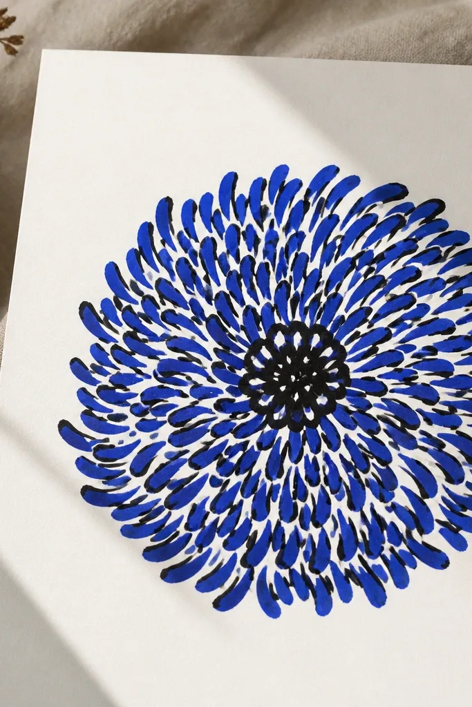
If you want speed, do this marker-only version. The thick center makes the flower read instantly from across the room, which matters for kids' drawings displayed on a wall. Petals are drawn as short curved strokes radiating outward, and you don’t need pencil guides. This style looks best with one bright color because the thick outlines and center give enough contrast by themselves. It also works on dark paper if you use white gel pen for the petals and a marker for the center.
Step 1: Draw a big center circle and fill most of it in thick marker, leaving 3-5 tiny white spots. Step 2: Around the center, draw 12-15 short curved petal strokes, each one starting near the center and ending slightly outward. Step 3: Add a second ring with 18 strokes, slightly longer and more spaced. Step 4: Color all petals with one color, leaving the white spots untouched. Finally, add two leaves in the same color with a black outline and a small vein line.
Good to knowPress hard for the center, then lighten your pressure for petals — it keeps the flower from looking heavy.
Common mistakeUsing pencil to sketch first and then going over everything with marker can make lines look messy.
11. Crayon Wax-Resist Chrysanthemum
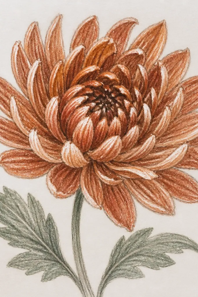
This is the “wow” technique I used when we ran out of fancy paint. Crayon wax-resist creates natural highlights that look like light catching petals. You draw your chrysanthemum in crayon first — outlines and a few streaks inside petals — then paint over it with watercolor or thinned paint. The wax repels the paint, so the highlights stay bright. It flatters pastel palettes because the highlights make the petals look soft and airy. For kids, it’s also forgiving because even messy crayon lines become part of the texture.
Step 1: Draw a chrysanthemum base in light pencil, then go over outlines and petal streaks with a white crayon. Step 2: Add petal shapes as simple comma strokes in crayon, leaving tiny gaps for highlights. Step 3: Paint over the whole flower with a wash of your chosen color, like pale pink mixed with a little water. Step 4: While still damp, add a darker wash at the outer edge of petals to create depth. Finally, once dry, add a darker center with a small dot cluster using a marker or colored pencil.
Use thick crayon lines for the highlights; thin wax marks disappear under heavy paint.
Painting too many times in the same spot makes the wax-resist look smeared.
12. Colored Pencil Layered Petal Chrysanthemum
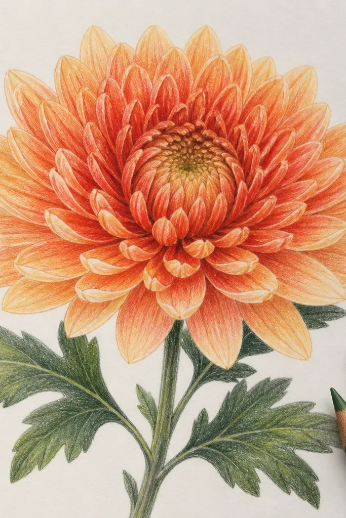
This one is about control and softness. I draw petals as curved lines, then shade each petal in layers — darker at the base, lighter at the tip. Colored pencil gives you that gradual fade without needing markers. It flatters anyone who likes realistic-looking flowers because the petal shading reads like depth. If your kid wants to color neatly, this style rewards careful strokes. It also looks great in a monochrome palette like all-salmon or all-lilac.
Step 1: Sketch the flower lightly in pencil: a center circle and 4 rings of comma petals. Step 2: Color the center first with a darker pencil, then lightly fill petal bases with the same dark shade. Step 3: Switch to a mid-tone for the middle of each petal, then finish with a lighter tone at the tips. Step 4: Use short pencil strokes that follow the petal curve, not scribbles. Finally, add a few tiny dot marks in the center to mimic flower texture.
Sharpen your pencil and shade with the tip, not the side, for cleaner petal edges.
Heavy scribbling flattens the petals and kills the layered look.
13. Geometric Facet Chrysanthemum
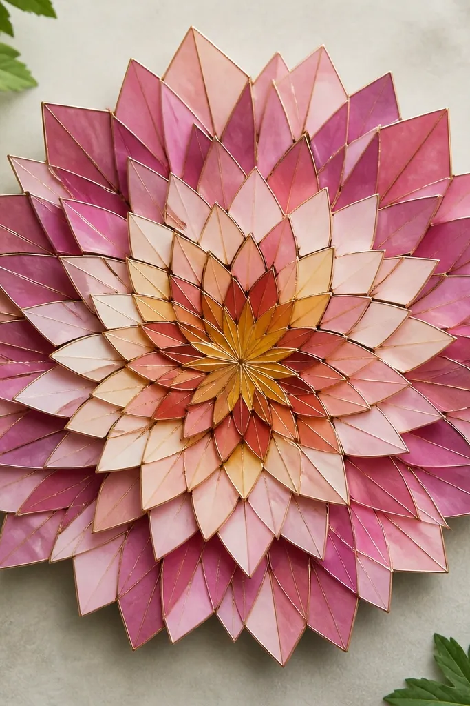
This is the chrysanthemum you draw when you want a craft-page look with clean edges. Instead of comma petals, you draw small polygon petals — triangles, trapezoids, and narrow wedges. It ends up looking like folded paper or stained glass, and that’s a fun change from the usual “curly” petal styles. It flatters bold color choices because each facet can be a slightly different shade. I’ve used it for kids who love patterns and for adults who want a break from organic curves.
Step 1: Draw a small center circle, then add 10-12 wedge guides like slices of a pizza. Step 2: Fill the first ring with trapezoids that follow each wedge, keeping the inner ends touching the center. Step 3: Add a second ring with slightly larger trapezoids and a third ring with triangles pointing outward. Step 4: Color each facet with a different shade of the same color family, keeping the outer ring darker. Finally, outline the outer edge with a single clean marker stroke to sharpen the silhouette.
Good to knowUse a ruler for the wedge guides, then erase — the facets look crisp without you drawing perfect freehand lines.
Common mistakeOverlapping facets or ignoring wedge spacing makes it look like random blocks.
14. Paper-Plate Chrysanthemum Template Transfer
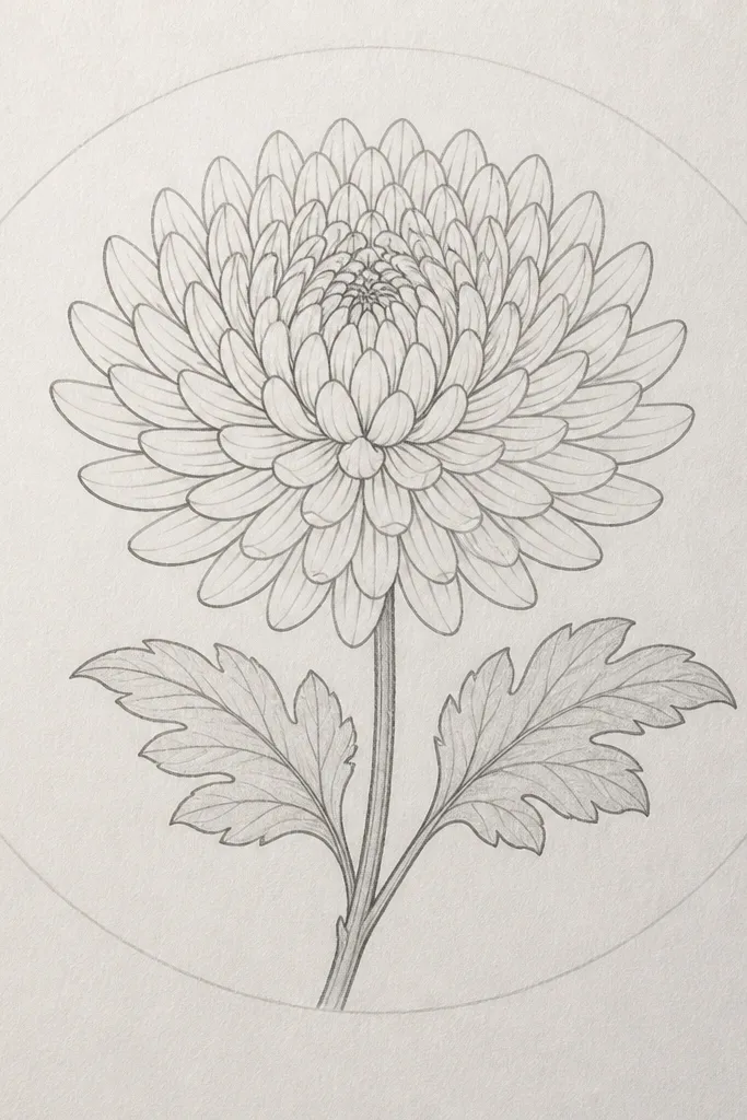
This is the easiest way to get consistent petal sizes when you’re doing multiple drawings for kids. I used a paper plate as a circle guide — the outer rim gives you a perfect diameter so the petals don’t crowd. You still draw the petals by hand, but the placement is easier because you’re working inside a traced boundary. This style flatters group projects since everyone ends up with a similar flower shape. It also looks good for making a set of matching cards or a classroom bulletin board.
Step 1: Trace a circle using a paper plate rim or a bowl, then lightly mark 4 petal ring circles inside it (about 1 cm apart). Step 2: Draw the center circle, then place comma petals along the first ring — keep each petal length consistent. Step 3: Move outward ring by ring, using longer comma strokes while staying within the traced ring boundary. Step 4: Erase the ring guides when the petals are done. Finally, add a stem line from the bottom center and two leaves that fit under the flower without touching the petals.
Good to knowTrace the circle lightly. Dark guide lines show through when you color.
Common mistakeDrawing petals outside the traced boundary makes the flower look uneven and “off-center.”
15. Mini Chrysanthemum Sprays on a Card
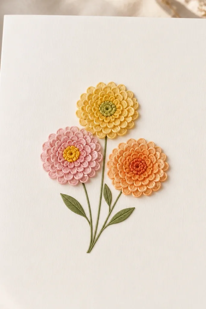
This one makes your drawing look more decorative even if you only know one petal method. Mini flowers are forgiving because you’re not trying to fit a huge bloom — the petals can be shorter and simpler. I like it for kids' cards because it turns one drawing skill into a complete composition. It flatters small spaces and keeps the page from feeling empty. Choose three colors or keep them in one palette like cream, peach, and coral for a soft look.
Step 1: On a card-size sheet, sketch three small circles for the flower heads, spacing them so they overlap slightly. Step 2: For each flower, draw a dot or tiny spiral center and add 3 rings of comma petals, keeping petals about the same height within each flower. Step 3: Draw thin stems that meet under the cluster, then add two leaves per stem cluster using simple teardrops. Step 4: Color the centers darker and the outer petals lighter. Finally, add a few tiny buds as small dots or half-moons near the stems.
Good to knowKeep petals shorter than you think — mini flowers look better when petals stay compact.
Common mistakeMaking one flower too large steals attention and throws off the cluster.