1. Single Aster with Teardrop Petals
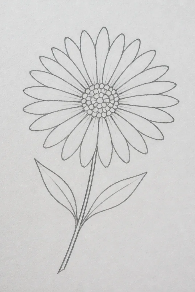
This is the first one I teach because it reads as “aster” immediately. Use a light pencil circle for the center, then draw 12 to 18 teardrop petals pointing inward. I like purple petals with a warm yellow center because the contrast looks crisp even with cheap markers. It flatters small pages because the flower stays compact and doesn’t sprawl. For kids, it’s forgiving — teardrops can overlap a bit and it still looks intentional. The styling principle is direction: every petal points toward the center so the flower looks alive, not flat.
Start by drawing a circle about 1 cm wide (smaller if you’re working with a kid’s page). Then add teardrops around it, leaving tiny gaps between each one so the center shows through. Color the petals in purple or lavender, and leave a thin white edge if you want a softer look. Finally, draw one curved stem and one leaf using a single oval with a pointed tip, and add a few short vein lines. Keep the leaf on the opposite side of the stem bend so the composition doesn’t feel lopsided.
Color the center dots with orange first, then add a darker brown dot on top. That two-step center makes the whole flower look more detailed.
Don’t fill the entire petal ring solid — leaving small gaps keeps it from looking like a sticker.
2. Aster Cluster in a Cup
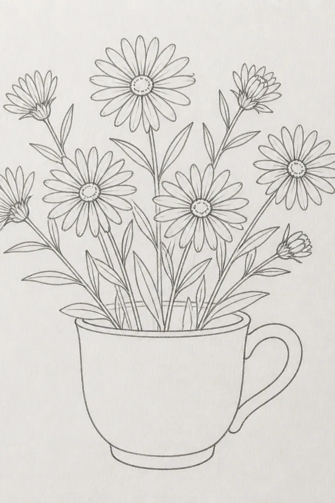
A cluster is a cheat code when you want “pretty” fast. You’ll draw one simple aster shape three times, but the overlap hides uneven petal sizes. I like a cup outline because it gives the drawing a home, which helps kids keep things inside the page. This also flatters busy coloring supplies: different petal colors look deliberate when they sit together. The center stays consistent, so the whole cluster feels cohesive. Styling principle: group and overlap — the cup rim hides the messy stem connections.
Draw the cup first: a trapezoid body with a slightly curved top rim and a small base line. Then sketch three flower centers near the top of the cup, spaced like a triangle. For each center, add teardrop petals outward, but keep the outer petals slightly shorter so they don’t collide. Color the petals in three different tones (pink, purple, blue) and make every center yellow-orange. Finish by drawing stems that curl behind the cup rim and add one short leaf tucked near the lower right flower.
Use the same yellow-orange center color for all three flowers. It makes the cluster look designed, not random.
Avoid drawing stems too straight — straight stems make the cup look like the flowers are floating.
3. Blue Aster with Dot Center Spiral

If your center always looks flat, this fixes it. Instead of a single filled circle, you place tiny dots in a spiral so the center has texture. The petals can be short curved strokes, which makes the flower feel airy and kid-friendly. Blue petals plus a warm yellow center look clean and cheerful, especially on light backgrounds. It flatters small hand-drawn spaces because the center details do the heavy lifting. Styling principle: texture in the center, simpler petals outside.
Start with a pencil circle for the center, then mark a spiral path with 8 to 10 faint dot positions. Dot them with a yellow-orange marker, then add a second layer of smaller darker orange dots on every third dot. For petals, draw 16 short curved strokes around the center, each stroke bending toward the middle. Color petals in sky blue or denim blue, leaving a tiny white line at the stroke edge if you can. Add a pale teal wash behind the flower using watered-down paint or a very light marker blend, staying clear of the petals.
Good to knowPress the marker down lightly for the first dot layer, then go back with darker dots only on the spiral’s inner half.
Common mistakeDon’t make the spiral too large — if the spiral reaches the petal ring, the center turns messy.
4. Aster Border Line on Notebook Paper
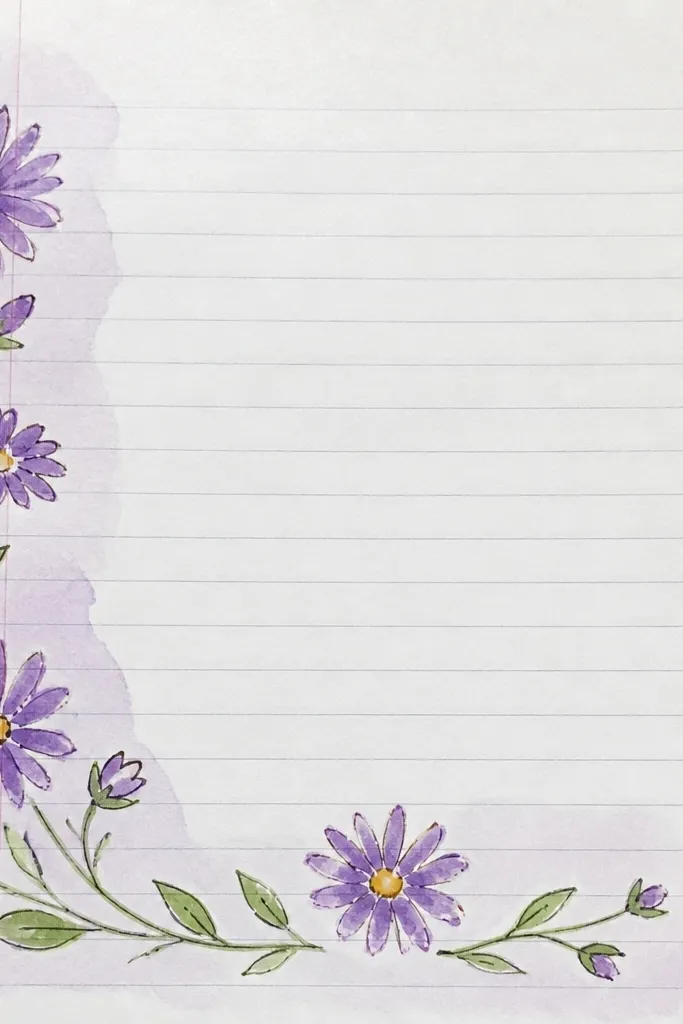
Borders are where simple drawings look intentional, fast. You repeat one mini aster pattern so the page feels finished without heavy shading. I use this when I’m making a page for a kid’s art journal because it frames everything below. It flatters thin paper because the petals are small and don’t smear as long as you use a fineliner or a dry marker. The styling principle is rhythm — consistent spacing and repeating centers.
Draw a straight guideline across the page at about 1 cm from the top. Then sketch a tiny center circle about 3 to 4 mm wide, followed by 8 petal teardrops around it. Repeat every 2 to 3 cm, alternating petal color between purple and lilac if you want a playful look. Keep each mini aster the same size — that’s the difference between “cute” and “chaotic.” Finish by adding two short leaf sprigs between flowers, using a single curved line and two small oval leaves.
Good to knowUse a ruler for the spacing guideline even if you freehand the flowers. It stops the border from creeping.
Common mistakeDon’t vary the flower size wildly — it makes the border look accidental.
5. Aster Bouquet with Staggered Petals
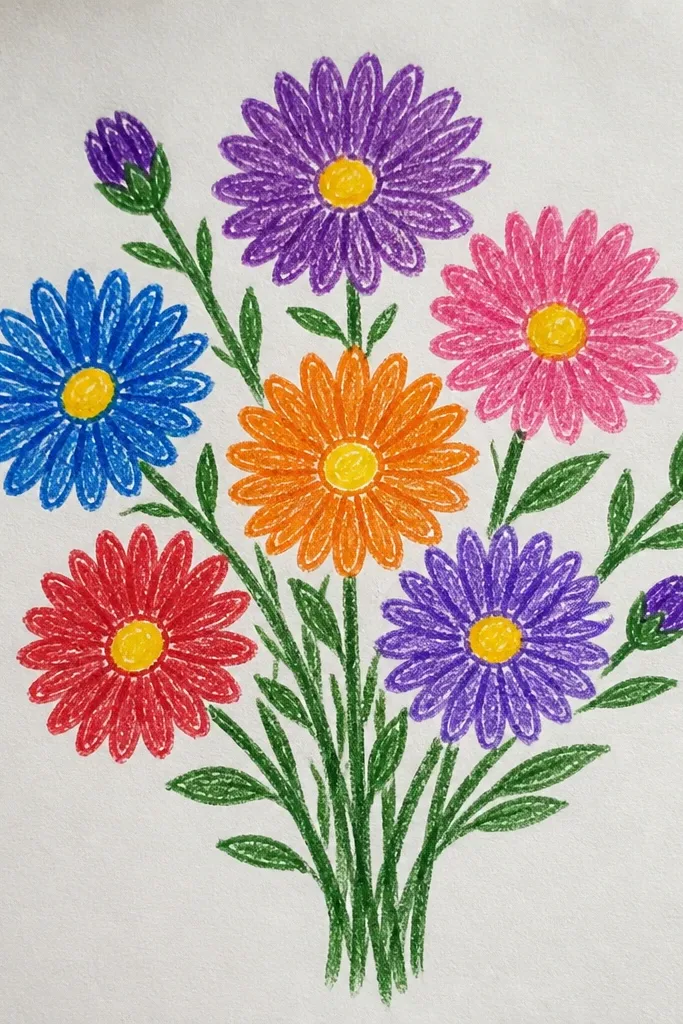
This one makes simple asters look layered without advanced shading. You draw the inner petal ring first, then add an outer ring with slightly larger teardrops. It’s flattering because the flower gets depth even if you only use one petal color. It works for all skin tones and ages because it doesn’t rely on delicate hand control — you just keep the ring sizes consistent. Styling principle: staggered layers — inner petals sit between outer petals.
Start each flower with a pencil center circle, then add an inner ring of 10 smaller teardrops. Next, add an outer ring of 12 to 16 slightly larger teardrops, placing the new petals between the inner ones. Color inner petals a slightly lighter purple than the outer petals, like lavender for inner and plum for outer. Draw stems that overlap in front of each other and add one leaf per stem at mid-height. Finish by darkening the center dots with a brown-orange marker so the layers read clearly.
If your markers bleed, outline first with pencil, then trace with a fineliner after coloring the petals lightly.
Avoid drawing both rings the exact same size — that flattens the flower.
6. Tiny Aster on a Heart Card
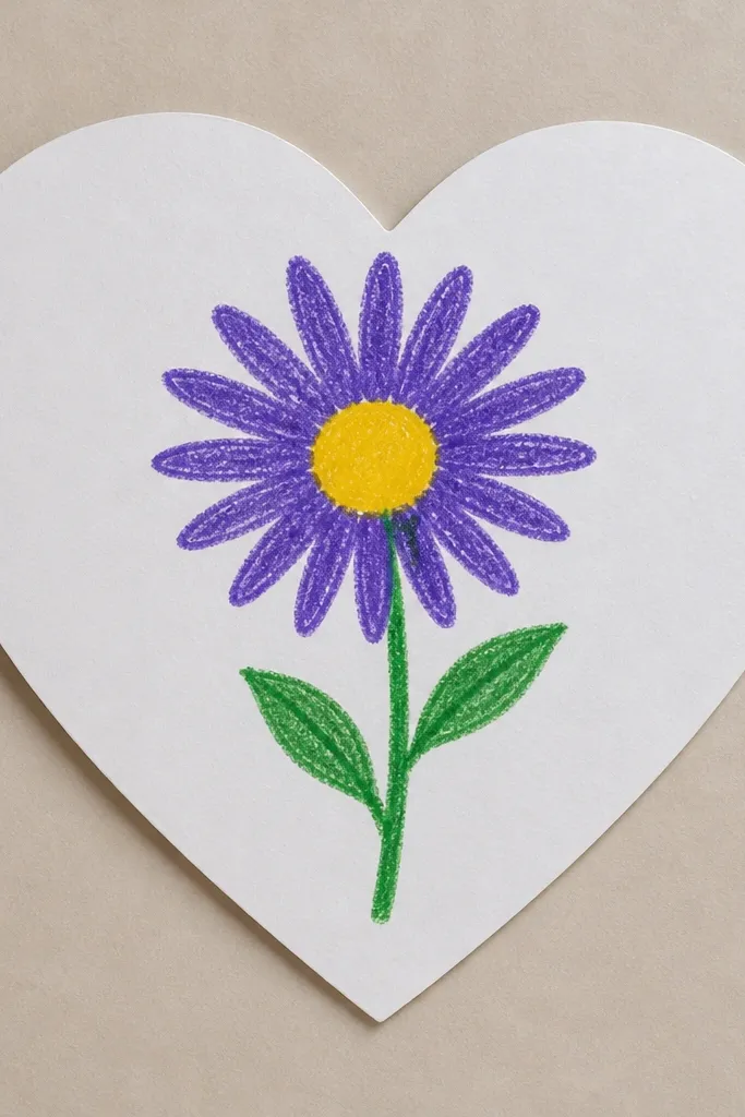
This is the easiest way to make a kid-made card look thoughtful. The heart shape gives a strong outline, so the tiny flower can stay simple without looking underdone. I’ve used this for Valentine’s and spring birthdays, and it always reads as sweet. It flatters smaller drawing skills because you’re not filling a big space — you’re placing one focal point. Styling principle: big shape framing a small detailed element.
Draw a heart on thick paper or cardstock, then lightly sketch a tiny center circle in the heart’s middle. Add 10 to 14 short petal strokes radiating outward, each one curving slightly toward the center. Color petals purple, then dot the center with yellow and add a few brown dots. Draw a short green stem from the lower part of the heart, and add a single leaf that sits just off-center. Add one or two tiny sparkles or dots in pale yellow around the flower for a clean extra touch.
Use a white gel pen to add 3 tiny highlights on the petals. It instantly makes the marker work look intentional.
Don’t place the flower too low inside the heart — the stem looks cut off.
7. Aster Mandala Style (No Compass)
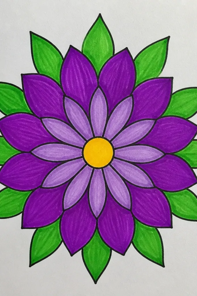
Mandala-style asters look complex, but you’re really just repeating a mini pattern. I like this when someone is bored with single flowers and wants more “wow” without learning shading. The radial layout keeps everything balanced, which helps kids who struggle with symmetry. It flatters anyone’s attention span because each ring is the same action: draw petals, color, repeat. Styling principle: repetition with radial spacing.
Draw a small center circle, then make one full ring of teardrop petals around it. Next, draw 6 to 8 small “mini centers” around the main flower like flower seeds around a circle. For each mini center, draw 6 petal strokes pointing inward toward that mini dot. Color the main petals a deeper purple and the outer ring a lighter lilac. Finish with a few green stem lines that radiate slightly outwards, but stop them before they reach the page edge.
Good to knowMark 8 points around the center with tiny pencil dots first. You’ll place each mini aster more evenly.
Common mistakeAvoid freehand-only symmetry — if you skip the pencil points, the rings drift.
8. Aster with Crayon Resist Wash
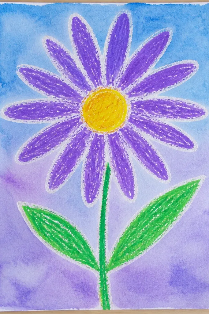
This is one of my favorite budget techniques because it uses cheap crayons and basic watercolor. You draw the aster with a light crayon outline, then paint over it with watered-down color — the crayon repels the wash and keeps lines crisp. It looks artsy even when the flower is simple. It flatters kids because the wash hides small sketch errors. Styling principle: use the medium’s behavior — crayon resist makes the drawing look more finished than it is.
Outline the aster with a white or pale yellow crayon: draw a center circle and 14 to 18 petal teardrops. Color the center lightly with orange crayon so it shows through the wash. Then mix watercolor (or watered tempera) in a thin purple tone and paint around the petals, not over the darkest lines. Let it dry, then go back with a marker or colored pencil to strengthen the petal edges. Add orange and brown dots in the center once the wash is fully dry.
Good to knowUse watercolor paint that’s watered enough to look milky, not thick. Thick paint will cover the resist areas.
Common mistakeDon’t press too hard with crayon on the petal tips. Heavy wax can repel too much paint and look patchy.
9. Aster on Striped Paper Background
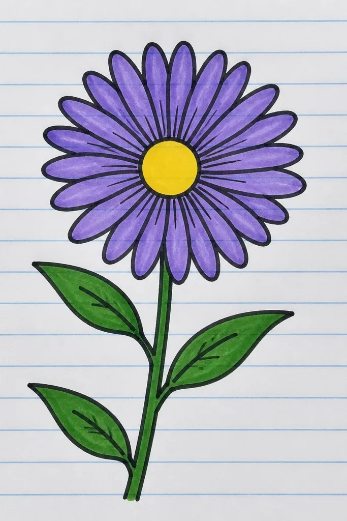
Stripes make the flower look styled without extra drawing. I use this when I want a clean, cozy look for kids because the background is simple and the flower becomes the focus. It flatters the drawing because stripes guide the eye toward the center height. Also, the contrast helps marker work look sharper. Styling principle: simple background pattern + one focal flower.
First, draw three to five thin horizontal stripes with a light green pencil or colored pencil, leaving white gaps between them. Then place your aster slightly above the middle so it doesn’t get swallowed by stripes. Draw the center circle and 12 to 16 petal strokes or teardrops in purple, keeping each petal pointed inward. Color the center with yellow-orange and dot with brown. Add a thin green stem and one leaf that crosses one stripe line for a nice visual rhythm.
Keep the stripes light. If they’re too dark, they compete with the flower center.
Avoid coloring over stripes with heavy black outlines — it turns the background muddy.
10. Aster with Stipple Shading Center
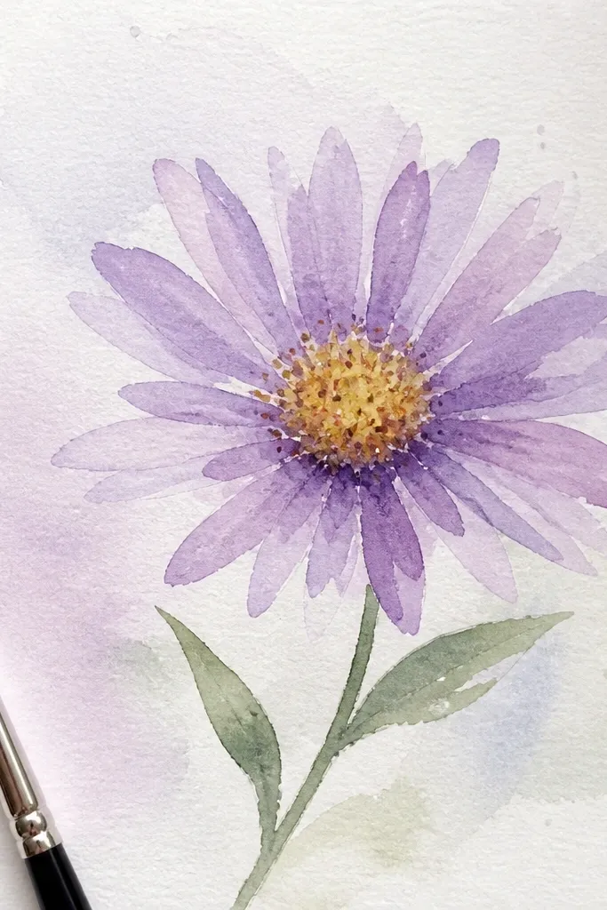
Stipple shading makes the center look like it has depth even if you skip shading the petals. I like using a darker brown marker for dots and keeping the outer center lighter. It gives a handmade texture that looks good on paper and doesn’t require blending skills. It flatters beginners because you’re repeating one tiny action. Styling principle: texture via dot density, not big color blocks.
Draw the center circle lightly in pencil. Then start placing dots from the outer edge inward, spacing them so the perimeter is lighter and the center is darker. Color petals with purple using teardrops or short strokes, and keep the outer petal ring slightly lighter than the inner ring. Add one small leaf using a simple oval with a pointed tip and two short vein lines. Finally, outline the stem lightly with a darker green pencil or marker so it stands out against the petals.
Use a fine tip marker for dots so they stay round. A thick tip turns stippling into blobs.
Don’t fill the center completely solid. Aster centers look better with visible dot structure.
11. Aster in a Mason Jar (Easy Shapes)
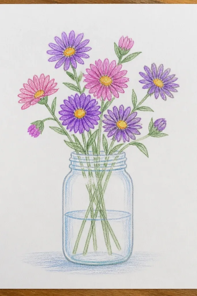
Mason jars make kids' drawings look like a real still-life. You don’t need a detailed jar — simple shapes work because the jar frames the flowers. I’ve made versions of this with marker outlines and it still looks neat when the petals aren’t perfectly even. It flatters a wide range of drawing skills because the jar hides stem messiness. Styling principle: use a container outline to organize the composition.
Draw a jar body as a rounded rectangle and add a slightly thicker rim line at the top. Sketch two flower centers inside the jar, one a bit higher than the other. Add teardrop petals around each center, keeping petals smaller near the edges so they fit inside the jar opening. Color petals in lavender and purple, then dot centers with yellow-orange and brown. Add 2 to 3 short leaf shapes near the stems and draw the stems angled upward inside the jar.
Add one thin vertical highlight line on the jar with a light gray pencil. It makes the jar look glassy without extra work.
Avoid drawing the jar too wide. If the jar is wider than the flowers, the page looks empty.
12. Aster with Checkerboard Petal Accent
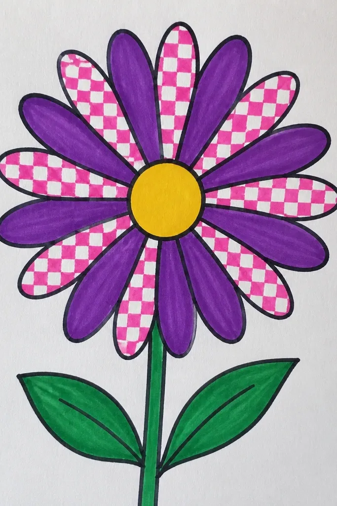
Checkerboard coloring turns a simple aster into a pattern you can repeat without overthinking. I use it when coloring supplies are limited to two purple tones and one green. It flatters small kids' control because even imperfect petal shapes still look good when colors alternate. The flower looks intentional on plain white paper, too. Styling principle: alternate colors by petal index, not by shading skill.
Draw the center circle and 14 to 18 petal teardrops around it. Color every other petal light lilac, then color the remaining petals deeper purple. Keep the center orange-yellow, then add small brown dots to keep it from looking flat. Draw a single curved stem and one leaf, and keep the leaf outline thin so it doesn’t compete with the petal pattern. Add a tiny row of dots above the center as a mini “halo” if you want extra texture.
If you lose track, count out loud as you color petals: 1, 2, 1, 2. It keeps the pattern clean.
Don’t alternate randomly across the ring. Random placement kills the checker effect.
13. Aster with Watercolor Bleed Edges
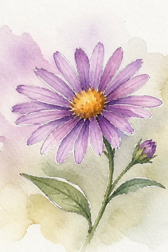
This style looks airy and cozy because the petal edges blur slightly like real petals. I use it when I’m working with watercolor paper and want a gentle look instead of marker sharpness. It flatters the drawing because the blur forgives wobbly petal lines. Kids like it too because the process feels like painting, not just drawing. Styling principle: let the medium soften the outline while you keep the center crisp.
Sketch the flower lightly with pencil: a center circle and 12 to 16 petal teardrops. Wet the petal areas with clean water using a small brush, then drop in diluted purple watercolor at the petal tips first. As the color spreads, it will bleed outward — keep the center area drier so the yellow-orange stays clean. Color the center with a stronger yellow-orange, then add brown dots once it’s mostly dry. Add a pale pink wash behind the flower, leaving white space around the petals.
Good to knowKeep the brush mostly clean and blot the brush edge on a paper towel. That controls the bleed.
Common mistakeDon’t flood the whole page with water. Too much pooling makes the petals turn muddy.
14. Aster with Simple Leaf Trio
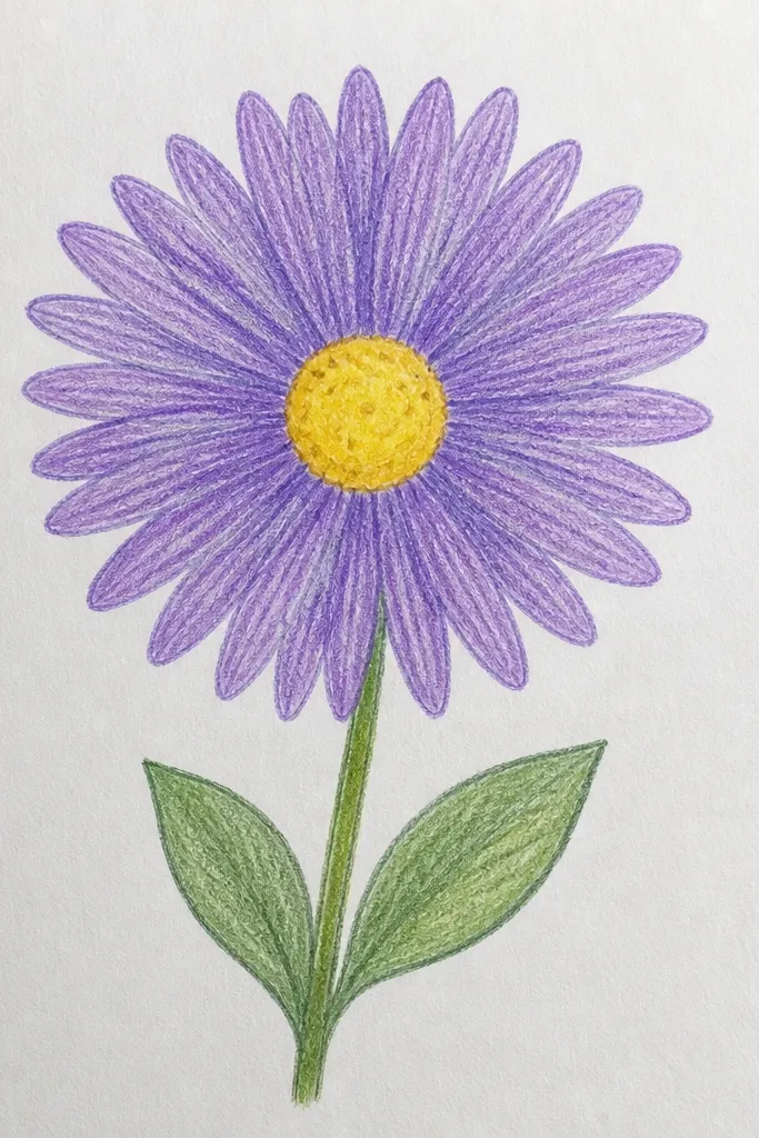
This is the “done in five minutes” look that still feels styled. The leaf trio frames the flower and balances the composition, especially if your petals are small. I like it for kids because leaf shapes are easier than petals, and the overall drawing looks more complete even when the flower is basic. It flatters smaller paper because the leaves take up space without clutter. Styling principle: balance — one flower plus a simple leaf fan equals symmetry.
Draw a center circle and add 12 petal teardrops around it. Color petals purple and center yellow-orange with a few brown dots. Draw a thin stem line that curves slightly right. Then make a leaf trio: three ovals with pointed tips attached along the stem at one spot, like a tiny fan — left, middle, right. Add two short lines inside each leaf to suggest veins, but keep them light. Finish by tracing the stem with a darker green so it stands out against the petals.
Good to knowMake the middle leaf slightly larger than the side leaves. That keeps the fan from looking flat.
Common mistakeAvoid adding too many leaves. More than three makes the drawing look busy.
15. Aster on a Scrapbook Circle Halo
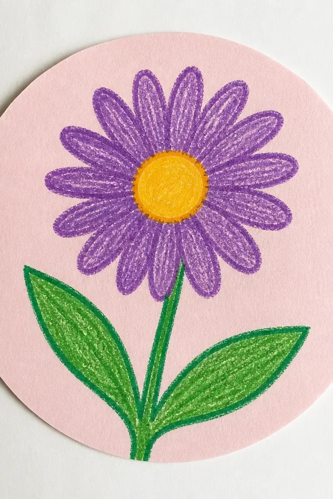
Circle halos make simple flowers look like they belong on a scrapbook page. The halo gives you a background shape without introducing clutter, and it guides the eye toward the center. I’ve done this on cheap printer paper and it still looks good because the pencil halo is subtle. It flatters small kids' drawings by covering up uneven spacing — the halo becomes the “frame.” Styling principle: use one geometric frame and keep the flower pattern tight.
Lightly draw a big circle around your flower area, about twice the width of the aster. Add one inner ring and leave a gap between rings so it looks airy. Draw the center circle and petals inside, using short strokes or teardrops — 14 to 18 for a full look. Color petals purple and center yellow-orange with brown dots. Add a few tiny dots along the outer halo ring for a confetti effect, then keep the stem thin and simple so it doesn’t overpower the circle.
Use a soft pencil for the halo so it doesn’t compete with marker color.
Avoid coloring the halo in dark colors. It will fight the flower center.