1. Vanishing-Point Path With Pink Petal Drift
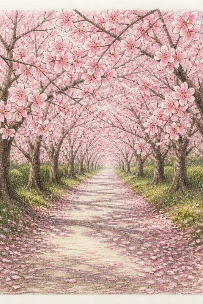
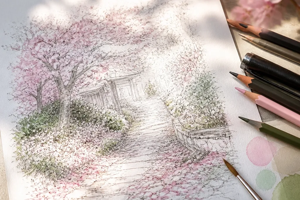
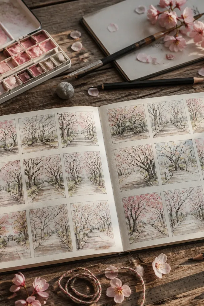
This one is the easiest “wow” drawing because the perspective does most of the work. I draw the path as two lines that converge at eye level, then add the ground edges with short, angled strokes so it looks like paving stones. The blossoms sit on top in clusters — darker pink near the viewer and lighter pink as they approach the vanishing point. It flatters a wide range of kids' drawings because it doesn’t require perfect realism, only consistent spacing and shape repetition.
Start by lightly sketching a horizon line and marking one vanishing point. Draw the walkway sides as two straight lines toward that point, then add a few paving lines that also point inward. For the trees, put a few curved branch lines along the left and right edges, then stop them before they reach the center so the path stays readable. Color the blossoms with watercolor pencils using two pinks: press lightly for pale petals and press harder for the clusters near the bottom. Finally, add a thin wash of watery pink on the far blossoms so they soften toward the center.
Rub a white colored pencil over the highlights on the nearest petals so they look like they’re catching light.
Don’t draw the path stones as equal-sized rectangles — if every tile is the same size, it will look flat and cheap fast.
2. Cherry Blossom Arch Tunnel Over a Winding Side Path
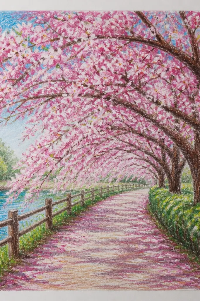
This design looks dreamy because it creates a tunnel view — your eye travels through the arch like you’re walking under it. I use a winding side path (not a straight one), then I repeat the arch shape rhythmically so it feels like a series of frames. The blossoms overhead are slightly larger and darker than the ones on the ground, which gives you depth without extra work. It’s especially flattering for kids because the arch shapes are repeatable, and the curve helps hide small drawing mistakes.
Good to knowUse a small circular scribble for the blossom center, then outline petals with quick teardrop shapes — it reads as flowers even if it’s imperfect.
Sketch a curved path that bends left, and keep your horizon line slightly above the middle. Build the arch by drawing two thick trunk lines that curve inward, then connect them with repeated branch arcs across the top. Place blossom clusters along the arch ribs first, then scatter smaller clusters on the ground in the open space beside the path. Color the overhead blossoms with a deeper pink (like rose) and the far clusters with a lighter wash. Add a few pale gray shadow strokes under the tunnel edges to make the curve feel three-dimensional.
Common mistakeDon’t make the arch too symmetrical. A little wobble looks more natural and stops it from feeling like a sticker.
3. Soft Mist Background With Floating Blossoms
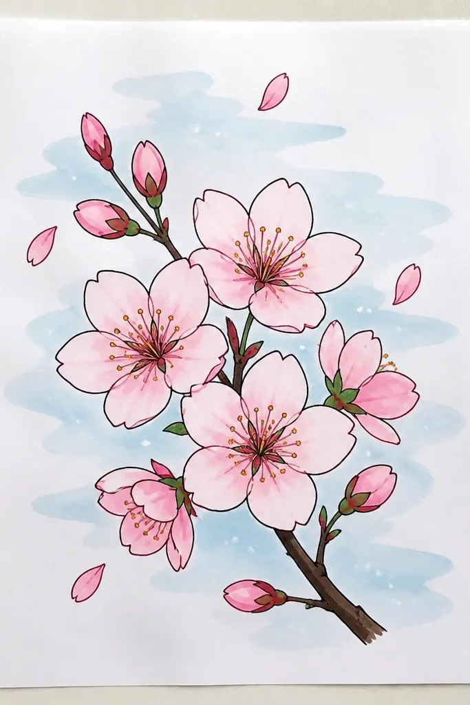
Mist drawings feel dreamy because you’re reducing contrast. I keep the background pale and let the blossoms carry the color — that makes the scene look airy even with simple linework. The path stays light, and the paving details fade, so your brain fills in the rest. This style flatters small hands because it rewards gentle strokes and doesn’t punish messy erasing. It also looks great for kids who press too hard with pencils because the mist wash helps unify the page.
Start with a light pencil path outline and faint paving lines, then erase any heavy marks so the lines stay delicate. Wash the background with a very diluted blue-gray or watered-down violet, leaving the center slightly lighter. Draw branch silhouettes on the sides with thin fineliner, then add blossom clusters as layered dots and teardrops. Color nearest blossoms with more pigment and lightly watercolor the far ones so they blur into the mist. Finish by adding a few darker petals on the bottom edge, then blend the ground haze with a damp brush.
If you don’t have watercolor pencils, use a watered pink marker very sparingly for the distant blossoms.
Don’t outline every petal sharply in the back layer — hard edges against mist make it look like clipart.
4. Sakura Petal Puddle Reflections on the Path
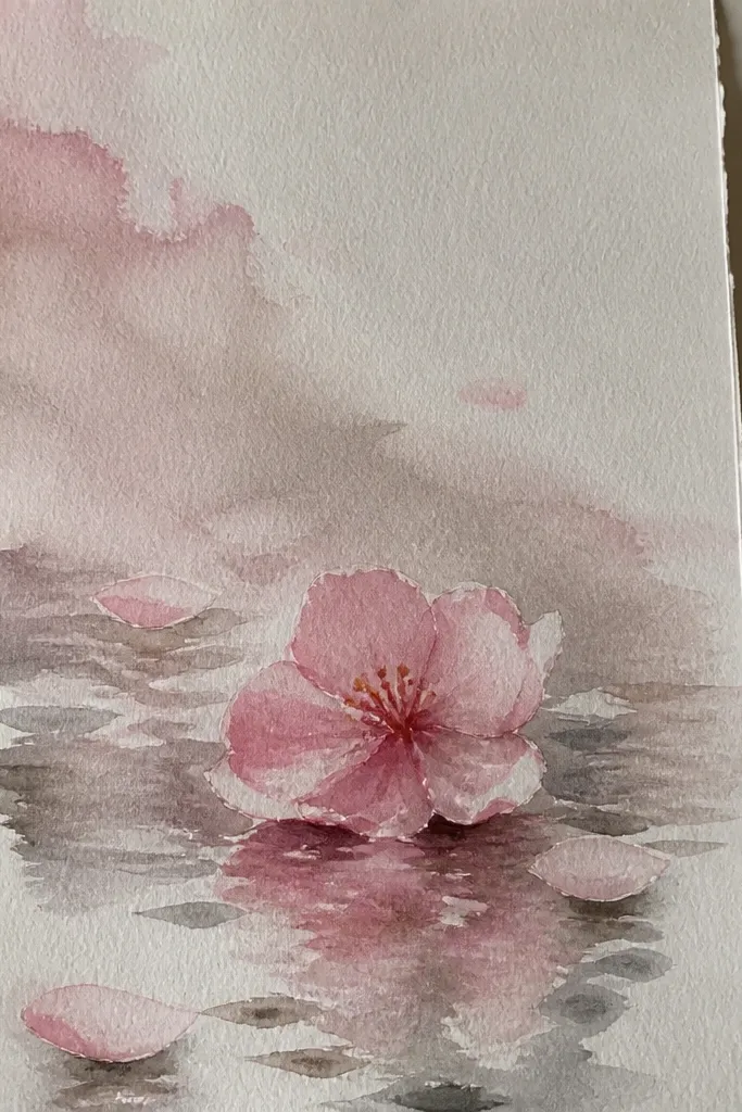
Puddles make the drawing feel dreamy because you get reflection — a natural way to add calm symmetry. I draw the puddles as soft ovals or irregular rectangles with rounded corners, then mirror only some blossoms inside them. The reflection should be lighter and slightly blurred compared to the blossoms above, so the puddles look like water instead of another layer of flowers. This is a fun option for kids because it gives them a clear “focus area” and makes the picture look intentional even with simple shapes.
Sketch the path first, then mark two to three puddle spots along the walkway centerline. Outline each puddle lightly, then color inside with a very pale gray-blue wash. Add blossom clusters above the puddles, then draw a smaller, lighter mirrored version inside each puddle — flip the shape vertically and reduce saturation. Add a few tiny petal fragments around the puddle edges to sell the water movement. Finish with a faint wet shine by leaving one small highlight area uncolored in each puddle.
Use a damp brush to soften the reflection edges. Hard reflection lines can make it look like a sticker sheet.
Don’t mirror everything perfectly. One or two missing reflections look more believable.
5. Paving Stones Pattern Leading Lines With Cherry Blossom Sprinkles
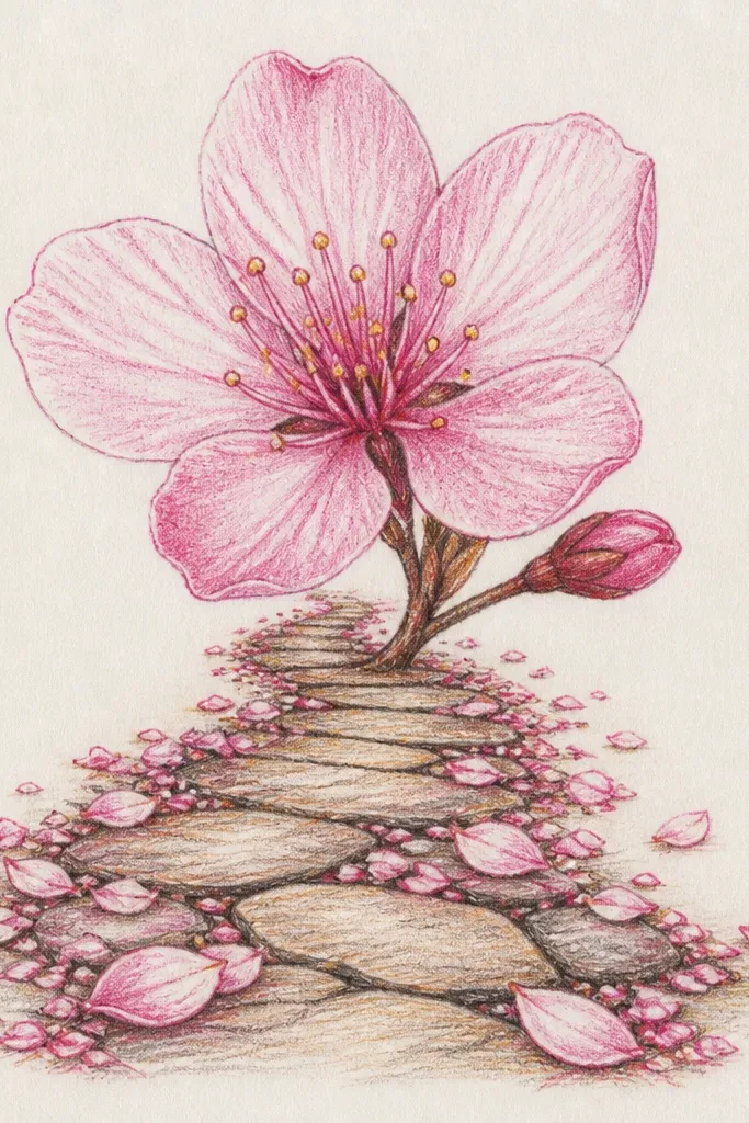
This style is for when you want the drawing to look “designed” instead of just pretty. The paving stones create strong leading lines, and the blossoms act like color punctuation. I keep blossom clusters small and spaced so they don’t fight the stone pattern. It flatters kids who like structure and helps them practice perspective without feeling like they’re doing math. The result looks great in frames because you get both detail and softness.
Draw the path as two converging edges and sketch a grid of rhombus paving stones that shrink toward the vanishing point. Keep the stone lines thin and consistent so the perspective reads. Add blossoms as tiny clusters only on the top surface of the stones, not as big blobs — press lightly for pale pink and darken a few clusters near the bottom. Lightly tint the stones near blossoms with a thin pink wash so color bleeds naturally. Add a few branch stems at the edges with minimal blossoms so the center stays the star.
If your stones look crooked, measure with a ruler for the first five paving lines, then stop measuring and keep the rhythm.
Don’t shade every stone the same dark gray. That kills depth — leave more white space toward the vanishing point.
6. Cherry Blossom Bench Path With Soft Pink Ground Glow

Adding a bench gives the drawing a story and a size reference, which instantly makes the perspective easier. I draw the bench in simple shapes — seat rectangle, backrest curve, and two legs — then I place a few petals on top to connect it to the blossom theme. The pink ground glow is what makes it dreamy: it’s a light wash that spreads outward from the bench area. This works well for kids because furniture shapes are easier than complex trees, and it gives them a “center of attention” besides the path.
Good to knowColor the bench first, then add petals on top. It keeps the petals from looking like they were drawn into the wood grain.
Start with the path and vanishing point, then place the bench slightly off-center so the scene feels like you’re walking past it. Sketch the bench using a few clean rectangles and a curved backrest. Draw branch lines overhead and add blossom clusters around the bench height, then scatter petals along the path in a soft arc. Wash the ground near the bench with very diluted pink, leaving the far path lighter. Add a few dark pink petals on the bench seat and one tiny highlight line on the bench backrest.
Common mistakeDon’t make the bench the same light color as the path. Contrast makes the scene feel real.
7. Sidewalk Border Roses and Sakura Over the Same Path
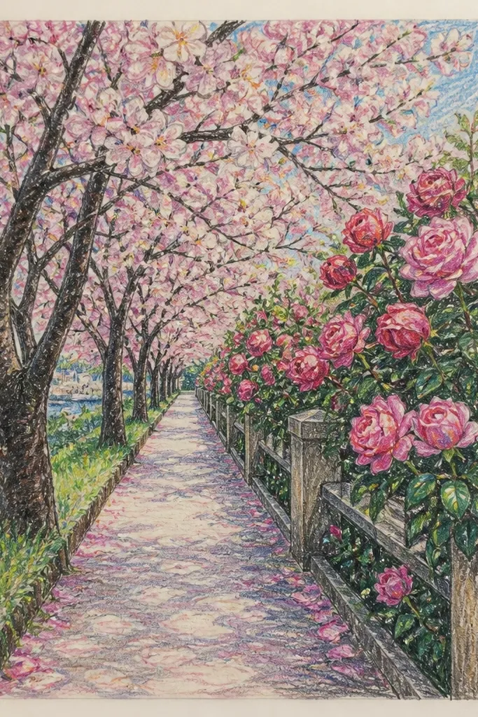
This one looks extra dreamy because it layers two plant heights: low border buds and taller blossom branches. I keep the border strip lower and slightly darker green, then I let the cherry blossoms float above it. The contrast in height creates depth even when you’re using simple shapes. It flatters a wide range of skin tones in photos if you’re drawing from a reference — but more importantly, it flatters kids because the border strip acts like a frame. You get a finished look without adding buildings or extra scenery.
Draw the path center and add a narrow border strip on each side, keeping the strips the same width near the viewer and shrinking toward the back. Sketch low buds as small five-petal clover shapes and add tiny leaf marks in pale green. Above the border, draw cherry blossom branch lines that sway slightly, then add clusters higher up. Color the cherry blossoms in two pink tones and keep the border buds lighter so they don’t steal attention. Shade the path with a gray pencil lightly, then add a faint pink tint where blossoms overlap the path.
Use a green pencil very sparingly — too much green makes it look like a generic garden instead of a cherry blossom walkway.
Don’t draw the border strip with random jagged edges. A clean edge reads more “intentional.”
8. Cherry Blossom Steps With Curved Petal Trails
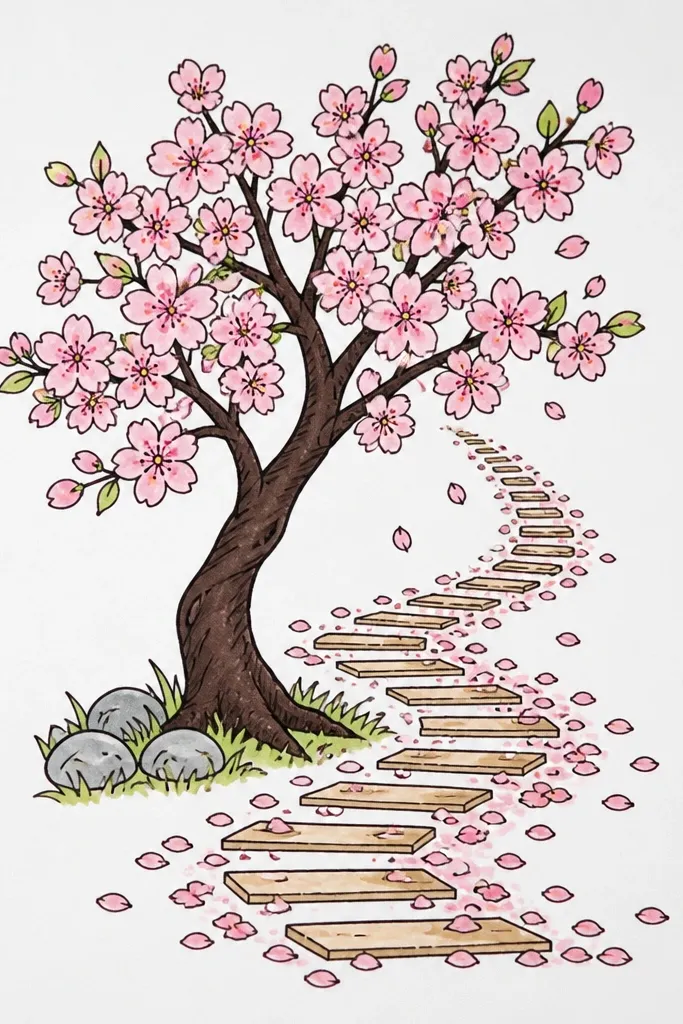
Steps add a built-in sense of motion, and petals forming trails makes that motion visible. I draw the steps with consistent riser heights so the staircase looks stable, then I place curved petal lines that follow the steps' direction. The trail effect is what sells the dreamy feel. This is great for kids because it’s easier to draw curved trails than detailed rocks or water — the repeating curve gives them a pattern to follow.
Sketch a staircase rising from the bottom toward the top left or right, with each step narrowing slightly as it goes up. Draw the step edges first, then add light shadow lines under each tread. Place blossom clusters at the sides and at the top landing, then draw curved petal trails across the steps using small comma shapes. Color the nearest petals with deeper pink and the farther ones with pale pink and a light watercolor wash. Add a few petals at the edges of each step to connect the clusters to the trails.
Keep petal trails to two to three main curves. Too many curves turn it into noise.
Don’t shade the steps dark gray all the way through. Leave the top edges lighter so the staircase looks like it’s catching light.
9. Night Sakura Path With Warm Lantern Glow
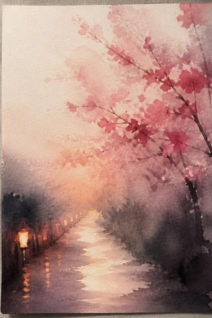
Night drawings look dreamy because the lantern glow changes everything — it turns simple blossoms into “light objects.” I use a dark blue background, then I paint warm yellow-orange halos around the lanterns so the pink blossoms look brighter where the light hits. The path stays mostly dark to preserve contrast. This is a strong option for kids who like bold color — they get a dramatic result without needing to draw complicated stars.
Start by washing the background with dark blue, leaving the path area slightly lighter. Sketch the path edges with pencil, then lightly shade them gray-blue. Place two lanterns along the sides and draw a soft halo around each using watered yellow-orange. Add blossom clusters along the branches and scatter a few petals on the path, coloring the nearest ones with a more saturated pink. Finally, lightly blend pink into the lantern halos so the glow looks like it’s lighting the blossoms.
Use a white gel pen to add tiny highlight dots inside a few blossom clusters near the lanterns.
Don’t color the whole sky with black. Pure black makes lanterns look pasted on.
10. Cherry Blossom Lane With Torii Gate Framing
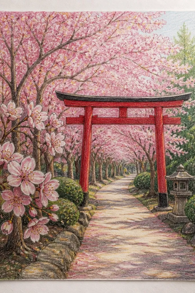
A torii gate gives you a natural focal point, and it makes the vanishing point feel intentional. I draw the gate at the far end so it shrinks with perspective, then I place blossom clusters around it so the gate looks surrounded by spring. The trick is keeping the gate simple: two vertical posts, one top beam, one bottom beam, and a few shadow lines. It flatters kids because it’s a clear shape to replicate, and the rest of the scene can stay loose.
Sketch the path with one-point perspective first and mark where the torii gate sits. Draw the torii posts as two rectangles that narrow slightly toward the top, then add the beams with straight lines that also follow perspective. Color the gate with red-orange or vermilion, then add a darker red shadow on the inner edge of each post. Draw branch lines on both sides that taper toward the gate, then scatter blossom clusters across the center path. Add a pale pink wash around the gate area to make it feel like blossoms are “softening” the background.
Outline the gate lightly in pencil first, then ink only the main edges — too much ink makes it look cartoony.
Don’t place the gate too big. If it doesn’t shrink with perspective, the whole lane loses depth.
11. Watercolor Pencil Background Wash, Inked Blossoms
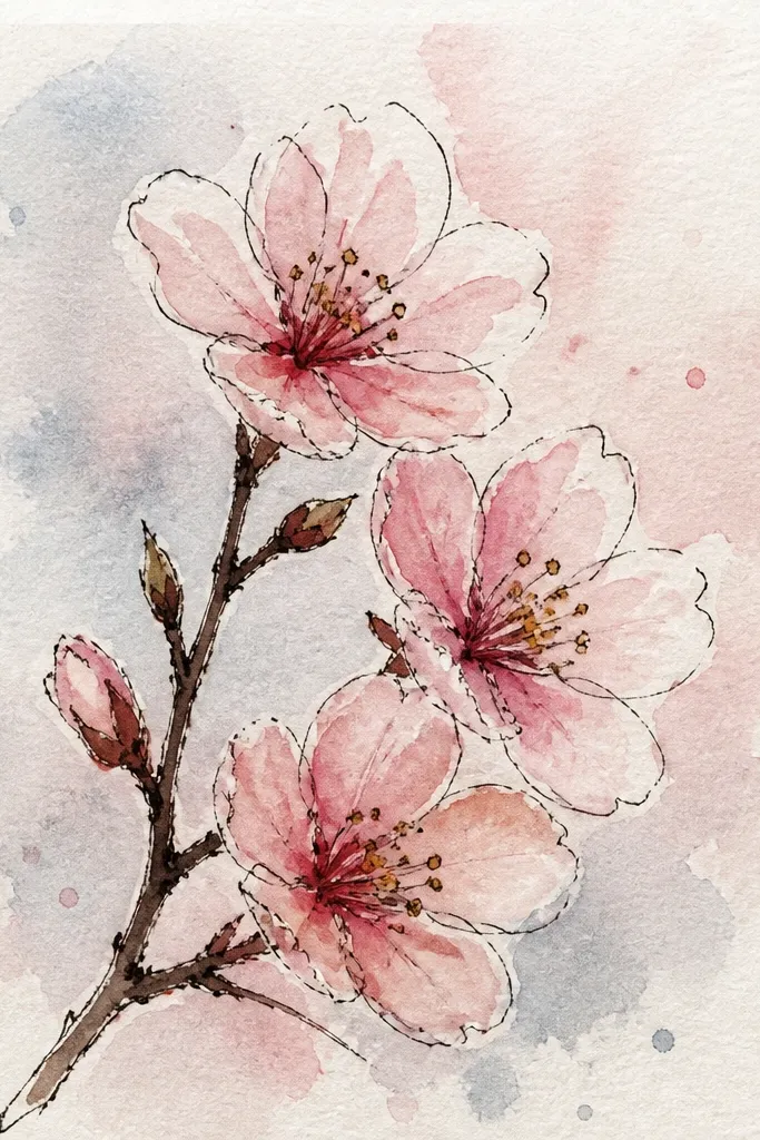
This is the cleanest “dreamy but neat” combo I’ve used with kids because ink gives control and watercolor pencil gives softness. I ink the blossom clusters first at a light hand, then color around them so the ink lines stay crisp. The path stays pale so the blossoms pop. It flatters kids who worry about drawing too lightly because ink makes the main shapes obvious even if the pencil lines are faint.
Start by sketching the path and horizon with HB pencil, then erase lightly so it’s clean. Wash a very pale background with watered pink and a touch of gray-blue for depth. Ink branch lines and blossom cluster outlines with a fineliner, keeping the far branches thinner and lighter. Color the nearest blossoms with a heavier pink layer and feather the far ones with a damp brush. Add a few light ground shadows under branches using a gray pencil so the path doesn’t float.
Let the background wash dry fully before you ink. If it’s wet, the fineliner bleeds and looks messy.
Don’t ink everything dark. If every line matches the same thickness, it looks flat.
12. Minimal Line Cherry Blossoms on a Single Pale Path
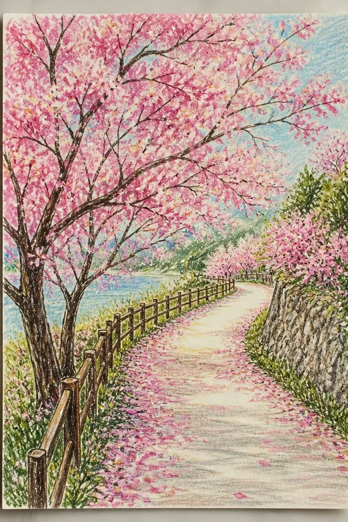
Minimal drawings feel dreamy because your brain fills in the rest. I use sparse blossoms and leave a lot of paper white so the scene breathes. The path is just enough to guide the eye: one soft ground line, a few paving hints, and a vanishing point. This style is flattering for kids because it’s forgiving; if a blossom cluster is slightly off, it blends into the simplicity. It also looks gorgeous in small frames because there’s negative space.
Draw a single pale path line that narrows toward a vanishing point, plus two faint side edges. Add only a few branch strokes on the left and right — keep them thin and stop them early. Place blossom clusters as small teardrop shapes with a dot center, mostly near the bottom corners and a few in the center. Apply watercolor pink in tiny controlled spots and stop before it spreads too wide. Add one very light gray shadow line under the path so it stays grounded.
Use a micro eraser or kneaded eraser to lift pencil lines instead of heavy erasing that tears the paper.
Don’t overcolor the sky or background. If everything gets tinted, the minimal look disappears.
13. Cherry Blossom Branches Crossing in the Foreground
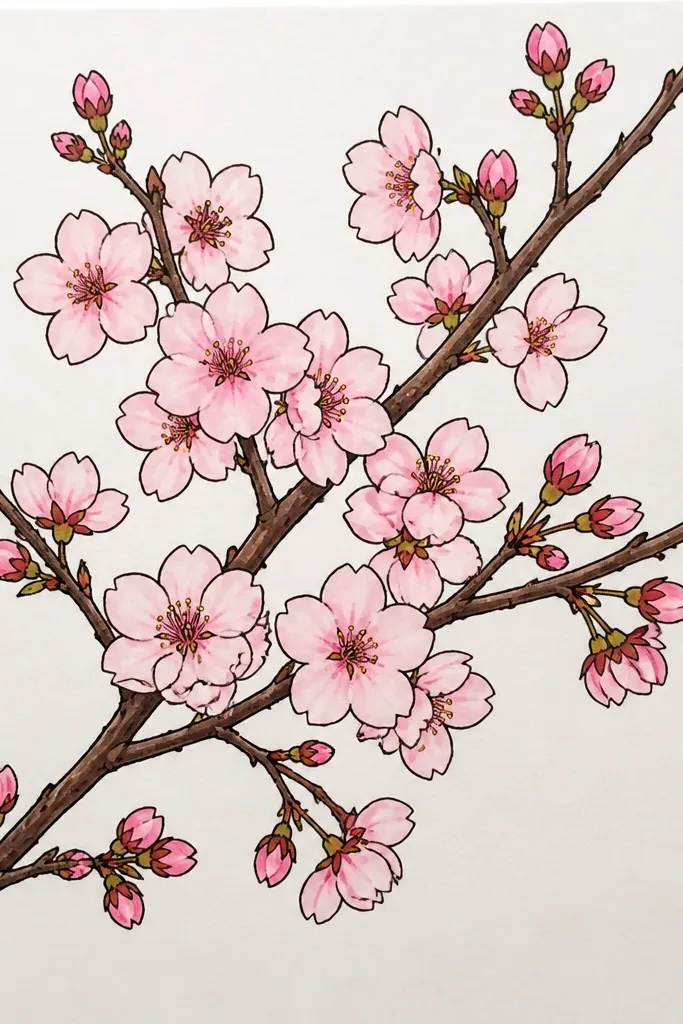
Foreground branches are a cheat code for depth. When the closest branches cross in front of the path, your drawing immediately feels layered, like you’re looking through a living frame. I keep the foreground blossoms darker and denser so they catch attention, then I lighten the background clusters and reduce their number. It flatters kids who like dramatic compositions because it gives them a clear “front, middle, back” structure. The path still does the perspective work, but the branches make it feel immersive.
Sketch the path and horizon first, then plan your crossing branches so they sit in the bottom third of the page. Draw two main branch lines with a slight curve, then add smaller twigs branching off at irregular angles. Ink the foreground branches darker, then keep the background branches lighter pencil lines only. Place dense blossom clusters on the crossing branches and fewer clusters along the sides of the path. Color foreground blossoms with richer pink and add a light wash to the background blossoms so they fade into the distance.
Let some blossoms overlap each other. Overlap sells “crowded branches” better than perfect spacing.
Don’t place the foreground branches behind the path. They need to sit on top so the layering reads clearly.
14. Pastel Chalk Sakura Path With Powdery Petal Edges
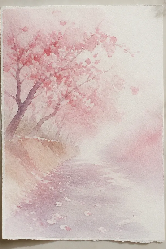
Chalk gives you that soft, dreamy bloom texture because the edges naturally blur. I like textured paper here, because it holds pastel dust and makes the blossoms look like they’re floating in air. The path looks best when it’s not too dark — you want a gentle ground tone so the pink pops. This style is flattering for kids because they can shade with their fingers or a cotton pad, and the picture still looks intentional even if lines aren’t perfect. It also hides small smudges better than ink-only drawings.
Start by lightly sketching the path in charcoal or a very pale pencil, then shade the path area with pale gray chalk. Add a faint lavender wash along the sides to create spring atmosphere. Draw branch lines with charcoal, then rub a little pink pastel over blossom cluster areas using your fingertip. Keep the nearest blossoms brighter and the far blossoms lighter by using less pigment and more blending. Add a few sharper petal accents with a darker pink pastel stick, then blend them outward with a soft cloth.
Fix the drawing with a light spray fixative from a distance so the pastel doesn’t smear later.
Don’t press hard. Thick chalk ridges look dusty and cheap unless you’re going for a very bold texture.
15. Cherry Blossom Path With River-Like Ribbon of Pink
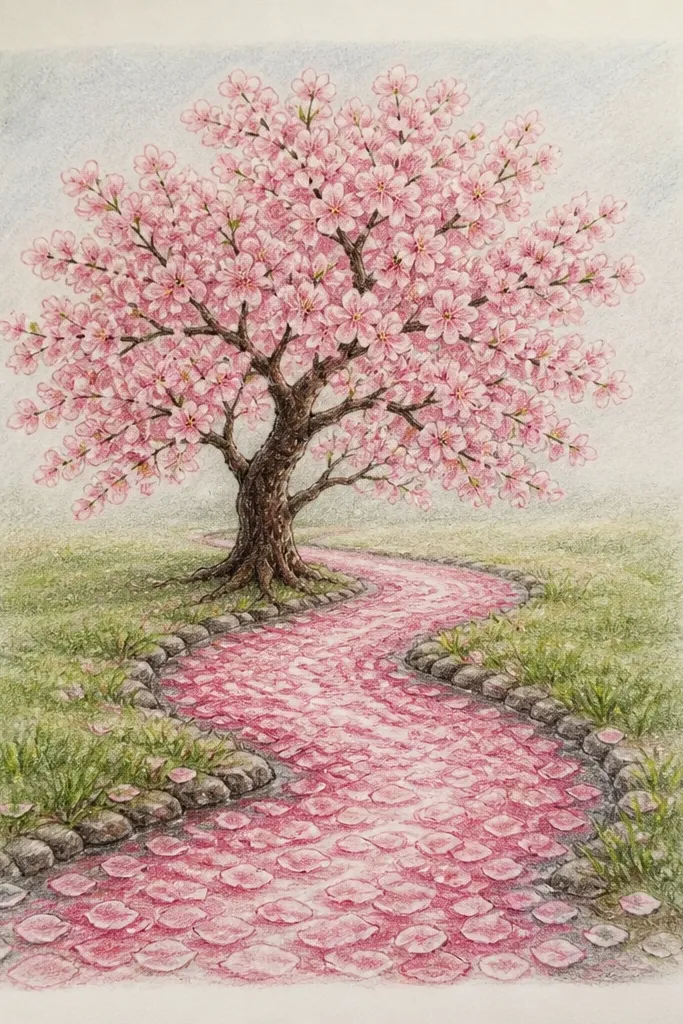
This drawing feels dreamy because the petal flow becomes a “river” that guides your eye down the path. I draw the ribbon as a soft band with uneven edges, then I layer lighter and darker pink inside it so it looks dimensional. You still keep the path perspective, but the center ribbon gives a strong focal point. It flatters kids because they get a clear rule: draw the band first, then place blossoms along its edges. The result looks artistic even with simple petal shapes.
Good to knowUse a damp brush to soften only the edges of the ribbon, not the center. That keeps it looking like flowing petals.
Sketch the path with one-point perspective and add a light paving line pattern on the sides. Draw the pink ribbon down the center as a thick, curved band that narrows toward the vanishing point. Add a lighter pink inner layer and a tiny pale highlight line along one edge of the ribbon. Place blossom clusters along the ribbon edges, using darker pink for the nearest clusters and lighter pink with watery edges for distant ones. Finish by adding a few petals that spill from the ribbon onto the path stones near the bottom.
Common mistakeDon’t make the ribbon perfectly straight. Straight looks like a stripe, not a drifting flow.