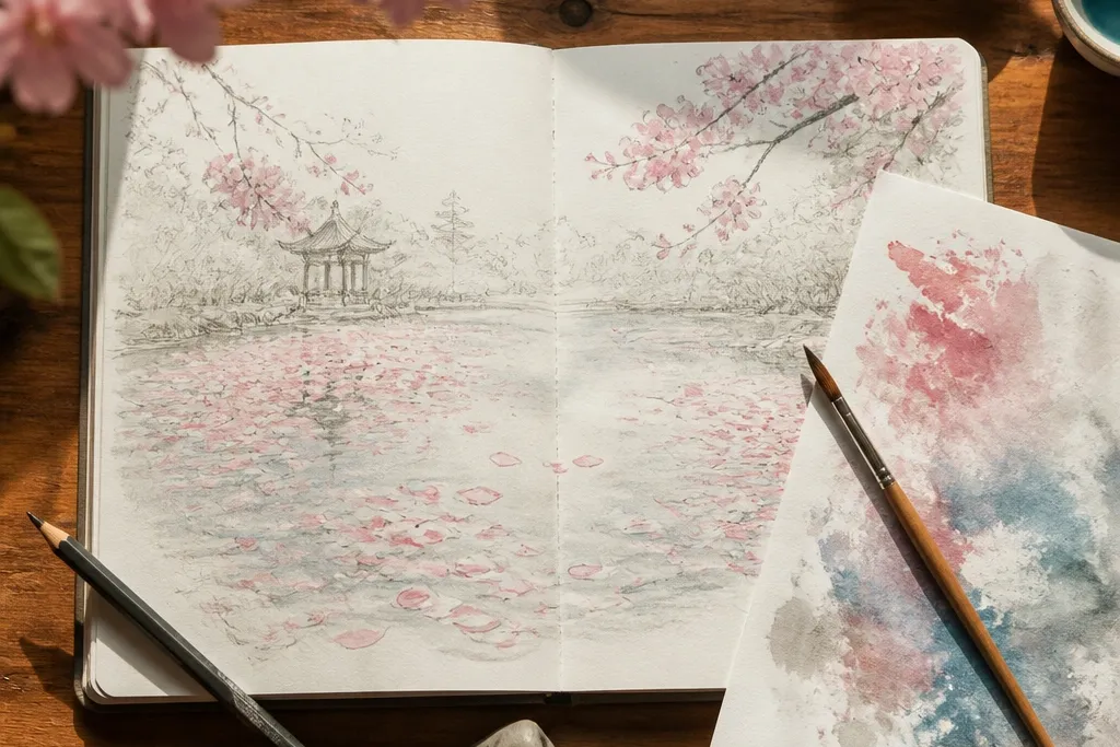
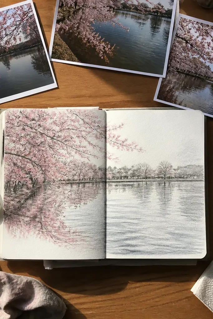
1. Sponge Fog Lake with Pink Clusters
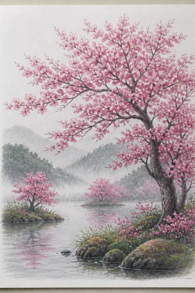
I tried this one when my page was already smudged — and it saved the whole drawing. You sponge the lake so the texture looks like misty air above water, which hides messy pencil lines. I use a sponge with gray-blue paint or diluted watercolor, then add a few deeper ripples with a brush after it dries. The blossoms are grouped into 5 to 7 clumps, so the scene reads even if you don’t draw perfect petals. This looks great for kids because the “blobs” stage is forgiving, and it still looks intentional for adults because the fog does the blending for you.
Start by sketching a simple horizon line about 1/4 down from the top. Mix gray-blue (blue + a tiny bit of black or brown) and sponge it across the sky and water, leaving the brightest area near the horizon. Let it dry, then add 5 to 7 blossom clumps using a light pink watercolor pencil or diluted pink paint. For reflections, drag each clump’s color straight down with a damp brush, stopping halfway into the water. Finally, add 6 to 10 thin ripple lines with a light gel pen — keep them faint so the fog stays soft.
Use a makeup sponge that’s been cut into a small wedge; it gives you cleaner edges for horizon and reflection shapes.
Don’t outline every blossom with a dark line — it makes the mist look like it’s been stamped from a sticker sheet.
2. Watercolor Pencil Lake with Wet-on-Wet Ripples
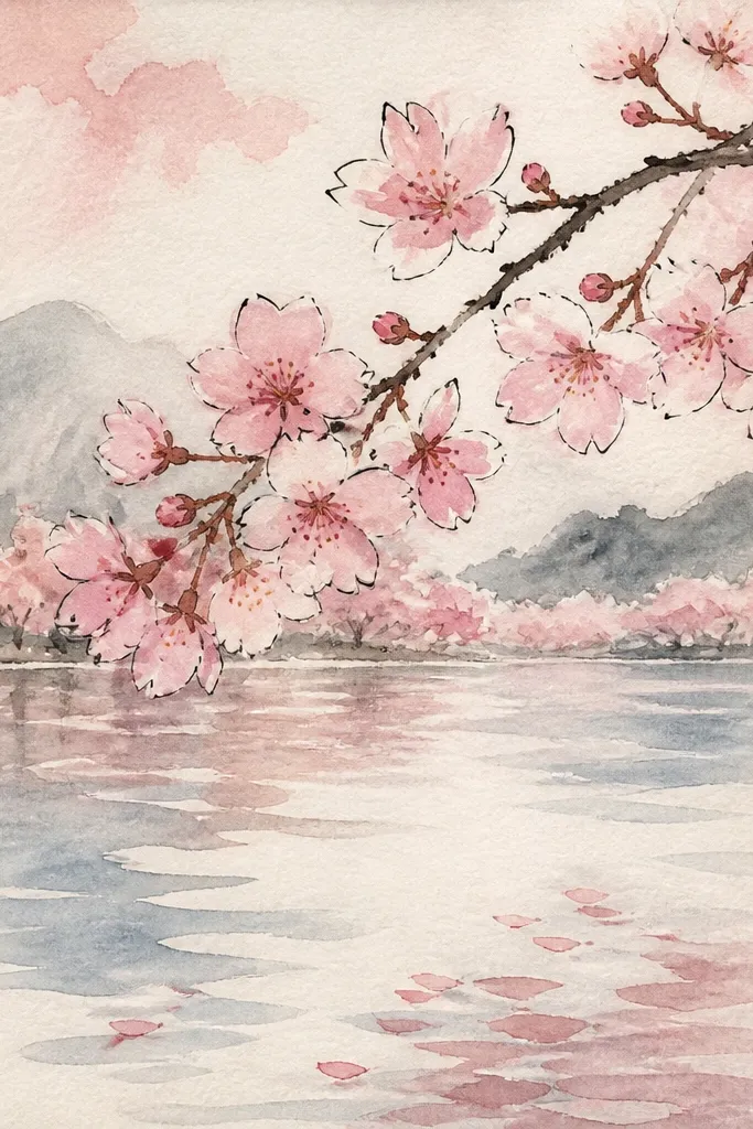
This is the one I reach for when I want a gentle, “storybook” look without messy paint. Watercolor pencils let you control the lake value step by step, then you activate it with water for that wet-on-wet softness. I keep the water mid-tone so the blossoms can stay bright without overpowering the scene. The ripples work because you draw them as light pencil arcs first, then let water blur them just enough to look like movement. It flatters almost any skill level — kids can scribble the clumps, and you can still get a polished lake because the pencil lines guide the texture.
Start by lightly sketching a shoreline that curves left to right, then block in the sky with pale blue pencil and a quick brush rinse. Add the lake with a broader layer of gray-blue pencil, then blend with a damp brush until it looks smooth. While the water is still slightly damp, draw 10 to 16 curved ripple arcs using a darker blue pencil, then touch them with water to soften. For blossoms, place 6 to 9 clumps along the far shore — I do them as circles and small teardrops, not individual petals. Add reflections by repeating the same clumps lower in the water and tapping with a damp brush to blur the edges.
Good to knowIf your water dries too fast, re-wet only the ripple area with a clean damp brush so the arcs soften without bleeding everywhere.
Common mistakeDon’t press hard with the pencil before blending — heavy graphite shows through as gritty specks.
3. Gel Pen Ripples Over Wash
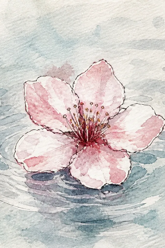
This idea looks fancy because the ripple lines are crisp, not fuzzy. I used watercolor wash for the background values, then let it dry so the gel pen could sit on top cleanly. The contrast is what makes it pop: soft wash behind, sharp lines in front. Blossoms are kept as clumps with minimal outlining, so the gel pen ripples don’t compete. This is great for older kids and anyone who likes clean edges — the crisp water lines make the whole page look “finished” quickly.
Paint a sky wash first with pale blue, then paint the lake as a light gray-blue gradient that’s darker near the horizon. Let it fully dry. Sketch 12 to 18 ripple lines starting near the horizon and curving slightly as they come forward; keep them light so they don’t look etched. Color blossom clumps along the far shore with diluted pink and a tiny bit of darker magenta in the center of each clump. For reflections, draw shorter ripple lines under each blossom clump and add a few vertical smear strokes with the gel pen ink.
Good to knowUse a white paint pen for just 5 to 8 highlight streaks; too many makes the water look like it has snow.
Common mistakeDon’t add gel pen on top of wet paint — it spreads and turns into a gray mess.
4. Cotton Swab Petal Drift
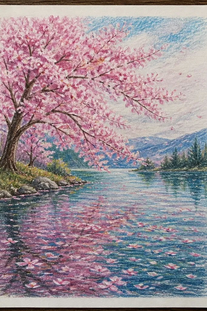
Cotton swabs are my go-to when I want blossoms to look airy instead of outlined. Swab dabs create a natural petal softness, and you can layer two pink tones to make depth without drawing individual petals. The reflection is the trick: you don’t copy the blossom shape exactly, you repeat it but blur it with a damp swab so it feels like water is moving. This method flatters small hands because it’s controlled and doesn’t require fine motor skills. It also hides shaky drawing lines, which is perfect for budget kids' art days.
Start with a simple lake gradient: pale blue at the horizon, slightly darker blue-gray toward the bottom. Dip a cotton swab in light pink paint and dab 6 to 10 blossom clusters across the far shore. Load a second swab with darker pink and add tiny circular centers inside a few clusters. For reflections, dab the same clusters lower in the water but immediately blend them with a clean, slightly damp swab to soften the edges. Add 8 to 12 gentle ripple marks using the tip of a dry brush — just enough to show direction.
Good to knowPress the swab lightly on scrap paper first; it removes excess paint so you don’t get big blobs.
Common mistakeDon’t smear the blossoms sideways — reflections should be vertical and blurred, not dragged into the sky.
5. Layered Paper Cutout Blossoms on Watercolor Lake
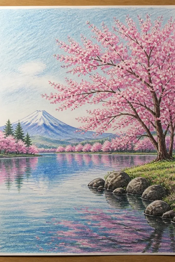
This is the one I tried when I wanted that “almost 3D” look for a classroom display. The paper cutouts make blossom shapes instantly readable, even from a distance. I build the lake with watercolor first, then glue paper blossoms lightly so they sit above the paint. For reflections, I draw them under the cutouts and blur the pencil with water — that gives you believable water behavior without trying to cut a reflection too. It looks best with medium-sized blossoms, not tiny ones, because small paper pieces can look choppy. Kids love it because they’re doing real craft work, not only drawing.
Paint the sky and lake first with watercolor, keeping the lake mid-tone and leaving the paper bright near the horizon. Cut 7 to 12 blossom clumps from pink craft paper, mixing two shades (blush and rose). Glue the blossoms along the far shore edge with a tiny dab so the edges lift just a bit. Draw each reflection beneath with a light pencil line, then wet the pencil line with a damp brush so it becomes a soft smear. Finish by adding 10 ripple lines across the lake using a fine pen, stopping them at the reflection areas so the reflections stay clean.
Good to knowUse matte paper or tissue paper, not glossy — glossy paper catches light and makes the scene look like a craft project instead of a drawing.
Common mistakeDon’t glue blossoms flat — the slight lift gives depth; flat glue makes everything look like stickers.
6. Monochrome Lake with One Pink Highlight
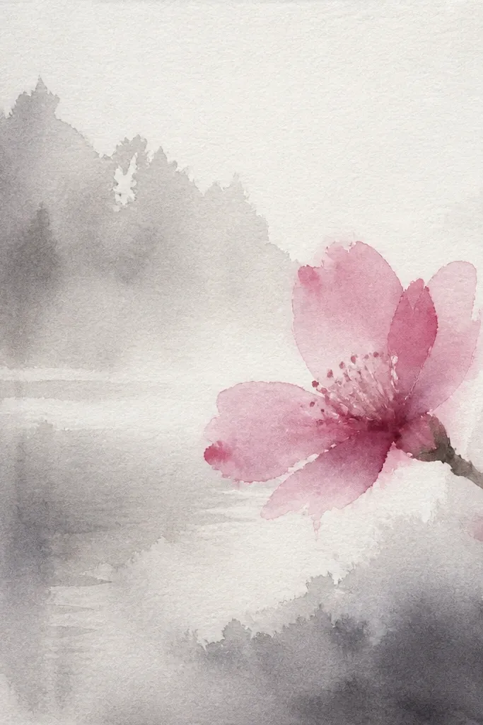
I did this when I wanted a calmer page that still feels special. When everything is monochrome, the eye goes straight to the blossoms, and you get a clean, modern look. I use gray-blue for sky and water, then add only a small section of pink blossoms so the drawing doesn’t look like it’s trying too hard. The lake reflections are subtle because they follow the same gray tone, with pink only where the blossoms are. This flatters kids because it reduces decision-making. Adults like it because it’s easy to make look intentional with just a few highlights.
Tone the whole paper with a light gray-blue wash for sky and water, leaving the horizon slightly brighter. Sketch a far shore line and pick one side of the page for blossoms — just 4 to 6 clumps. Color those clumps with blush pink and add a tiny darker center. For reflections, draw faint vertical smudges directly under each clump, then blend with a damp brush. Add ripple lines with pencil first, then trace 5 to 7 of the brightest ripple crests with a white paint pen for sparkle.
Choose one blossom cluster to be the brightest; the rest should be lighter so the focal point reads instantly.
Don’t add pink everywhere — the monochrome trick dies when the page turns uniformly pink.
7. Salt-Sparkle Snowy Water Ripples
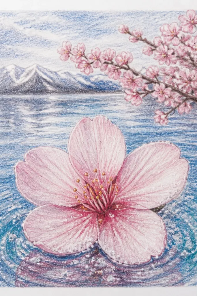
This one is silly-fun but looks gorgeous once it dries. Salt resists watercolor and creates random light speckles that look like tiny reflections catching light on a lake surface. I use it when I want a “sun on water” effect without drawing every ripple. The blossoms stay as clumps so the speckle texture belongs to the water, not the petals. It flatters kids who like surprise — they get to watch how the salt makes patterns. For adults, it’s a fast way to add detail without overworking the page.
Wet a section of the lake lightly, then paint a gray-blue wash and sprinkle coarse salt while the paint is still wet. Keep the salt mostly in the mid-water area, not the horizon — too much near the shore looks grainy. Let it dry fully, then brush off the salt gently. Add blossom clumps along the far shore with diluted pink and a deeper rosy center in a few spots. For reflections, paint a faint mirror version beneath each clump, then lightly tap a few speckles with a damp brush so it matches the sparkle pattern.
Good to knowUse coarse salt, not table salt; coarse crystals leave bigger, prettier resist dots.
Common mistakeDon’t touch the wet salt-water area with your fingers — you’ll leave smears that won’t brush off.
8. Black Pencil First, Color Later
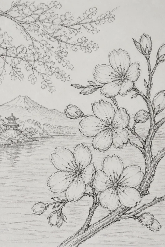
This is my “I want it to look clean” workflow. I start with black pencil or charcoal-style pencil for the structure, then add color in controlled layers. The water ripples stay readable because you already drew their direction first. Blossoms also look better because clumps have a clear boundary even when you use soft washes. This method flatters kids who rush to color; you give them lines to follow, so the page doesn’t turn into random color blocks. Adults get a more graphic, poster-like look.
Sketch the horizon and shoreline curve in dark pencil, keeping the shoreline line thin. Draw 14 to 20 ripple arcs in light pencil across the lake, curving slightly toward the horizon. Block blossom clumps as simple circles and teardrops along the shore, leaving gaps between clumps. Add a light blue wash for sky, then color the lake with gray-blue wash, staying inside your ripple arcs. Finish by coloring blossom clumps with pink and adding a darker pink center to 2 to 3 of them; then use a white paint pen to trace 5 ripple highlights.
Good to knowUse a kneaded eraser to keep highlights clean — lift pencil from the brightest ripple crests before you paint.
Common mistakeDon’t color over heavy pencil lines — it turns the ripples muddy instead of crisp.
9. Crayon Resist Waterline Highlights
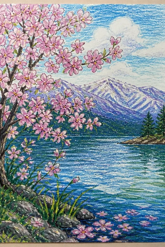
Crayon resist is the fastest way I know to get that “light catching water” look without drawing every ripple. The wax from crayon repels watercolor, so you get natural highlight streaks that look like reflections. I like this for kids because it feels like magic, but it still gives a controlled result. The blossoms sit on top of the water values so the page has depth. If your paint tends to bleed, the resist lines keep the water from looking flat.
Draw the lake shape and shoreline lightly. Use white or light pink crayon to draw 10 to 15 thin highlight streaks across the water, following the ripple direction. Paint the sky first with pale blue watercolor, then paint the lake with gray-blue watercolor, letting the crayon lines stay bright. Add blossom clumps along the far shore with diluted pink, then strengthen a few clumps with a darker rose. For reflections, paint a faint mirrored version of each clump and include a few crayon resist streaks under the brightest blossoms.
Good to knowPress the crayon firmly only in the highlight streaks; light pressure gives faint resist and looks patchy.
Common mistakeDon’t use too much water on the first wash — crayon resist can smear if you flood the page.
10. Masking Tape Horizon with Crisp Shore
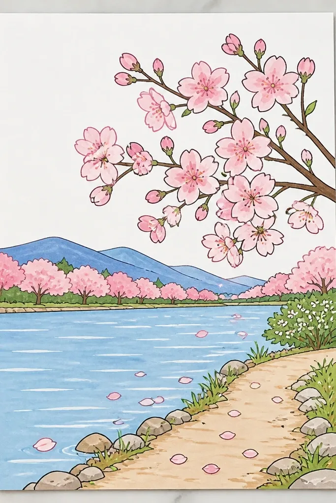
Sharp horizon lines make the whole drawing look more “designed,” even when the blossoms are simple. I use masking tape because it gives a clean boundary between sky and water without fighting with watercolor blooms. Once the horizon is crisp, you can focus on blossom clumps and reflections rather than fixing smudges. Kids also benefit because the tape removes the hardest part — keeping paint from running. Adults get a clean, modern look that still feels soft because the water and blossoms are watercolor.
Tape off the horizon line with thin masking tape, placing it so the sky is about 1/3 of the page height. Paint the sky with pale blue watercolor and let it dry for a few minutes. Peel the tape carefully to reveal a crisp edge. Paint the lake below as a gray-blue wash, darker near the horizon and lighter as it comes forward. Add blossom clumps along the shore, then paint reflections below by pulling color down lightly with a damp brush.
Good to knowPull the tape back at a low angle (almost parallel to the paper) so you don’t tear fibers.
Common mistakeDon’t tape over fully wet paint — it will smear and glue to the tape.
11. Pastel Crayon Lake with Dry Brush Petals
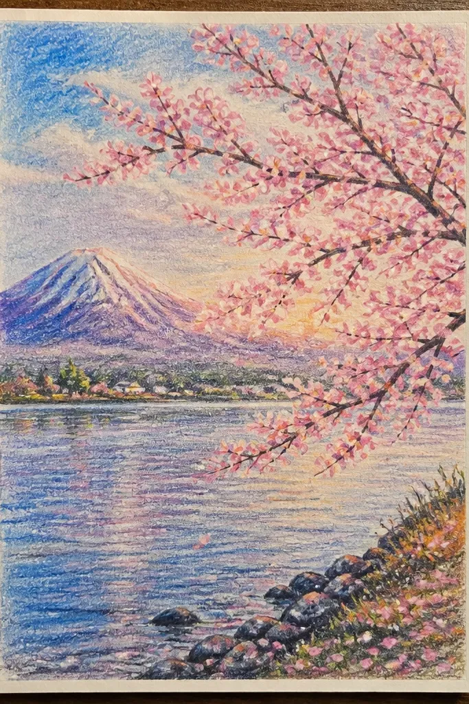
This one is for when you want texture that looks like real chalky light. Pastel crayons lay down a base color fast, and the dry brush makes blossoms look like petal dust instead of flat paint. I like pastel peach mixed into the pink clumps because it makes blossoms feel warmer without getting too red. The lake ripples are made by dragging a nearly dry brush through the waxy surface, which gives subtle bands. It’s flattering for kids because they can make marks quickly, and it still looks coordinated because the texture repeats across the page.
Rub pastel crayon lightly for sky and water, keeping the horizon slightly lighter. Use gray-blue and a tiny bit of green-gray to avoid a too-cold look. With a dry flat brush, lightly drag over the water to create ripple bands, alternating a lighter pass and a slightly darker pass. For blossoms, use dry brush technique: load brush with pink (and a little peach), then tap and flick in clumps along the shore. Add reflections by repeating the clumps below but brushing less — reflections should fade faster than the blossoms.
Good to knowWipe your brush on scrap paper before you touch the page; a too-wet brush smears pastels into muddy patches.
Common mistakeDon’t over-blend — heavy blending turns the ripples into one dull gray.
12. Tiny Dot Reflection Technique
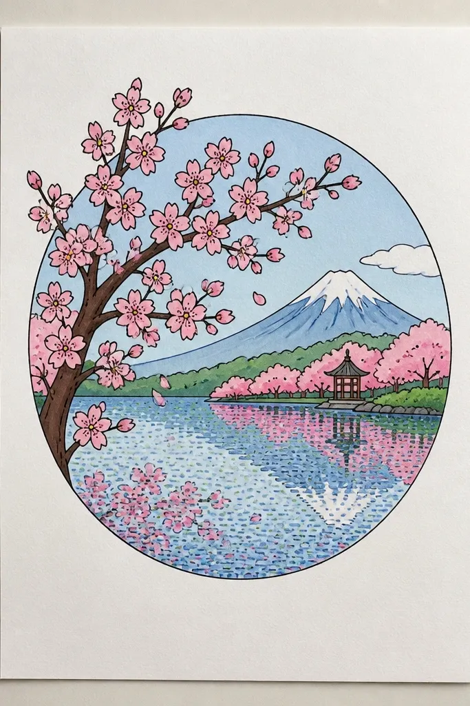
Dots are the secret when you want reflections without smearing. I tried this after my reflections kept looking like fingerprints. Instead of dragging color down, you place tiny dots in a vertical line under the blossom clump, fading as you go deeper. It reads as shimmer, and it looks intentional even when blossoms are rough. The technique looks especially good for kids because it limits the number of moves: dot, dot, dot. Adults get a clean, modern shimmer effect that doesn’t require advanced watercolor control.
Paint sky and lake with a smooth watercolor wash, leaving the lake mid-tone. Add blossom clumps along the far shore using pink paint or watercolor pencil, keeping edges soft. Let it dry completely. For each blossom clump, place 8 to 14 tiny dots in a vertical column beneath it using a darker pink or diluted rose. Fade the dots by using less paint as you move downward, then add 6 to 10 light ripple arcs across the rest of the lake so it doesn’t look empty.
Good to knowUse a gel pen for dots if your paint wobbles; dots look consistent when they’re the same size.
Common mistakeDon’t draw reflections as full mirrored shapes — that makes the water look like glass and kills the shimmer.
13. Palette Knife Water Ripples
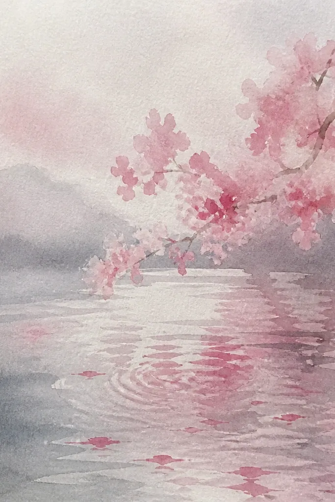
This is the drawing for people who want texture without fancy tools. A palette knife (even a cheap plastic one) scrapes and drags paint into ridges that catch light. I used it to make ripples that look like they have surface tension, not just lines on paper. Blossoms stay soft so the textured water doesn’t overpower the scene. It flatters older kids and adults because it’s more hands-on and you get instant visual payoff. If you like tactile art, this one feels satisfying.
Paint the sky with a smooth pale blue wash and let it dry. For the lake, paint a gray-blue base and wait until it’s slightly tacky, not watery. Use a palette knife to pull short curved strokes across the lake, making 10 to 16 ripple ridges that angle toward the horizon. Add blossoms as soft pink clumps on the far shore with a brush, then use the knife lightly to drag a few thin reflection ridges downward beneath the brightest blossoms. Finish with a white paint pen on just the top edges of 6 ripples to simulate sparkle.
Good to knowPractice on scrap first; the knife angle changes how thick the ridges look.
Common mistakeDon’t press too hard — gouges can tear paper and make the water look damaged.
14. Dramatic Paper Wash Sunset Lake with Blossoms
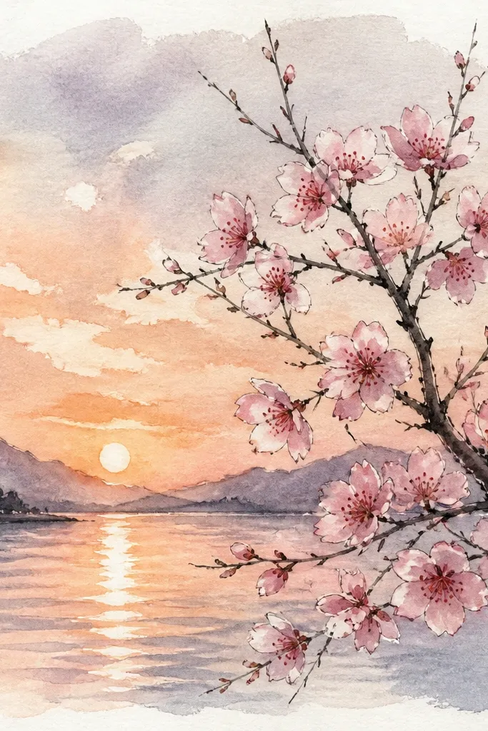
Warm sky makes cherry blossoms look like they’re glowing, and it’s the fastest way to make a lake feel alive. I tested this using peach and light orange in the sky wash, then toned the lake gray-blue with a hint of peach so reflections match. The blossoms look best when you keep them a true pink, not orange-pink, so they don’t blend into the sky. This flatters kids because the sky colors are fun, and it flatters adults because it looks like you planned the color palette, even when you’re working fast.
Paint the sky first with a gradient: pale blue at the top, then peach and a light orange near the horizon. Let it dry or set it with a quick hairdryer blast if you’re impatient (I do this with kids). Mix gray-blue and add a tiny touch of peach for the lake wash, keeping the lake darker near the horizon. Add blossom clumps along the shore with diluted pink, then add a darker rose center to a few clumps. For reflections, paint softer mirrored clumps in a lighter pink-peach mix and blend the edges with a damp brush so the warm tone shows through.
Good to knowIf your peach turns muddy, add more pale pink instead of more orange — it stays clean.
Common mistakeDon’t make the lake as bright as the sunset sky — reflections should be softer and darker.
15. Crayon Blooming Branches Over Lake
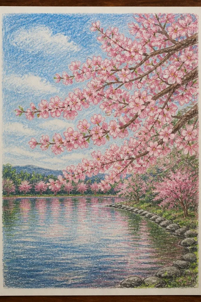
Branches make the whole scene feel like cherry blossoms, not generic pink blobs. I use white crayon for the branch lines because watercolor can’t cover them, so the branch stays bright and readable. Then I add blossom blooms around the branches as soft circles, which looks like petals gathering on twigs. The reflection is simpler than it sounds: you repeat the branch line faintly lower in the water and add a few bloom smudges. This is beginner-friendly because the crayon gives you a structure that watercolor can’t erase.
Lightly sketch a branch curve across the page and trace the branch with white crayon, adding 4 to 7 smaller twigs. Paint the sky with pale blue and the lake with gray-blue, leaving the crayon branch lines bright. Add blossom blooms around the branch using pink watercolor pencil or diluted paint, focusing on clumps near the top and middle of the branch. For reflections, draw the branch line faintly in pencil under the water area, then paint a few soft pink smudges beneath each blossom clump. Finish with 5 to 8 white highlight streaks across the ripples using a paint pen.
Good to knowUse a smaller brush for blossoms near the branch so the blooms don’t spread into each other.
Common mistakeDon’t paint directly over wet crayon — it can streak and look like wax smears.