1. Dual-tip outline petals with a dark center ring
I like this one when I want the sunflower to read clearly from across the room. The petals use two marker tips: the brush/broad side lays down yellow, and the fine side draws the orange edge like a stitched border. The center ring matters - I shade a narrow band of deep amber right where the seeds start, then keep the very middle slightly lighter so it feels round. This style looks best on warm-toned paper because the yellow pops without turning neon. It flatters most color palettes too, since you can swap greens to match your room decor.
Start by sketching a circle for the head and a loose ring of petal shapes with a soft pencil. Then fill each petal with a light yellow pass, and immediately trace just the outer edge with orange using the fine tip. Shade the center ring with deep amber, then add seed dots in small clusters using a medium brown - keep them uneven so it doesn't look printed. Finish by drawing the stem with a mid green and adding one darker shadow line along one side of the stem for depth. Leave the background blank so the edges stay the star.
Good to knowIf your marker bleeds, outline the petals first with the fine tip, then fill - it keeps the color inside the lines.
Common mistakeDon't fully color the center the same dark shade everywhere, or the sunflower looks flat.
2. Seed-grid center with a pencil-first texture
This is the style I use when I care more about the center than the petals. Pencils win here because you can vary pressure to create a realistic seed texture, then markers add color to the petals without muddying the seed detail. I keep the petals more uniform and let the center do the work, which makes the whole drawing feel intentional instead of random. It looks great on slightly toothy paper because pencil lines catch and stay crisp. If you want a sunflower that feels "handmade and real," this is the one.
Begin with a light pencil map: draw a center circle, then sketch a faint grid of seed direction lines. Next, use a 2B pencil to fill the seeds in small curved strokes, leaving tiny gaps for highlights. Now switch to marker for petals - apply yellow in short strokes, then glaze a thin orange layer near the tips. Add a shadow under the head with a pale green-gray marker so it doesn't look like it's floating. Finish by darkening only the outer seed ring with a brown marker so the center has depth.
Good to knowUse a kneaded eraser to lift two tiny highlight spots in the center so it looks glossy.
Common mistakeDon't erase too aggressively after you add marker, or you'll lift pigment and smear the petals.
3. Petals with marker-vein strokes
Vein strokes are where marker drawings start looking like illustration, not coloring. I use the fine tip to pull a single curved vein line on each petal, then add a second faint line beside it using a lighter orange. That gives each petal a "direction," so the flower doesn't turn into a flat yellow circle. This works especially well if you use a warm yellow marker instead of a cool one, because the veins look natural. It's flattering for bold wall art since the texture reads even when you're not close.
Sketch the flower head and petal outline with pencil, then mark the center circle lightly. Fill petals with a smooth yellow layer, staying inside the pencil petal boundaries. Add veins: with the fine tip, draw one curved orange line from base to tip, then lightly reinforce the outer third. Shade the center with deep gold, then add small seed marks around the edges only. For balance, draw leaves with one vein line each using the fine tip and a two-tone green (light fill, dark edge).
Good to knowKeep your vein lines slightly curved - straight veins make the petals look stiff.
Common mistakeAvoid thick outlines on every petal; it makes the sunflower look like a sticker.
4. Two-color ombre petals on upcycled box paper
Ombre petals are the fastest way I know to make marker work look painterly. I do it with just two colors: a warm orange at the base and a bright yellow outward, then blend by layering without pressing hard. It works because the petal shape already gives you a natural gradient direction. Using upcycled box paper keeps the colors slightly matte, so the ombre doesn't look like glossy ink. This is a great style for anyone who struggles with shading - you don't need realism, just smooth transitions.
Start with a clean petal outline using pencil and make sure each petal has a pointed tip. Apply orange only where the petal meets the center, using short strokes that stop halfway down. Immediately layer yellow from the halfway point to the tip, then overlap the two colors in the middle to blend. Add a deep brown ring for the center edge, then sprinkle seed dots with a lighter brown to keep it dimensional. Keep the background blank or add a thin pale green wash behind the stem for a soft frame.
Good to knowBlend by layering, not by rubbing - marker smearing makes petals look cloudy.
Common mistakeDon't use three or more petal colors; it turns into patchwork fast.
5. Marker crosshatch leaves with a soft sunflower backdrop
This one is about contrast between textures. The sunflower petals stay clean and bold, while the leaves get crosshatch shading that looks dimensional and graphic. I use a softer background haze behind the head to make the sunflower feel layered, like it's sitting in front of a light wash. It looks great on darker scraps of paper too, because the pale background haze brightens everything without needing a full-color background. If you like a slightly modern look, this style nails it.
Sketch the sunflower and place leaves slightly lower and to the side so they frame the head. Fill petals with yellow and a thin orange edge, keeping the center details crisp. For the backdrop, lightly color around the sunflower head with a pale yellow marker, staying away from the petals so edges stay sharp. Shade leaves with dark green crosshatches: draw a set of diagonal strokes, then add a second direction to deepen the underside. Finish with a stem line in mid green and a single dark shadow line to tie the foreground together.
Good to knowCrosshatch only the lower half of each leaf so the top edge stays brighter.
Common mistakeDon't crosshatch the petals; it makes them look busy and cheap.
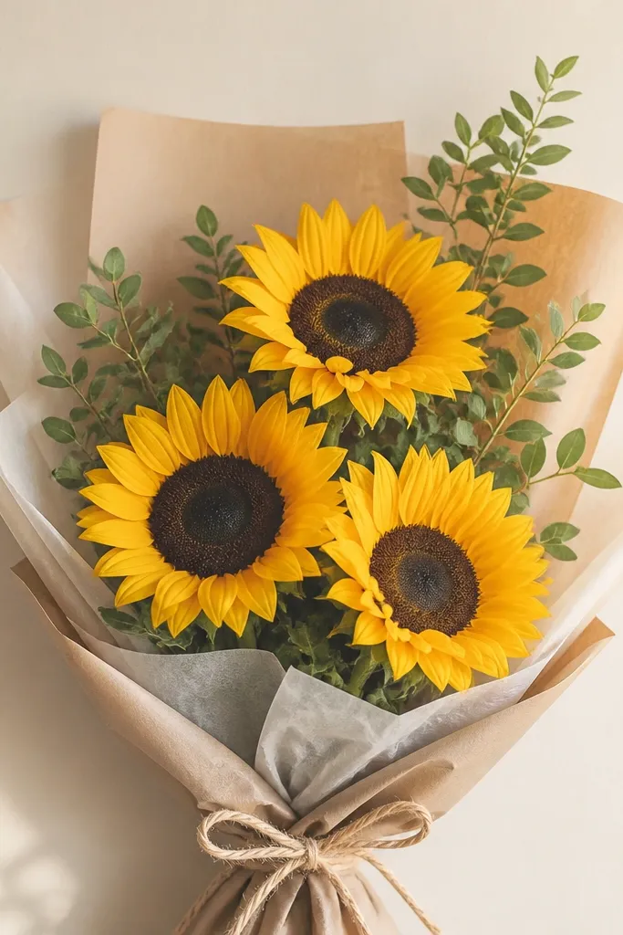
6. Sunflower bouquet cluster with staggered heads
Single sunflowers can look a little lonely. A staggered bouquet cluster is how I make marker drawings feel like a finished card or framed piece. I keep every head consistent in style (same yellow and orange petal edge), then vary scale: one head large, one medium, one slightly turned. The overlapping stems and leaves create depth without needing complicated shading. This style flatters small spaces because it fills a frame nicely and directs the eye diagonally.
Start by drawing three circles at different sizes, then sketch stems that overlap in the center. Draw petals on each head using the same petal width so the set feels cohesive, not random. Add orange edges to all petals and keep the center rings dark to unify them. Shade leaves with one darker marker edge and add veins with the fine tip. Finish by thickening one stem line slightly and leaving the other thinner so the overlap reads clearly.
Good to knowTurn one head slightly sideways - it makes the bouquet look less symmetrical and more natural.
Common mistakeDon't space the heads evenly; equal spacing makes it look like a pattern.
7. Sunflower in a mason jar silhouette
Putting the sunflower in a jar instantly makes it feel like an illustration, not a doodle. I draw the jar with fine-tip lines first, then add a soft shadow behind it so the jar doesn't look pasted on. The sunflower inside stays bold and centered, which makes the composition easy to pull off even if your perspective is shaky. This style looks especially good on cream paper because the jar lines stay clean. It also works for upcycled label tags, like old cardboard price tags, if you keep the jar simple.
Sketch the jar silhouette: rounded rectangle with a handle line and a lid band. Outline the sunflower head inside the jar, then fill petals with yellow and orange tips. Keep the jar mostly unfilled, but add a gray-green shadow under the jar rim and along one side. Color the stem and leaves so they peek above the jar opening. Add a few seed dots in the center but keep them less dense than a full texture, since the jar frame already adds detail.
Good to knowUse a ruler for the jar lid band so it stays crisp while your sunflower stays freehand.
Common mistakeDon't over-shade the jar - heavy fill makes it look muddy next to bright petals.
8. Sunflower with stitched outline look
This style mimics fabric stitching, and it's the reason marker drawings can look handmade even when you're not using paint. I do it by outlining with the fine tip using a repeated dash pattern, not a continuous line. The visual effect is softer and more textured than a normal outline, and it hides small wobble in your drawing. It also pairs well with upcycled paper labels and packaging because the stitched look matches the "repair" vibe. If you like crafts that feel tactile, this is your winner.
Sketch the sunflower head and leaves lightly with pencil, then fill petals with yellow. Switch to the fine tip and outline each petal edge using short dashes, keeping the dashes evenly spaced. Add orange at the petal tips by coloring from the tip inward about one-third of the petal length. Draw the center ring in deep amber, then add seed dots in a tight circle pattern. Finish by stitching the leaf outline and a single vein line, leaving the leaf interior mostly filled with light green.
Good to knowPractice the dash spacing on scrap first - consistent dash size makes it look intentional.
Common mistakeDon't use a super dark outline everywhere; it kills the softness of the stitched look.
9. Sunflower with marker-marbled background wash
Marbled backgrounds make marker work look like mixed media, even if you only use markers and paper. I do the marble by layering pale marker color lightly and then dragging a clean tool through it before it fully settles. The sunflower stays crisp by keeping its petals outlined and filled after the background is dry. This style looks great on off-white cardstock because the marbling stays airy instead of turning heavy. It's also forgiving: if the marble smudges a little, it still reads as texture.
Start by drawing the sunflower head and leaves lightly with pencil, but don't outline them in marker yet. Color a loose background area around the head with pale yellow and pale green marker blobs, keeping them light. While the ink is still slightly wet, use a dry paper towel corner to swirl and break up the blobs into marbling. Let it fully dry, then outline petals and fill with yellow and orange edges. Add a deep amber center ring and seed dots, then finish with a darker green shadow line under leaves.
Good to knowUse one scrap sheet under your page so marbling doesn't stain your table.
Common mistakeDon't marble over the sunflower petals after you color them; it smears the edges.
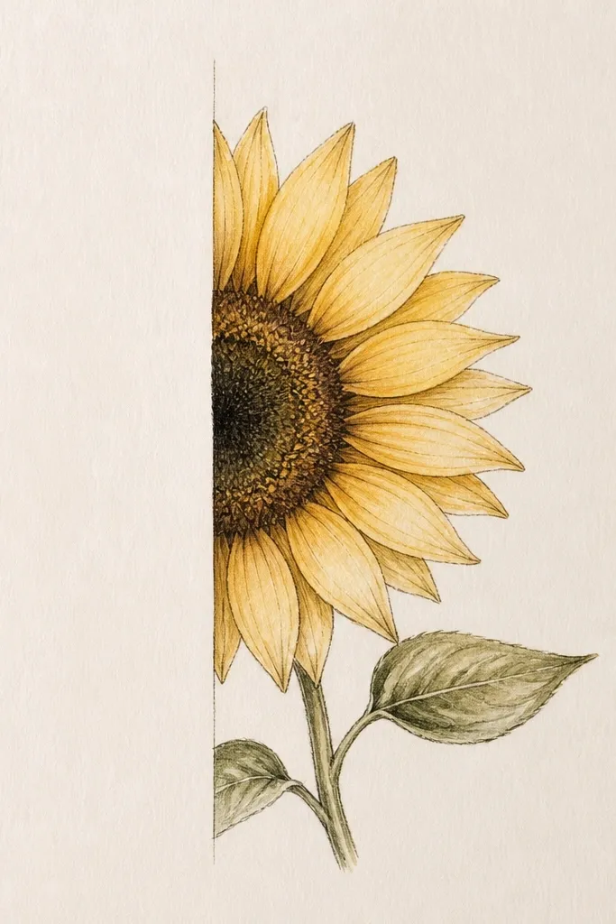
10. Sunflower side profile with long stem and tall leaves
Side profile sunflowers look more dynamic, and they're easier than you'd think if you treat them like shapes. I keep the head as an oval circle with petals fanning outward, then I draw fewer petals on the far side so it reads as turned. The long stem and tall leaves give you movement, which makes marker lines look intentional. This style works well for tall paper scraps like cereal box panels or mailing labels. It also looks great for bookmarks because the composition follows the vertical shape.
Sketch an oval head tilted about 20-30 degrees and draw a center circle inside it. Place petals mostly on the visible side first, then add a smaller set on the far side with shorter lengths. Fill visible petals with yellow and add orange at the outer tips; keep the far-side petals lighter by pressing less. Draw a long stem in mid green and add a shadow line along one edge in darker green. Add two tall leaves with a single vein line, then darken the leaf underside with crosshatch or a light gradient.
Good to knowTurn your paper slightly while drawing so your hand follows the stem - your lines stay smoother.
Common mistakeDon't draw the head perfectly round; a flat circle makes a side view look wrong.
11. Mini sunflower on a torn-label banner
Small sunflower drawings look best when the background is honest and textured, like torn cardboard labels. The marker color pops against the rough edge, and the roughness hides tiny imperfections. I keep the sunflower small but high-contrast: dark center ring, bright yellow petals, and only two leaves so it doesn't look cluttered. This style flatters gift tags, fridge magnets, and packaging labels where you want something cute without a lot of work. It also makes marker bleeding less noticeable because the drawing area is smaller.
Cut a strip from a cardboard label and tear the edges so they're uneven. Sketch a small circle near the top third for the sunflower head, then add about 12-14 petals using quick pencil marks. Color petals with yellow and orange tips, keeping the center ring deep amber and adding seed dots sparingly. Add two leaf shapes on either side of the stem and outline them with a fine green line. Finish by outlining the banner strip with a thin darker marker line only at the bottom edge.
Good to knowUse a fine tip for the center dots even if you use a brush tip for petals - it keeps the mini scale readable.
Common mistakeDon't add a full background scene; it makes a torn tag look busy and messy.
12. Sunflower with polka-dot petals and seed sparkle
If you want marker drawings that look instantly cheerful, polka-dot petals do it without needing realistic shading. I add dots only on the upper half of each petal so the pattern feels intentional, not chaotic. The seed center gets dense enough to feel full, then I add a few bright highlight "sparkles" with white gel pen. That combination makes the sunflower pop on matte cardstock and looks great in scrapbooking pages. It also works for people who struggle with drawing petal veins.
Sketch a sunflower head and draw petal outlines with pencil. Fill the petals with a solid light yellow layer, leaving the lower petal edges slightly paler. Add orange polka dots using the fine marker tip or a separate orange pen, placing them mostly near the top curve of each petal. Color the center with deep amber, then add seed dots in a darker brown. After the ink dries, use a white gel pen to add 5-8 tiny highlight dots and short lines on the center and a few petal tips. Keep leaves simple with light green fill and a darker outline along the edge.
Good to knowLet marker dry fully before gel pen, or the white will go grainy.
Common mistakeDon't cover the whole petal in dots; leave space for the yellow to breathe.
13. Sunflower with watercolor-style marker lift highlights
This is the style I use when I want a softer, more painterly look but I still want the speed of markers. The trick is adding color, then lifting small areas with a damp brush or cotton swab so you get natural-looking highlights. It makes the petals look dimensional without heavy blending. This works best with markers that lay down smooth color and paper that can handle light moisture. If you like a gentle aesthetic, this will feel right.
Sketch your sunflower and lightly outline petals with pencil. Lay down a light yellow marker wash on petals - don't color hard; keep it thin. Dip a clean cotton swab in water, then dab it on areas where you want highlights, lifting pigment to create soft light spots. Add orange near petal tips with the fine marker tip and keep the orange areas smaller so the lifted highlights still show. Shade the center with deep amber and seed dots, then add a small darker ring around the seeds for roundness.
Good to knowUse a clean swab for each highlight - reusing a dirty swab turns highlights gray.
Common mistakeDon't flood the paper; soaking makes the petals buckle and bleed.
14. Sunflower with inked doodle border and minimal shading
Doodle borders make a simple sunflower look like it belongs on a card or a journal page. I keep the sunflower itself straightforward: yellow petals with orange tips, a deep amber center ring, and only a little green shading on the leaves. The border does the decorating work, so you don't have to over-render the petals. This looks great when your paper is already pretty - like recycled craft paper or notebook pages with texture. It also gives you an easy way to fill empty space without painting a full background.
Draw the sunflower in the center and keep shading minimal: one light yellow fill, orange tips, deep amber center ring, and seed dots only around the outside edge. Outline leaves in green and fill lightly with one pass. Now draw a border around the page: make a line inset about 1 cm from the edge, then add tiny dots and short dash marks between the border and the sunflower. Add a couple of small leaf doodles at corners to tie the border to the sunflower. Finish by darkening the border line slightly so it looks intentional against the blank background.
Good to knowUse the fine tip for the border - thick marker there makes the page look crowded fast.
Common mistakeDon't doodle right next to the sunflower edges; leave breathing room.
15. Sunflower with a halo of tiny seed marks
This one tricks your eye into seeing extra detail without drawing hundreds of petals. The halo of tiny seed marks radiates outward from the center, so the sunflower feels full and energetic while the petals stay simple. I draw the halo with a light brown marker so it doesn't overpower the petal color. It looks really good on pale backgrounds because the marks feel like texture catching light. This style is also friendly for beginners because the pattern is repeatable.
Sketch the sunflower head and petals with pencil, then outline petals lightly. Fill petals with yellow and add orange tips along the outer half only. Color the center ring deep amber, then add seed dots in tight clusters. For the halo, use a lighter brown and place tiny seed marks in a circular pattern around the center, pointing outward like little commas. Keep the stem and leaves simple with mid green fill and one darker edge shadow. Leave the rest of the background blank so the halo stays readable.
Good to knowMake the halo marks smaller as they move outward so the center looks larger.
Common mistakeDon't make the halo dark - it competes with the center and flattens the flower.