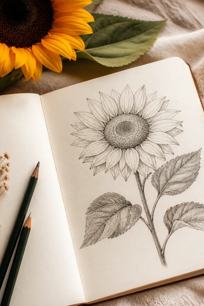
1. Warm Olive Leaf with Pencil Vein Fade
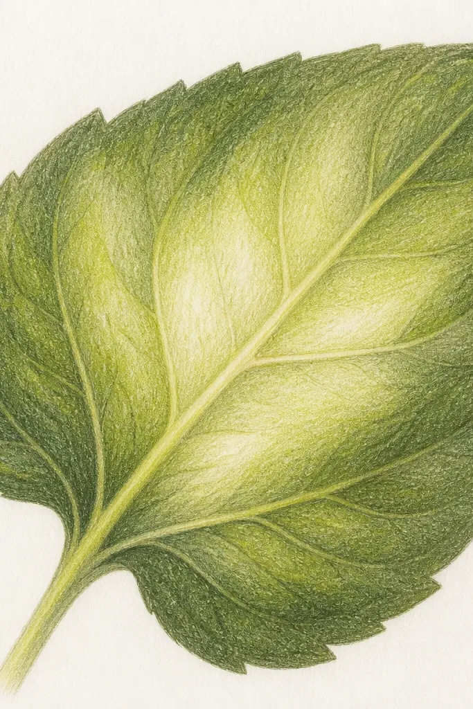
This look uses pencil to create a leaf that feels plush, not flat. I start with a light warm yellow-green base so the leaf reads sunny even before the shadows. Then I add the vein with a lighter pencil and soften it outward with gentle strokes following the leaf curve. The edges get a darker olive ring so the leaf has a rim like fabric catching light. It flatters cozy sketch styles and works especially well for small hands because pencil marks let you fix shaky lines without smearing.
Step 1: Sketch the leaf outline lightly with a 2H or light HB, then shade the whole leaf with a thin layer of yellow-green (keep it even, no heavy spots). Step 2: Build the mid-tone by adding warm olive strokes along the direction of the veins, staying 2-3 mm away from the outline. Step 3: Add the darker rim by pressing a little harder at the edge and around the vein intersections, then blend with a light back-and-forth motion. Finally, lift a tiny highlight along the vein using a kneaded eraser - press, twist, and lift once, don't rub back and forth.
Good to knowIf your leaf looks "dirty," stop layering and switch to lighter pressure for the next layer; muddy color usually comes from too many dark passes.
Common mistakeAvoid coloring all the way to the outline with the darkest green - it makes the leaf look like it's been colored with a thick marker.
2. Sage Shadow Leaf with Marker Edge Pop
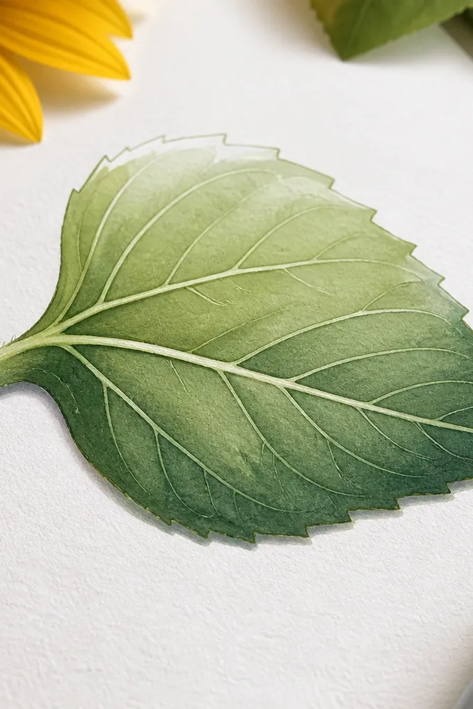
This is the marker version of cozy because it keeps contrast where your eye expects it: the rim. I use marker for the edge shadow and the vein definition, then I leave the center lighter so the leaf still feels soft. The palette matters: sage green plus cool shadow green reads calmer than straight forest green. It looks great for people who want quicker progress and cleaner lines, and it flatters anyone who struggles with pencil grain showing through too much. The overall vibe is crisp cozy - like a warm kitchen light on paper.
Step 1: Draw the leaf outline in pencil first, then color the leaf center with a light sage marker in one direction only. Step 2: Hold the marker at a shallow angle and add a darker cool green only along the lower edge and around the vein forks. Step 3: Go back with a pencil (or a super light marker) to re-draw the main vein so it looks intentional instead of accidental. Finally, leave a narrow highlight strip near the top edge uncolored - that negative space is what makes it feel "soft."
Good to knowTest your marker on the same paper scrap before you commit; some markers spread and you want to know the bleed size.
Common mistakeDon't try to shade the entire leaf with marker like you're coloring a cartoon; it goes streaky fast on small leaf shapes.
3. Two-Tone Pencil Leaf with Eraser-Fold Highlights
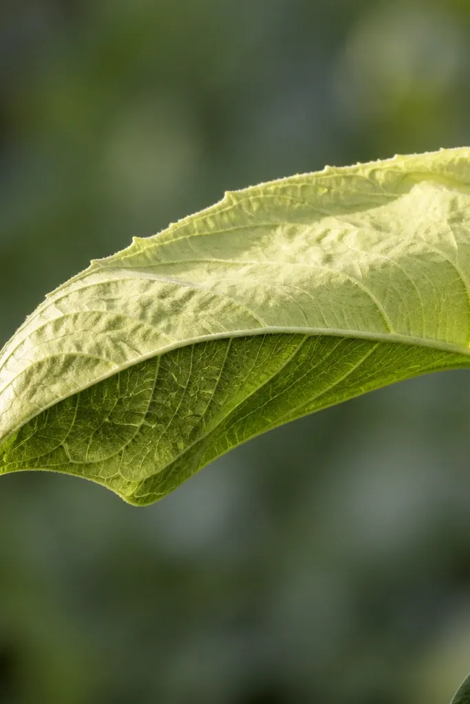
This look is my go-to when I want leaves to look dimensional without spending time blending. The trick is using two temperature tones: warm yellow-green for the top and olive for the bottom. Then you create the fold highlight by lifting color after the shading is set. It feels cozy because the leaf looks like it has a crease, not just a shape. This is especially flattering for drawings that include multiple leaves stacked - the lifted crease makes each one read as a separate piece.
Step 1: Lightly block in the leaf shape and main vein, then shade the top half with a warm yellow-green pencil using short strokes that follow the curve. Step 2: Shade the bottom half with olive, slightly heavier pressure near the underside edge. Step 3: Blend gently with a lighter pass of the yellow-green so the transition is smooth, not striped. Finally, press a kneaded eraser into the fold area (usually near where the leaf bends) and twist to lift - stop when the highlight looks like a thin stripe, not a big white patch.
Good to knowIf the eraser lifts too much, you can re-glaze over it with the light yellow-green pencil in tiny strokes.
Common mistakeDon't rub the highlight area with the eraser like you're cleaning a stain - that smears pencil texture and kills the cozy look.
4. Marker + Pencil Vein Combo on a Curved Leaf
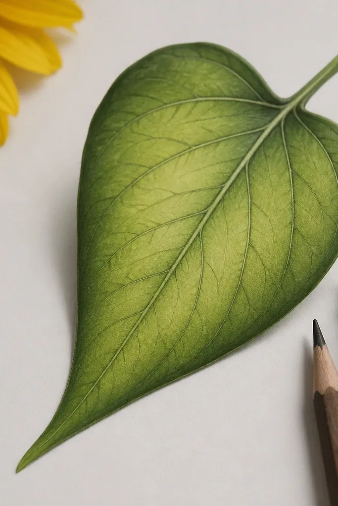
This combo gives you speed without losing detail. I lay a smooth marker base for the leaf body so it looks evenly filled, then I switch to pencil for veins and small texture lines. Pencil veins make the leaf feel hand-drawn and cozy; marker alone makes veins look too uniform. The color choice is still warm: I use yellow-green for the base and add olive shadow on the underside. This method flatters people who can't blend pencil smoothly but still want leaf realism.
Step 1: Use pencil to sketch the leaf outline and vein map lightly. Step 2: Fill the leaf body with a light yellow-green marker, moving in one direction and keeping the pressure consistent. Step 3: Add olive marker only along the lower edge and where the veins branch, then let it dry fully. Step 4: Finish with pencil by drawing the main vein and a few smaller veins, then add tiny edge dots with a darker pencil for texture.
Good to knowLet marker dry for a full minute before you add pencil veins so the pencil doesn't drag color into the paper.
Common mistakeAvoid coloring over your pencil outline too early with marker; it blurs the vein plan and you lose the cozy structure.
5. Cool Yellow-Green Pencil Leaf with Soft Grain
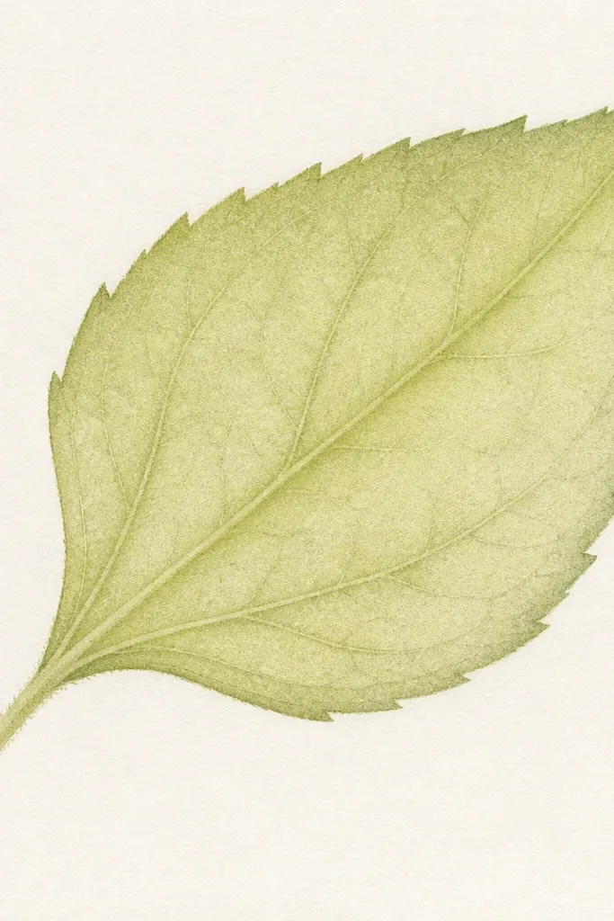
This is the "airy cozy" leaf. Instead of heavy layering, I use a cool yellow-green pencil and keep the pressure light so the paper texture shows. The darker green is limited to the edges and the underside vein shadow. This makes the leaf look delicate and sketchy, like it belongs in a notebook. It's a great pick for beginner-friendly cozy sketches because you don't need perfect blending to make it look right.
Step 1: Draw the leaf outline and lightly mark the main vein. Step 2: Shade the entire leaf with cool yellow-green using light, repeated strokes - leave tiny gaps for paper to show through. Step 3: Add the edge shadow with a darker green pencil and keep it narrow, about 2-4 mm from the outline. Step 4: Re-emphasize the vein with a mid-tone pencil, then stop. Don't keep polishing the drawing - that's how the leaf loses its airy feel.
Good to knowIf you want more cozy warmth, add a thin glaze of warm yellow-green over the center only.
Common mistakeAvoid heavy burnishing on this style; smooth, shiny pencil makes it look less like a sketch and more like a coloring-page copy.
6. Forest Edge Marker Leaf with Negative Space Highlights
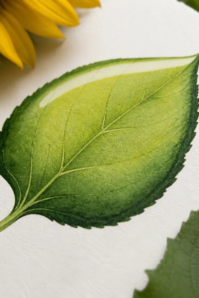
This look is dramatic cozy - not in color, in contrast placement. The center stays light, and the forest edge gives you that "leaf shadow" without turning the whole leaf dark. I like it for leaves that overlap because the edge line helps separate layers. It reads well in photos because the blank highlight strip catches the viewer's eye immediately. This is also forgiving if you're not great at drawing tiny veins; the edge shadow does a lot of the work.
Step 1: Outline the leaf with pencil, then choose a light top area and mark it as "do not color" with a faint pencil line. Step 2: Fill the rest of the leaf body with a light yellow-green marker, keeping the gradient gentle. Step 3: Add forest green marker only along the outer edge and the underside curve - keep the stroke controlled and stop before it reaches the highlight strip. Step 4: Add a few pencil vein lines lightly so the leaf doesn't look like it's just filled color.
Good to knowUse a chisel tip marker for the edge so you get a consistent line width instead of uneven blobs.
Common mistakeAvoid thick marker pooling at the tip of the leaf; it turns into a dark dot that looks accidental.
7. Sunflower Leaf Underside Shade with Pencil Crosshatch
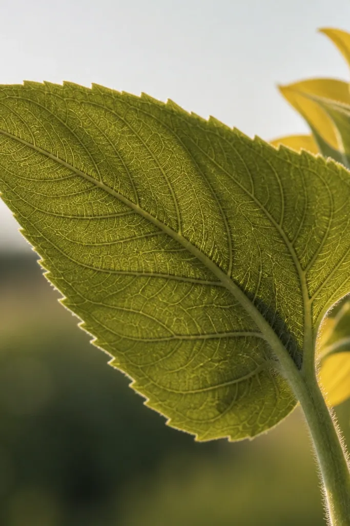
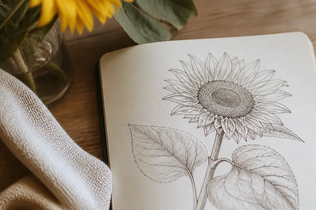
Crosshatch is the quickest way I know to make an underside look real without over-blending. I keep the top edge light and let the underside get darker with angled strokes. The leaf looks cozy because the texture catches light differently than smooth color. This one works great when you're drawing a bunch of leaves around a sunflower head - the underside shading gives the whole page depth. It also flatters sketchbook pages because you don't need fancy tools, just consistent pencil pressure.
Step 1: Sketch the leaf shape and mark the main vein. Step 2: Shade the underside with olive using diagonal strokes that follow the leaf curve - keep them fairly spaced at first. Step 3: Add a second layer of crosshatch in a different diagonal direction, but only in the underside half. Step 4: Use a darker green pencil to dot the vein shadow spots - small clusters near where veins branch. Leave the top edge lighter and add a thin highlight by lightly erasing or using lighter pressure.
Good to knowIf your crosshatch looks messy, make the second diagonal layer shorter - stop before it reaches the top edge.
Common mistakeDon't crosshatch the entire leaf evenly; it flattens the shape and kills that cozy underside effect.
8. Marker Petal Warmth Transfer onto Leaf Edges
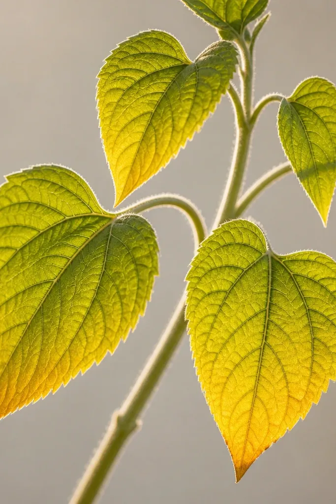
This is the trick I learned after too many drawings looked "separate" - like the sunflower head and leaves didn't belong to the same light source. I add a warm amber tint along the leaf edges to simulate reflected light from the petals. The leaf base stays green and calm, but the edge warms up and suddenly the whole piece looks cozy and unified. It's a flattering approach for drawings meant to look like late afternoon light. You can also use it to fix leaves that feel too cold.
Step 1: Color the leaf body with pencil in yellow-green and olive, keeping the main green tones separate from any warm tint. Step 2: Switch to a warm amber marker (or a warm orange pencil if you prefer) and lightly touch it only along the lower edge and the areas closest to the sunflower center. Step 3: Use a clean pencil to soften the transition by blending from the green inward 5-10 mm. Step 4: Re-draw the vein lines in pencil so the warm edge doesn't overpower the structure.
Good to knowUse the warm tint like seasoning - three light passes beat one heavy pass.
Common mistakeAvoid putting warm amber on the whole leaf; it turns the leaf into a brownish blob and stops reading as green.