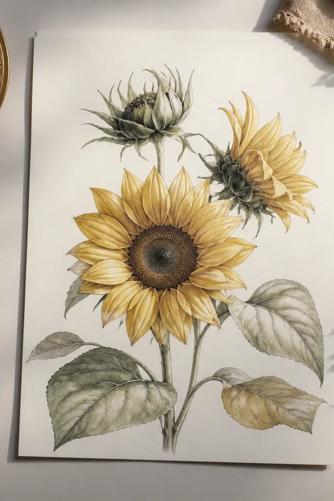
1. Single Head Side View with Rim Shadow Halo
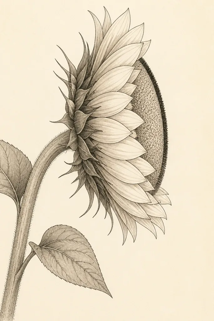
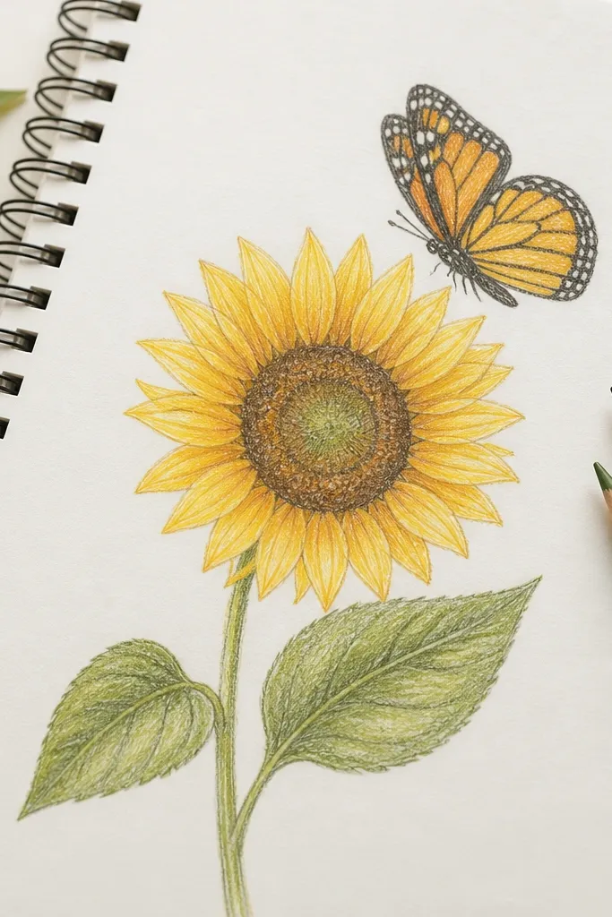
Start with one sunflower head tilted 20-35 degrees so the viewer sees depth. The luxe part is the rim shadow: draw a thin dark band on the far side of the head, then soften it with a 2B pencil so it looks like light is wrapping around the petals. Use honey yellow for the front petals and burnt orange at the petal bases, keeping the far petals slightly darker. This layout flatters smaller spaces because it's vertical and controlled - it looks good on slim frames and narrow shelf decor.
Step 1: Sketch the head as an oval, then add a light guide line for where the center disk sits (slightly off-center). Step 2: Place petal anchors in a gentle arc, 12-16 petals total, with the closest petals drawn larger and the far ones thinner. Step 3: Add rim shadow along the far edge of the oval head, then shade petal bases where they overlap. Step 4: Draw the stem as one continuous curve and add one simple leaf behind the stem line, not under it. Finish by coloring only the petal front faces - leave the far edges a touch paler so the depth reads.
Good to knowShade with your pencil side, not the tip, for a smoother halo effect. If your shadow looks gray, glaze over with a light burnt sienna layer.
Common mistakeAvoid drawing the center as a perfect circle - in side view it kills the 3D read.
2. Two Petal Layers Only Luxe Side View
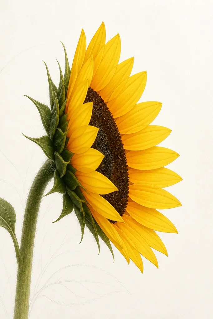
This is the "expensive minimal" version. You keep the silhouette sharp by drawing only the outer two petal layers and letting negative space do the work. Color the outer layer with goldenrod and reserve deep sienna for the petal base shadows. Because there's less clutter, the drawing looks crisp and modern on warm beige paper and on dark matte frames. It suits smaller busts of art - think 5x7 prints or mini upcycled tags.
Step 1: Draw the oval head and lightly mark two petal rows: one near the front edge and one behind it. Step 2: Outline only those petals, keeping each petal shape consistent in width - about 8-10 mm wide at the base. Step 3: Shade the base of each petal with 2B pencil, then add a thin burnt orange wash where the petal overlaps the head. Step 4: Add a single leaf that sits behind the stem, drawn with fewer veins - 3 main veins max. Step 5: Leave the rest of the page blank so the contrast reads luxe.
Good to knowIf you want it to look even pricier, use a slightly thicker fineliner (0.7) for the outer contour and 0.3 for the center disk seeds.
Common mistakeDon't add lots of tiny seed dots across the whole center - it makes the minimal style look busy.
3. Side View with Draped Ribbon Petals
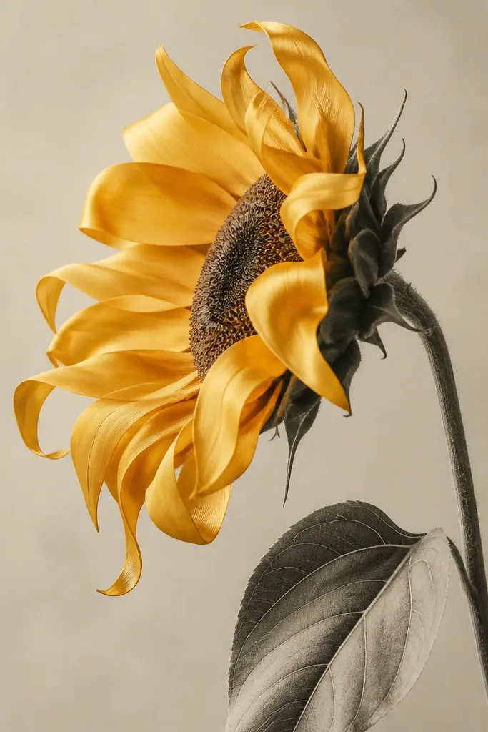
Ribbon petals look luxe because they mimic fabric drape. You draw each petal with a gentle S-curve so it catches light along one edge. Color the front edge with a lighter yellow and fade to a deeper orange toward the overlap line. This works well if you want the piece to feel feminine and soft without losing structure. It flatters anyone who likes art that looks like it could be printed on a high-end scarf or stationery.
Step 1: Sketch the head oval and then draw 14-20 petals as flowing ribbon shapes, each starting thick at the base and tapering at the tip. Step 2: Make the nearest petals slightly larger and let 2-3 petals curl outward at the far end of the head. Step 3: Shade by adding a highlight edge line lightly in colored pencil, then deepen the overlap areas with burnt sienna. Step 4: For the center disk, use short, curved seed marks that follow the oval's curve, not straight lines. Step 5: Keep the stem thin and add one leaf with a soft graphite wash so the petals stay the star.
Good to knowCurl tips should be subtle. If a tip folds too sharply, it reads like a sticker, not draped paint.
Common mistakeAvoid hard, uniform dark outlines on every petal edge - the ribbons lose their softness.
4. Sunflower Side View with Vintage Etched Seeds
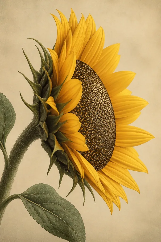
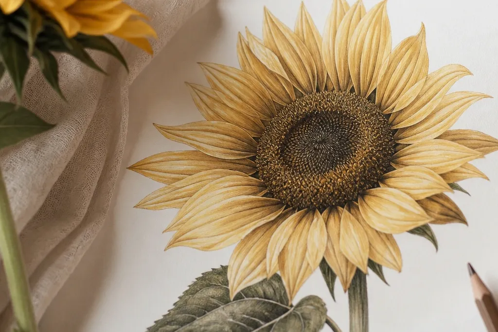
Etched seeds make the center look like a carved illustration, which reads high-end fast. For this style, you keep the petals simpler and let the center do the texture work. Use a 0.1 or 0.3 fineliner for seed marks and shade the far half of the oval with a light cross-hatch. Color petals in two tones only: pale golden on the front faces and sienna at the base shadows. This version looks great on cream paper and pairs nicely with gold ink accents.
Step 1: Draw the head oval and outline the petal shapes with a 0.5 fineliner, keeping the petal count around 16-18. Step 2: Fill the center disk with curved seed lines - start light near the front and build density toward the far edge. Step 3: Add a gentle cross-hatch on the far side only, then soften with a kneaded eraser if it gets too dark. Step 4: Color petals with light yellow, then glaze burnt orange at the base overlap line. Step 5: Add one thin leaf vein line and a second faint vein for balance.
Good to knowUse a kneaded eraser to lift graphite haze on the oval's front edge so it looks glossy.
Common mistakeDon't outline every seed - that makes it look like a pattern sheet instead of etched print.
5. Side View Sunflower with Pearl-Style Highlight Dotting
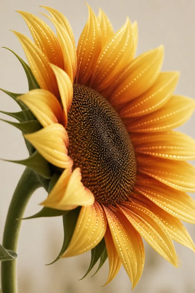
Pearl-style highlights look luxe because they mimic the way light catches textured paint or enamel. You don't need glitter - just tiny controlled dots placed along the highlight ridge of each petal. Keep the rest of the petal shading smooth, then add dot highlights sparingly on the front-facing edges. This style is perfect for greeting cards, upcycled jewelry boxes, and frame mat accents. It flatters warm skin tones and golden color palettes, and it photographs beautifully under daylight.
Step 1: Draw the side-view head oval and outline 14-18 petals as ribbon-like shapes. Step 2: Color the petals with a light golden layer, then deepen bases with burnt orange where petals overlap. Step 3: For the highlight ridge, lightly mark a curved line on each front petal. Step 4: Add tiny dots (2-3 mm apart at most) along that ridge using a white gel pen or white colored pencil, then stop before the far edge. Step 5: Shade the center disk oval with a smooth gradient and add seed lines only on the front half so it stays airy.
Good to knowIf the dots look chalky, press lighter and do two passes instead of one heavy pass.
Common mistakeAvoid dotting the entire petal - keep dots on the highlight ridge only.
6. Sunflower Side View with Soft Watercolor Wash Edges
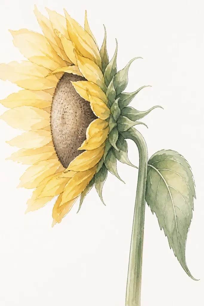
Watercolor-edged petals look high-end because the fade creates air between layers. You still keep control by using fineliner for contours, then letting diluted color blur the transitions. Use a warm yellow wash for the front petals and a diluted burnt orange wash for overlap shadows. For the rim shadow, mix a neutral gray-brown (pencil shading plus a tiny bit of warm ochre) so it doesn't look like a harsh outline. This style suits airy wall art and gift tags where you want softness without losing shape.
Step 1: Outline the head oval and petal shapes with fineliner first, so your watercolor doesn't spread past the design. Step 2: Wet the petal area lightly (with clean water) and lay down a light honey yellow wash, leaving tiny gaps for paper texture. Step 3: Add burnt orange only at the petal bases and along the overlap lines, then pull the color outward with a damp brush. Step 4: Create the rim shadow with a thin gray-brown wash along the far edge of the head. Step 5: Paint the stem and leaf with a light olive wash and add one darker vein line at the center.
Good to knowUse a hairdryer on low for 20-30 seconds between layers so the colors don't bleed into the seed area.
Common mistakeAvoid painting the whole petal fully opaque - the luxe look is in the fade.
7. Side View Sunflower with Gold Ink Center Arc
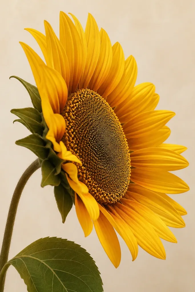
Gold ink accents make the center feel like jewelry. The trick is using a single gold arc instead of scattering gold everywhere, so the drawing keeps a calm, expensive rhythm. You keep the petals in warm matte colors (yellow and sienna), then add gold only where the eye naturally rests: the center disk curve. This looks especially good on dark paper or black matte card stock because the gold pops without needing glitter. It's also a strong choice for upcycled frames where you want one "wow" detail.
Step 1: Draw the side-view head oval and outline 14-16 petals with fineliner. Step 2: Fill the center disk with seed lines using a 0.3 fineliner, but keep them lighter on the far side. Step 3: Paint or draw one gold arc along the far edge of the oval center, about 3-5 mm thick. Step 4: Shade the rim shadow with a soft pencil line under the gold arc so it looks like light. Step 5: Add petals in two layers: base yellow, then burnt orange at overlap bases, leaving the highlight edge lighter.
Good to knowLet gold ink dry fully before you add any pencil shading near it - otherwise you get muddy smears.
Common mistakeAvoid gold on every petal. One arc reads luxe; many arcs read costume.
8. Sunflower Side View with Cut-Paper Petal Texture
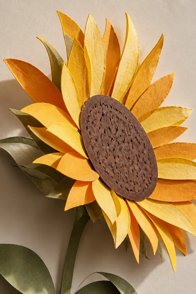
Cut-paper texture looks luxe because it has real depth, not just drawn depth. You build the side view by stacking petal strips so the nearest petals physically cover the far ones. Use two paper tones: a buttery yellow for front petals and a slightly darker orange-brown for overlap shadows. The center disk gets a textured paper so it doesn't look flat. This is a great choice if you're upcycling a thrifted frame or turning a sketch into a 3D wall piece.
Step 1: Trace your sunflower side-view outline onto thin cardstock, then cut petal strips about 10-12 mm wide at the base and taper them down. Step 2: Layer the petals starting from the far row, gluing each strip so it overlaps the previous by 3-4 mm. Step 3: Create the rim shadow by adding a thin strip of darker orange-brown paper along the far edge of the head. Step 4: For the center disk, cut an oval from textured brown paper and draw seed marks with a fine pen. Step 5: Finish by gluing a real leaf shape behind the stem and pressing everything under a heavy book for 30 minutes.
Good to knowUse a craft knife with a fresh blade. Ragged cuts make the texture look messy instead of high-end.
Common mistakeSkip glossy paper for petals - it reflects light weirdly and ruins the soft luxe feel.
9. Side View Sunflower with Charcoal Smoke Background
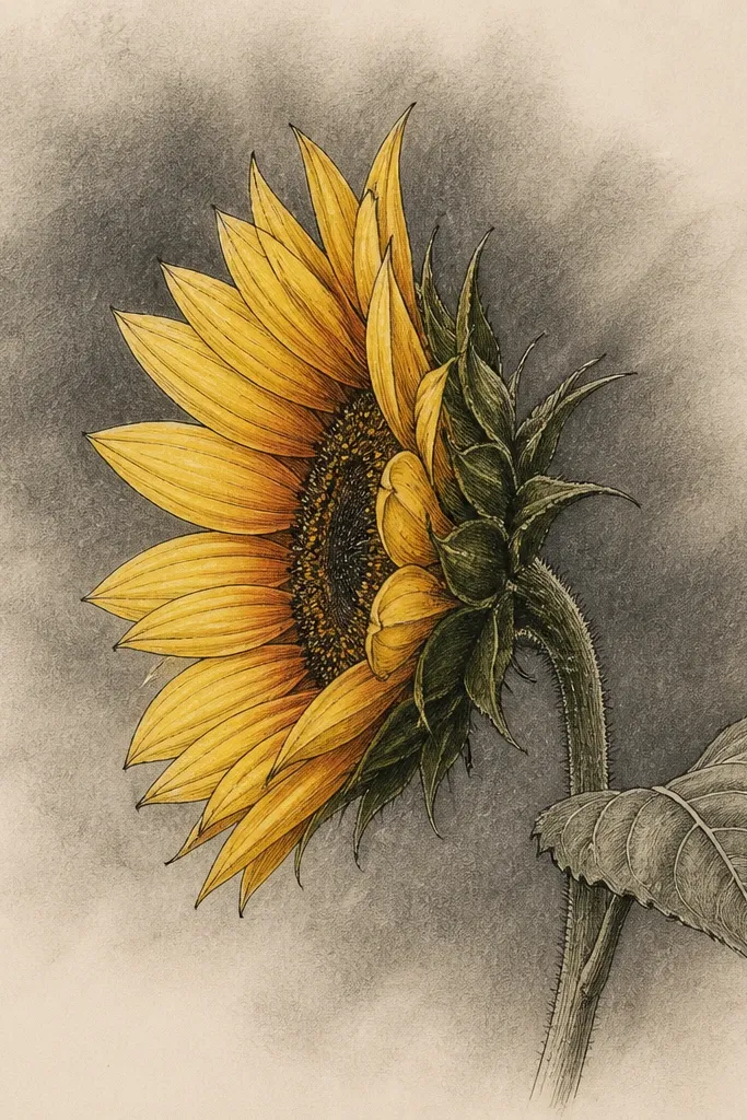
A smoky charcoal background makes the sunflower look like it's lit from the front. The side view benefits because the rim shadow has something to separate from, so the head doesn't blend into the page. Keep the sunflower colors warm and matte, then let the background stay neutral gray-brown. This style looks dramatic on large art prints and works well for upcycled cabinet doors where you want a focal point without adding extra objects.
Step 1: Draw the sunflower side view in outline first and keep the head margin at least 2 inches from the edges. Step 2: Rub charcoal lightly around the sunflower using a tissue or blending stump, building a gradient that's darker behind the far edge of the head. Step 3: Shade petals with pencil at the overlap bases, then add color in warm yellow and burnt orange only in those shaded areas. Step 4: Add the rim shadow along the far head edge with a darker pencil line and blend outward slightly. Step 5: Fix with a light spray of workable fixative once everything is dry so the charcoal doesn't smear.
Good to knowHold the charcoal darker on the far side only. Symmetry makes it look like a smudge, not a studio light.
Common mistakeAvoid heavy charcoal all over the page - it turns the sunflower into one gray blob.
10. Sunflower Side View with Monoline Stem and One Leaf Fan
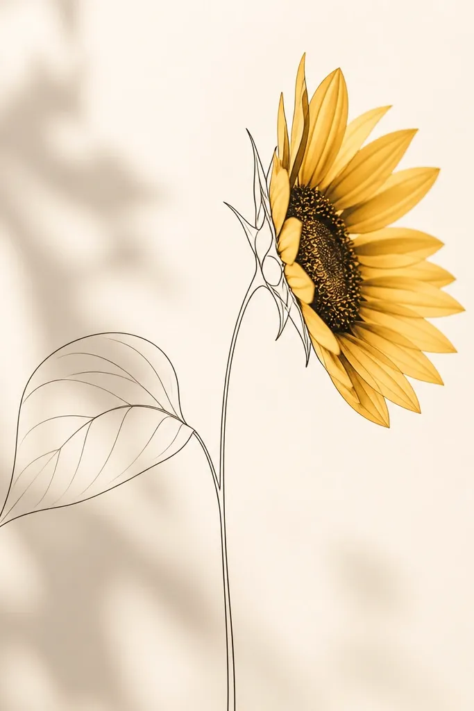
Monoline stems and a single leaf keep the drawing airy and expensive-looking. The side view needs a clean support line, and a thin stem gives you that "gallery sketch" feeling. Use the leaf as a framing device: fan it slightly outward so it balances the head's tilt. Color the petals in warm yellow and sienna, but keep the leaf mostly pale olive so it doesn't compete. This works well for slim frames and for labeling jars or items where you want the sunflower to feel light, not heavy.
Step 1: Draw the head oval and outline 14-18 petals with fineliner, keeping the petals crisp. Step 2: Draw the stem as one continuous line with no added thickness changes. Step 3: Place one leaf behind the stem and split it into 3 main vein lines, each curved gently from base to tip. Step 4: Shade petal bases with soft pencil, then color with honey yellow and a burnt orange wash at overlaps. Step 5: Add a light rim shadow on the far edge of the head using a 2B pencil and blend with a fingertip.
Good to knowIf the stem looks wobbly, redraw it once in pencil first, then go over with ink in a single smooth pass.
Common mistakeDon't add multiple leaves. Two or three leaves in side view crowds the composition.
11. Sunflower Side View with Patterned Petal Bands
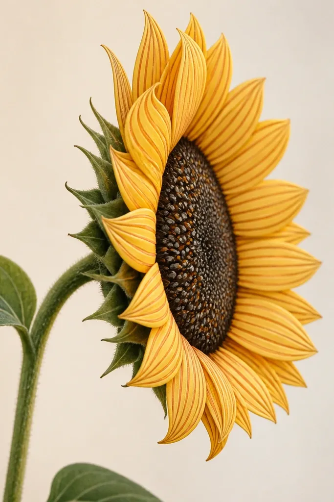
Patterned petal bands look luxe because they add controlled texture without clutter. You're not drawing tiny seeds on every petal - you're adding a few stripes that follow the petal curve, which makes the petals feel designed, like fabric. Keep the stripes thin and consistent, about 1-2 mm wide. This style is great for DIY wall decals, printed transfers, and upcycled paper crafts where you want the sunflower to look intentional even at a distance.
Step 1: Outline the sunflower side view and block the head oval, then place 16-20 petals around it. Step 2: Color the whole front face with light yellow, leaving the far edge slightly paler. Step 3: Add 2-3 petal bands per petal using burnt orange - one near the base, one mid-petal, and one near the highlight ridge. Step 4: Shade the overlap areas lightly with 2B pencil so the bands don't look flat. Step 5: Draw the center disk as an oval with seed marks only in the front half, then add the rim shadow along the far edge.
Good to knowUse the same pen for every stripe so the line weight stays consistent across the head.
Common mistakeAvoid random stripe placement. If stripes don't follow the petal curve, it looks cheap.
12. Sunflower Side View with Embroidered-Look Stitching Lines
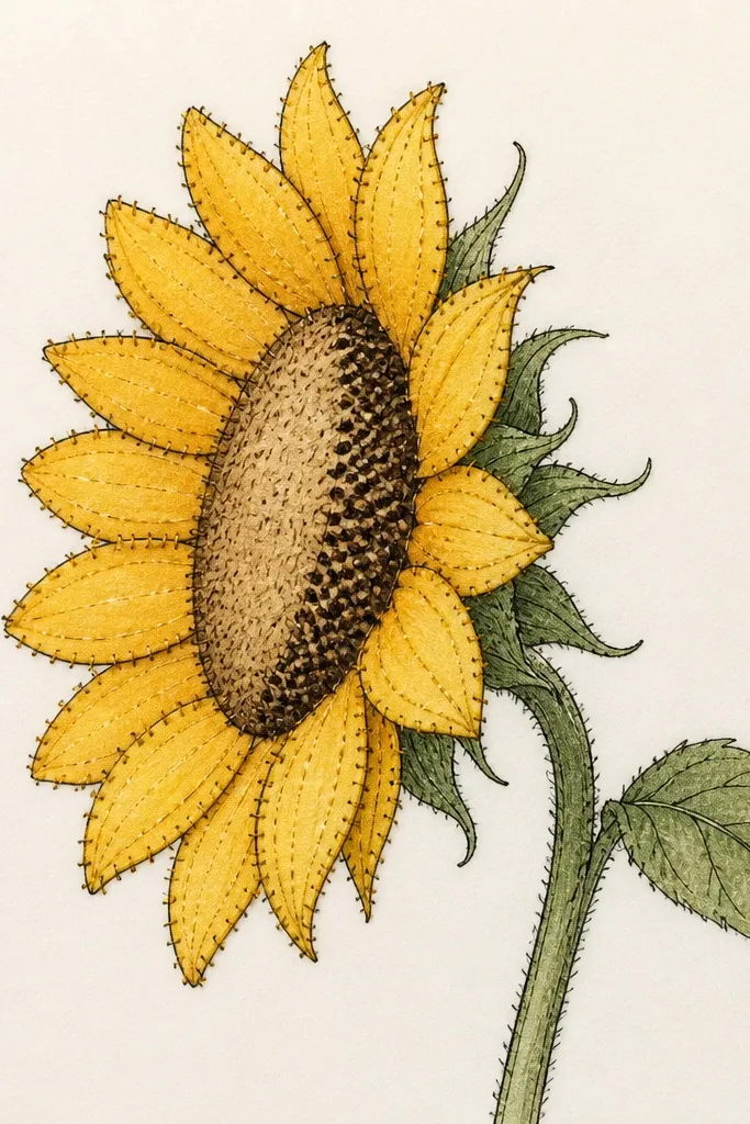
Stitching lines read luxe because they mimic hand craft. The side view gives you a natural place for stitches: along the far rim shadow and the petal edges where you'd expect thread to catch. Use a light warm yellow for petals, then add burnt orange shading at overlaps, and place stitch marks only where the silhouette needs definition. This style is perfect for upcycled tote bags, embroidered patches, and mixed-media art where you want a "handmade but clean" vibe.
Step 1: Outline the sunflower side-view head oval and define 14-18 petals with fineliner. Step 2: Color petals with light yellow and add burnt orange at the overlap bases. Step 3: Draw a thin rim shadow line along the far edge of the head, then place short stitch marks (tiny V shapes or dots) along that line. Step 4: Add 3-5 stitch marks per outer petal edge on the front-facing side only. Step 5: Keep the center disk simpler: oval outline plus a few seed lines, then stop so the stitches carry the texture.
Good to knowMake stitches smaller near the center and slightly larger at the outer rim. That gives depth without extra shading.
Common mistakeDon't stitch over the entire center disk - it crowds the design.
13. Sunflower Side View with Matte Marker Velvet Shading
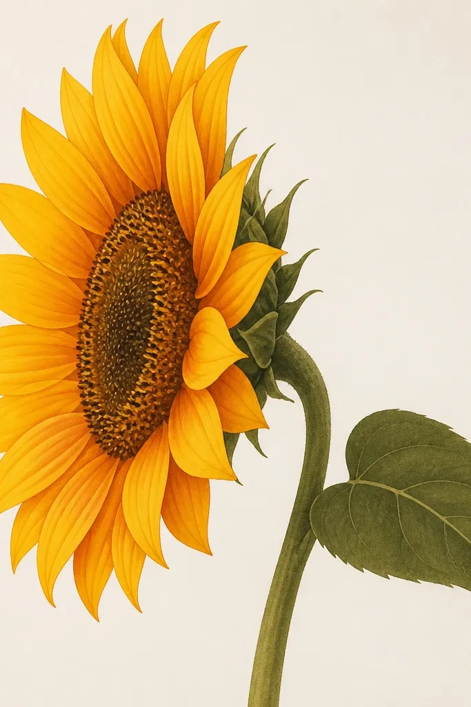
Matte marker shading looks high-end when you blend in the direction of the petal. You're building a gradient that follows the petal curve, not just coloring randomly. Keep the front petal edges lighter, the bases darker, and the far edge slightly muted. This style works well for people who hate wet watercolor mess and want clean control. It also photographs well under flash because matte markers don't glare as much as glossy pens.
Step 1: Outline the sunflower side view with fineliner, then lightly map the petal overlaps. Step 2: Color the front faces with a light honey yellow marker, staying inside your fineliner. Step 3: Add burnt orange only at bases and overlap zones, then blend upward with a lighter yellow marker using circular motions that never cross into the background. Step 4: For the rim shadow, use a neutral warm gray marker along the far edge and blend outward 5-8 mm. Step 5: Color the leaf in pale olive and add one darker vein line; keep it simple so the petals stay luxe.
Good to knowBlend while the ink is still slightly damp. If you wait, you'll get hard bands.
Common mistakeAvoid coloring the whole petal solid. Velvet shading is about transitions, not full coverage.
14. Sunflower Side View with Layered Tissue Paper Glow
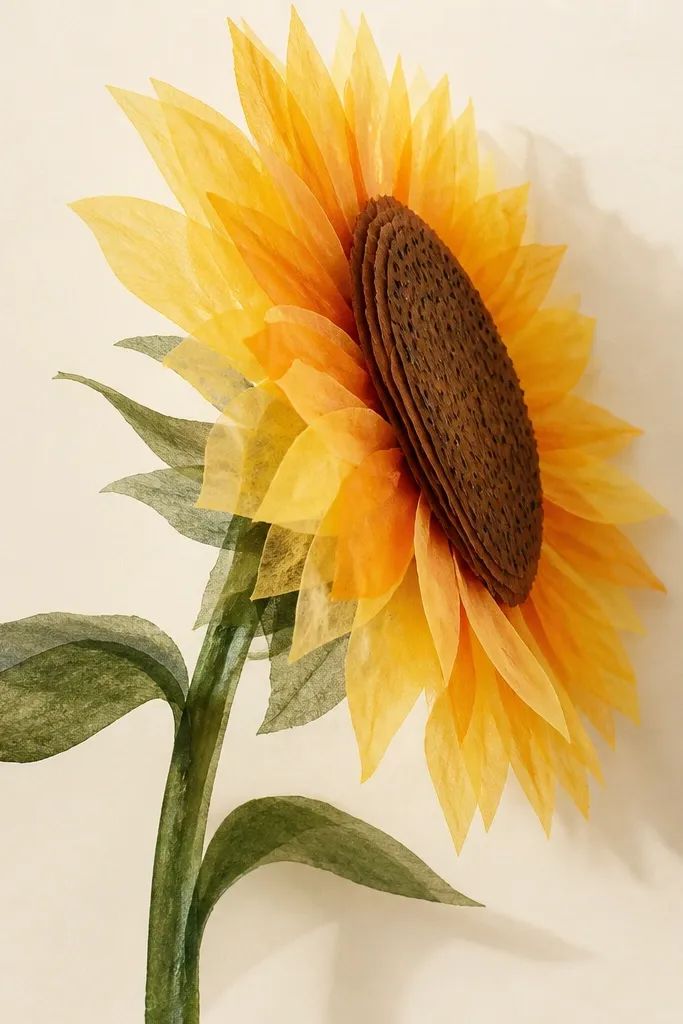
Tissue paper glow looks expensive because it creates light diffusion like a lampshade. In side view, you get a natural gradient: the front petals look brighter, and the far petals look softer and deeper. Use multiple layers but stagger them so the overlaps create the 3D stair effect. This style is stunning on backlit frames or anywhere light hits from the side. It flatters warm, cozy decor - think farmhouse-modern corners and soft neutral rooms.
Step 1: Cut tissue petals in two tones: buttery yellow and burnt orange, using petals about 1.5-2 inches long with tapered tips. Step 2: Layer the far petals first on a cardstock base, then add front petals last so they sit higher. Step 3: Build the rim shadow by placing a thin strip of darker orange tissue along the far edge of the head oval. Step 4: Create the center disk by layering brown tissue into an oval and drawing seed marks after the layers are glued down. Step 5: Add a leaf cut from pale green tissue and keep it behind the stem so it looks airy.
Good to knowUse a glue stick, not liquid glue, so the tissue doesn't wrinkle and warp the petals.
Common mistakeAvoid thick glue blobs. They make shiny spots that kill the glow.
15. Sunflower Side View with Monoprint Texture Base
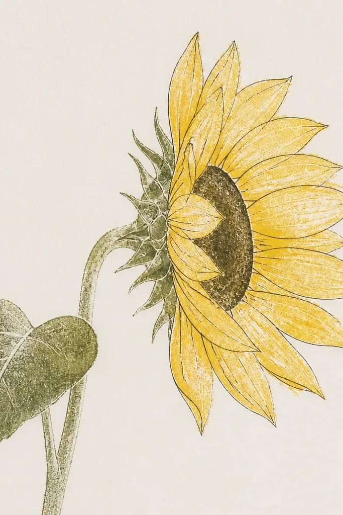
Monoprint texture reads luxe because it looks like artwork, not a coloring page. The side view helps because texture sits in the petal planes, so the depth shows even without heavy shading. Use a warm yellow ink for the front, a lighter ochre for highlights, and a warm brown for the center. Keep your outlines clean so the print texture doesn't blur the shape. This is a strong choice if you like repetition-free art - every print comes out slightly different.
Step 1: Make a simple petal texture plate using a piece of craft foam and a few crumpled bits of plastic pressed into it. Step 2: Ink the plate with warm yellow and pull a light print on your petal shapes, then outline the sunflower side view with fineliner. Step 3: Add a second print pass for overlap shadows using burnt orange, placing it only where petals overlap the head. Step 4: Print a warm brown oval for the center disk and then add seed lines with a fine pen on the front half. Step 5: Draw the stem and leaf with thin ink lines and color them lightly with the same ochre ink so everything stays cohesive.
Good to knowPress your paper firmly but briefly. Too long gives you muddy petal textures.
Common mistakeDon't overprint. If the texture gets too dark, it stops looking high-end and starts looking dirty.