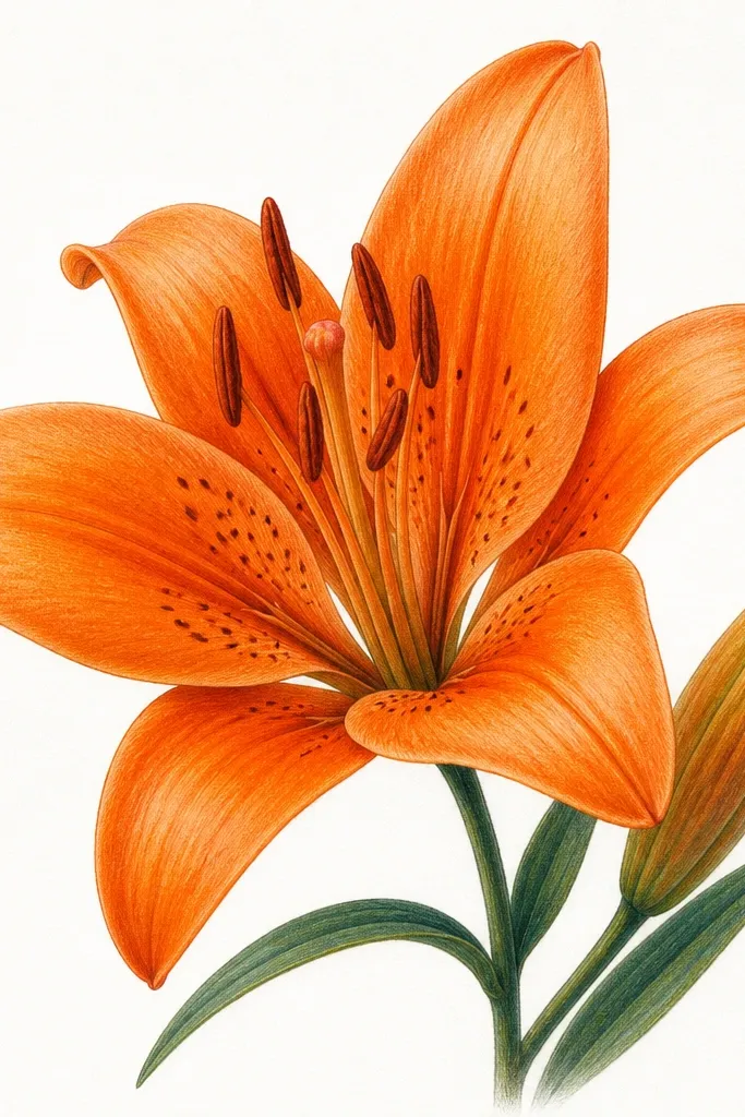
1. Single Lily Over a Thrift Tote Pocket
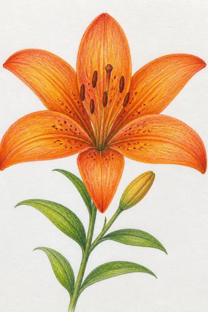
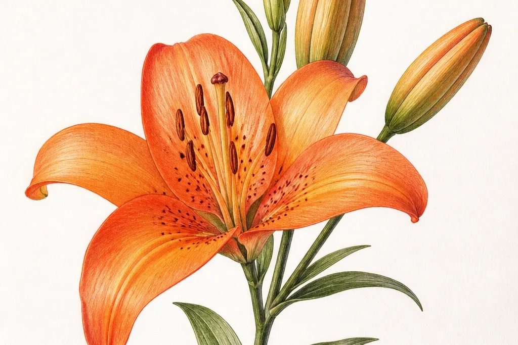
This layout is the fastest way I’ve found to make a tired tote look intentional. The single lily keeps attention on one spot, so you don’t need to cover the whole bag. I like it for medium-to-tall figures because the stem curve pulls the eye upward and makes the pocket area look “framed.” The orange reads warm against cream canvas, and the dark fold lines keep each petal separate even if your marker bleeds slightly on fabric. Wear it with simple jeans and a white tee — the lily becomes the color anchor.
Start by drawing a light pencil oval for the lily center, about 2.5 inches wide on the pocket flap. Then sketch six petals around it, each petal slightly rotated so no two petals point the same direction. Outline with an orange brush pen, but add the darkest orange only along the inner crease lines where petals would fold. Finish with a pale yellow center circle and a few tiny pollen dots in warm ochre. Finally, use a thin green marker for the stem and let it tuck under the pocket seam so it looks like it grows from the fabric edge.
Good to knowTest your orange pen on scrap canvas first — if it feathers, switch to a paint pen and outline with a darker marker.
Common mistakeDon’t color the whole petal solid orange — you’ll lose the petal shape and it will look like a stamp.
2. Lily Trio in a Vertical Wreath Band
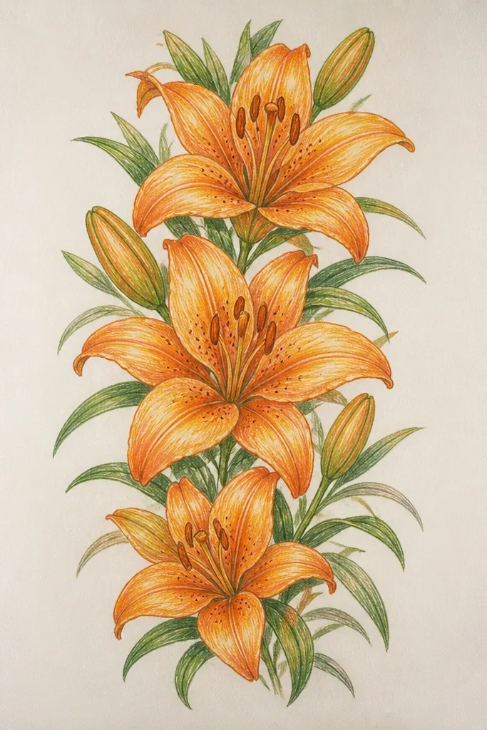
A trio works when you want more color without turning the page into a busy poster. This one looks good on taller items like journals, phone sleeves, or long tote straps because the stack creates a steady rhythm. I prefer it for people who like clean lines because the petals stay consistent and the only variation is petal tilt and center brightness. The pale background prevents the orange from overwhelming the surface, and the thin green leaves add structure without stealing attention. It also looks great with gold accents — I’ve paired it with a thrifted brass zipper pull and it reads cohesive.
Begin by painting or wiping a very light cream wash behind the band, leaving the edges of the fabric or paper visible. Draw a center guideline down the middle, then place the top lily center at about 1 inch below the cover edge. Sketch three lilies along the line, spacing them so the bottom petals don’t overlap more than half their width. Outline each lily, then add fold shadows: dark orange along the inner curve and a lighter orange along the outer arc. Add two small leaf sprigs between lilies, then finish with a single thin stem line that visually connects the trio.
Use a ruler for the band edges and stop the lilies a half-inch before the sides so the design looks crisp.
Don’t add full leaves everywhere — three small leaf sprigs are enough to make the wreath feel intentional.
3. Orange Lily and Teal Dots Pattern on a Picture Frame
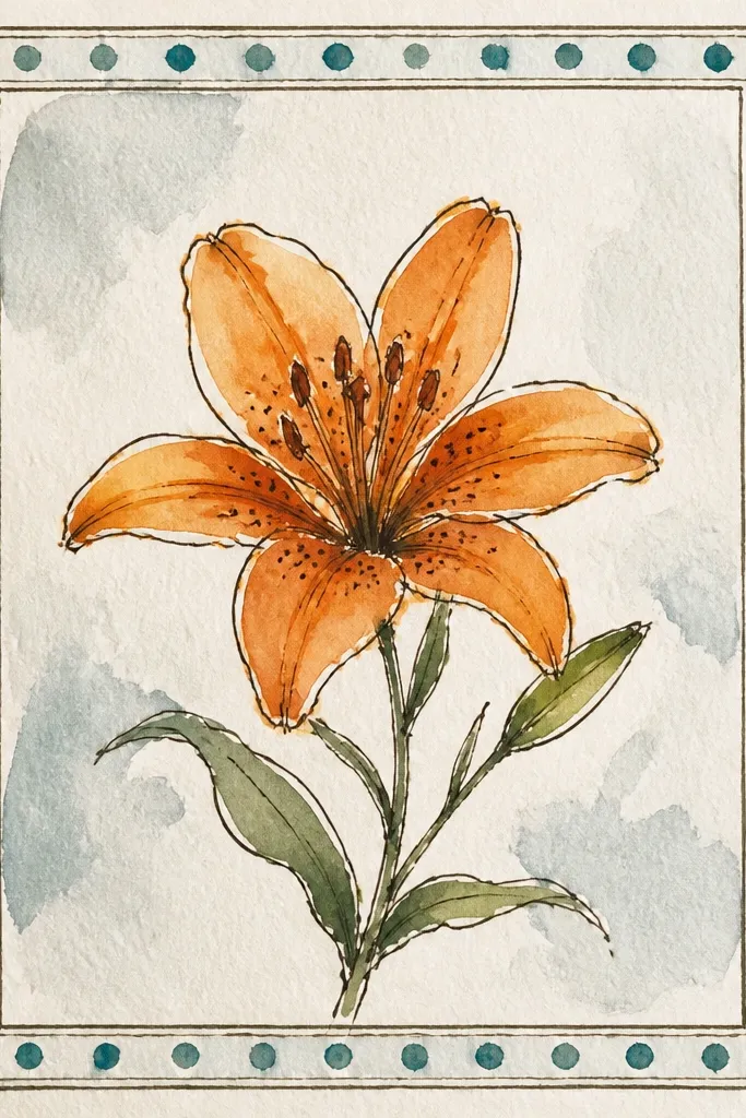
This is my go-to when a frame looks boring and you want brightness that doesn’t require painting the whole thing. The teal dots give texture, and the orange lily becomes the focal point without getting swallowed. I like it for warm skin tones and golden hair because the orange and teal combo flatters warm undertones and makes the design feel fresh. The angled lily feels playful, not formal, and the speckled center adds that handmade look you can’t fake with a sticker. It’s also forgiving if your frame has old scuffs — the dots distract from uneven wood grain.
Start by sanding the frame lightly and wiping dust off with a damp cloth. Base-coat only where you want the dots to sit: a small cream rectangle where the lily will land. Tap teal paint using a cotton swab to create dots; keep them denser near the lily and lighter toward the edges. Draw the lily with pencil first, then outline with orange marker and fill petals with two shades: medium orange base and darker orange fold lines. Add pollen dots in pale yellow and a few tiny speckles near the center. Let it dry fully, then seal with a matte acrylic spray so the teal doesn’t smear.
Good to knowIf your dots look too perfect, vary the pressure on the swab — that inconsistency makes it look hand-done.
Common mistakeDon’t outline the lily in black — it makes the orange look harsh and less bright.
4. Corner Lily Sprig for a Wrapping Paper Sheet
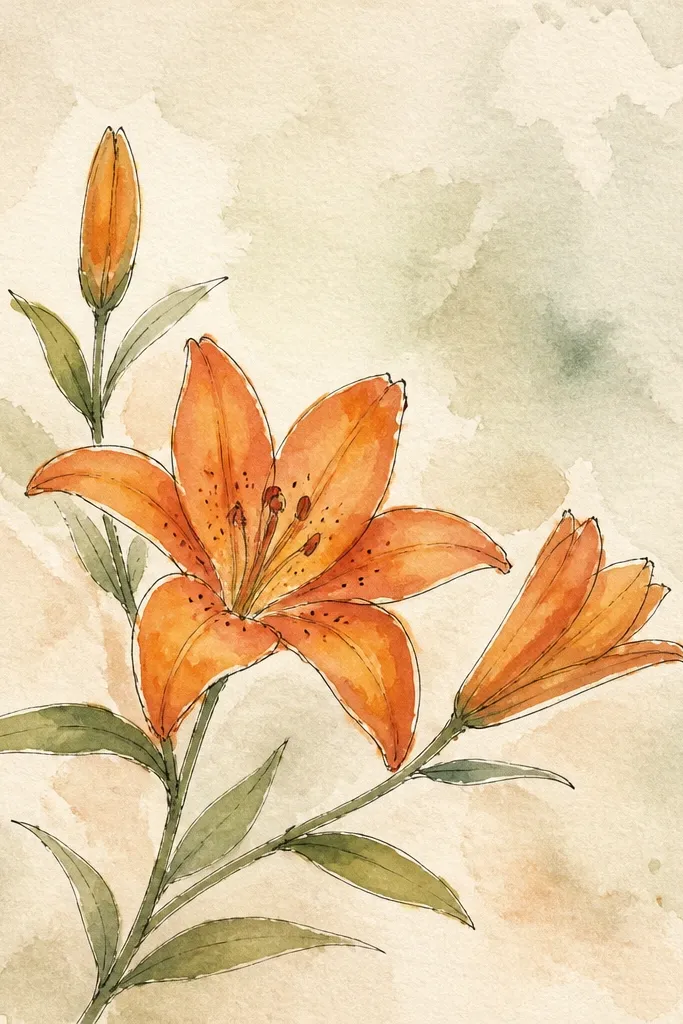
Corner designs make wrapping paper look expensive without covering the whole sheet. This one works because the diagonal stem gives motion, and the kraft background makes the orange feel warm instead of neon. It looks great for birthday gifts where you want a clean, modern vibe but still want the handmade touch. I’ve used this on paper bags and it reads the same from across the room — the lily sits where people naturally look first. If you’re trying to upcycle plain brown paper, this design gives it purpose in one pass.
Start by marking a light pencil guide for the corner: leave a 1.5-inch margin on the top and right edges. Draw one lily with a slightly open petal shape so it fits the corner space, then add two smaller buds along the stem. Outline the petals with orange and fill with a medium orange wash, keeping the darkest fold lines near the inner petal curves. Add a pale yellow center glow and dot a few tiny pollen marks. Finally, draw thin green leaves with a single tapered line each, and keep the leaf details minimal so they don’t blur when the ink dries on kraft.
Use a chisel-tip marker if you have one — the tapered petal edges look sharper on rough paper.
Don’t center the lily — corners look more intentional and the kraft background stays part of the design.
5. Orange Lily Frame Inside an Old Book Cover
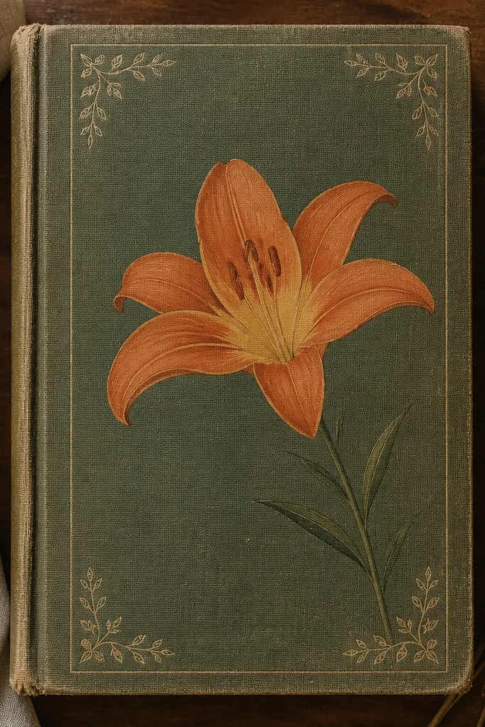
Framing a lily gives you structure, which matters when you’re decorating something with a lot of existing texture. I love this on old book covers because the edges already have history, and the rectangle makes the design look like it belongs. This layout is flattering on smaller surfaces because it contains the flower and prevents it from feeling cramped. The lily center glow stays bright, while the thin border keeps everything from going too busy. It also pairs well with black-and-white outfits because the orange becomes the single color punch.
Begin by covering any glossy or dirty spots with a thin layer of matte acrylic medium, then let it dry. Draw a rectangle border about 1 inch away from the cover edges using a pencil and straightedge. Place the lily center around the middle of the rectangle, but shift it slightly to the right for a more natural look. Outline petals with orange and shade folds with a darker orange, leaving the outer edges a lighter tone. Add small leaf sketches in each corner inside the border — just three leaf lines per corner. Seal the whole design with matte varnish so the lines don’t rub off when you handle the book.
If your cover is textured, press the pencil lightly — you want the final lines to look drawn, not carved.
Don’t make the border too thick — it will overpower the lily and make it look like a sticker.
6. Lily on a Thrifted Denim Jacket Pocket Flap
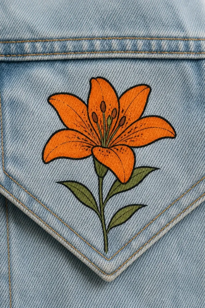
Denim pockets are my favorite place for a lily because the fabric already has a strong texture. The lily linework looks crisp against the weave, especially if you use fabric paint instead of ink. This design flatters coats on people who like a little vertical shape — the stem wrap guides the eye along the pocket seam. The orange looks warm and wearable, not costume-like, because the folds stay darker and the highlights stay light. It also hides minor stains on the pocket flap since the lily draws attention right where you want it.
Start by washing and fully drying the jacket so fabric paint sticks. Sketch the lily with pencil first, then trace with a fabric paint pen. Fill petals with medium orange, leaving the highlight curve unfilled so it stays lighter. Add dark orange along each inner crease line, and keep the darkest areas narrow so the petals don’t look heavy. Paint a pale yellow center circle and add a ring of tiny orange speckles. Finish with a thin green stem and two small leaves near the bottom edge of the pocket flap.
Good to knowUse a piece of cardboard inside the jacket when painting — it stops paint bleed onto the other side of the pocket.
Common mistakeDon’t paint over rough fuzz — sand the pocket flap lightly or the paint will sit patchy.
7. Orange Lily + Butterflies for a Repurposed Pillowcase
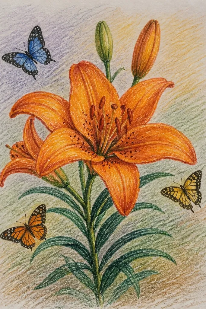
This is the design I reach for when I’m turning a basic pillowcase into something that looks like a boutique throw. The lily gives you the main structure, and the butterflies add movement without clutter. It’s flattering on most spaces because the orange sits at the center where your eyes land first, and the white background keeps the color bright. I like it for living rooms with neutral furniture because the orange feels warm rather than loud. The butterflies also help hide small uneven paint coverage — they break up any minor inconsistencies in the lily outline.
Start by ironing the pillowcase flat so the fabric paint lines don’t crack. Draw the lily center first, then place it about 3 inches above the bottom seam so it sits nicely when the pillow is on a couch. Outline petals with orange fabric paint and fill with medium orange, leaving thin lighter highlights. Add a pale yellow center glow and dot tiny speckles around the center. Then draw two butterflies with simple wing shapes: outline in orange and fill with pale yellow, using a thin line for body and antenna. Add one or two green leaf strokes near the lily base only.
Let each color dry between layers — especially yellow — so the orange doesn’t tint the pale parts.
Don’t add too many butterflies — two is enough to make it feel airy, five makes it look crowded.
8. Lily Face Close-Up on a Ceramic Tile Coaster
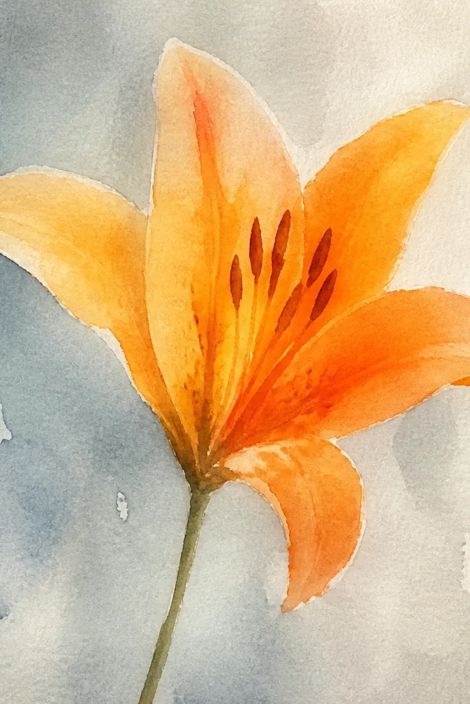
Close-up drawings look bold and modern, especially on small repurposed items like coasters. This design makes the orange lily feel like a pattern, not a single flower, because the petals take up almost the whole surface. It looks great on coffee tables with light wood because the warm orange contrasts without clashing. I also find it’s forgiving: if your line is slightly uneven, the petal folds still read as intentional shading. The green stem peek adds balance so the coaster doesn’t feel like just a blob of orange.
Start by cleaning the tile with rubbing alcohol and letting it dry. Draw a circle guide on the tile, then sketch the lily bloom so it fills about 80% of the coaster area. Outline petals with a fine-tip paint pen designed for ceramics or a permanent marker meant for hard surfaces. Color petals with medium orange, then add dark orange fold lines inside each petal. Add a pale yellow center circle and small orange dots around it for pollen. Finish with a thin green stem line that cuts in from one side and stops before the edge so the design stays clean.
Good to knowSeal with a clear ceramic-safe topcoat — unsealed paint will dull and scratch where cups sit.
Common mistakeDon’t use watery paint — it pools on glossy tiles and makes petals look fuzzy.
9. Orange Lily Border Along a Repurposed Tray Edge
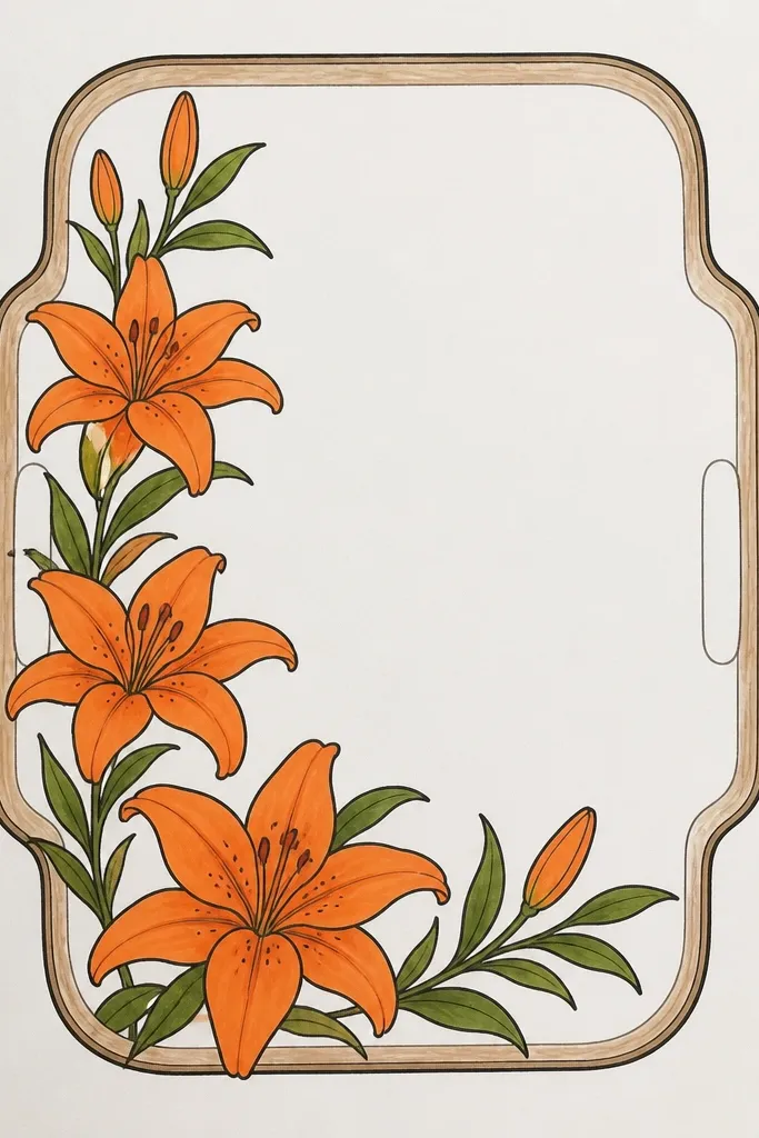
Borders are how you make a repurposed tray look like a set, even if the rest of the tray is plain. I prefer simplified lilies here because the tray gets handled and bumped, and tiny details wear faster. This design flatters your table setting because the border stays low and controlled, so the orange feels like decoration instead of a loud centerpiece. The pale yellow centers keep the lilies bright, while the small green leaves prevent the border from turning into a row of orange blobs. If you use the tray for coffee or snacks, the lily border still reads clearly when you’re reaching across the table.
Sand the tray lightly and wipe dust off. Paint a thin cream strip along the front edge where the lilies will go, about 1 inch wide. Draw small lily symbols spaced every 2 inches, each one with three main petals and one center. Outline each lily in orange and fill petals with medium orange, then add dark orange folds as two short inner lines. Place a pale yellow dot center in each lily and add a tiny green leaf between them. Let it dry, then seal the tray with a clear matte or satin varnish.
Use painter’s tape to keep the cream strip straight — your border will look 10x cleaner.
Don’t stack tall flowers — keep lilies low and flat so they don’t catch on plates and cups.
10. Lily on a Thrifted T-Shirt Hem Band
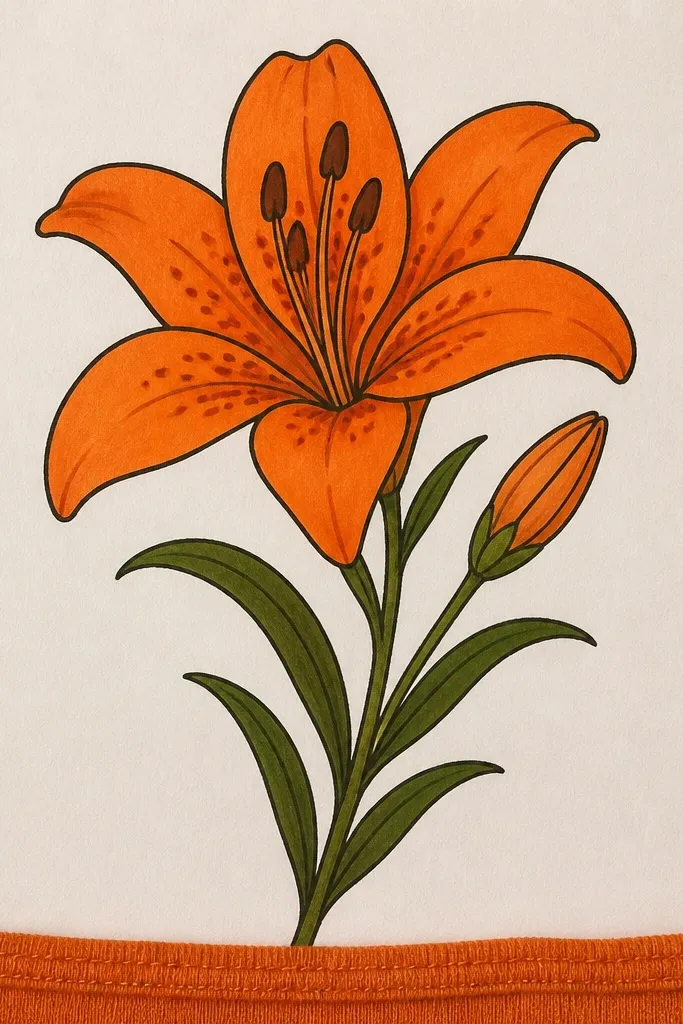
A hem band is one of the most flattering placements I’ve done because it frames your waist without covering the whole shirt. It looks especially good on people who like fitted silhouettes since the band creates a visual line across the body. The pale peach band keeps the orange lily from looking too high-contrast on gray fabric. I like to keep the lilies slightly smaller here so the shirt still feels wearable, not costume. If you’re working with a thrifted shirt that has uneven dye or a faint stain near the bottom, the band hides it better than a single placement.
Start by washing and drying the shirt so the fabric paint doesn’t crack. Mark a line around the hem where you want the band, then mask with painter’s tape to keep it straight. Add a pale peach wash inside the tape area and let it dry. Sketch three lilies across the band, keeping the outer two slightly smaller than the center. Outline with orange fabric paint, fill petals with medium orange, then add dark orange fold lines. Finish with pale yellow centers and a few thin green stems that connect the lilies lightly.
Good to knowStretch the shirt while the paint is drying by pinning it flat — it helps prevent cracking when you wear it.
Common mistakeDon’t paint the band too close to the seam — shrinkage can pull the design out of shape.
11. Orange Lily + Geometric Arches on a Thrifted Notebook Spine
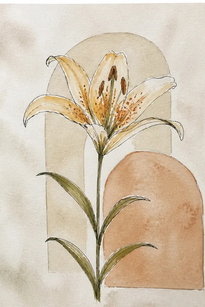
This one is for when you want your lily to look modern instead of purely botanical. The geometric arches give a clean structure, and the lily keeps it warm. I like it for people who wear simple outfits and want one graphic detail that looks intentional from a few feet away. The arches also help balance the vertical spine shape of notebooks — your eye reads from the arches into the lilies. It’s a good choice when your notebook already has a printed design you can’t fully cover; the arches act like a frame.
Cover the notebook spine area with a thin beige base coat if the original print shows through. Draw two vertical guideline lines to define where the lilies will sit. Sketch one lily bloom near the top and one near the bottom, then connect them with a thin green stem line that curves toward the center. Add geometric arches behind each bloom: three small arch shapes stacked, outlined in light orange. Outline lily petals with orange, shade dark fold lines, and add pale yellow center glow with tiny pollen dots. Keep the arches lighter than the petals so they don’t steal attention.
Good to knowUse a fine liner for the arches — thick lines make the background feel heavy.
Common mistakeDon’t darken the arches — if they match the petal contrast, your lily loses its focus.
12. Orange Lily Mandala Panel on a Repurposed Wooden Box Lid
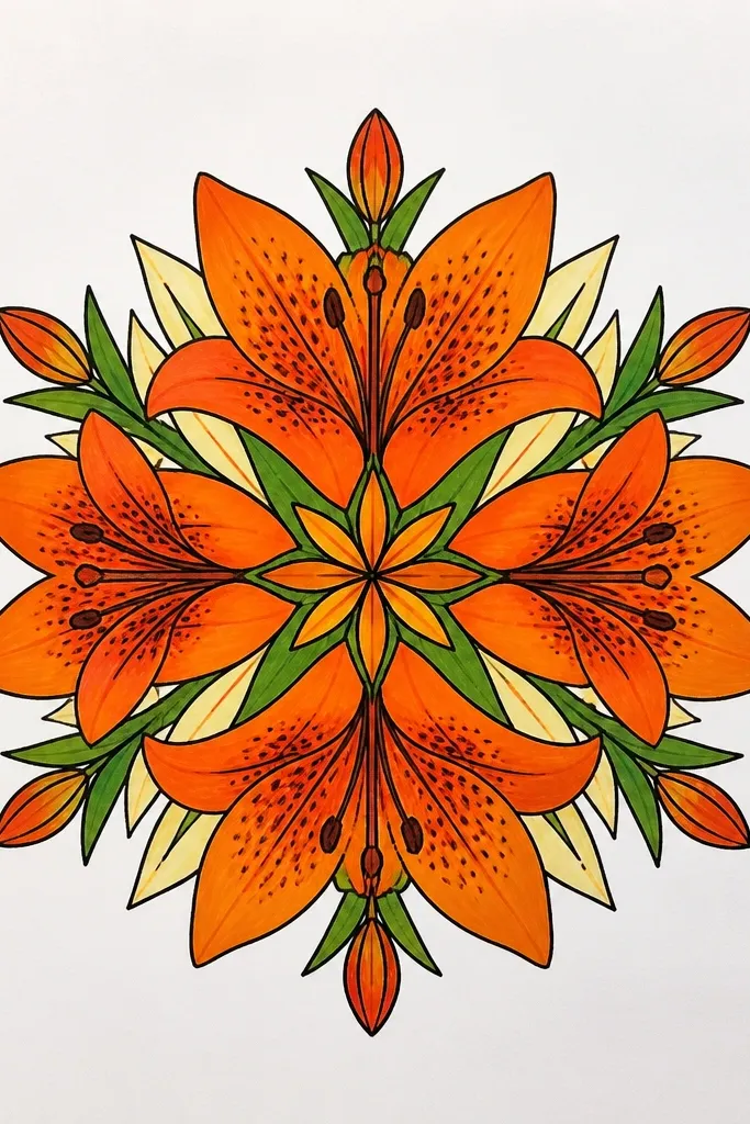
This is where the orange lily turns into a centerpiece. I like it on wooden lids because wood grain adds warmth, and the mandala structure gives the drawing something to “sit in.” It looks great as a catch-all box on a vanity or shelf because the design doesn’t feel fragile. If you like ornamental details but still want orange to stay bright, this keeps the lily crisp by limiting the number of repeating shapes. The pale yellow center and dark fold shadows anchor the whole panel so it doesn’t turn into random doodles.
Sand the lid lightly and wipe clean. Paint a thin cream circle base where the mandala will sit, then let it dry. Draw a central lily with six petals, then add a ring of small leaf petals around it, each one angled outward. Next, add dotted circles: one ring of tiny orange dots and one ring of pale yellow dots, spaced evenly. Outline and shade the lily with medium orange and dark fold lines, then fill the center pale yellow and add speckles. Finish with an outer ring of alternating green dots and short leaf marks, keeping the outermost details smaller than the lily petals.
Good to knowMark dot spacing with a compass or a small stencil — even spacing makes the mandala look intentional.
Common mistakeDon’t add too many rings — two dotted rings plus one leaf ring keeps it readable.
13. Orange Lily in Watercolor Wash with Ink Outline
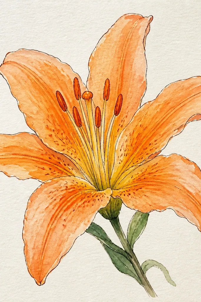
This style looks bright because the orange is layered, not filled in one go. I use it when I’m making prints or decorating paper labels from thrifted stationery. The ink outline keeps the petals from spreading, and the watercolor wash gives that light, airy glow around each fold. It flatters small surfaces because the softness keeps details from feeling heavy. If you’re working with a paper that warps easily, keep your washes thin and let each layer dry before adding the next petal shadow.
Tape your paper to a board so it doesn’t buckle. Sketch the lily pencil first, then outline petals with a fine black ink pen — thin lines only. Mix a light orange wash and paint each petal in one direction, leaving lighter streaks near the outer rim. After the wash dries, add darker orange fold lines with a smaller brush and more concentrated pigment. Paint the center pale yellow and dot a few tiny orange pollen marks. Let the piece dry flat, then erase pencil marks gently so the paper texture stays visible.
Add the dark fold lines only after the first wash dries — wet layering turns into muddy brown.
Don’t flood the center — if yellow spreads into orange, the flower loses that bright glow.
14. Orange Lily + Script Word Band on a Thrifted Mug Sleeve
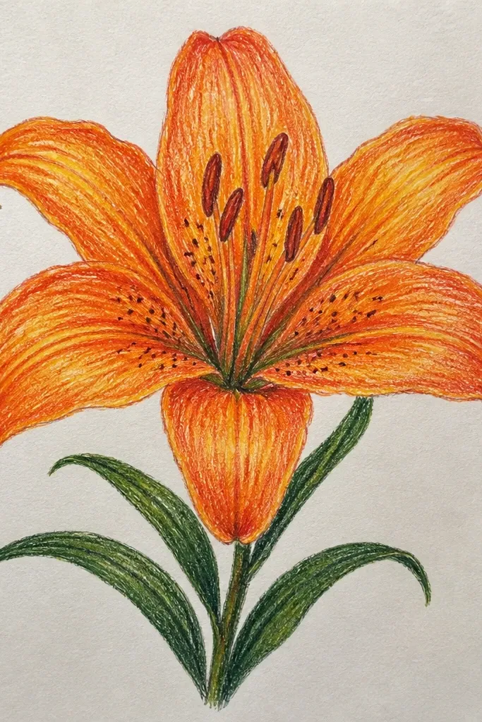
This is for when you want the lily to look decorative and personal, not just floral. The word band gives you a reason to use the orange — it ties the typography into the flower color palette. I’ve done this on mug sleeves for gifts and it always gets comments because the lily feels hand-drawn and the script feels custom. It’s also flattering because the lily sits left and the eye reads across the sleeve, so your design doesn’t crowd the full surface. Use it when your thrifted sleeve has a faded patch — the lily and text cover it in a clean line.
Start by measuring your mug sleeve width and draw a pencil line where the script band will sit, keeping it slightly above center. Sketch the lily on the left side, about 2 inches tall, with a stem that curves into the band line. Outline petals with orange fabric paint marker, then fill with medium orange and add dark fold shadows. Add pale yellow center glow and a few pollen dots. Write your script with the same orange paint marker, keeping letters thin so the background fabric still shows through. Finish with two tiny green leaf strokes at each end of the script band to balance the composition.
Good to knowPractice your script on scrap fabric first — stretchy fabric paint can widen strokes if you press too hard.
Common mistakeDon’t make the script bold block letters — it competes with the lily and looks like a label.
15. Orange Lily + Faux Embroidery Stitch Lines
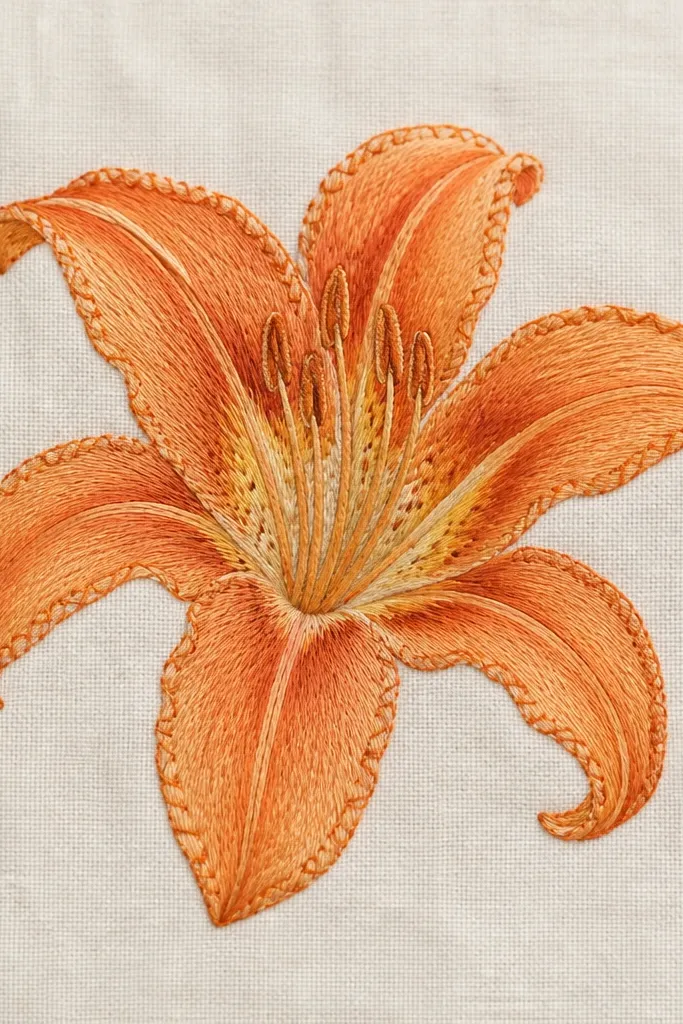
Faux embroidery lines make a drawn lily look stitched, which is exactly the kind of detail that elevates upcycled pieces without needing a sewing machine. I use this on thrifted linen napkins, plain tote panels, and even cheap canvas art boards. The stitch effect flatters the design because it adds texture where you’d normally expect thread. It also helps hide small wobble in your outline since the “stitches” create a consistent pattern around the petals. The orange stays bright because the stitches are drawn with controlled darkness, not heavy fill.
Start by drawing your lily pencil sketch on off-white fabric. Outline each petal with orange fabric paint marker, then choose one darker orange shade for the stitch effect. Add tiny curved stitch marks along the outer petal edges — think small U-shapes spaced close together. Fill petals with medium orange but keep the inner fold lines darker and narrow. Paint the center pale yellow and add a few orange speckles. Finish by adding a simple green stem line with one or two leaf marks, then let the fabric dry and heat-set if your paint requires it.
Good to knowUse a toothpick or stylus to keep stitch spacing consistent — your stitches will look more even.
Common mistakeDon’t draw stitch lines across the petal center — it looks like a stain instead of embroidery.