1. Denim Pocket Lily with Tiny Butterfly Corner
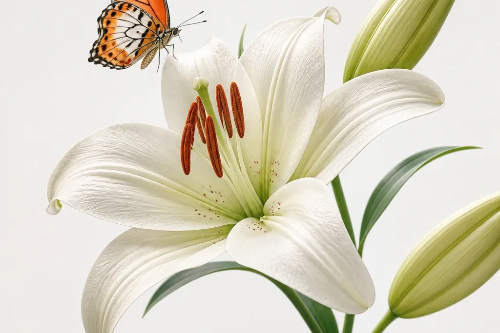
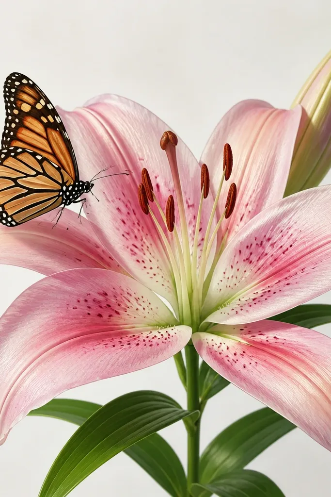
This one looks best on light-wash denim because the background acts like a built-in watercolor paper. I draw the lily head in soft white with a faint pink center, then I deepen the petal folds with rose pigment — it keeps the flower airy instead of heavy. The butterfly is smaller and placed near a corner so it looks like it landed, not like it’s floating. This combo flatters casual outfits and works on all skin tones because the colors stay bright and clean. If you wear denim a lot, this turns a plain jacket pocket into an intentional detail without changing the silhouette.
Start by washing and fully drying the jacket so the paint grips. Mark a rectangle on the pocket about 3.75 inches wide, then sketch the lily head so its base sits just above the pocket’s lower seam. Outline with a fine black fabric marker, then fill petals with watered-down off-white paint and glaze pink only in the inner folds. Place the butterfly so its wings overlap the lily stem line by about a quarter inch. Finally, heat-set or seal with fabric-safe clear coat, then let it cure flat for 24 hours before wearing.
Press the pocket with a warm iron through parchment before drawing so the lines don’t crack on creases.
Don’t use thick paint straight from the bottle on denim — it sits on top and makes the lily look like a sticker.
2. Candle Jar Lily Label with Butterfly Wing Tips
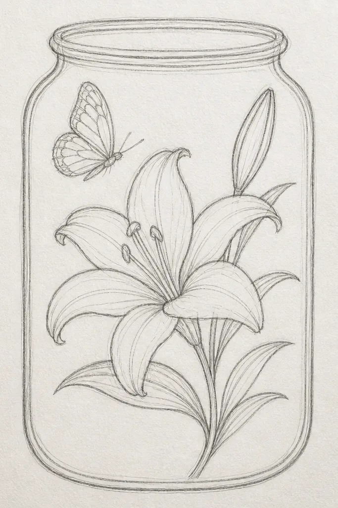
This is the prettiest option when you want the drawing to look like it came from a shop label. I keep the lily cream with light blush shading so it matches the glass reflections. The butterfly wings are painted with a warm apricot wash and small darker dots near the tips — that detail makes it look alive. It’s flattering for kitchens and bathrooms because the soft palette looks clean next to stainless steel and white tile. If you like “quiet pretty,” this is your move.
Good to knowUse matte sealant for the label so glare doesn’t wash out the butterfly dots.
Start by wiping the jar with rubbing alcohol so the label adhesive sticks. Print or hand-cut a label strip to fit the jar circumference, then sketch the lily centered on the strip with a height around 5.5 inches. Paint the petals in two passes: first a thin cream wash, then a second blush glaze only where petals overlap. Add the butterfly at the top so the wings touch the label edges, then seal the label with a clear matte decoupage medium. Smooth it down and let it dry overnight before putting it back on the shelf.
Common mistakeDon’t try to paint directly on the glass unless you’re using glass-specific paint — standard craft paint peels from the smooth surface.
3. Thrift Tee Back Print Lily with Butterfly Trail
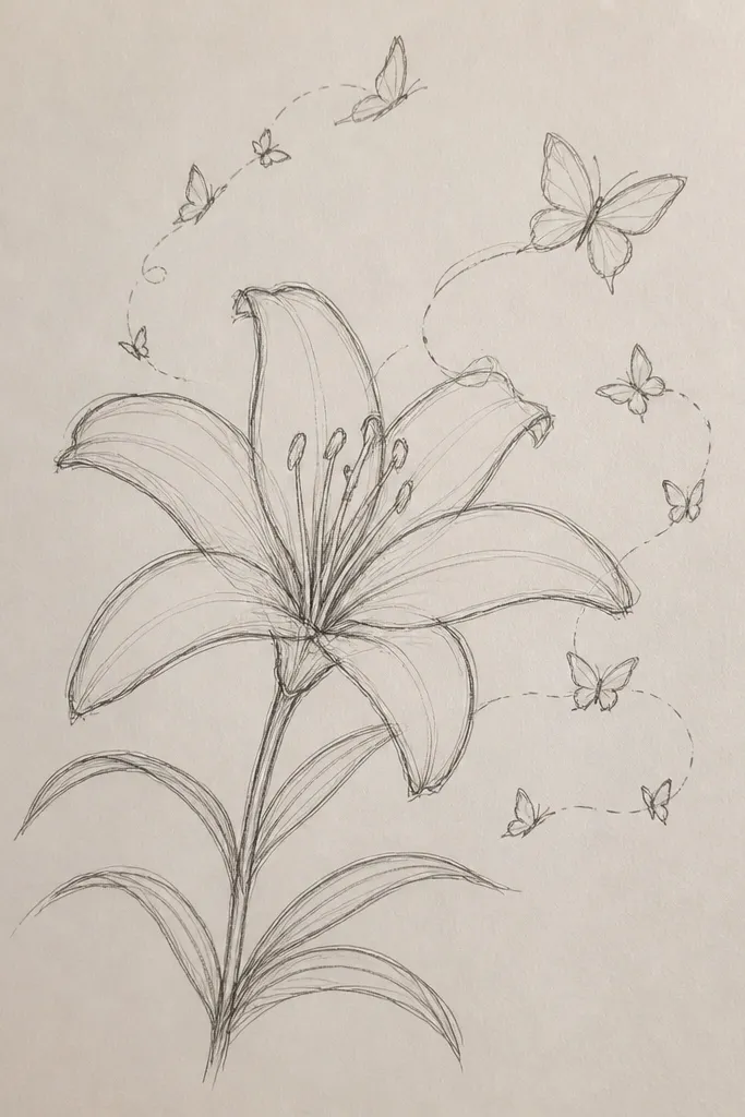
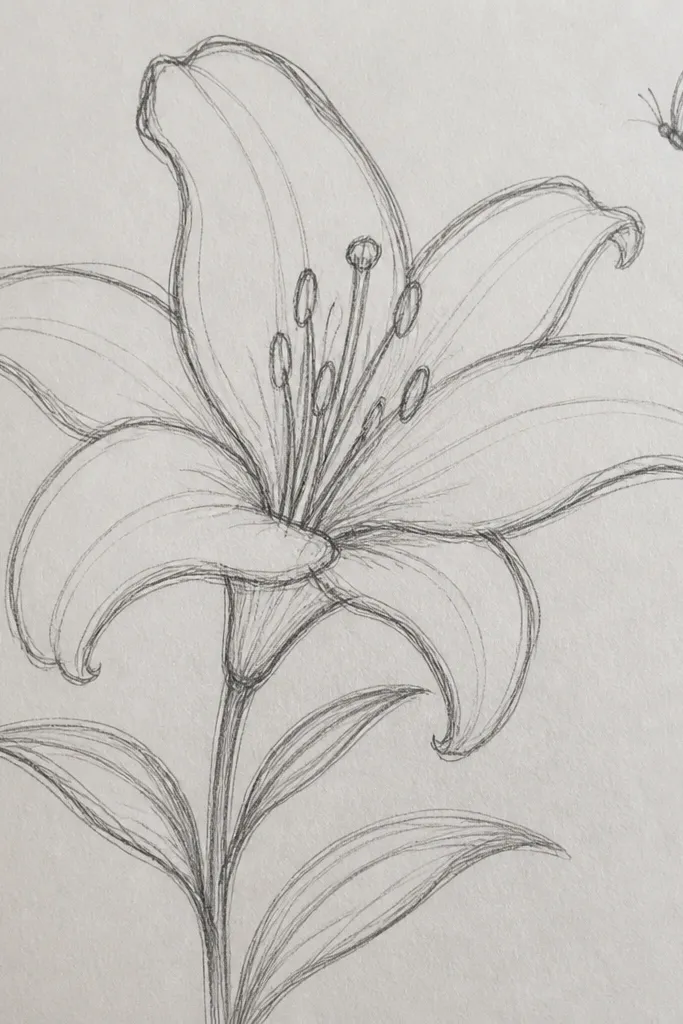
Dark tees need contrast, so I keep the lily bright and slightly opaque instead of watercolor-sheer. The lily is cream with soft gray-lilac shading in the folds, then I add a tiny dot cluster at the center to mimic pollen. The butterfly is warm gold with soft brown outline — it reads clearly on black without looking childish. This design flatters most body types because it sits near the upper back and draws the eye upward. It also looks great with jeans, leggings, and even a blazer because the art feels intentional, not random.
Good to knowIf your black tee pills, trim the fuzz with scissors first so the paint sits evenly.
Start by laying the shirt flat and taping a piece of cardboard inside so paint doesn’t bleed through. Measure where you want the lily: I place the top of the lily about 2.5 inches below the collar seam for an adult small/medium. Sketch the lily head and stem in pencil, then outline with a fabric marker. Fill petals with cream paint in thin layers, letting each layer dry 10 minutes before the next. Add the butterfly to the right of the stem line and paint a small curved “trail” line so the composition feels connected. Seal with fabric-safe clear coat after the final layer dries.
Common mistakeDon’t place the lily too low on the back — it makes the shirt look like it has a stain.
4. Wood Tray Lily Centerpiece with Butterfly in Negative Space
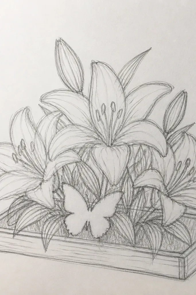
This looks expensive because the wood grain becomes part of the art. I paint the lily petals in thin white and pale pink so they sit softly on the surface, then I keep the butterfly mostly as an outline. Leaving the butterfly wings open — letting the wood show — gives it that airy, vintage print feeling. It flatters warm-toned decor because the brown outline matches oak, walnut, and honey woods. If you’re building a set of matching home items, this one ties everything together.
Good to knowUse a round stencil or a printed lily template to keep petal symmetry without redrawing a dozen times.
Start by sanding the tray lightly with 220 grit and wiping off dust with a tack cloth. Sketch a lily centered on the tray, about 3.5 inches tall, with the stem lines extending slightly downward. Paint petals with a watered white acrylic, then glaze pale pink where petals overlap. For the butterfly, outline with a fine brush using dark brown paint and add a few dot details, but don’t fill the entire wings. Seal with two thin coats of clear matte or satin varnish, letting each coat dry fully.
Common mistakeDon’t use thick varnish on top of wet paint — it can drag pigment and blur the butterfly outline.
5. Canvas Tote Lily Arch with Butterfly Landing Strip
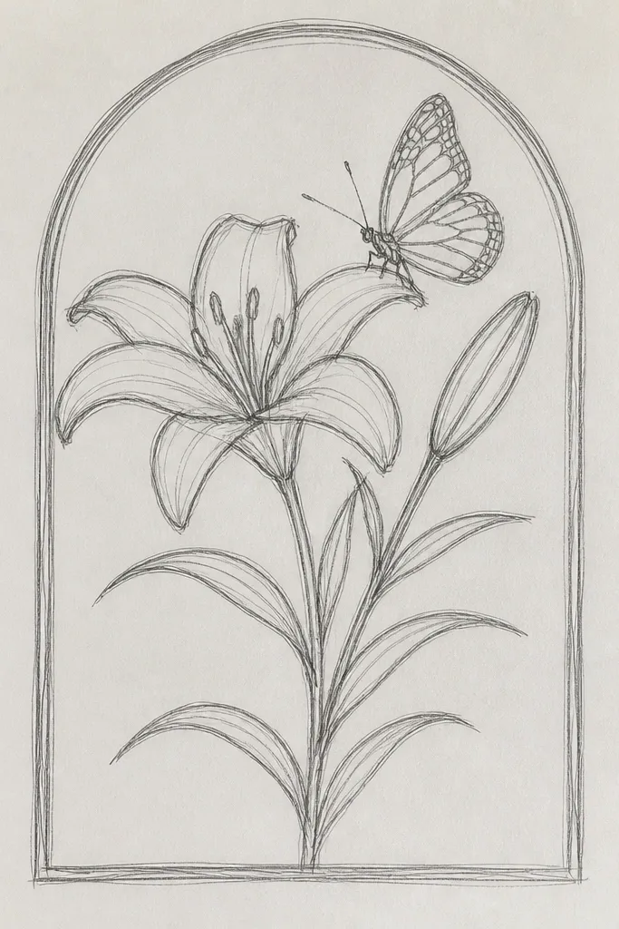
Natural canvas is forgiving. The lily looks crisp when you use a light base color and then add darker petal folds, and the butterfly reads like a little accent rather than the main event. I like this composition because it frames the tote handles and makes the bag feel structured even when it’s empty. The cream and blush palette works with denim, black leggings, and summer dresses. This one is perfect for everyday use because it doesn’t get fussy with too many tiny details.
Good to knowPaint the petal edges with a smaller brush than you think you need — it keeps the lines delicate.
Start by ironing the tote flat and tracing a gentle arc across the top front panel. Draw the lily so the arch starts near the left handle seam and ends near the right, with the tallest petal centered. Outline lightly, then paint petals in cream and blush in three layers: base wash, inner fold glaze, then a final thin line for petal edges. Add the butterfly on a “landing strip” — a thin stem line you paint under the butterfly so it looks grounded. Seal with fabric medium or fabric-safe clear coat after paint dries.
Common mistakeDon’t let the arc drift — if one side is higher, the lily looks lopsided like a tilted poster.
6. Picture Frame Lily Corner Fill with Butterfly Accent
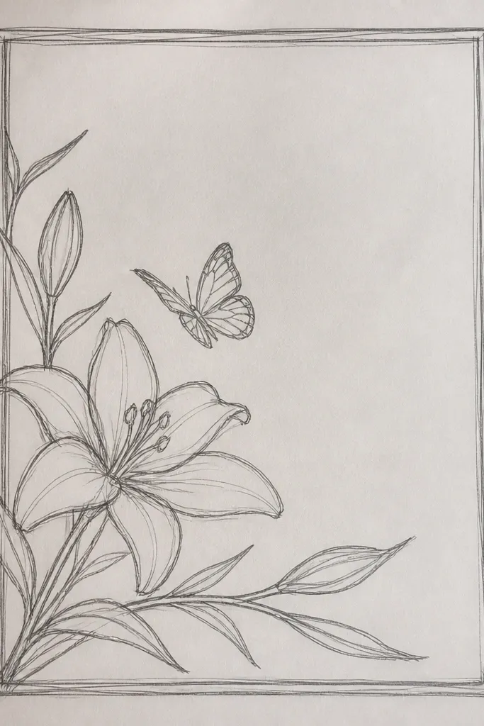
Frames are where I see the biggest “before and after” jump. The lily corner fill makes the frame look custom, even if the photo inside is simple. I paint the lily in pale yellow and cream, then add a thin wash of light peach on the petals. The butterfly is smaller and tucked near the inner corner so it doesn’t compete with the artwork you put in the frame. This works well for warm skin tones and cozy living rooms because the colors sit between neutral and soft color. If you hang family photos, it makes the whole wall look curated without doing an overhaul.
Good to knowUse brown outline for corners — black can look harsh against distressed white paint.
Start by scuffing the frame with 220 grit so paint grips, then wipe dust off. Mix cream paint with a tiny bit of yellow for the lily center. Sketch the lily corner so it fits inside a 4x4 inch square in the top-left corner. Outline in dark brown instead of black for a softer antique vibe. Fill petals with cream and add peach wash only where petals overlap. Finish by sealing the painted areas with matte varnish, then attach or replace the glass and backing only after the varnish cures.
Common mistakeDon’t cover the whole frame with paint — keep the lily limited to the corner so the texture stays attractive.
7. Ceramic Mug Lily Stem Wrap with Butterfly on Handle
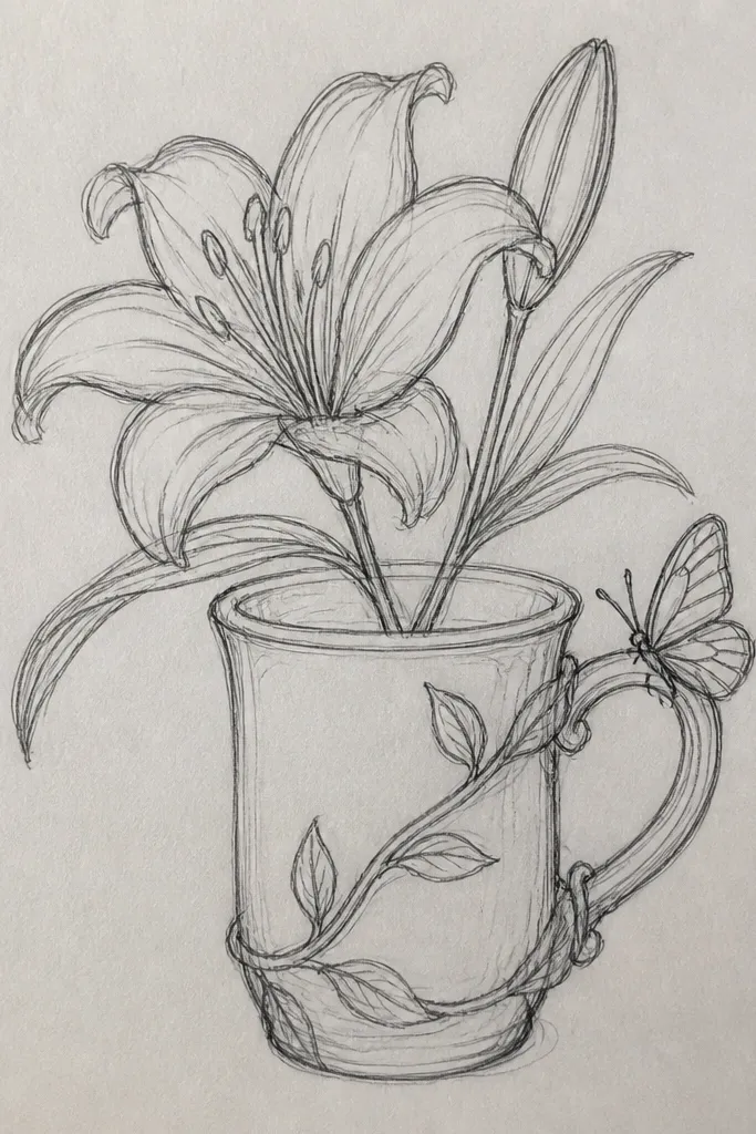
Mugs are tricky because heat and washing attack paint, so I only use designs that I seal properly. The lily stem wrap looks best when you keep the lily tall and narrow, so it follows the mug’s curve instead of flattening. I paint petals in off-white with blush shading, then add tiny dots on the center to mimic pollen. The butterfly sits on the handle side, which makes it feel like it’s part of the mug’s shape. This looks flattering on any kitchen style because white ceramics make the art pop without needing loud colors.
Good to knowChoose a butterfly with simpler wing patterns for mugs so edges don’t chip from repeated washing.
Start by degreasing the mug with rubbing alcohol. Sketch a vertical lily stem so it wraps around the mug — leave about half an inch of spacing between stem lines and the mug’s rim. Paint petals with thin off-white layers, then glaze blush in the inner folds. Outline the butterfly in fine brown and add small wing dots in darker peach. Use ceramic paint meant for mugs and cure it according to the brand instructions, then apply a food-safe sealant if the product says it’s allowed. Let it fully cool before washing — I wait 72 hours the first time.
Common mistakeDon’t put the lily too close to where your hand grips — your thumb rub will wear it off.
8. Glass Vase Lily with Butterfly at the Shoulder
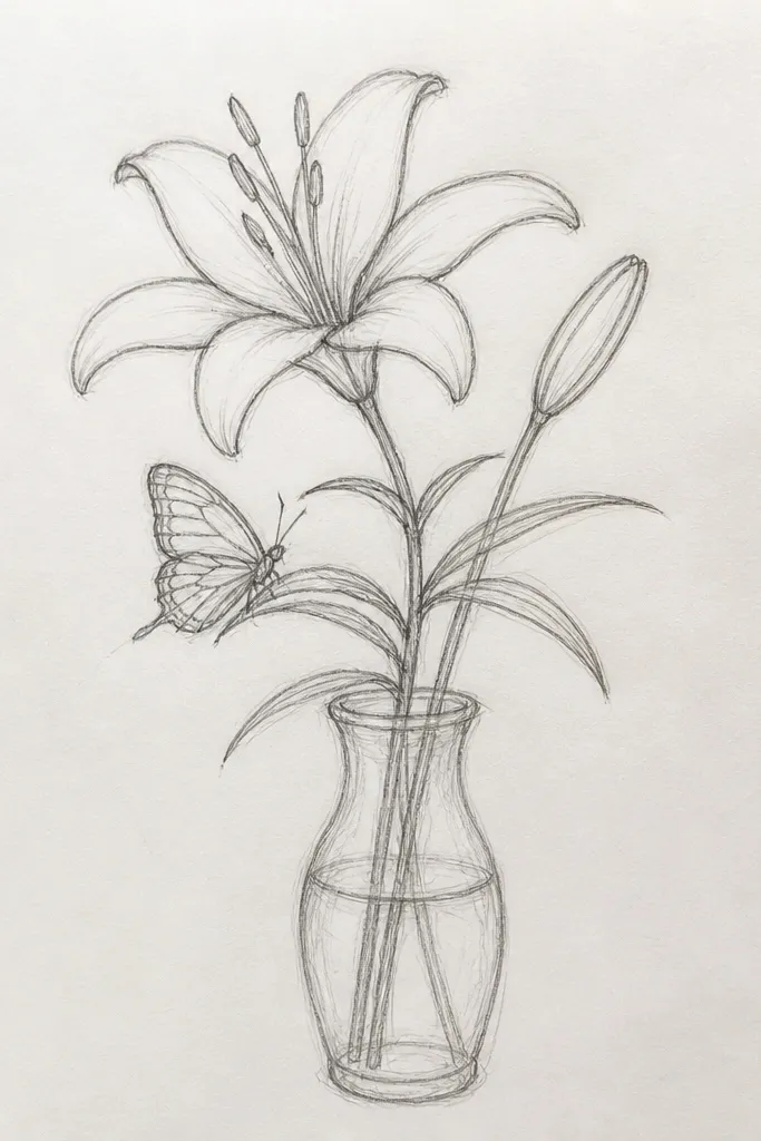
Clear glass makes the drawing feel floating, especially if you use semi-transparent paint. I paint the lily in layers: first a thin cream wash, then pale pink in the folds so the petals look dimensional. The butterfly goes near the shoulder because that’s where you can see it when the vase is on a table. I keep the butterfly outline crisp and the fills lighter so it doesn’t look like a sticker stuck to glass. This works in bright rooms because light passes through the colors. It also pairs well with real lilies or dried grasses without looking theme-y.
Start by cleaning the vase with glass cleaner and then alcohol wipe. Mask the rim with painter’s tape if you don’t want paint there. Sketch a lily centered on the front panel with a height around 6 inches for a medium vase. Paint petals with thin translucent coats, letting each coat dry before adding blush shading. Outline the butterfly with a fine brush, then paint just the inner wing sections with a light peach wash. Seal with a glass-specific clear coating if your paint requires it, then let the vase cure away from dust for the full time on the paint label.
Use a foam brush for big petals so you don’t leave streaks on the glass.
Don’t use matte acrylic on glass unless it’s sealed well — it can look chalky and scuff easily.
9. Shoe Side Lily Stripe with Butterfly Charm Look
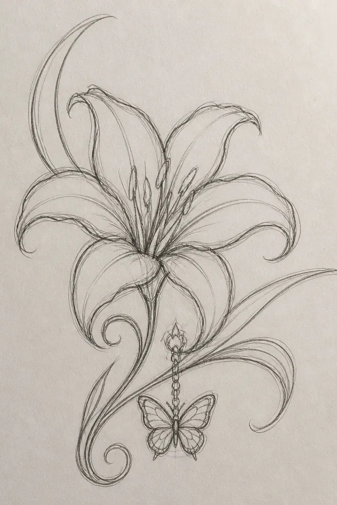
Shoes are where this drawing style gets attention fast. I like a side stripe because it keeps the art aligned with the shoe’s shape and doesn’t fight the laces. The lily is painted in cream with light pink shading so it pops on white leather or canvas. The butterfly gets slightly darker outline and small dot details so it looks crisp even when the shoe flexes. This flatters smaller feet because the stripe is placed along the side and doesn’t swallow the whole shoe. For casual wear, it adds personality without turning the shoes into a costume.
Good to knowPaint on the shoes when they’re fully dry and at room temperature — cold surfaces make paint crack.
Start by cleaning the shoe surface and roughing it lightly with a fine sanding block if it’s glossy leather. Sketch a vertical lily stripe about 1.5 inches wide on the outer side panel. Outline with a fabric or leather paint marker depending on the material, then paint petals with thin layers of cream and blush. Add a tiny stem line so the lily looks connected to the stripe. Place the butterfly near the midfoot and paint it about 2 inches wide, with wings slightly angled toward the toe. Seal with a flexible clear shoe sealant after paint cures.
Common mistakeDon’t paint over creases while the shoe is bent — the first wear will crack the outline.
10. Book Cover Lily Spine with Butterfly Bookmark Tab
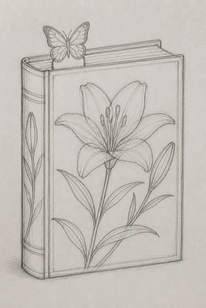
Fabric book covers look so much better with a spine design. It makes the cover look intentional even when the book sits on a shelf with other plain covers. I paint a lily on the spine area because it follows the natural vertical line and makes the butterfly feel like it’s perched at the top. The palette stays soft — cream petals, blush folds, and a brown outline. This flatters small spaces because it doesn’t take over the entire front. It also makes the book easy to find visually.
Good to knowUse painter’s tape as a guide for the spine — it keeps the lily straight without re-measuring every time.
Start with a clean fabric cover and iron it flat. Measure the spine panel width and sketch a lily about 7 inches tall down the center of the spine. Outline in soft brown, then fill petals in cream with blush shading only where petals overlap. Paint a tiny stem and one or two small leaf suggestions so the lily doesn’t look like it’s floating. Add the butterfly near the top and align it with the spine so it doesn’t tilt sideways. For the bookmark tab, paint a simplified butterfly wing on the tab edge and seal the whole cover with fabric-safe clear coat.
Common mistakeDon’t over-detail the butterfly on a spine — tiny wing patterns blur when the fabric stretches.
11. Wall Art Scrap Panel Lily with Butterfly Overpainted Edges
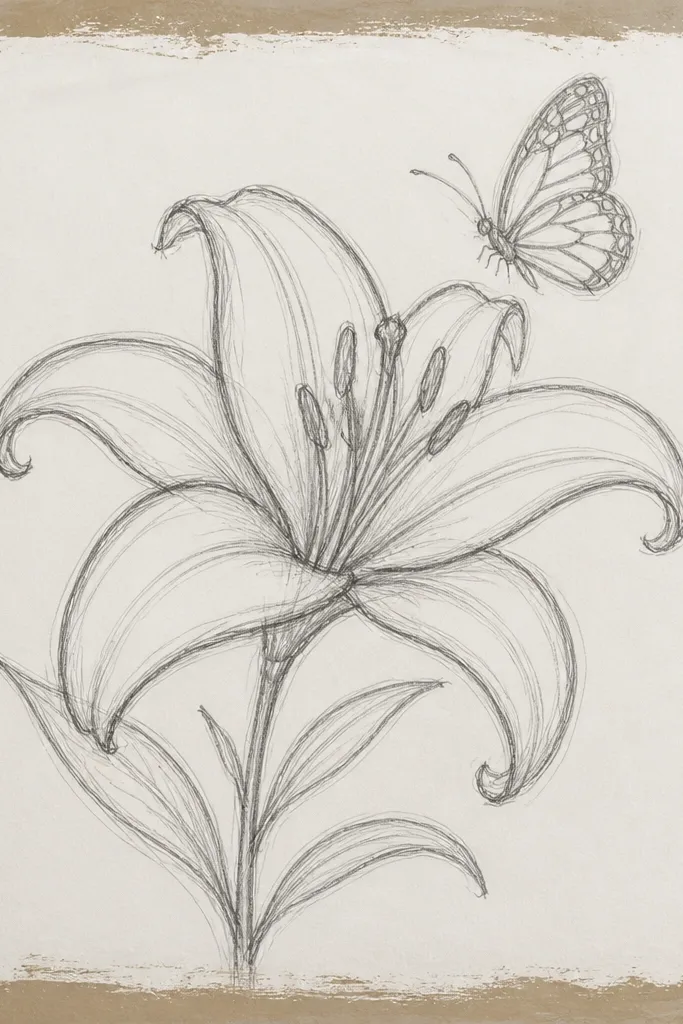
This look is for when you love texture and you want the drawing to match it. The rough edges make the butterfly feel like it’s part of the wood, not printed on top. I paint the lily in semi-opaque cream so the grain doesn’t disappear, then I add pink shading in petal folds. The butterfly gets deeper brown outline and a few controlled overpaint strokes that follow the grain. This flatters modern rooms because the texture keeps it from looking too delicate. It also makes a cheap scrap panel look like a planned art piece.
Good to knowIf your grain is wild, use a bigger brush for petals and a smaller one only for the outline — it keeps texture from looking accidental.
Start by sanding only the flat area lightly and leaving the edges rough. Apply a thin base coat if your wood is very uneven, then let it dry. Sketch the lily centered with a 6-inch height, and keep the stem lines simple. Paint petals in cream with a pale pink glaze, leaving some grain showing in the lighter areas. Outline the butterfly and then intentionally paint part of the wing over the edge so it wraps visually around the panel. Finish with a clear satin topcoat that protects the paint but doesn’t fully smooth the grain.
Common mistakeDon’t fill the entire panel smooth — the rough edge effect is what makes this style look real.
12. Metal Tin Lily with Butterfly on Lid Hinge
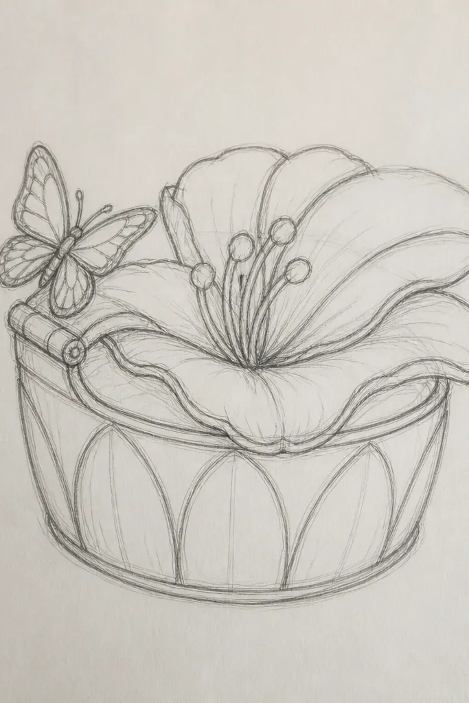
Metal tins take paint differently, so the key is thin coats and good adhesion. The lily looks clean when you keep the petals bright and the center slightly darker, then you add a soft gray-lilac shadow under the petals. The butterfly on the hinge is a fun placement because the viewer sees it when they open the tin. I use a fine brown outline so it doesn’t look like a sticker on shiny metal. This is great for organizing buttons, hair clips, or tea bags because the art makes the tin feel like decor.
Start by scrubbing the tin with dish soap, then dry completely. Lightly sand the painted area with 400 grit so the paint grips. Prime if the tin is glossy and paint doesn’t stick — I’ve learned the hard way. Sketch the lily on the lid center with a height around 4.5 inches. Paint petals in white with a pale pink inner fold, then add a slightly darker shadow line near the base of each petal. Paint the butterfly near the hinge so its wings straddle the hinge line visually, then seal with a metal-safe clear coat.
Use painter’s tape to mask the hinge area if you want crisp edges around the butterfly outline.
Don’t skip sanding on glossy tins — paint will chip at the first bump.
13. Ceramic Tile Coaster Lily with Butterfly Corner Signature
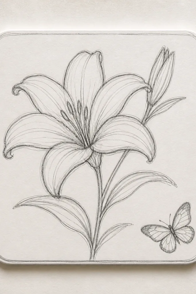
Coasters are the fastest way to use your drawing skills without committing to a big project. The lily stays readable because the surface is flat, and the butterfly in a corner feels like a signature. I paint the lily with a clean cream base and blush shading, then I add a tiny dot cluster at the center for realism. The butterfly gets a warm peach wash with darker dot accents. This works in any kitchen because cream and blush sit between farmhouse and modern. It also makes your mug-and-cup setup look coordinated when you group them together.
Good to knowUse a waterproof marker for the outline so it doesn’t bleed when you paint over it.
Start with clean ceramic tiles and wipe with alcohol. Sketch a lily about 3 inches tall near the center and outline with a thin waterproof marker. Paint petals with acrylic made for ceramics or ceramic paint, using watered-down coats for smooth coverage. Add blush shading only in the inner petal folds and keep the outer edges lighter. Paint a small butterfly in the bottom-right corner so it looks like it belongs to the tile, not like it’s floating. Seal with multiple thin clear coats, then add cork or felt pads underneath once fully cured.
Common mistakeDon’t rush the curing time — early stacking smears the butterfly dots.
14. Upcycled Picture Mat Lily Line Art with Butterfly in the Margin
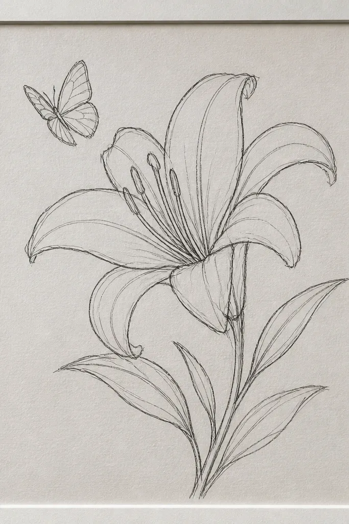
This is the “I want it subtle” version that still looks intentional. I keep the lily mostly as line art, then I add one light wash of pale pink on the inner petals so it doesn’t look flat. The butterfly stays in the margin area, small and slightly tilted, so it feels like it’s part of the design rather than an afterthought. This works especially well for people who wear neutral clothes and like clean styling. It also looks great under glass because the lines stay sharp and protected. If you hate loud color, this style wins.
Start by cleaning the mat board and removing any dust. Lightly sketch the lily lines with a pencil so you can erase easily. Outline the lily with a fine archival pen in gray-brown, then add a tiny blush wash with a small round brush inside only two or three inner petals. Place the butterfly in the top-right margin and keep it mostly line-based with a few peach dot accents. Let it dry fully, then seal the drawing with a light spray fixative meant for paper. Frame it under glass so it stays protected from humidity.
Use a pencil grid transfer if you want the lily proportions to match a template exactly.
Don’t press hard with the pencil — deep graphite lines show through and make the final art look messy.
15. Resin Keychain Lily with Butterfly Wing Tint
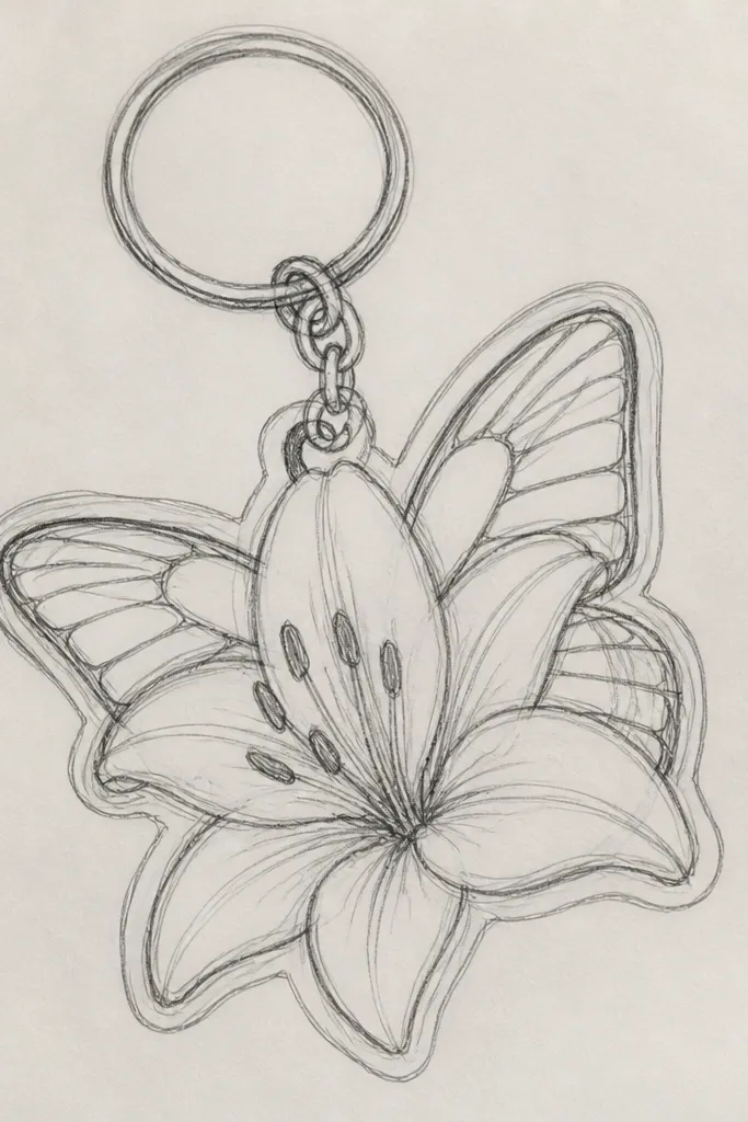
Resin is where your drawing looks like it’s trapped in glass, and that changes everything. I paint the lily in a simple two-tone style because resin magnifies detail. The lily looks best when the petals are white with blush shading that stays soft at the edges. The butterfly gets a tiny tint — peach with light gold highlights — so the wings catch light as the keychain moves. This looks great on bags, especially when your bag hardware is silver or gunmetal. It also makes a practical upcycle item feel like a collectible.
Good to knowUse matte paper for the printed art so the resin looks even, not cloudy.
Start by printing or drawing your lily and butterfly on thin paper, then cut them small enough for your mold. Apply a thin layer of clear resin to the bottom of the mold and place the cut art carefully. Add a second thin resin layer to cover the paper so it doesn’t show through too much. Keep the butterfly near the top of the mold so it reads when the keychain swings. Cure according to your resin instructions, then pop out the keychain and polish the edges lightly if needed. Finish with a jump ring and a key loop hardware piece.
Common mistakeDon’t overfill the mold — thick resin can create bubbles and distort the butterfly wings.