1. Lemon Grass Curtain on Toned Cream Paper
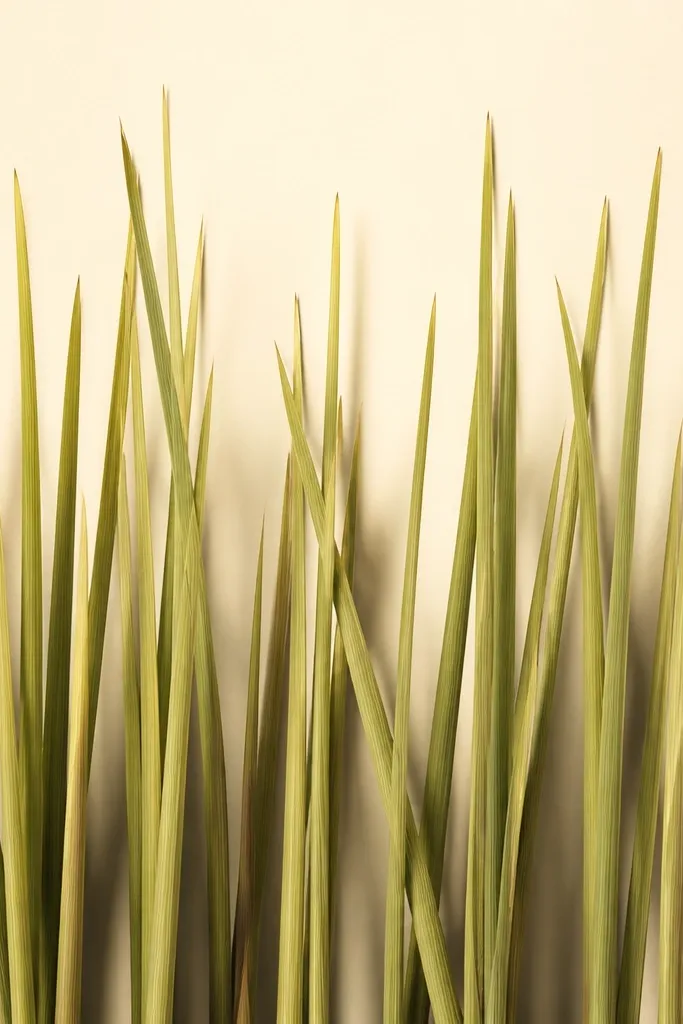
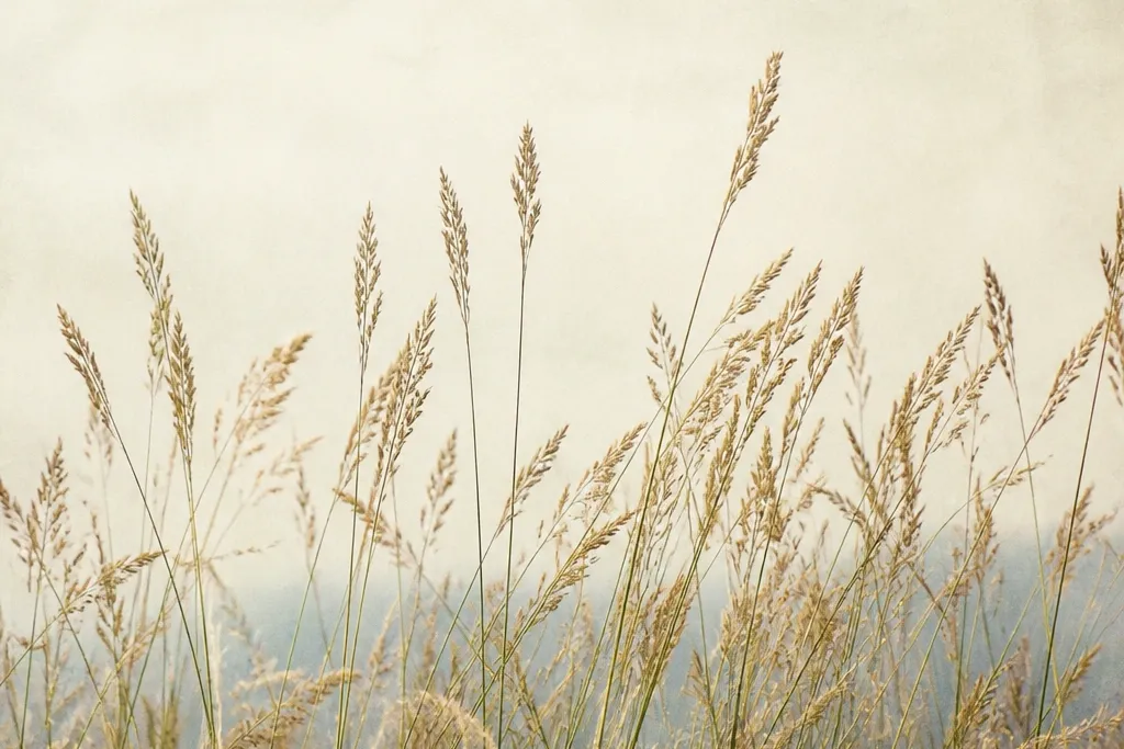
This one looks like the first day the garden wakes up, because the tips stay light and the base gets the weight. I use toned cream paper so the highlights feel built-in, not drawn over. The stems are pencil first, then colored with two greens: a yellow-green near the tips and an olive that deepens at the overlaps. It flatters small rooms because the background stays quiet while the grass does the talking. For styling, it's friendly with warm wood, brass frames, and anything beige or soft white.
Start by marking the bottom line and drawing 5 to 7 vertical "anchor" blades, spaced about 1/2 inch apart. Then fill between them with shorter, thinner blades that lean slightly toward the center, keeping every blade's shadow side consistent. Add a yellow-green wash or light marker color at the top third, then deepen the bottom third with olive and a darker green at the base where blades overlap. Finish by blending the shadow area behind the stems with a soft pencil haze so the grass reads as a curtain, not floating lines. Seal with matte fixative in 3 light passes from 10-12 inches away.
Good to knowIf your greens look flat, add a tiny highlight line on the left edge of each blade with a sharp white gel pen.
Common mistakeDon't color the background too - a busy background makes tall grass look messy and cheap.
2. Two-Color Lemon Grass Fan (Left Light, Right Shadow)
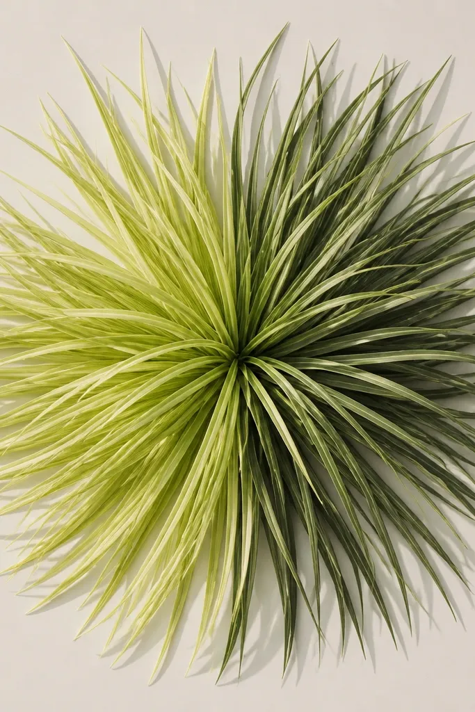
This is my go-to when I want movement without drawing a whole scene. The fan shape gives you that "fresh cut" energy, and the left-light/right-shadow rule makes it look dimensional. I draw the blades starting from a tight center point, then flare them outward in arcs. The color ladder is simple: pale yellow-green at the top half, olive at the bottom half, plus a darker shadow green on the right side of each blade. It flatters people who like clean decor because there's structure, not chaos.
Start by lightly sketching a circle and dividing it into 2 halves: left and right. Then draw blades in arcs, keeping them closer together near the center and farther apart as they reach the edge. Use yellow-green for the left half and olive for the right half, then add a darker shadow green only along the shadow side (right edge) of each blade. Blend the transition through the middle with a light pencil so there's no hard stripe. Mount the piece on a white mat with a 1/2 inch border to keep the fan crisp, then spray matte fixative.
Good to knowUse a ruler for the arc guide lines, then freehand the blades so the curve still feels alive.
Common mistakeSkip random coloring - if you change the light direction on different blades, it stops looking real.
3. Lemon Grass Border Frame for Photos
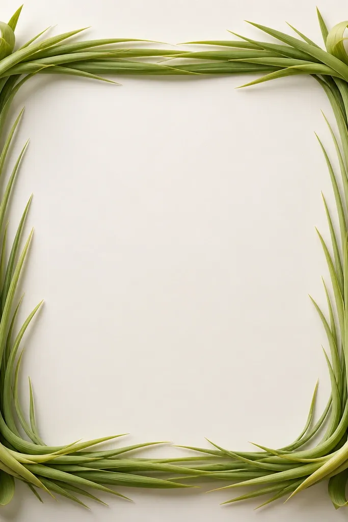
This one turns a plain print into decor that looks custom. I've used it around an 8x10 photo and the grass border makes the whole set feel intentional. The trick is height variation: corners go taller, sides stay calmer, so your eye lands on the center image. I keep the border blades thinner than a full artwork because they act like framing lines, not a wall of grass. It looks especially good for family photos, wedding portraits, and kitchen prints with warm tones.
Start by drawing a rectangle inside your paper for the photo window, leaving a 1.5 to 2 inch margin. Then sketch grass blades along the border: corners at the full height (about 12 inches if your paper allows), sides at about 7-9 inches, and keep the spacing about 1/4 inch. Color tips yellow-green, then olive at the base, and add small darker overlaps right where blades cross. Use a fine liner for the sharpest outlines on the outer edge so the border reads even from across the room. Seal with matte fixative, then mount the finished drawing behind glass to protect it.
Good to knowFor corners, add a gentle curl at the tip by bending the last 1/2 inch of each blade slightly inward.
Common mistakeDon't make the border blades all the same length - it looks like a printed stencil.
4. Tall Grass + Sunbeam Highlight Stripe
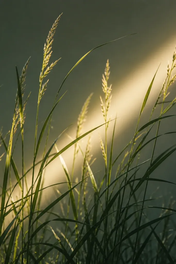
This idea makes the grass feel like it's catching afternoon light, even indoors. The sunbeam stripe adds a simple background element that makes tall blades look more dimensional without painting a whole sky. I draw the stripe first, then place the blades on top so the highlight stays clean. Color-wise, I keep the tips lighter and add a slightly warm yellow to the top third, then switch to olive for the base. It flatters bright, modern interiors because the stripe gives it a graphic look.
Start by masking a diagonal stripe area using low-tack tape, then lightly paint or marker-color it in warm pale yellow. Remove the tape to keep edges sharp. Sketch and draw blades crossing in front of the stripe, keeping your light direction tied to the sunbeam (highlight edge faces the stripe). Shade the shadow side with olive and a darker green at overlaps near the bottom. After the drawing is dry, remove any stray marks inside the stripe and seal with matte fixative.
Good to knowUse tape for the stripe even if you freehand everything else - straight highlight edges sell the lighting.
Common mistakeDon't shade both sides equally - it kills the sunbeam effect.
5. Lemon Grass Still Life Shadow Study
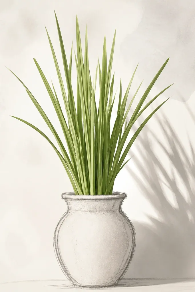
This is the "I want it to look like it's in my kitchen" version. You get the tall grass feeling, plus a grounded base so it doesn't float. I draw a simple pot shape in grey pencil, then build the blades right behind and above it. The shadows are where the realism comes from: I shade the pot shadow first, then match the grass shadow direction to it. This works great for people who like farmhouse-modern decor because the palette stays calm and the subject is clear.
Start by sketching a simple pot oval and a rim line about 1/3 down from the bottom of the page. Then draw grass blades emerging from behind the pot rim, with the tallest blades near the back center. Add highlights with a lighter pencil pass on the side facing your light source, then shade the opposite side with olive. Draw a soft shadow shape on the background using a grey wash or very light graphite smudge, then deepen the shadow base under the blades where they overlap. Finish with matte seal so the grey doesn't smear.
Good to knowIf your shadows look flat, add one darker shadow "pool" right at the pot base where the blades block the light.
Common mistakeDon't outline the pot too thick - thick outlines make it look like a sticker.
6. Monochrome Ink Lemon Grass on Black Paper
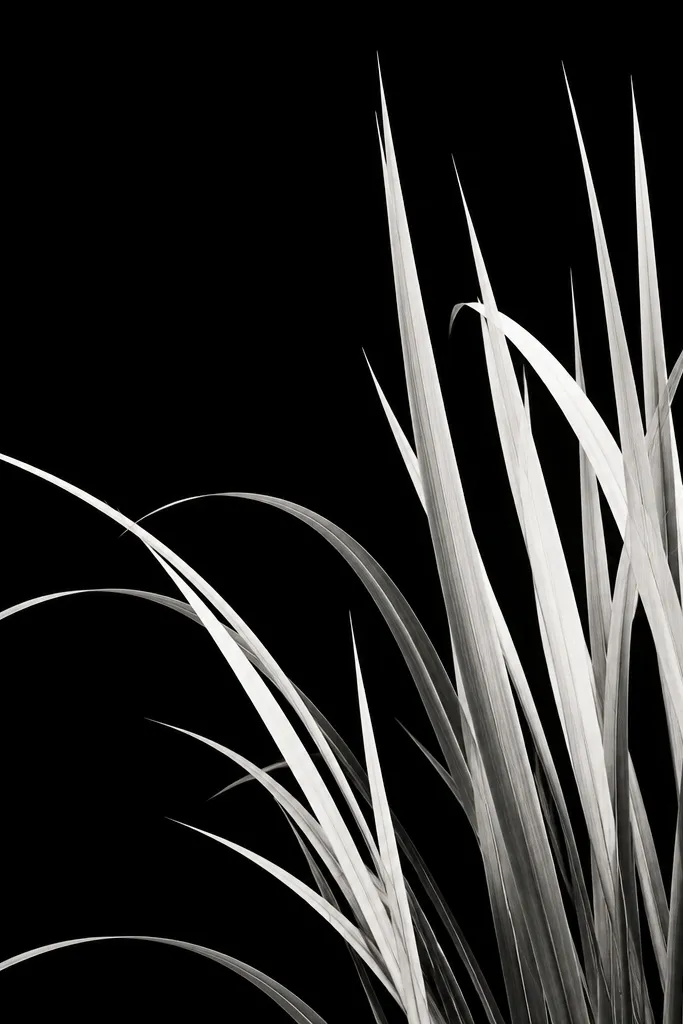
When I want high impact without color mixing, I go monochrome on black paper. It's the fastest way to get that "high grass drawing all year" look because the contrast doesn't fade the way light greens can. I use white gel pen for highlights and grey ink for shadow edges, then keep the blade spacing consistent so it looks clean. It flatters cool-toned interiors, black frames, and anything with chrome or stainless accents. It also hides minor paper texture well, so it's forgiving if your drawing isn't perfectly smooth.
Start by taping your black paper edges down so it doesn't shift. Sketch a few anchor blades first, then fill between with consistent spacing. Draw the blade outline in light grey ink, then add a darker grey line only on the shadow side of each blade. Add white gel pen highlights along the opposite edge, keeping the highlight line thin (about the width of a pencil line). If you want depth, add a light grey wash at the base cluster and seal with a matte fixative that won't turn the white grey.
Good to knowUse a scrap sheet under your hand - black paper shows smudges immediately.
Common mistakeSkip heavy white fill - it turns the grass into chalky blobs.
7. Watercolor Lemon Grass Washes with Pencil Blade Tips
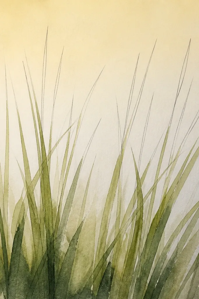
This one looks airy and hand-painted, but it still reads as tall grass. I like watercolor washes for the background because they blend naturally and keep the piece from feeling harsh. The key is mixing loose wash with precise pencil tips, so the blades stay crisp even when the wash gets soft. I use two washes: a pale yellow-green for the upper third and a more saturated olive-green for the bottom third. It flatters people who want something gentle for a bedroom, hallway, or reading nook.
Start by wetting only the bottom third of the paper with clean water using a wide brush, then drop in olive wash and let it pool slightly where blades will overlap. After that dries, sketch blades lightly in pencil. Paint the upper third of each blade with pale yellow-green, leaving the very tips lighter, then go back and sharpen the blade tips with darker pencil or a thin green pen. Add a tiny amount of darker green only at overlaps near the base. Seal with matte fixative once the watercolor is fully dry, then frame behind glass if you used heavier wet paint.
Good to knowPaint in thin layers. Thick watercolor at the base makes paper buckle later.
Common mistakeDon't paint the entire blade one solid green - it looks flat and muddy.
8. Knife-Cut Paper Blade Lemon Grass (Mixed Media)
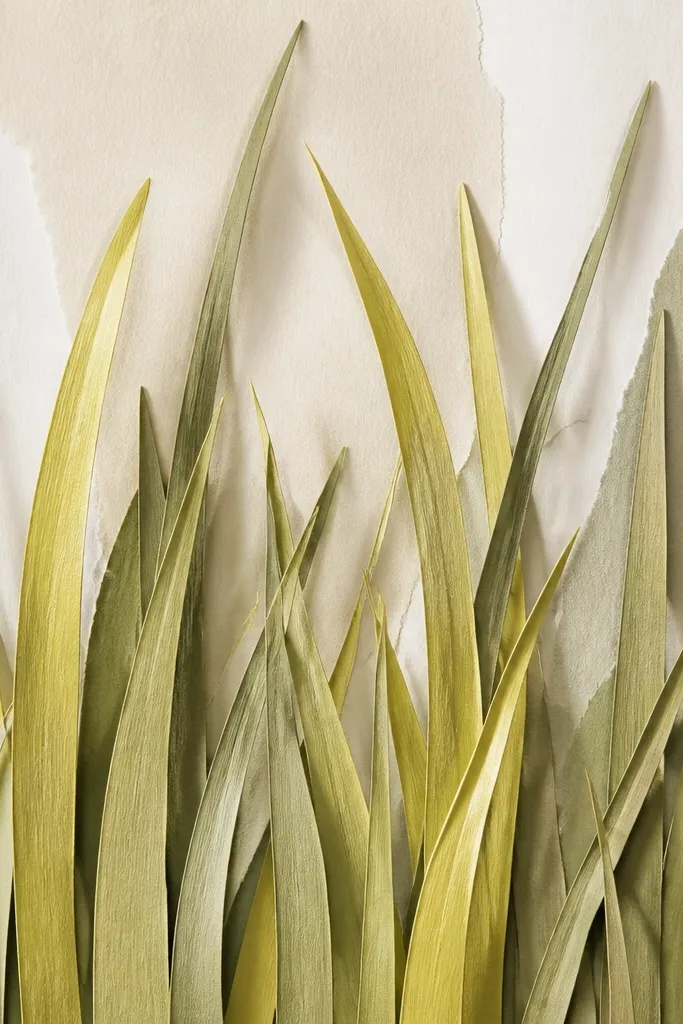
If you want the most "3D" tall grass without sculpting, this mixed-media approach wins. The cut paper blades cast real shadows, which means your piece looks dimensional even under flat lighting. I use thin craft paper or matte cardstock, then color it with watered-down marker or watercolor so the strips keep a natural gradient. It flatters modern spaces because it looks like a graphic botanical collage, not a flat drawing. For durability, it's also easier to control because paper edges are the only thing that changes, and you can seal the whole surface.
Start by cutting a base rectangle and choosing two paper shades: pale yellow-green and olive. Draw blade shapes on the paper with a blade width of about 2-3 mm near the top and 1-2 mm thickness at the tip. Cut the blades with a craft knife, then layer them: place the olive blades first, then add yellow-green tips on top for a gradient effect. Attach with double-sided tape or glue dots only near the base so tips stay lifted. Finish by drawing tiny shadow lines along the lifted edges with a grey pencil, then seal the whole piece with matte medium.
Good to knowUse a cutting mat and keep your blade angle consistent so all tips curve the same way.
Common mistakeDon't glue the entire blade flat - full contact kills the 3D shadow effect.
9. Lemon Grass on Grid Paper for Perfect Spacing
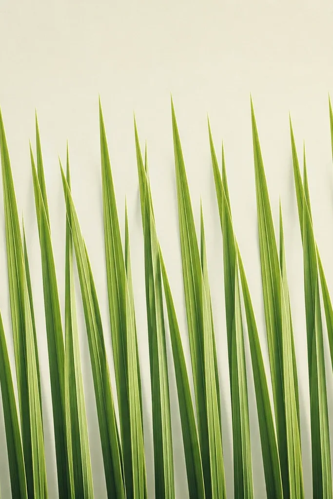
This is the method I use when I want that crisp, editorial look. Grid paper keeps your spacing even, which matters a lot for tall grass because uneven gaps make it feel accidental. I draw the blades with a consistent angle so the whole piece feels intentional. The color stays simple: yellow-green tips, olive base, and a darker olive shadow edge. It flatters people who like symmetry and calm decor. Also, it's beginner-friendly because you're not guessing proportions.
Start by sketching a light rectangle crop area, then lightly mark a baseline and place your blade "columns" using the grid squares. Draw blades with the same lean direction, keeping blade width consistent across the page. Shade the left edge as highlight and the right edge as shadow (pick one direction and stick to it). Add olive shading where blades overlap and keep the background clean. When you're done, erase grid lines carefully and seal with matte fixative.
Good to knowPick one blade lean angle and write it down. I use 10 degrees from vertical so I can repeat later.
Common mistakeDon't erase hard - grid lines can tear the surface if you press too much.
10. Lemon Grass Ombre Strip Across a Long Canvas
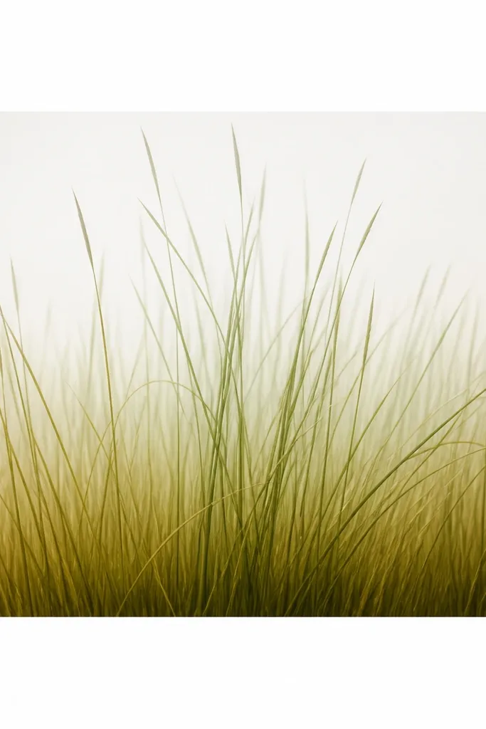
Long ombre looks expensive because your eye tracks the gradient instantly. I love this for entryways because it reads as one continuous piece even from across the hall. The blades are drawn taller in the middle, shorter at the edges, which gives you a soft "stage curtain" effect. I start the base with pale yellow-green and blend into deep olive, then keep the top portion lighter so it doesn't look heavy. This works well with neutral furniture and light walls.
Start with a long sheet or canvas panel and mark a center band about 8-10 inches wide where the tallest blades will rise. Draw blades in that band first, then taper blade height down toward the edges. Color the base band in a smooth ombre: pale yellow-green at the center top of the base, then olive as you move outward. Add individual blade shading with a darker green shadow edge and leave the highlight edge lighter. Seal with matte fixative, then frame with a slim profile so the long composition stays crisp.
Good to knowUse a flat brush for the ombre base so the gradient looks smooth, not streaky.
Common mistakeDon't make the ombre too dark at the top - tall grass gets swampy fast.
11. Lemon Grass Leaves with Minimal Linework + One Accent Pop
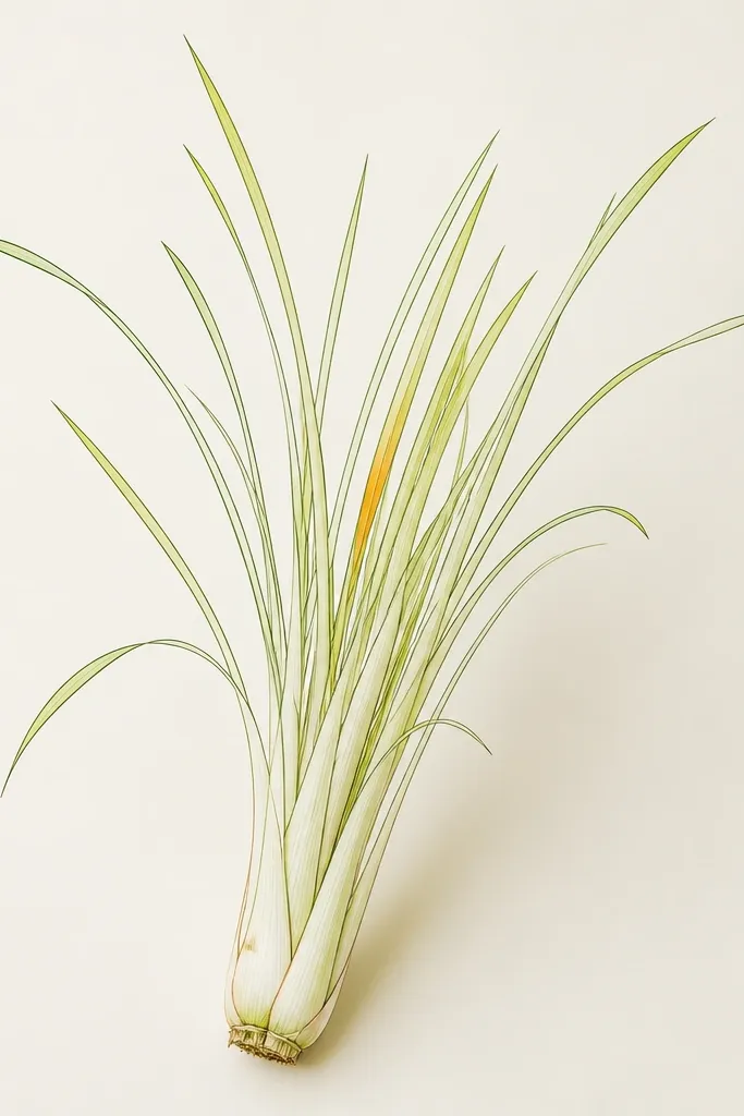
This is for when you want the drawing to feel modern and calm. Minimal linework keeps the grass from turning into a coloring page, and the one accent pop makes the composition feel intentional. I use a thin dark green pen for outlines, then fill only the top third with pale yellow-green. The base gets a soft olive wash, but I don't over-color every blade. It flatters people who like clean walls, and it looks great with simple frames and neutral textiles.
Start by drawing a baseline and then sketching blades with a consistent thickness in your pen lines. Leave most blades unfilled, then add pale yellow-green color only to the top third of each blade. Add an olive wash at the base cluster, then deepen only the overlaps with a darker green pen. Choose one blade near the center and color its tip with warm yellow-orange so it reads like a fresh new shoot. Seal with matte fixative so the linework stays crisp.
Good to knowPick the accent blade based on where your viewer's eye lands - I place mine slightly above center, not dead center.
Common mistakeDon't add multiple accent colors - the piece loses its clean focus.
12. Botanical Labels Handwritten on the Grass
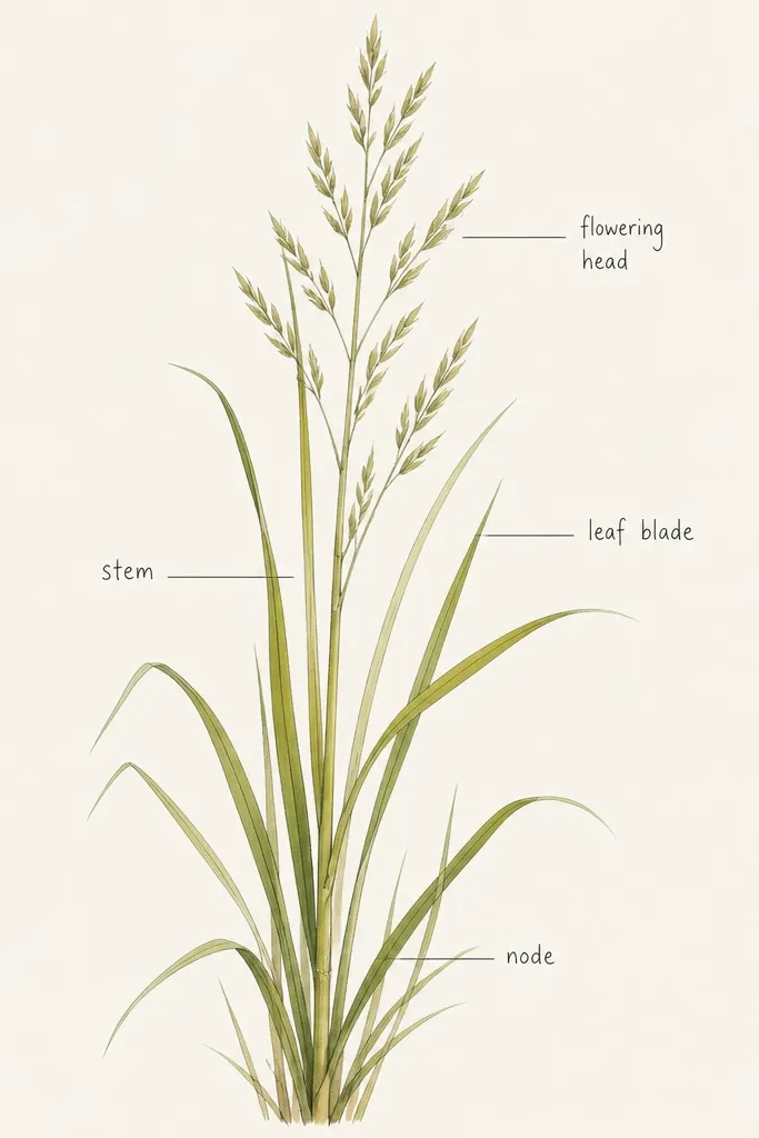
This turns art into a decor conversation without making it busy. I've used it on a kitchen wall above a cutting board, and people always ask what the plant is. The grass stays tall and stylized, while the labels add a neat "scientific notebook" vibe. I keep the labels small and use thin leader lines so they don't fight the blades. It flatters cottage-modern spaces and also looks good with black frames and kraft paper mats.
Start by drawing tall blades in pencil and finishing them with color: pale yellow-green tips and olive base shading. Leave 3 to 5 spots in the upper third where you'll add labels. Add thin leader lines from the labels to the nearest blade area, then write the words in a consistent style using a fine archival pen. Keep the handwriting size around 1/8 to 1/4 inch tall so it stays delicate. Seal with matte fixative carefully so the ink doesn't smear.
Good to knowWrite labels first on scrap paper so your spacing stays steady.
Common mistakeDon't use thick marker for handwriting - it looks like a craft store stamp.
13. Lemon Grass Dip-Dye Tip Effect
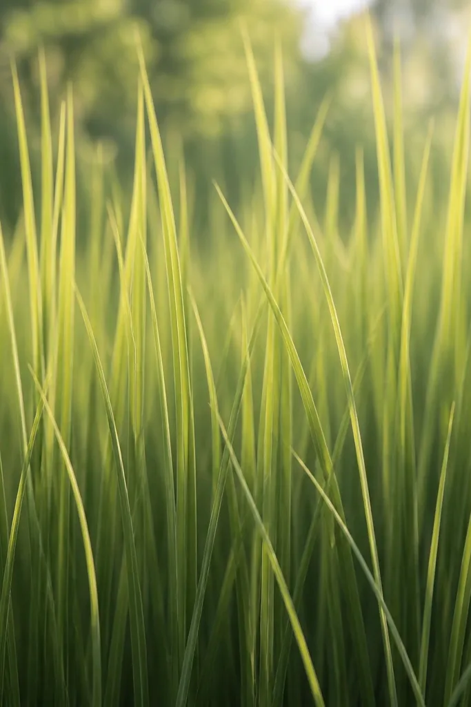
Dip-dye tips look dramatic because your color transition is doing the work. I use this when I want the grass to feel airy but still saturated, like fresh lemon grass in a vase. The blades are drawn with a defined outline, then colored with a gradient that fades smoothly down the blade. It flatters warm lighting rooms because the yellow-green catches light and makes the piece feel alive. It also pairs nicely with wood, rattan, and linen textures.
Start by drawing blades with a light pencil so you can erase without tearing. Outline each blade lightly with a fine green pen or dark pencil, then color the tips first with yellow-green marker. Blend downward into olive using a damp brush or a second marker, stopping around the middle third. Leave the base darker: add a deeper olive or moss green at the bottom and blend just slightly upward so the transition stays smooth. Finish by adding a darker shadow edge on one side of each blade, then seal with matte fixative.
Good to knowUse the same brush water level for every blade so your fade looks consistent across the whole piece.
Common mistakeDon't rush the blending - muddy transitions make the tips look dirty.
14. Lemon Grass in a Rectangular Vase Silhouette
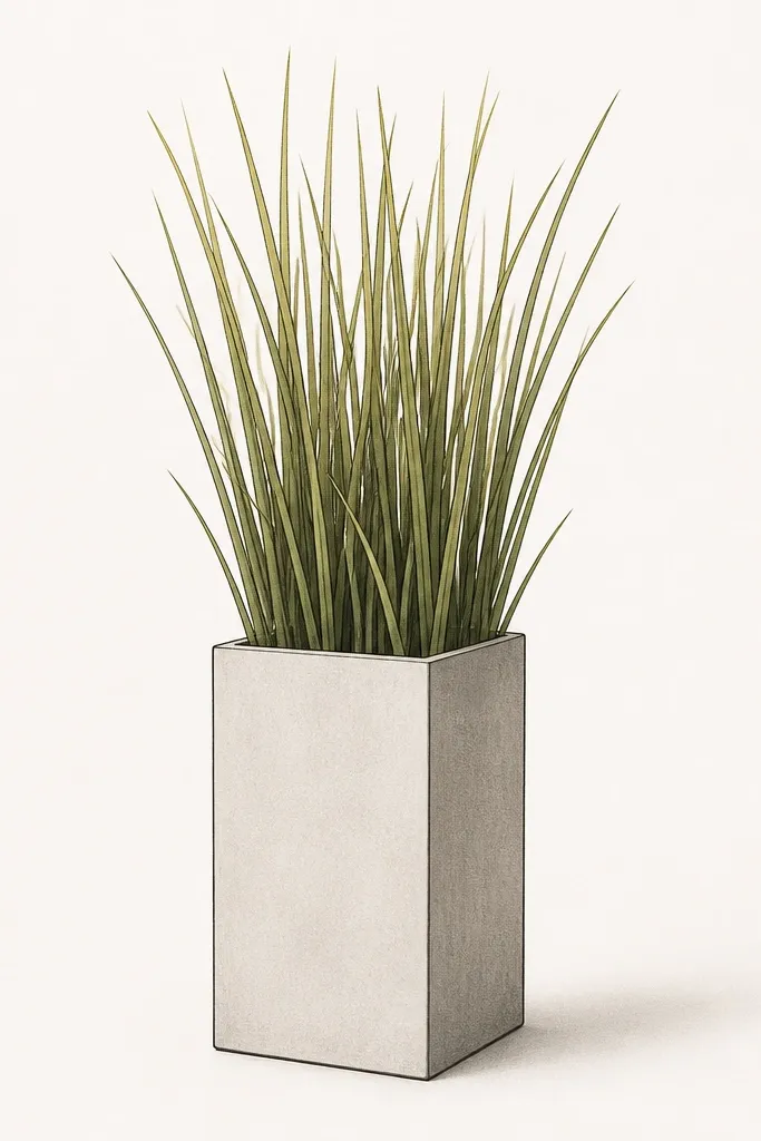
A clear vase silhouette makes the composition feel designed, not just decorative scribbles. I like rectangular vases because they force your blades to respect the shape, which keeps the tall grass from spreading out. The contrast between geometric vase lines and organic grass blades looks good in modern rooms. The color ladder stays the same: pale yellow-green at tips, olive mid, darker moss at overlaps. It flatters people with clean-lined furniture because the vase gives the eye something stable to hold onto.
Start by drawing the vase rectangle and rim about 1/4 of the way up from the bottom of the page. Shade the inside of the vase with a light grey pencil so blades look like they originate from it. Draw grass blades emerging from behind the rim - keep the tallest ones near the center and slightly shorter toward the corners. Color tips yellow-green, then add olive shading on the lower half, and darken overlap edges with a moss green line. Add a soft shadow under the vase rim, then seal with matte fixative and frame behind glass.
Good to knowKeep your vase lines ruler-straight, then allow the blades to tilt freely - that contrast is the whole look.
Common mistakeDon't forget the rim shadow - without it, the blades look pasted on top.
15. Endless Grass Repetition Pattern (Stems Like a Print)
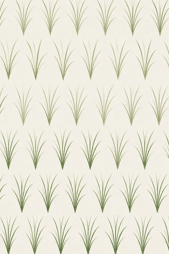
This is the one I make when I want the piece to feel calm and steady, like wallpaper but in a framed format. Repetition is what keeps it looking good year-round because the pattern doesn't rely on a single focal scene. I draw blades in rows with a fixed angle, then vary only the shading intensity so it still has depth. The palette stays lemon grass: yellow-green tips, olive bases, and a darker shadow side on each blade. It flatters spaces with lots of neutral decor because it adds texture without clutter.
Start by sketching an even baseline and dividing the page into 3 horizontal bands. Draw blades across the first band with consistent spacing, then repeat in the next band but shift the blade start points slightly so the pattern feels organic. Keep the blade angle the same in every row, then shade the left edge highlight and right edge shadow consistently. In the bottom band, add slightly darker olive at overlaps to create depth. Finish by sealing with matte fixative and placing it in a frame with a simple mat so the pattern reads cleanly.
Good to knowUse a tiny dot at the base of each blade as a placement marker - it keeps the pattern from drifting.
Common mistakeDon't vary angles too much - then it stops reading as a designed print.