1. Front-facing tight bud with a teardrop center
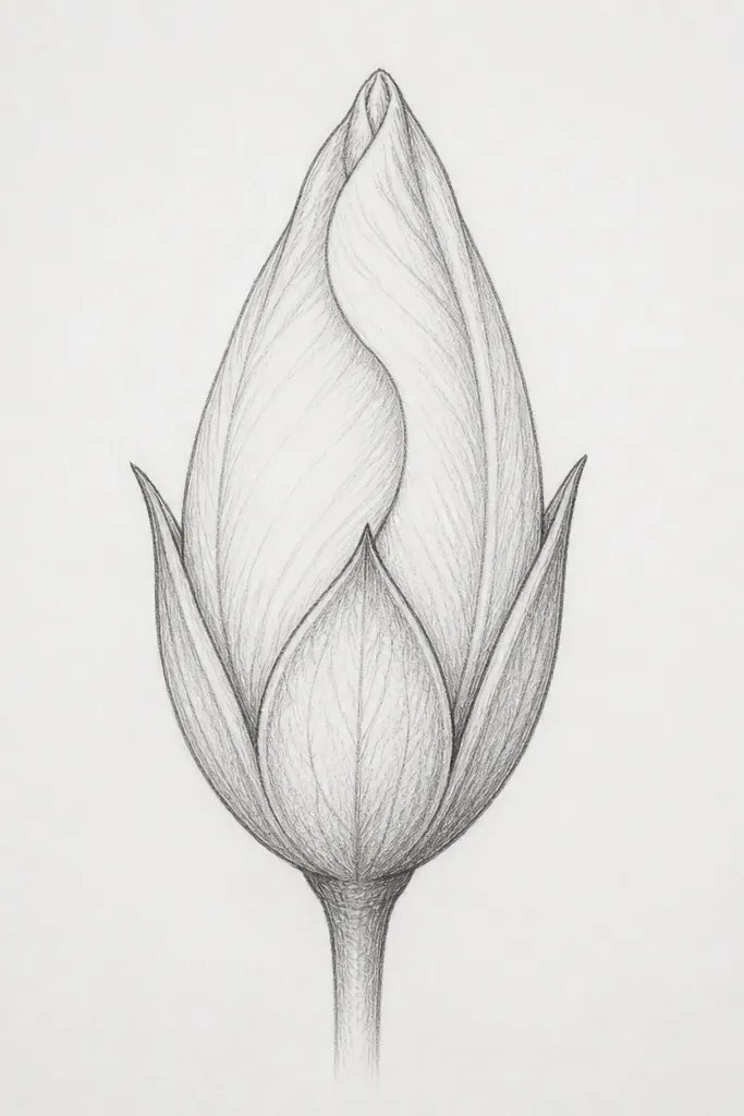
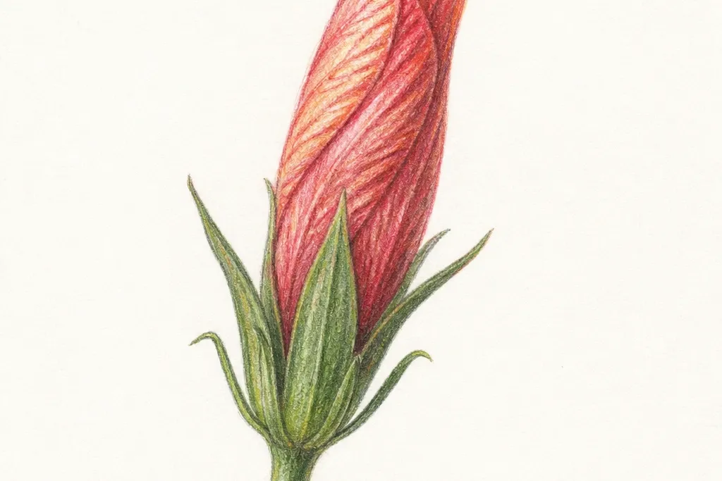
Start with a bud that looks like a closed fist — perfect for practice because everything is symmetrical enough to catch your mistakes early. The inner curl is a teardrop that points up, and the outer bracts wrap around it in three big segments. I like this look on cream paper because the graphite stays soft and the bud reads as delicate instead of harsh. It flatters small spaces on greeting cards because the shape stays compact and tidy. If your hand shakes, this one helps because the center is your anchor.
Step 1: Draw a small teardrop for the center, then add a faint oval around it as the bud boundary. Step 2: Add three outer bract edges that start near the top curl and sweep down, each one overlapping the previous by about one-third. Step 3: Darken only the outer bract edges with a 2B pencil, and keep the inner fold lines light. Finally, add a short stem line and a tiny leaf nub at the base.
Good to knowKeep your bract overlap consistent — if one petal covers too much, the bud looks lopsided fast.
Common mistakeAvoid drawing every bract with the same thickness; the inner folds should look lighter.
2. Three-quarter bud with layered bract staircase
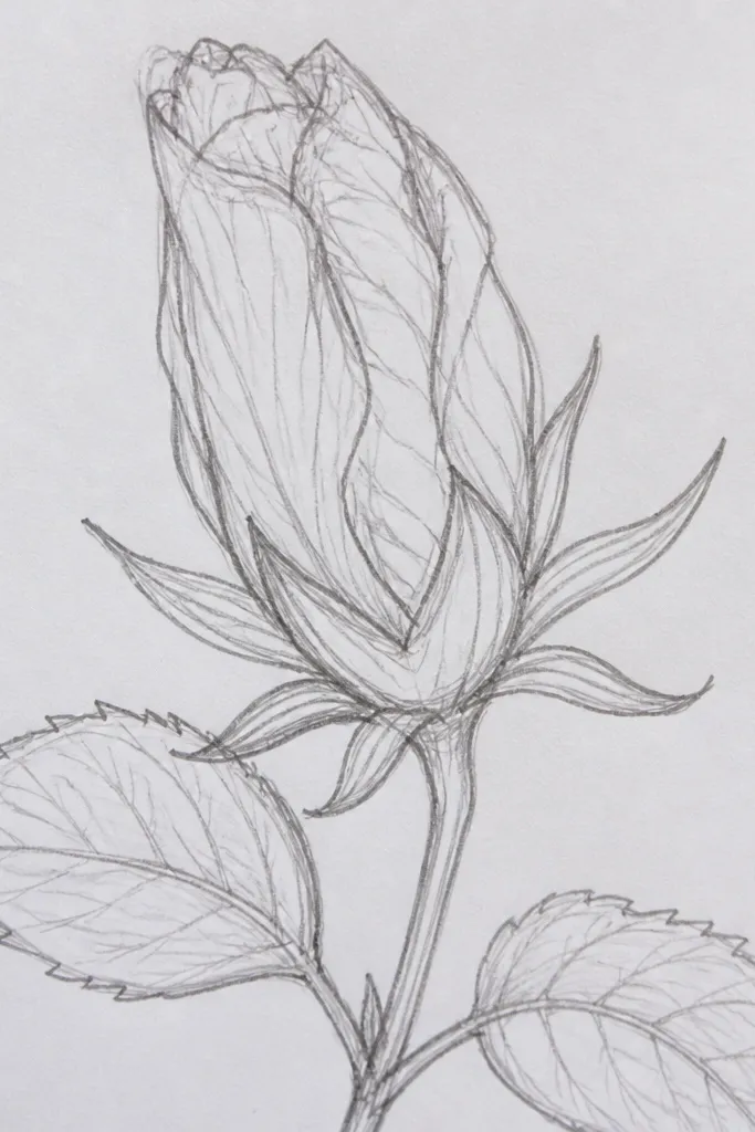
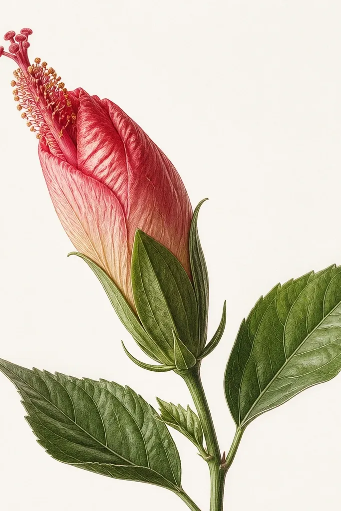
This is the bud I reach for when I want depth without getting fancy. The three-quarter angle lets you show the fold thickness: the near bracts look darker and the far bracts stay lighter. I use it a lot on sketchbook pages because it fills the page better than a flat front view. It also flatters drawings meant to look dimensional on stickers or printables since the overlap reads clearly at small sizes. If you struggle with perspective, this angle gives you one direction to commit to.
Step 1: Sketch a curved center line for the bud axis, then draw a small oval cluster around the top curl. Step 2: Build the bracts like a staircase: draw the nearest bract first, then add the next bract so it overlaps the first by roughly the width of your pencil tip. Step 3: Lightly outline the far bracts, then darken only the edges that face the light. Finish with a thin stem line that bends away from the darker side.
Good to knowUse a kneaded eraser to lift highlights on the far bracts — it makes the fold look glossy instead of flat.
Common mistakeDon’t outline the far bracts as dark as the near ones — that flattens the whole bud.
3. Side-view bud with a thick petal rim
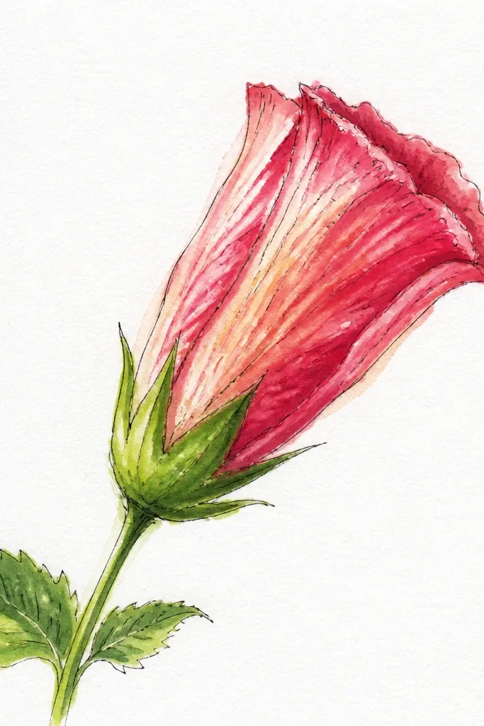
Side-view buds are great for learning the “petal thickness” look. The outer rim line is intentionally thicker and darker, while the inner fold line stays slimmer. I like this one for practice because it forces you to draw volume, not just outlines. It also works well for minimalist line art since the rim creates a clear silhouette. If your buds always look like flat flowers, this teaches you where shading should go: right along the rim and under the top hook.
Step 1: Draw a capsule shape with a slight curve, then add a small hook at the top that points inward. Step 2: Create the thick rim by drawing one outer edge line and one inner edge line close to it, leaving a narrow gap for the fold. Step 3: Add two or three short bract fold lines that start at the rim and fade toward the center. Finally, shade a thin band under the top hook using a 4B pencil and blend lightly with tissue.
Good to knowShade only the rim band — if you shade the whole bud, it turns muddy.
Common mistakeAvoid making the inner space too wide; side-view buds need that tight pinch to look like they’re closed.
4. Bud with two bracts peeled back
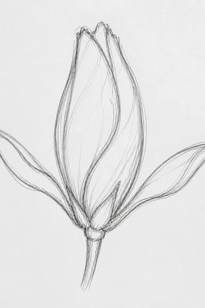
This one feels playful because it shows partial opening without turning into a full flower. The trick is to lift exactly two bracts and keep the rest tucked. I use this for quick illustrations because the lifted petals give you a focal point and a clear “action” moment. It flatters composition on postcards since the open bracts create a wider silhouette. If you’re practicing for botanical-style art, this teaches controlled asymmetry while still reading as hibiscus.
Step 1: Draw the closed bud shape as an oval with a tight top curl inside. Step 2: Choose two bracts to peel back: draw them as curved arcs that start near the center and swing outward, each overlapping the closed bracts behind it. Step 3: Darken the outer edge of the lifted bracts, then add a light inner fold line to show the curve. Finish by placing a tiny shadow under the lifted bracts along the bud body.
Give the peeled bracts slightly different heights; matching them perfectly makes it look like a cartoon mask.
Avoid lifting too many bracts — once you lift three or more, it starts looking like a flower head instead of a bud.
5. Mini bud cluster of three on one stem
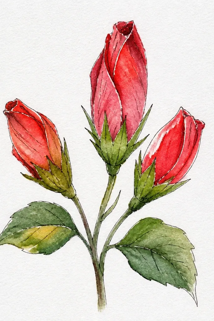
Clusters make your page look finished even when each drawing is simple. I like drawing three mini buds because it forces you to vary angle while keeping the same structure. The buds look cute and balanced, and they’re perfect for practicing line confidence. This also flatters layouts for phone wallpapers or pattern sheets since repeating small buds reads as intentional. If your solo buds look lonely, clustering fixes that instantly.
Step 1: Draw one gentle stem curve, then mark three bud attachment points along it. Step 2: For each bud, draw the same top curl teardrop shape but change the outer bract overlap direction: left bud overlaps toward the left, right bud overlaps toward the right, center bud overlaps forward. Step 3: Add one tiny leaf nub beneath the left and right buds, keeping leaves small so the buds stay the focus. Finally, darken the outer edges on all three buds with consistent pressure.
Use a ruler only for the stem. Freehand the bud shapes so they don’t look machine-perfect.
Avoid making all three buds the same size; clusters look fake when everything is identical.
6. Bud with a curled sepal frame
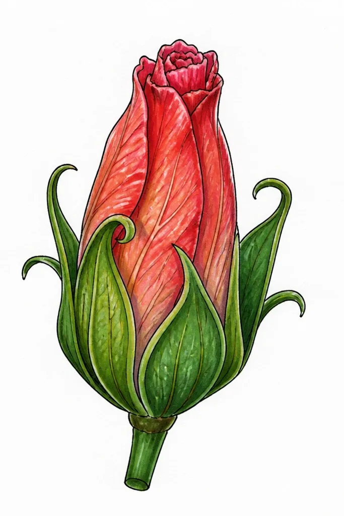
This idea adds structure at the base, which is where hibiscus buds often look unfinished. The curled sepal frame makes the bud feel anchored and gives you a place to add a darker shadow. I like it for drawings where you want a more botanical look instead of a soft cartoon bud. It also flatters thicker paper because the line weight contrast looks crisp. If your buds always look like they float, the sepal frame solves that.
Step 1: Draw the bud as a simple oval with a top curl inside. Step 2: Add an outer sepal frame by drawing 4 to 6 curved leaf shapes around the base, each one overlapping the next like shingles. Step 3: Keep the sepal leaves slightly shorter than the bud body so they don’t overpower the center. Finally, shade under the base frame with a light 3B pencil and blend just at the contact points.
Good to knowCount your sepal leaves and keep it consistent across sketches; it helps the bud read as hibiscus quickly.
Common mistakeDon’t draw the frame too high; if the sepals reach the top curl, it stops looking like a bud.
7. Bud in a vertical teacup composition
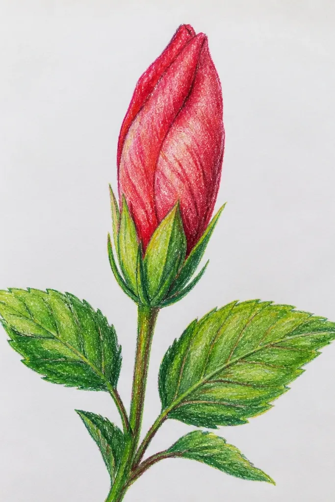
This is one of my favorite aesthetic compositions for practice pages because it looks intentional even with minimal shading. The vertical teacup curve below gives you a visual reference for where the bud “lands,” so your base pinch looks right. I use it when I want the bud to look graceful rather than chunky. It also flatters tall paper formats and right-margin placement for zines. If your buds look too wide, this vertical layout keeps them slim.
Step 1: Draw a long stem line down the page and add a curved “teacup” bowl shape at the bottom. Step 2: Build the bud around a narrow oval: place the top curl high, then add three bracts that wrap down and inward. Step 3: Shade a thin crescent under each bract fold where it meets the bud body. Finally, add a tiny highlight line on the inner curl by lightly erasing with a kneaded eraser.
Good to knowKeep the bud width to about one-third of the teacup bowl width so the shape reads elegant, not squat.
Common mistakeAvoid heavy shading on the teacup bowl; only shade the bud so it stays the subject.
8. Bud with visible inner petals like folded paper
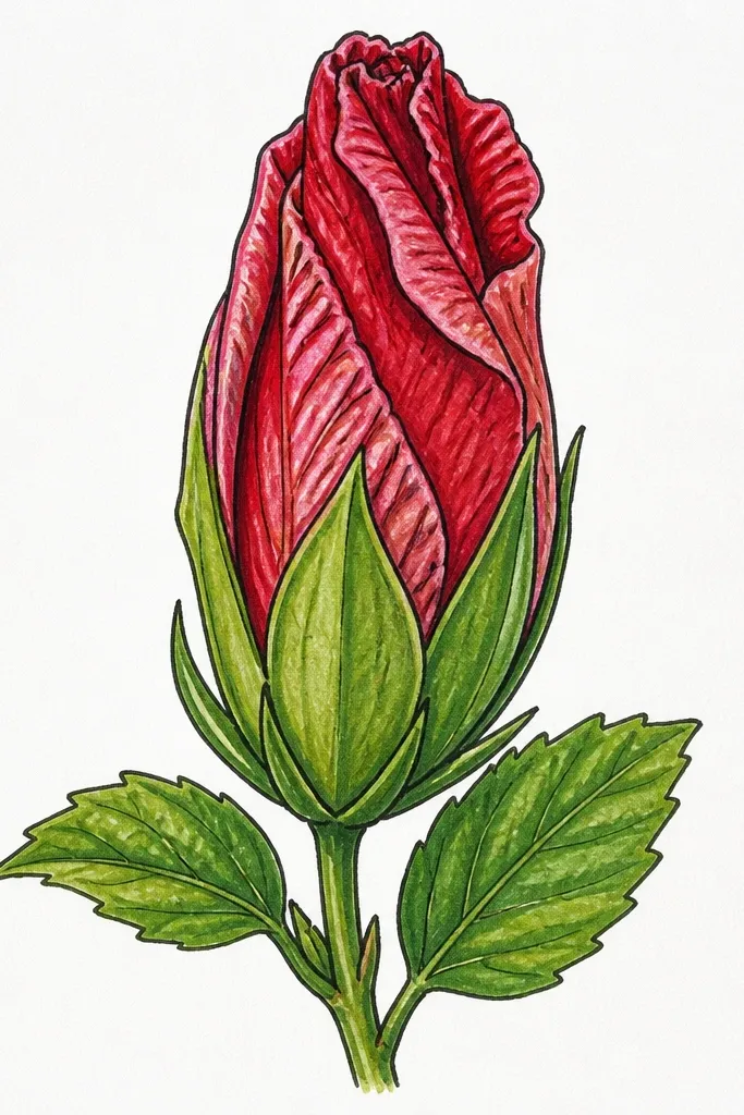
If you want that “hibiscus bud realism” look, draw the inner petals as thin folded sheets. The outer bracts stay thicker and darker at the edges, but the inner folds are delicate lines that stop before the rim. I like this for pen-and-pencil hybrids because the fine lines look crisp. It also flatters detailed art prints and works well if you plan to add a watercolor later. People read this as botanical because the folds look intentional, not random.
Step 1: Sketch the outer bud boundary with light lines and mark the top curl. Step 2: Add 5 to 7 inner folded petal lines that start near the top curl and taper toward the center, each line ending before it hits the outer bract edge. Step 3: Darken the outer bract edges, then add a soft shadow band at the base pinch. Finally, blend the shadow lightly so the inner folds stay sharp.
Use the side of your pencil for the base shadow, then switch to the tip for inner fold lines.
Don’t connect every inner fold to the outer edge; that makes it look like a single closed scribble.
9. Bud with a subtle cross-hatching shadow band
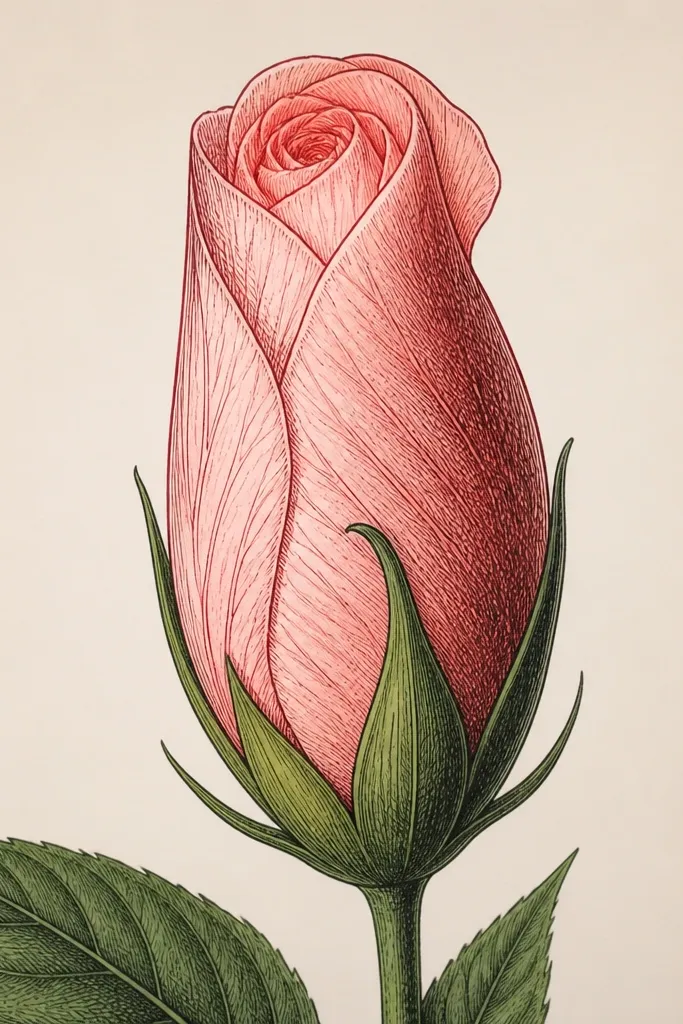
This is the bud idea I use when I want form without smudging. Cross-hatching gives you texture that reads as petal thickness, especially on paper that can’t handle heavy blending. It’s also great for black-and-white prints because the contrast stays controlled. If your shading always looks blotchy, this keeps it tidy. It flatters monochrome sketch styles and looks good next to ink outlines.
Step 1: Draw the bud as a simple oval with a top curl and three outer bracts. Step 2: Choose one side for light direction and leave the opposite side almost blank. Step 3: Add a shadow band across the chosen side using short hatch marks, then cross them with a second direction of short lines. Finally, darken the outer bract edges with your darkest pencil for a clear silhouette.
Keep your hatch spacing tight near the base pinch and wider near the top curl for a natural fade.
Avoid hatching the entire bud; the blank inner area is what makes the folds look soft.
10. Bud with a single sweeping highlight line
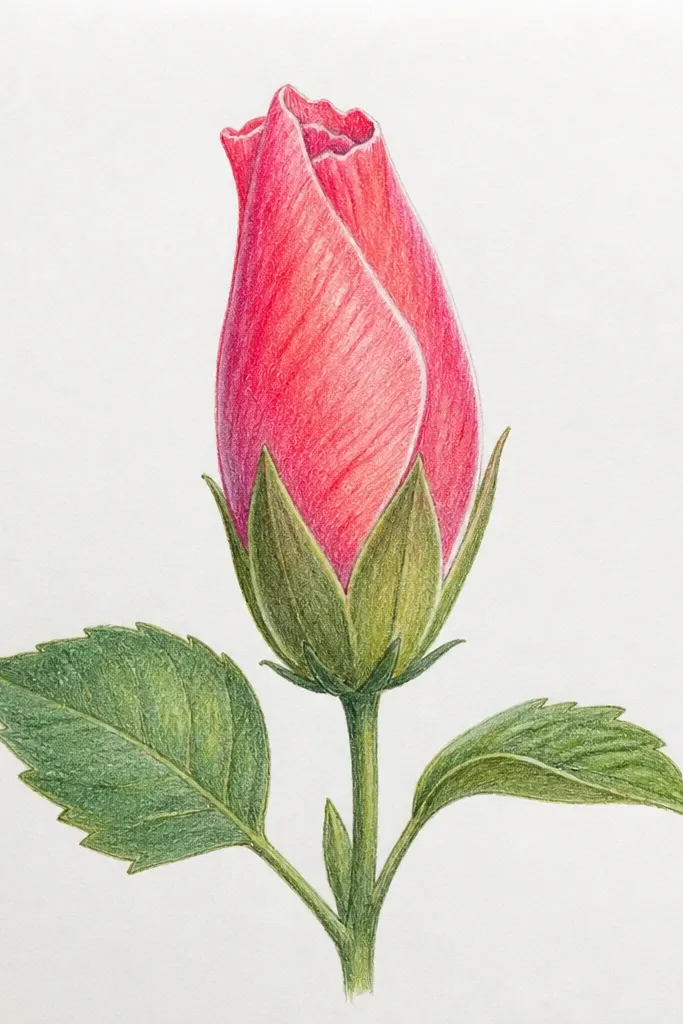
This one looks polished fast because the highlight line tells the viewer where the light hits. I treat the highlight like a guideline, not decoration — it follows the curve of the inner fold. The result feels glossy and fresh, even in pencil. It’s perfect for small buds where you don’t have space for lots of shading. If your buds look flat, this adds form without extra work.
Step 1: Sketch the bud outline with light pressure and place the top curl inside the center. Step 2: Add three outer bracts with overlap, then pick one inner fold line to become your highlight. Step 3: Shade only under the outer bract edges and around the base pinch with a light 2B. Finally, erase lightly along your chosen highlight line to make it brighter than the surrounding graphite.
Good to knowPick the highlight line before you shade so you don’t accidentally shade over it.
Common mistakeAvoid multiple highlight lines; two or more makes it look like you’re drawing plastic.
11. Two-bud pair with mirrored tilt
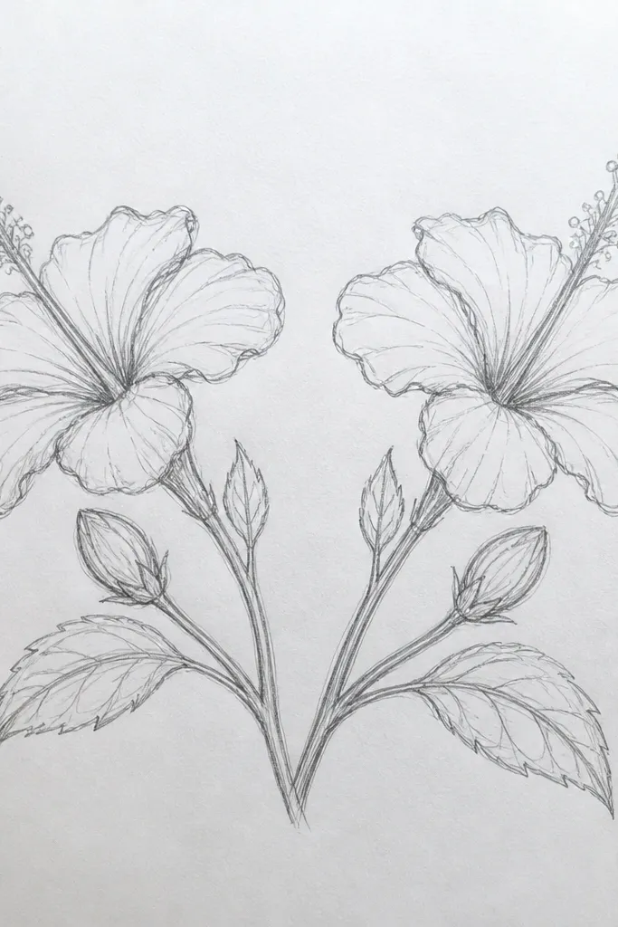
Mirrored tilt pairs look intentional and balanced, which is why they’re great for beginners. You get practice drawing overlap twice, but the second bud acts like a consistency check for your line weight. I like this for cover art and small frames because it creates symmetry without being boring. It also flatters color washes later since both buds have clear edges for clean paint boundaries. If you want a page that looks like it was planned, this is the easiest way to get it.
Step 1: Draw one shared stem base point, then add two short stems that curve outward in opposite directions. Step 2: For the left bud, draw a front-ish oval with a top curl, then wrap three outer bracts around it. Step 3: Mirror the right bud by reversing the overlap direction — far bracts stay lighter, near bracts stay darker. Finally, add tiny leaf nubs behind the bracts so the pair feels connected.
Use the same bract count on both buds; it keeps the pair reading as one plant.
Avoid changing the bud size too much between the two; the mirror effect breaks if one is tiny and one is large.
12. Bud with a thick calyx base and short stem
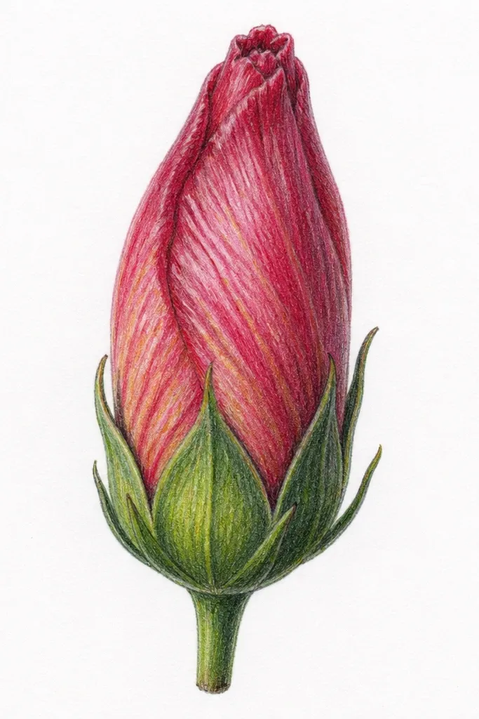
A thick calyx base makes the bud look real because hibiscus buds don’t start thin. This idea gives you a strong anchor and makes the top curl feel like it’s emerging from a tight pocket. I use it when I want a bolder silhouette, like for bookmarks and thick-line drawings. It also flatters darker paper since the base shadow reads clearly. If your buds look too delicate to be hibiscus, this grounds them.
Step 1: Draw the calyx as a rounded mound at the bottom, then attach the bud oval on top of it. Step 2: Add the top curl inside the bud, then wrap 4 outer bracts down toward the calyx. Step 3: Darken the bract edges and add a darker shadow crescent where the bud meets the calyx. Finally, draw a short stem line that disappears behind the calyx so the base looks thick.
Keep the calyx wider than the bud by a small amount so the bud reads like it’s supported.
Avoid a thin base; a narrow calyx makes the whole bud look like it floats in space.
13. Bud with ink-like outline and light pencil interior
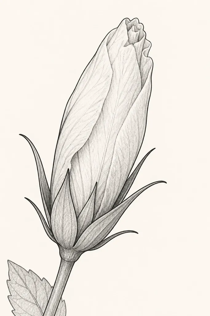
This is a clean aesthetic approach I use when I want the bud to look finished without heavy rendering. The bold outline gives you hibiscus identity instantly, while the light interior keeps it airy. I’ve done versions of this with a fineliner and then added pencil shading only at the base, and it always looks crisp. It flatters line-art style prints and works well if you plan to scan and color later. If you’ve struggled with “pretty but messy” pencil sketches, the outline-first method helps.
Step 1: Sketch the bud lightly with pencil: oval boundary, top curl, and bract overlap guides. Step 2: Trace the outer silhouette and outer bract edges with a fineliner, leaving internal folds untraced or lightly traced. Step 3: Add pencil shading only under the top curl and at the base pinch, keeping it subtle. Finally, erase any leftover guide lines so the interior stays clean.
Good to knowUse a single fineliner thickness across the whole outline so the bud doesn’t look uneven after scanning.
Common mistakeAvoid tracing internal fold lines too dark; it turns the bud into a coloring-book blob.
14. Bud surrounded by small leaf shadows
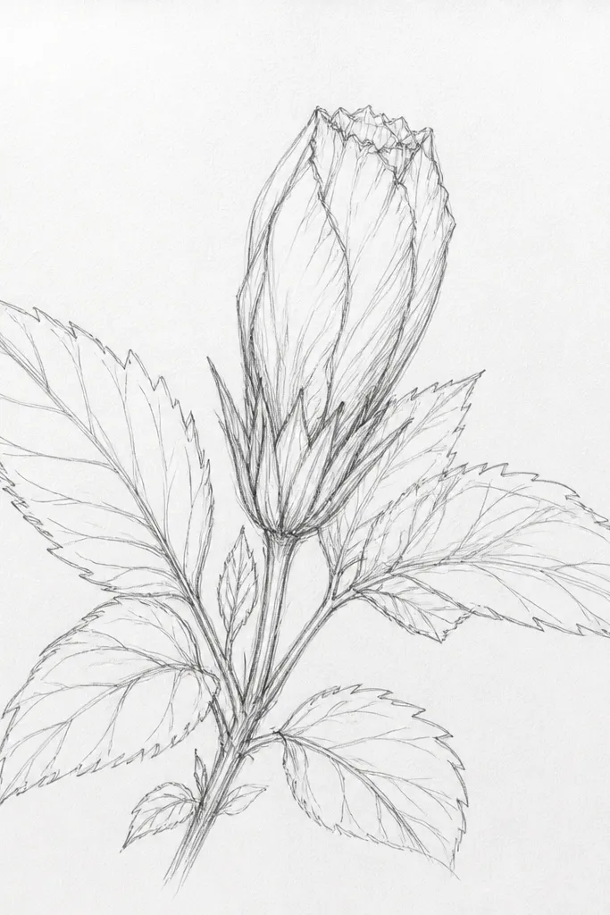
Adding nearby leaf shadows makes the bud feel like it’s in a real plant cluster, not floating in a blank page. I draw the leaves as simple shapes and use them to create a shadow pattern across the bud bracts. This makes your hibiscus look more dimensional than shading alone. It also flatters nature journaling pages because the plant reads as a scene. If your buds always look too isolated, leaf shadows fix that while staying simple.
Step 1: Draw the bud first with a light oval and top curl, then add three outer bracts. Step 2: Add two small leaves on either side, angled so they cast a shadow across one side of the bud. Step 3: Shade the bud with a soft, irregular shadow shape that matches the leaf edges, then blend lightly. Finally, darken the bract edges that face the light so the shadow reads correctly.
Match the shadow edge softness to the leaf thickness — thicker leaf edges get a harder shadow edge.
Avoid shading the entire bud under the leaves; keep the shadow to one side so the highlight still shows.
15. Hibiscus bud in a round frame medallion
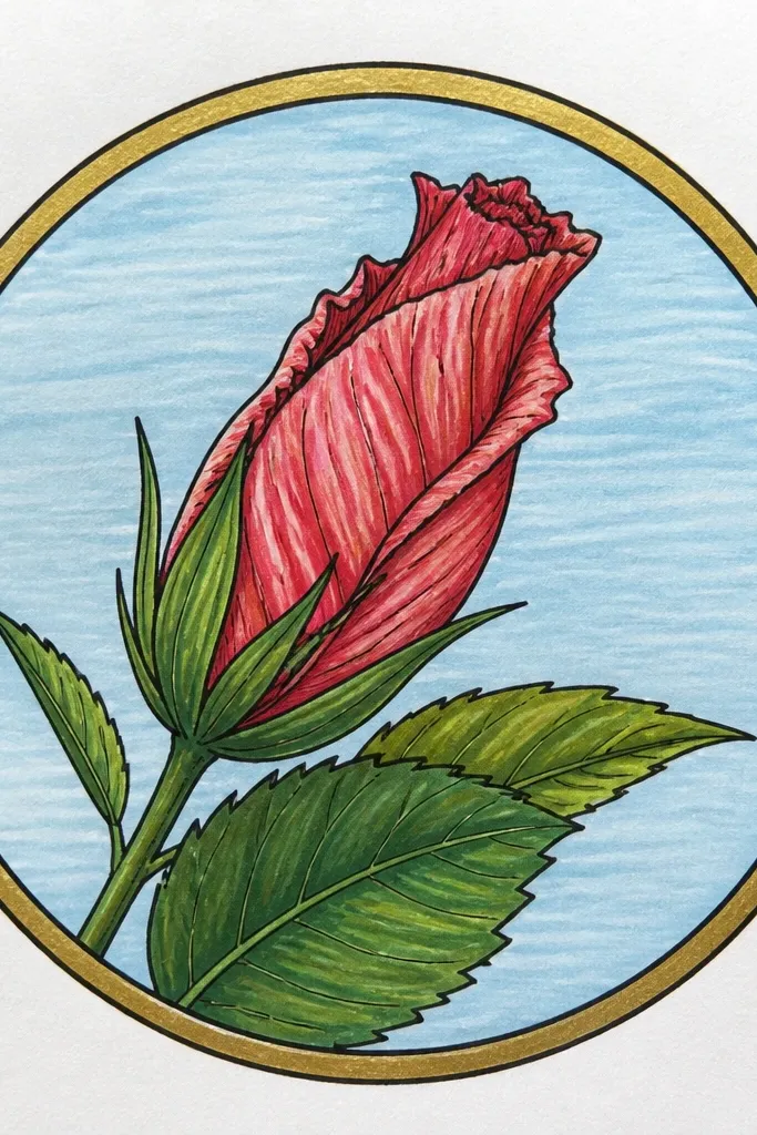
This one is about presentation. A round frame makes the bud feel like it belongs on a sticker sheet, embroidery design, or printable medallion. I like drawing the bud slightly larger than the center so it doesn’t look lost, and I keep the bract lines clean so the medallion doesn’t get crowded. It flatters symmetrical layouts and pairs well with one color wash later. If you want your practice to look like finished art, frame it.
Step 1: Draw a circle, then lightly outline the bud centered inside it. Step 2: Add 4 outer bracts around the top curl, keeping overlap consistent and leaving a clear opening gap at the center. Step 3: Add small petal-like tick marks around the circle edge, spaced evenly, but keep them smaller than the bud bracts. Finally, darken the bud silhouette and leave the tick marks lighter so the bud stays the focus.
Good to knowUse a compass or tracing template for the circle once, then freehand everything inside so it still looks human.
Common mistakeAvoid crowding tick marks near the bud; leave breathing space between frame marks and the bud outline.