
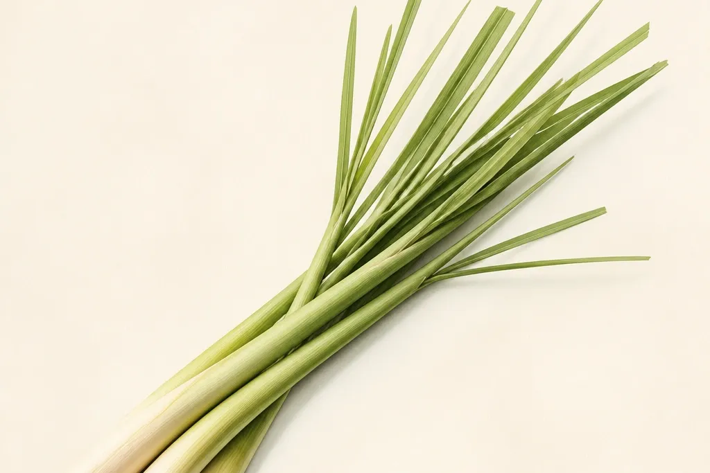
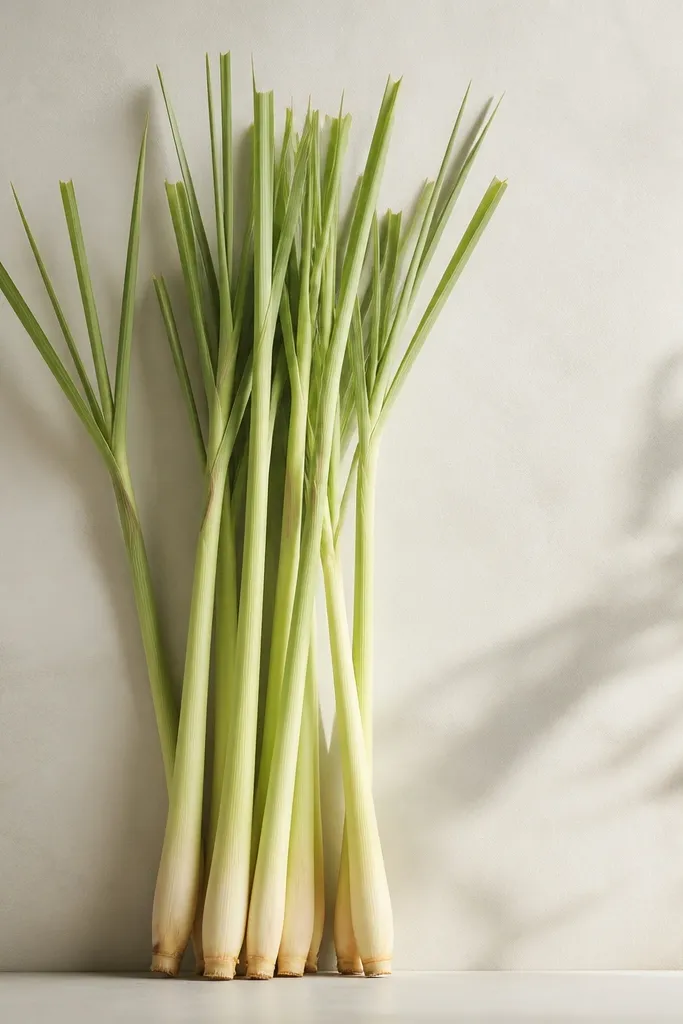
1. Burnished lemon blade cluster on warm ivory
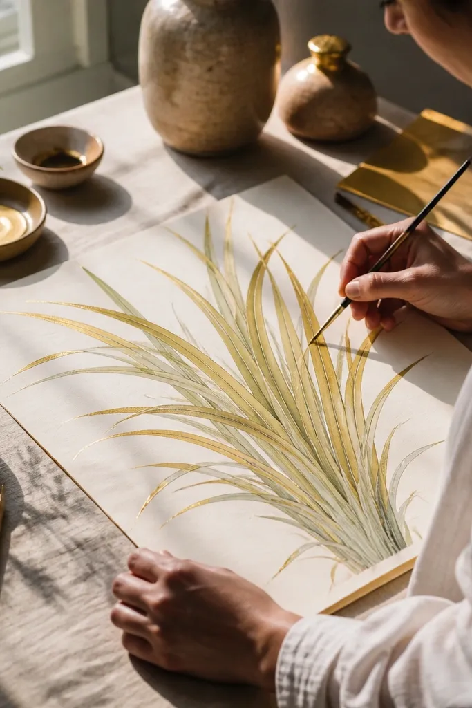
This one nails the lemon grass drawing luxury look because the highlights are actually smooth and reflective-looking. You get it by treating the brightest side of each blade like a highlight strip, then burnishing it until the pigment stops looking dusty. The base stays airy, so the shadows read dimensional instead of heavy. It works in small frames too, because the blade tips stay crisp even when viewed from a distance.
Start with a light sketch of blade direction and a simple mass shape for where the cluster sits. Lay a thin base using yellow-green and pale lime with light pressure, covering the whole grass area. Add shadows next using olive and cool gray-green on the underside and lower half only. Finally, burnish the highlight edges with a sharper light yellow-green using heavier pressure until the surface looks smoother, then deepen only the very tips with dark olive.
Good to knowUse a hard pencil edge for the highlight strip, not a flat side — it keeps the “blade” shape clean.
Common mistakeDon’t outline every blade; luxury comes from value shading, not contour lines.
2. Watercolor glaze base with pencil blade tips
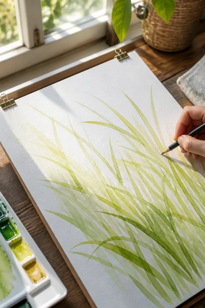
This is the most forgiving route to a luxury look because watercolor builds the lush base quickly, then pencil fixes the details that watercolor blurs. The result is grass that looks like it has air around it, not drawn lines stuck to paper. The pencil layer at the end gives you those crisp lemony tips that make it feel “finished.” It suits wall art where you want softness in the background but precision at the top third.
Wet the paper lightly in the grass mass area, then drop a diluted yellow-green wash to create the base color. While it’s still damp, add a second wash of olive in the lower half to form natural shadows under the blades. Let it dry fully, then use colored pencil to draw each tip and underside edge in small repeated strokes. Add a final glaze of very light yellow-green over the top highlights if the look is too dry, then sharpen only the tips again with a dark olive pencil.
Good to knowDry time matters: pencil on damp watercolor smears and kills the blade edges.
Common mistakeSkip the temptation to pencil over the wet wash — you’ll get gray smudges instead of lemon highlights.
3. Toned paper luxury grass (instant warmth, less mud)
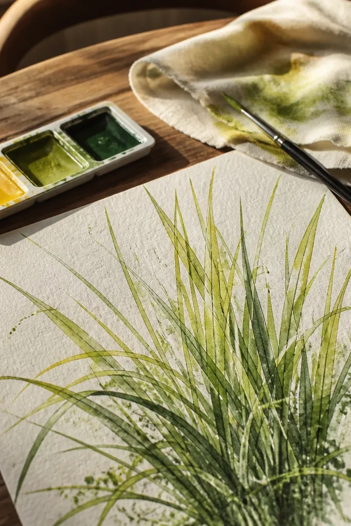
Toned paper is a cheat code for lemon grass drawing luxury look because it prevents the greens from turning chalky. Warm beige makes your yellow-green read richer and your olive shadows read cleaner. You also waste less time building midtones since the paper already provides a believable light. This is ideal if your pencil layers often look dusty or uneven.
Choose a warm beige or light tan paper around 160-250 gsm. Sketch blade flow lightly with a pale pencil so you don’t indent the surface. Start with a translucent wash-like layer using light yellow-green (even with pencil, use very light pressure and many passes). Add olive shadows in the lower half, then burnish the highlight edges with a brighter lemon-yellow-green. Finish by sharpening the darkest underside edges and the very top tips with a cool dark olive.
Good to knowBurnish last, and do it in short strokes along the blade direction so the highlight stays blade-shaped.
Common mistakeDon’t over-darken mid-blades; keep most darkness for underside and tips.
4. Two-tone blade layering (warm edge vs cool underside)
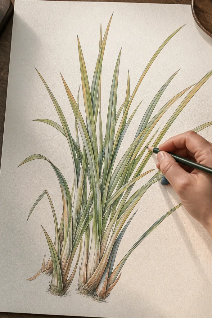
This is the technique that turns a normal grass drawing into a lemon grass drawing luxury look. You are not just coloring grass — you are controlling temperature. The warm edge catches the eye, while the cooler underside gives the blades depth without needing thick outlines. It looks especially good on medium-value paper where both warm and cool tones can show up clearly.
Block in blade directions with a very light yellow-green and keep pressure low. Add the cool underside using gray-green or cool olive, placing it only along one side of each blade. Layer the warm edge again with more yellow-green to make the highlight strip brighter than the rest. Then add narrow dark accents for the underside just near the top third. Finish with a light burnish on the warm edge only, so the contrast stays crisp.
Good to knowThink “two sides of a cylinder” — pick one side to be warm and the other to be cool and stick to it.
Common mistakeDon’t switch warm and cool sides blade-to-blade; that’s what makes drawings look flat.
5. Pencil stipple grass base with sharp tip finish
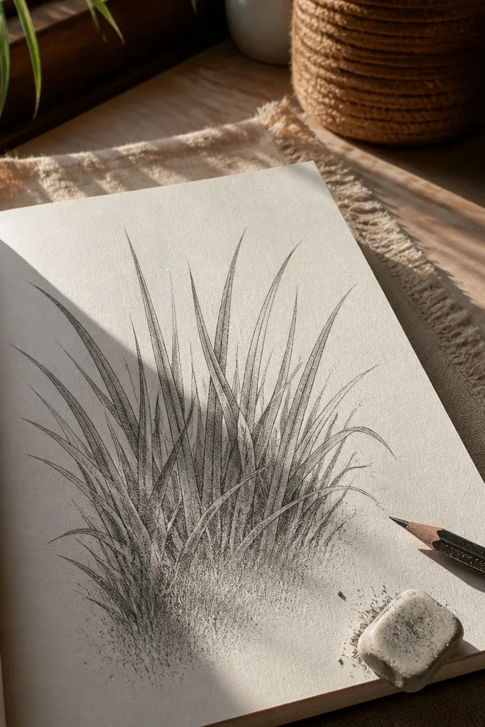
This one looks expensive because the base has texture, but the tips stay controlled. Stippled bases hide gaps and prevent the “scribble” look that cheap pencil grass gets. When you then sharpen only the tips, the drawing reads like real blades catching light. It works great for backgrounds, especially if your grass cluster sits behind a pot, vase, or tabletop scene.
Sketch the overall grass mass shape and blade direction. Build the base with tiny stipple marks using pale yellow-green and very light olive, keeping the stipples smaller in the highlight area. Add shadows by increasing olive density in the lower half, not by using darker strokes across the whole drawing. Once the base looks even, switch to sharper pencil work and draw clean blade tips in repeated short strokes. Darken only the underside edge near the tip and add a few stray darker blades to create depth.
Good to knowUse a softer pencil for stipple (like B range) and a harder one for tips so the detail stays crisp.
Common mistakeDon’t stipple all the way to the tips; the top third needs clean, defined edges.
6. Watercolor wet-on-wet lemon haze with hard-edged tips
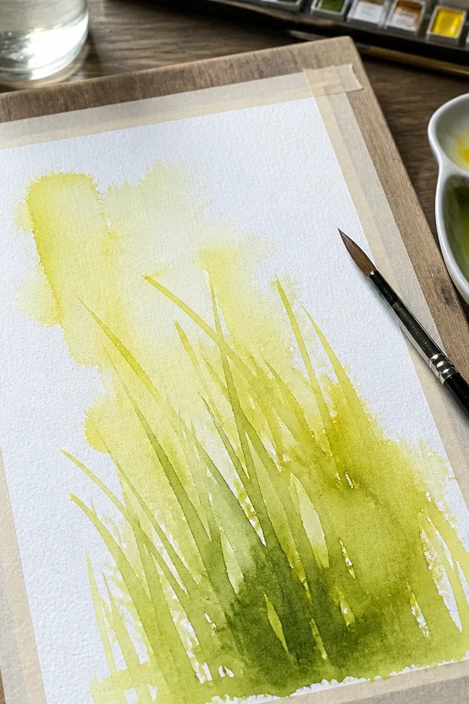
Wet-on-wet gives you that airy lemon haze that reads like fresh grass, which is exactly what you want for a lemon grass drawing luxury look. The trick is that you stop the softness where the viewer expects detail: the tips. This method gives you a natural gradient from bright top to deeper base without harsh banding. It’s a great fit for tall grass drawings where you want movement and lightness.
Prime the area with a light, even wash of diluted yellow-green. While it’s still damp, drop slightly darker olive and let it feather into the wet field to form shadow pockets. Do not add blade lines yet — focus on the mass and gradient. When it dries, use pencil to add blade tips and underside edges with short, controlled strokes. Add a final thin watercolor glaze of pale yellow-green over the top area only to unify the highlights.
If the watercolor starts drying, switch to pencil sooner — waiting too long makes the tips look pasted on.
Don’t draw straight blade lines while the wash is still wet; everything turns fuzzy.
7. Hybrid watercolor depth plus pencil highlight burnish
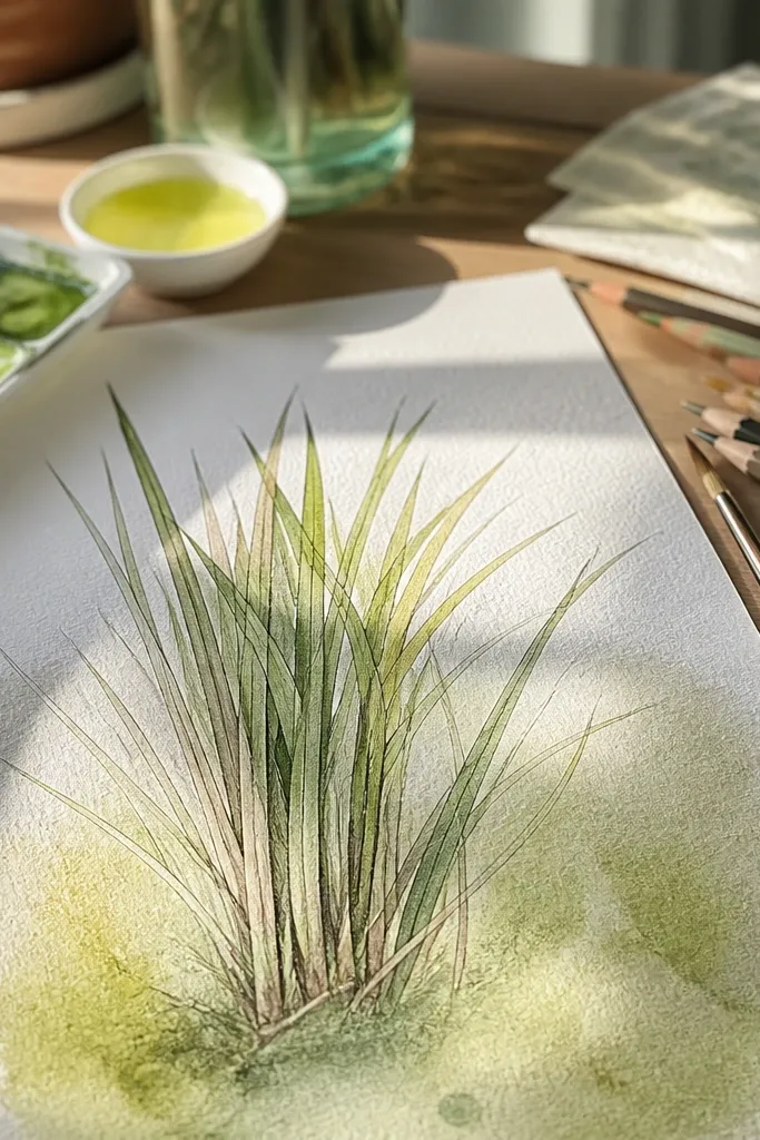
If you want the most convincing luxury look, this hybrid approach is the cleanest path. Watercolor handles the smooth color transitions and soft depth in the lower half, while colored pencil puts the real blade definition at the top. The highlight burnish makes the lemony edges look like light is bouncing off them. It suits larger pieces where you need depth, not just a flat cluster.
Paint a base watercolor wash: diluted yellow-green for the main grass mass and a deeper olive in the lower half. Let it dry fully, then lightly glaze again with pale yellow-green to unify. Next, draw blade tips and underside shadows with colored pencil, using repeated light strokes rather than heavy lines. Burnish the highlight edges with a bright yellow-green pencil until the surface looks smooth. Finish by adding a few darkest underside accents and tip points so the drawing has a clear focal area.
Keep your pencil highlights consistent: one bright edge per blade direction looks more realistic than random sparkle.
Don’t burnish over dark pencil shadows; it smears values together and kills contrast.
8. Two-stage watercolor glaze for layered stems
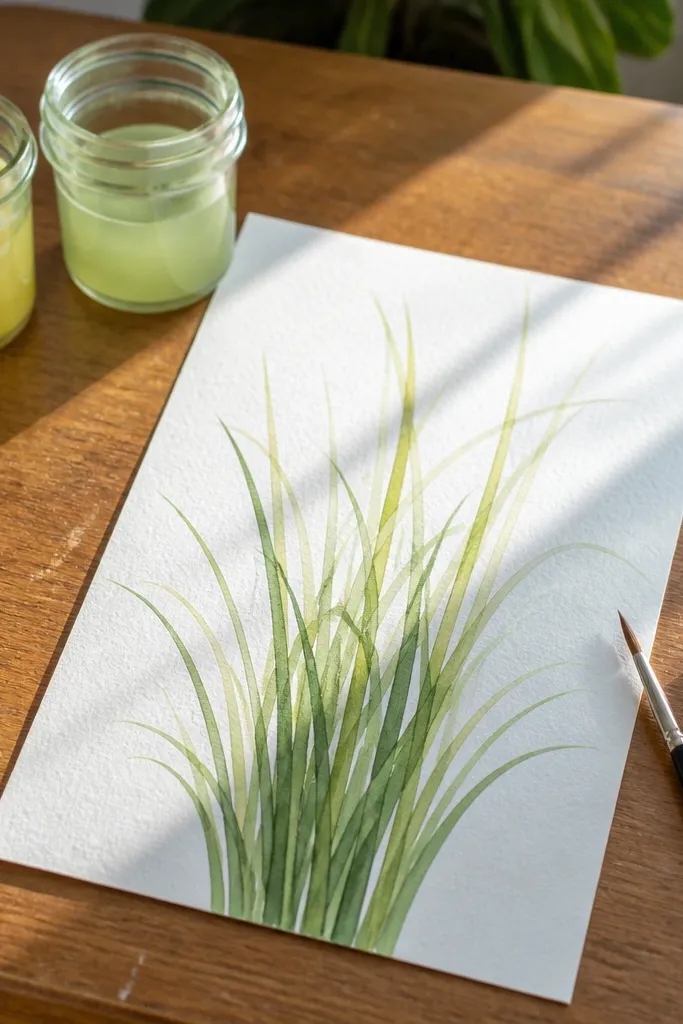
This is a watercolor-only way to get luxury depth without turning the whole piece dark. Two-stage glazing builds the lower shadows slowly, so the lemon grass keeps its fresh, bright character. The result looks like stacked layers of blades rather than one flat wash. It’s perfect for drawings that need a clean gradient from base to top.
First glaze: wash a diluted yellow-green over the whole grass area, then add olive only near the lower half. Let it dry completely. Second glaze: repeat a lighter yellow-green over the top third and add slightly darker olive in the bottom third, keeping the middle lighter. After drying, use a fine pencil to sketch blade tips and add a darker underside edge to each blade. Finish with a thin pale watercolor glaze over highlights if they look dull.
Good to knowUse very diluted paint for glazes; thick paint makes blades look heavy and flat.
Common mistakeDon’t keep re-wetting the same area; repeated soaking causes muddy transitions.
9. Pencil "highlight gaps" for glassy blade shine
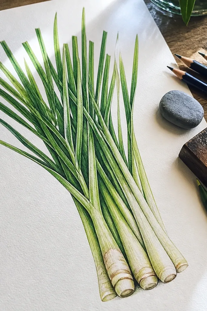
Luxury grass often has tiny breaks in pigment where the paper shows through, like a reflected highlight. This method uses highlight gaps on purpose, so your lemon grass drawing luxury look feels crisp and glossy instead of fully filled. The gaps also prevent the drawing from looking overworked. It’s a strong choice when you want clean, modern art rather than painterly softness.
Sketch blade directions and mark where the highlight edge should run on each blade. Color the bulk of the blade mass with light yellow-green, but leave those highlight edge lines mostly uncolored (or very lightly colored). Add olive shadows on the underside and lower half, overlapping up to but not across the highlight gaps. Then reinforce the highlight edges with a thin pass of brighter lemon-yellow-green right beside the gaps. Finish by sharpening the tips and adding a few short darker marks under the brightest edges to sell depth.
Use the paper as your highlight — leaving gaps works better than trying to “erase into” pencil layers.
Don’t fill the gaps “just to be safe”; that removes the luxury shine.
10. Watercolor + lifting for pale lemon blade highlights
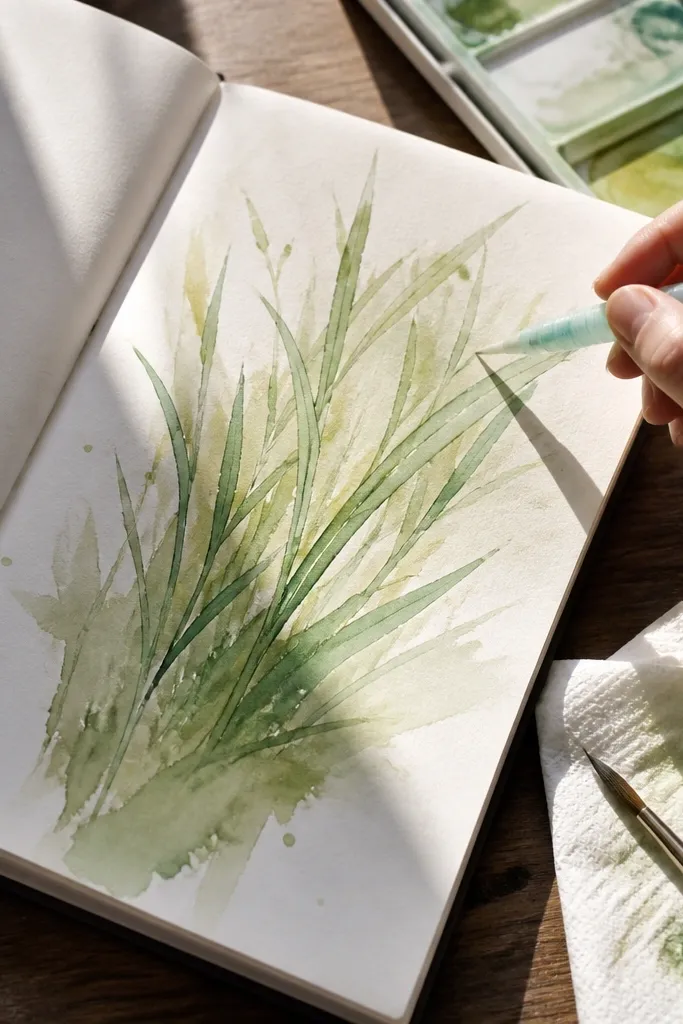
Lifting gives you highlight blades that look like light catching wet leaves, which is exactly the lemon grass drawing luxury look. It’s also a practical fix when your watercolor wash goes too even and loses sparkle. The lifted areas create natural contrast without adding thick pencil lines everywhere. This works best when you want a softer, airy luxury style.
Paint the base wash with diluted yellow-green and olive in the lower half. While the paint is still slightly damp (not fully dry), lift highlight areas using a clean, dry paper towel by blotting along the blade direction. Let everything dry fully. Then add blade tips and underside edges with colored pencil for crisp definition. Finish with a very light yellow-green glaze over the remaining base so lifted spots look intentional, not accidental.
Blot, don’t rub. Rubbing spreads pigment and makes gray smears.
Avoid lifting after the wash fully dries; you’ll get patchy marks instead of clean highlights.



